


Recommendations for adaptive email message layout
When you prepare an email template, you cannot predict which mail client or which device the recipient will use to open it. That is why we recommend that you consider general rules for the adaptive email message layout for your email templates. Complying with these rules will ensure the correct display of your email at different devices.
Attention
The pre-configured Creatio content blocks are adaptive by default. This article covers the nuances that influence the correctness of displaying the emails that were created using custom content blocks or imported in Creatio via HTML elements.
Contents
•General principles of adaptive email message layout
•MS Outlook specifics that affect how your emails display
•Specifics of email message layout for mobile devices
General principles of adaptive email message layout
Abide by the following recommendations to make your email readable regardless of the device and mail client:
-
The email template layout is table-based. Many of the HTML and CSS properties that work for websites do not work for emails. In Creatio, the table layout is managed via the “block” template element.
-
We recommend creating templates no wider than 700 pixels since many mail clients limit the email width and a recipient might see a horizontal scroll bar.
-
Use standard fonts for email texts. They are easy to read at any screen resolution. Besides, if you use one of the fonts that are not supported by the recipient’s mail client, it will be automatically converted to a standard font and might damage the layout. For more on email template fonts, see the “Adding custom fonts” article.
If you need to use the headers with non-standard fonts, paste them into your email as images and use alternative text for cases when the recipient mail provider does not upload images by default.
-
Make your email text no smaller than 12–13 pixels to save your recipient from straining their eyes. Some mail clients of mobile devices can increase the font automatically if it is smaller than 12 pixels in the original, which might interfere with your email layout.
-
Use the screen effectively: the most important information including the call-to-action buttons should be placed at the upper part of the email and should be visible both on the computer and mobile device screens without the need to use the scroll bar. For more on CTA buttons in Creatio email templates, see the “Button” article.
-
Stick to minimalistic design. The templates that use 2–3 primary colors and few images load faster and adapt to mobile devices better.
-
We do not recommend using background images in templates. They increase the loading time and might fail to display in some mail clients. If you still use such an image, add a color background to it so that your text is well visible if the image fails to display.
-
Use big buttons to make it convenient to use for the recipient, especially in case he uses a mobile device. The recommended button size is 44х44 pixels.
MS Outlook specifics that affect how your emails display
When sending emails to customers, Microsoft Outlook users should take into account that when viewing emails in MS Outlook, some elements may be displayed differently than in the template preview. For example, the buttons might not display the corner radius. Also, for security reasons, MS Outlook blocks the downloading of images in emails by default.
Configure the correct display of email styles in MS Outlook
For the correct display of email template styles in MS Outlook, add comments that determine styles for MS Outlook to each table cell in the HTML code. For example, for an employee signature (Fig. 1) the MS Outlook comments will look as follows:
<tr>
<td valign="top" style="vertical-align: middle;"><!--[if (gte mso 9)|(IE)]>
<table width="100%" cellpadding="0" cellspacing="0" border="0" style="vertical-align:top;">
<tr>
<td width="300" valign="top" style="vertical-align: middle; margin: 0; padding:0;">
<![endif]-->
<div style="display: inline-block; vertical-align: middle;max-width: 300px; width:100%; margin: 0; padding:0;">
Fig. 1 Employee signature display in MS Outlook

Creatio ready-made content blocks, as well as any content designed using standard Content Designer elements, are already optimized for MS Outlook.
How do the buttons display in email templates and MS Outlook
The “corner radius” settings (rounded edges) for CTA buttons (Fig. 2) will be ignored in MS Outlook, and the buttons will display as if the [Corner radius, px] property is set to “0” (Fig. 3).

Fig. 3 — Buttons display in MS Outlook

Specifics of email message layout for mobile devices
The following layout types are used to adapt the display of custom email templates to mobile devices:
-
Single-column layout. If you do not use columns in the “Block” elements of your emails, their layout will be the same for desktop and mobile devices. Note that most out-of-the-box template content blocks use multiple columns.
-
Multi-column layout, also known as module grid layout. In this case, the email layout is divided into several columns. If the screen width reaches the value specified in the [Mobile breakpoint] setting of the template, the columns will be rearranged to fit the narrow screen of a mobile device.
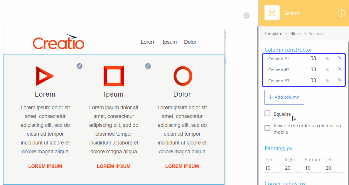
The number of columns in an email template depends on the structure of its content blocks. By default, all new “Block” elements have a single row and a single column. You can check the column layout of each section in a content block by clicking this section in the setup area (Fig. 4).
Fig. 4 Checking the column layout of a content block
Single-column layout
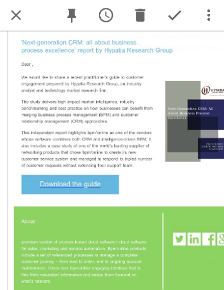
For a single-column layout, we recommend using templates containing one column, 600-700 pixels wide. Otherwise, the message may not be displayed correctly. For example, parts of tables or images can exceed the size of the recipient’s mobile device screen, which might reduce or the font size to the point when it becomes unreadable (Fig. 5).
Fig. 5 Example of an email created via 3rd-party HTML editor that was not adapted to the mobile device view
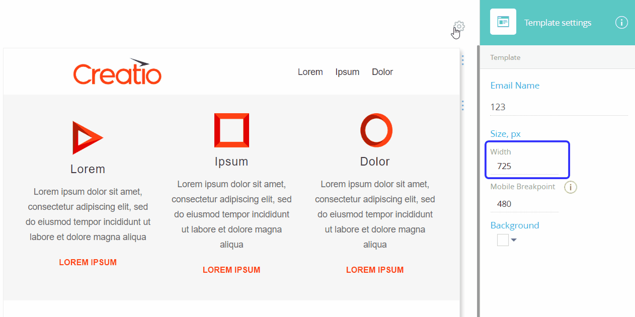
If you design your emails in Creatio Content Designer, you can set the template width in the [Width] field of the template setup area (Fig. 6).
Note
The preview of the generated message in the Content Designer does not guarantee that the email recipient will see the same thing. This is due to the settings and features of different email clients.
Note
Before you start sending an email, we recommend testing the message layout by sending it to addresses registered on different email services. Send a test letter. More information is available in the “How to send a test email” article.
Multi-column layout
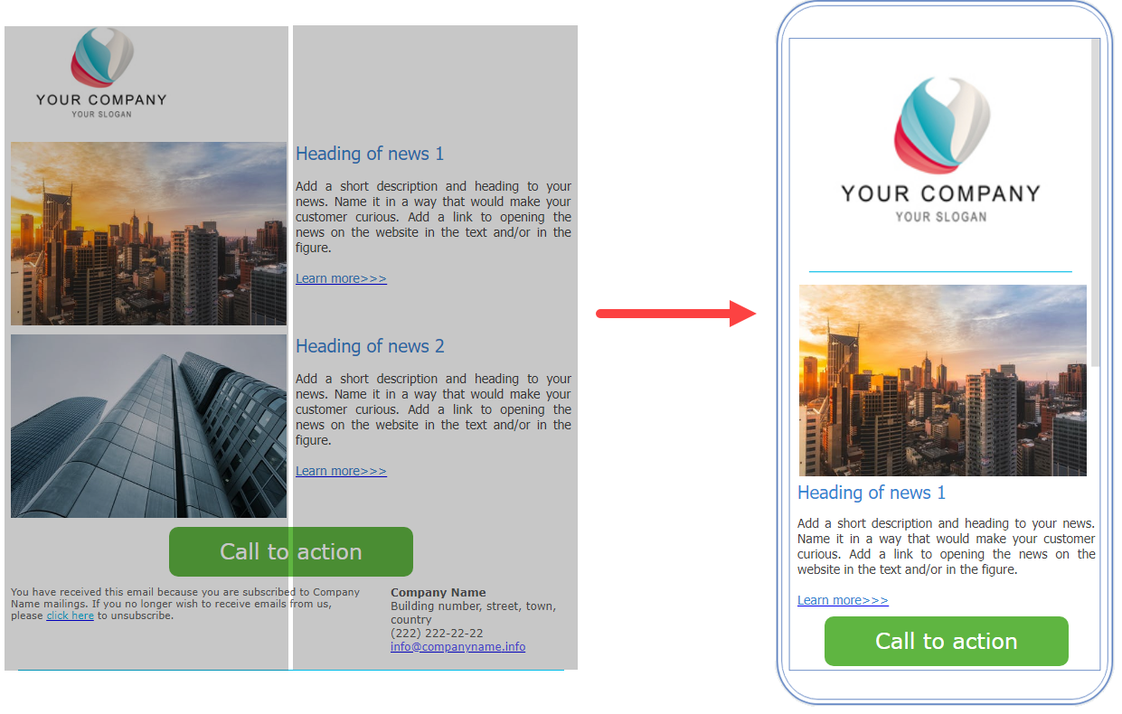
We recommend using a multi-column layout for marketing emails. It works well for templates with different types of content: texts, images, buttons, or HTML elements. Use 2-4 columns in a multi-column layout. This structure is convenient for adapting to mobile devices – the content elements are restructured to fit one column (Fig. 7).
Fig. 7 Example of a template with a multi-column layout and its display in a mobile device
In templates, designed with Creatio Content Designer, you can manage the order in which the columns will go in the mobile layout. You can group columns to force them to display side-by-side on mobile devices. For more on managing the mobile layout, see the “Column layout on desktop and mobile” article.
See also