


The Content Designer is a visual drag&drop editor that enables creating email templates that look great on desktop and mobile devices.
You can use the Content Designer to design templates with complex layouts, such as marketing emails, newsletters, greeting cards, etc. Working in the Content Designer does not require an in-depth understanding of HTML: Creatio generates the code automatically based on the layout that you design in the visual editor.
Example
Configure a mobile-optimized company news digest email template. The template should have a header with navigation bar, a banner, top 3 features or products and a “call to action” button.
I. Add a new template in the [Email templates] lookup
1.Go to the [Studio] workplace and select [Email templates] (Fig. 1).
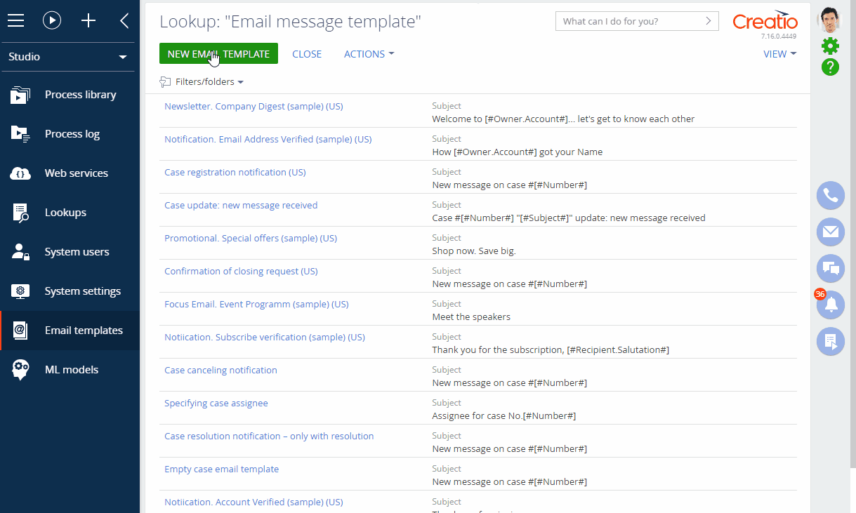
2.Click the [New email template] button.
3.On the opened page, specify the template name, e.g., “Introduction email.”
4.Click the [Edit] button next to the [Emil template] block to open the Content Designer.
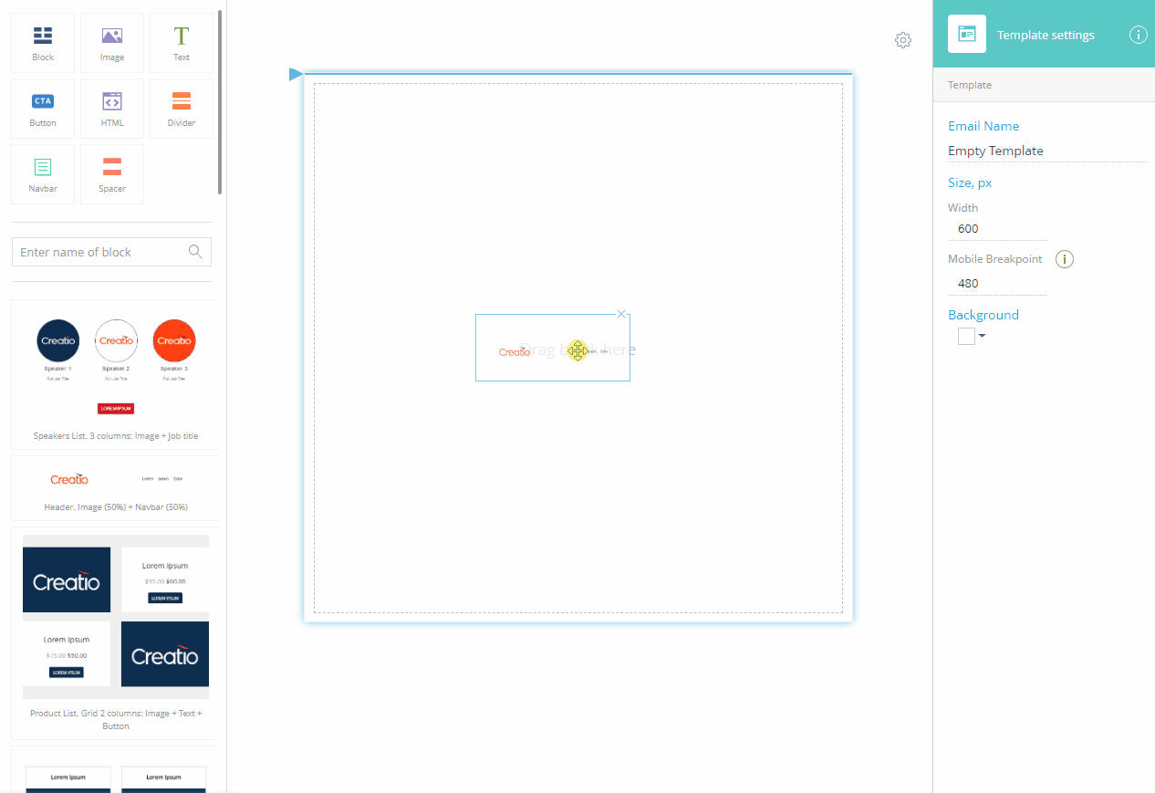
II. Design your template in the Content Designer
1.Set up the template header (Fig. 2):
a.Drag&drop the “Header. Image (50%) + Navbar (50%)” element from the block library into the working area.
b.Click the navlinks to edit their captions.
c.Specify the destination of each link in the setup area on the right. Remove the “#” prefix to treat the value as a URL. Leave the prefix to treat the value as a local anchor.
d.Click [Navbar] –>  to remove extra navlinks. Alternatively, you can add more navlinks by clicking [Add link].
e.Select the [Hamburger menu] checkbox to display the navigation menu as a collapsible hamburger menu on mobile clients.
f.Click  to make the navigation menu float on the right.
g.Click [Section] and select the [Reverse the order of columns on mobile] checkbox to push the logo under the navigation on mobile clients ().
Note
If the [Reverse the order of columns on mobile] checkbox remains cleared, the image in the left column will display above the navigation menu on mobile devices.
2.Set up a banner (Fig. 3):
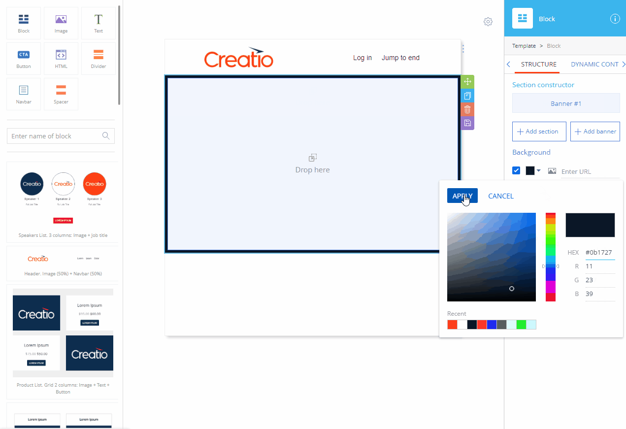
a.Drag&drop the [Block] element from the element toolbar into the working area.
b.Click [Add banner] in the setup area on the right.
c.Click  to the right of the [Section #1] to remove the section.
d.Select the background settings checkbox at the bottom of the setup area.
e.Click  under [Background], select the background color of the block and click [Apply].
Note
We recommend setting up a background image of the banner after all banner elements are added and configured. There are two reasons for that: the background image is practically indistinguishable when not a single banner element has been added and the contents of the banner may affect the height of the banner and, consequently, the background image layout.
3.Add an image on top of the banner (Fig. 4):
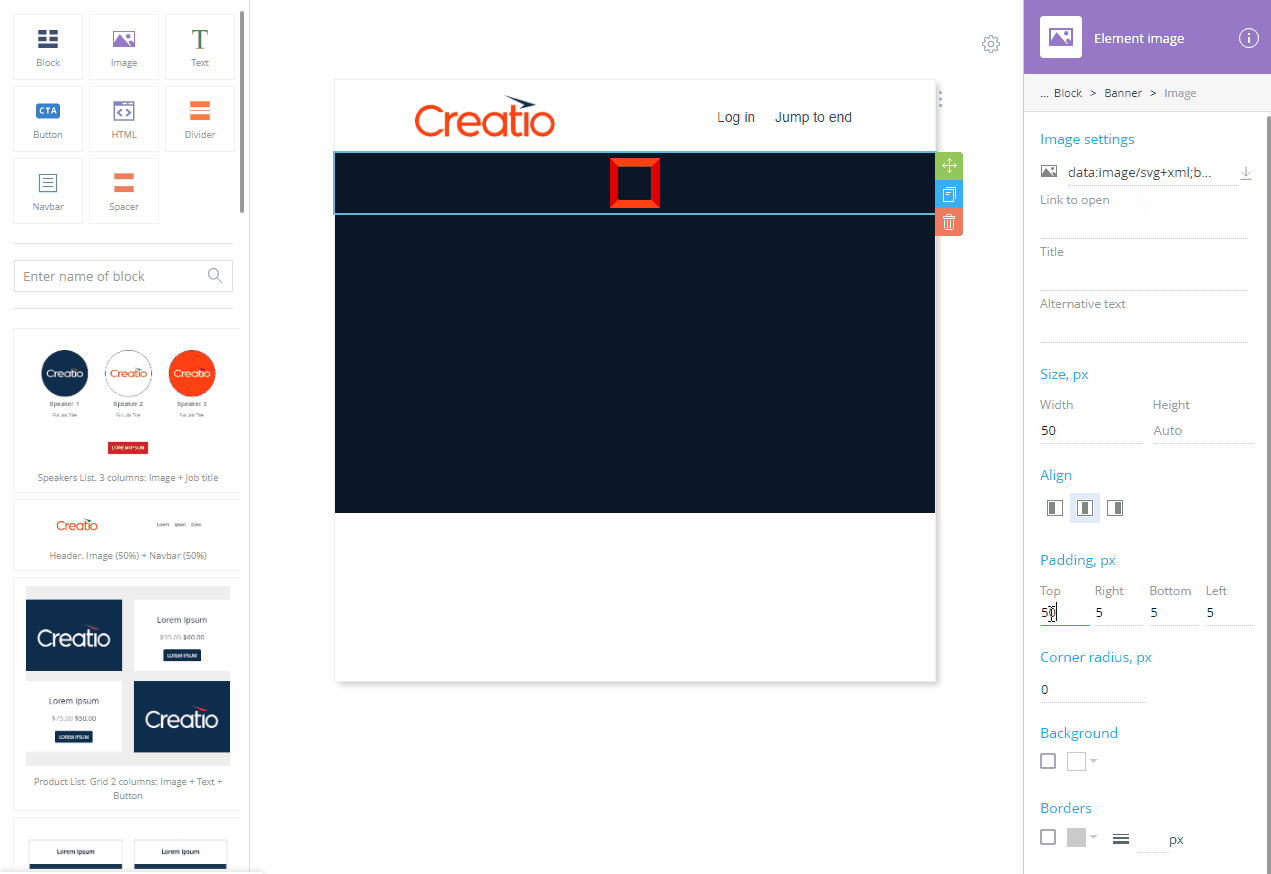
a.Drag&drop the [Image] element.
b.Click  to clear the
  field in the setup area on the right.
c.Upload the image from your computer or provide the URL of the image or a data URI containing the image.
d.Specify the desired width of the image in the [Size, px] property.
e.Specify the desired padding settings.
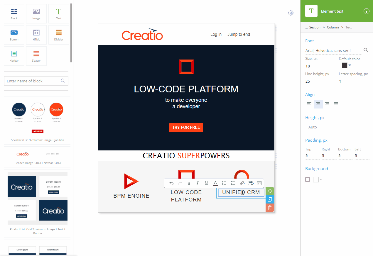
4.Add a title to the banner (Fig. 5):
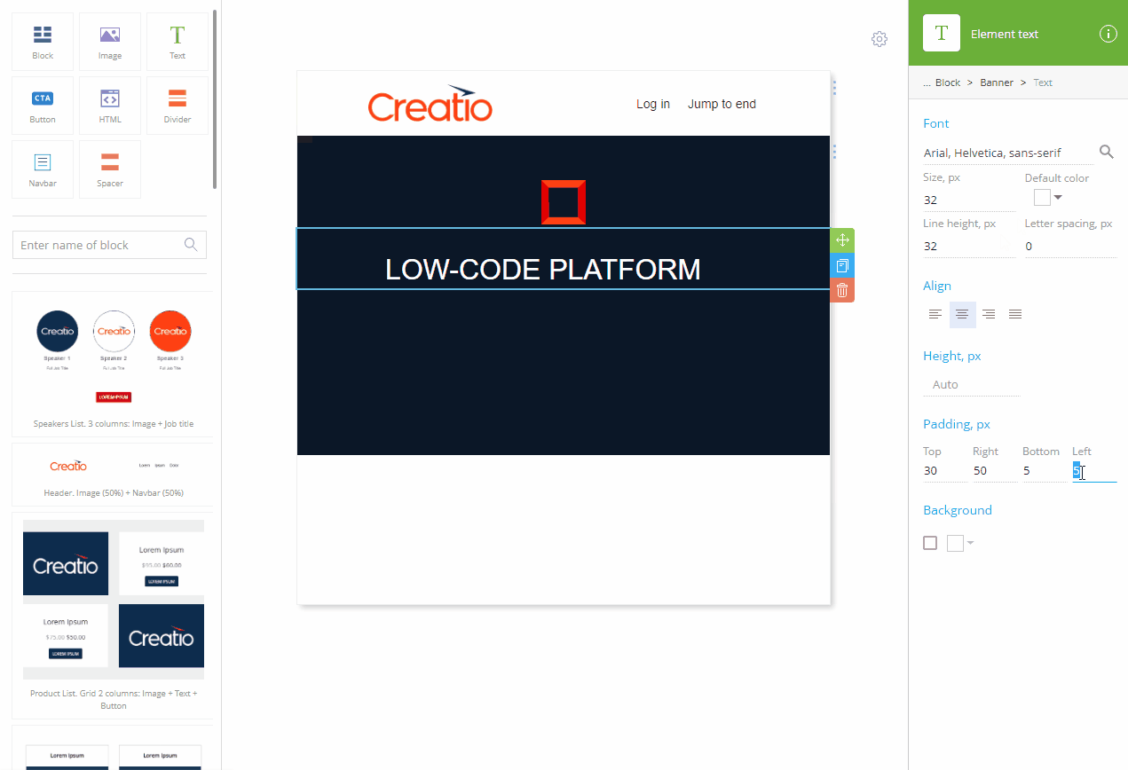
a.Drag&drop the [Text] element.
b.Click  in the [Font] property in the setup area to open the font color picker. Select the font color and click [Apply].
c.Replace the placeholder text with the title text.
d.Specify the font size using the [Size, px] field.
e.Click  to align the text.
f.Specify the desired padding settings.
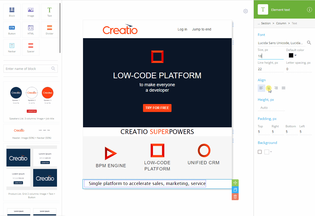
5.Add a subtitle to the banner (Fig. 6):

a.Drag&drop the [Text] element.
b.Repeat steps (b) through (f) from the title instruction, using a different value for the font size.
6.Add a button to the banner (Fig. 7):
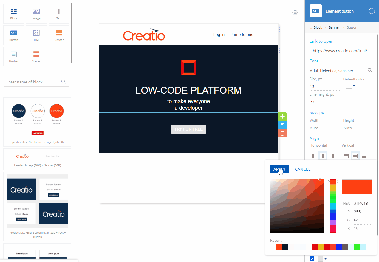
a.Drag&drop the [Button] element.
b.Replace the default text with your text.
c.Specify the link to open in the [Link] field.
d.Click  in the [Font] property in the setup area to open the font color picker. Select the font color and click [Apply].
e.Use the [Margin, px] property to specify the margin of the button.
f.Click  at the bottom to open the color picker. Select the background color of the CTA button and click [Apply].
7.Add the background image to the banner (Fig. 8):
Fig. 8 Adding a banner background image
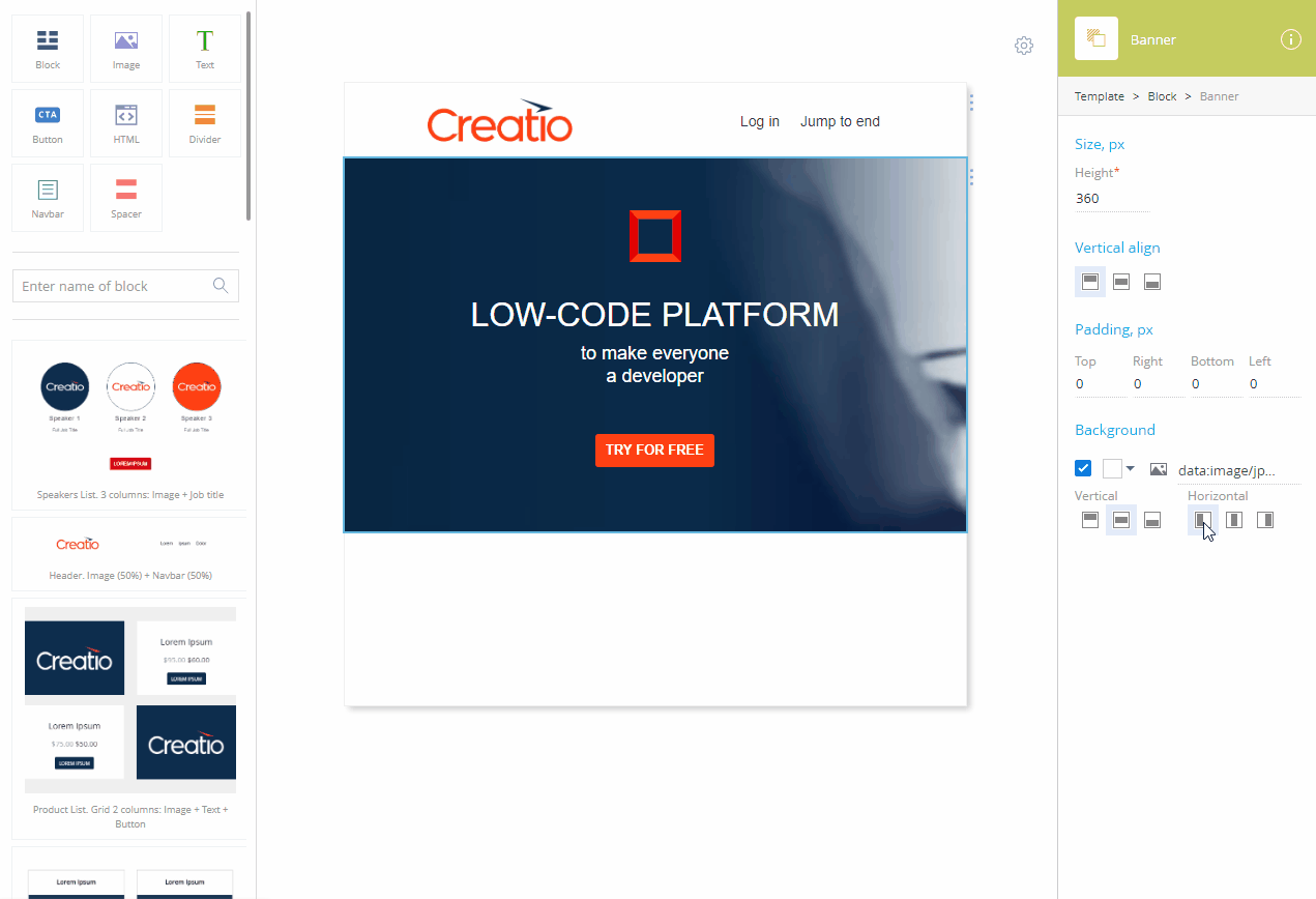
a.Select the banner using the “breadcrumbs” navigation.
b.Click  to clear the
  field in the [Background] property.
c.Upload the image from your computer or provide the URL of the image or a data URI containing the image.
d.Use the  ,
,  , and
, and  buttons to align the image vertically and the
  ,
,  , and
, and  buttons to align the image horizontally.
Note
The background image will keep the aspect ratio but will otherwise stretch or shrink to fill the banner. Depending on the ratio of the image or the banner, you can align the image either horizontally or vertically, not both.
8.Add a subtitle (Fig. 9):
Fig. 9 Adding a feature subtitle
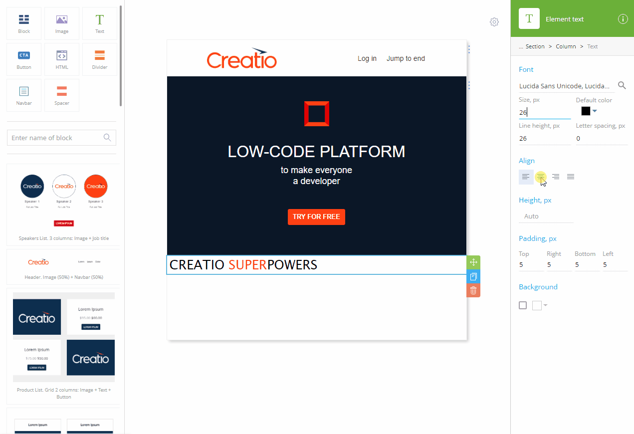
a.Drag&drop the [Block] element.
b.Drag&drop the [Text] element on the new empty [Block] element.
c.Replace the default text with your text.
d.Specify the font family of your text using the lookup in the [Font] property.
e.Specify the font size using the [Size, px] field.
f.Click  to align the text by center.
9.Add a feature block (Fig. 10)
Fig. 10 Adding a feature block
a.Drag&drop the “Product list. 3 columns: Image + Text + Button” block from the Content Library.
b.Delete unneeded elements.
c.Replace the default text in the columns with your text.
10.Add a summary text (Fig. 11) the same way you added the subtitle after the banner on step 9.
11.Click [Save].
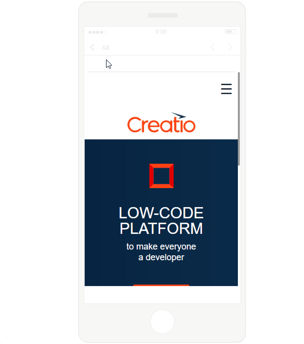
As a result, a new template will be created. It will be already optimized for Desktop and mobile (Fig. 12).
Fig. 12 Template on mobile and desktop:
See also
•Text