

Content block elements arrange other elements of a template. You need at least one block in your template to be able to add non-block elements. Blocks cannot contain other blocks.
Fig. 1 Sample template layout
A block has a table-like layout. Blocks can hold two types of “rows”:
-
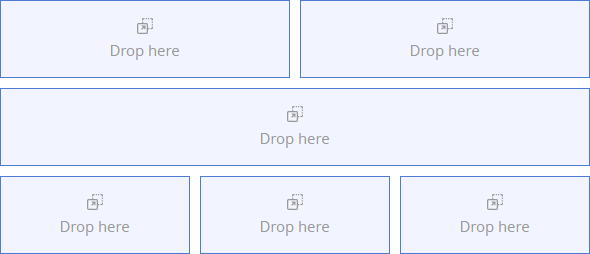
Sections are multi-column rows. A section can have up to 6 columns. Use sections to arrange most types of content. They are also preferable in general because of their flexibility.
-
Banners are single-column rows. Use banners to insert images that will fill all available space and fit inside the element regardless of the image size. You can align the background image of a banner vertically and horizontally.
Note
As an alternative to using banners, you can specify a background image of an entire block. However, this background image will not stretch or shrink to fit the borders of the block.
By default, a block has one section and no banners. A block must have at least one section or banner. It is not possible to delete the only section or banner of a block.
You can add multiple sections to a single block or add multiple blocks. A template, consisting of a single block with multiple sections will look the same as a template that consists of multiple blocks. We recommend adding any reusable content as separate blocks and saving them to the Block Library for later.
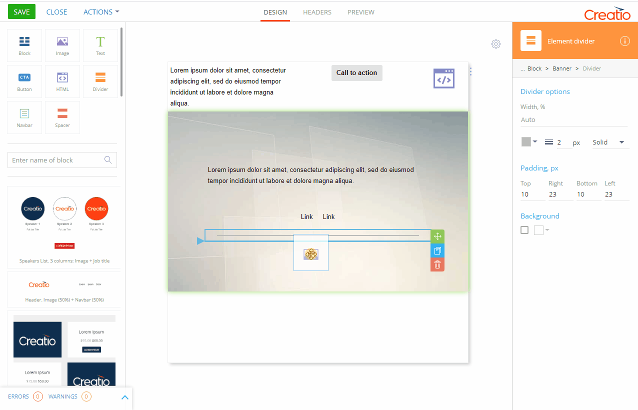
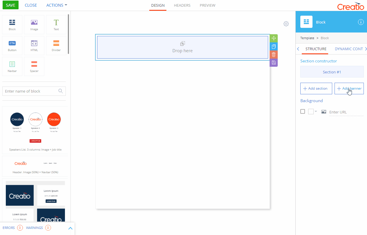
To add a block to a template, drag&drop the [Block] ( ) element from the element grid onto the working area (Fig. 2).
Fig. 2 Using the content designer
Unlike other elements, blocks may be tricky to select, since clicking on a block may select one of the elements rather than the block itself. There are two ways to select a block:
-
Click on the right border of the block (Fig. 3).
-
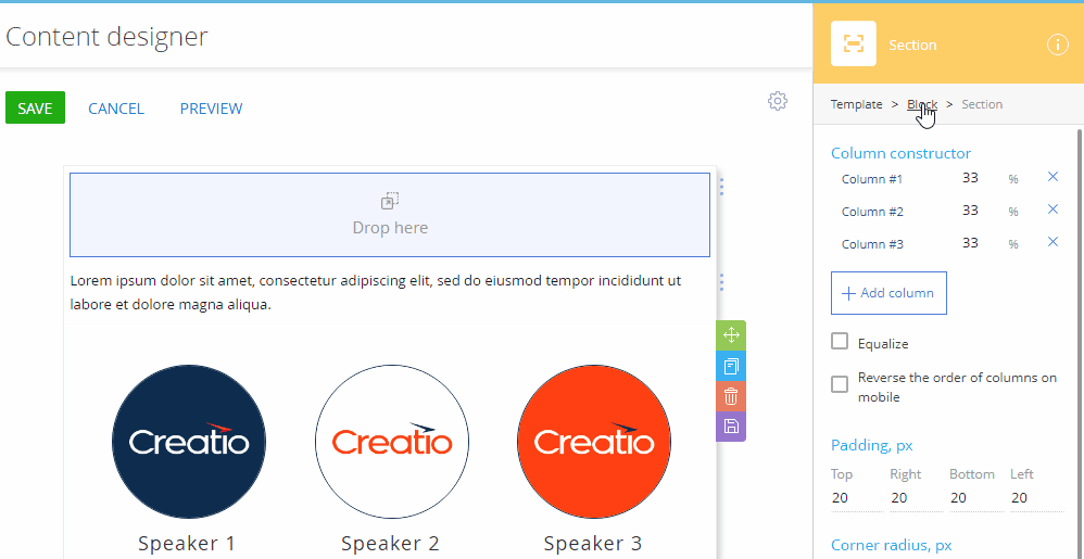
Click any element inside the section or banner, then press [Esc] to go up the navigation tree until the [Block] element is selected.
-
Click any element inside the section or banner, then click “Block” in the breadcrumb navigation in the setup area. Click the leftmost element if “Block” is not yet visible. (Fig. 4).
Fig. 3 Selecting the block by clicking on the right border
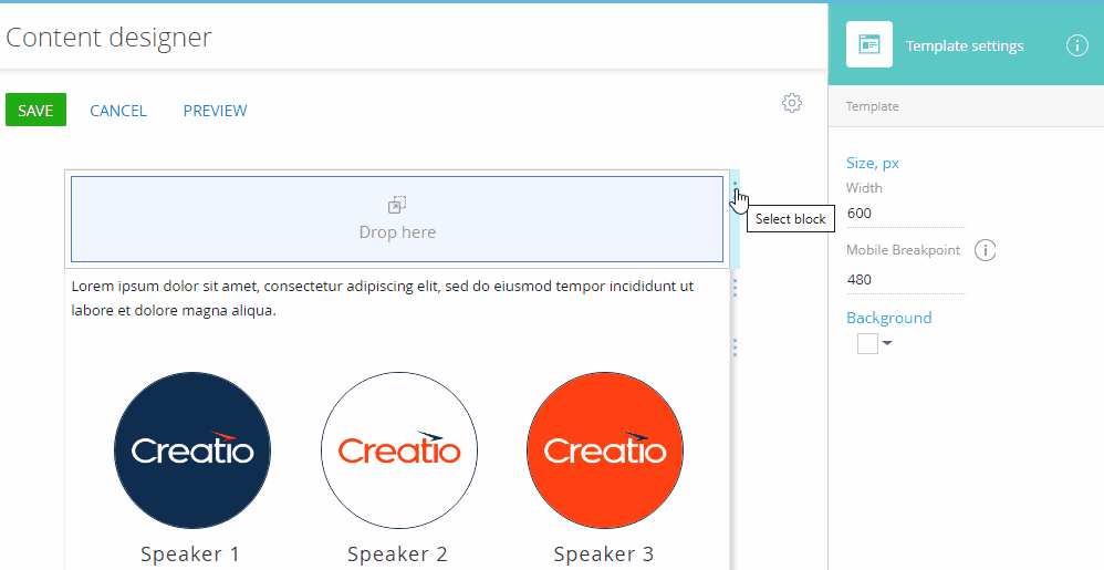
Fig. 4 Selecting the block by using the setup area
When a block element is selected, its context menu appears on the right (Fig. 5).
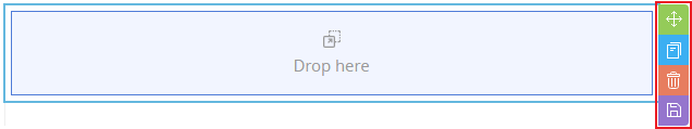
-
 - Drag the block up or down to reorder the blocks in the template.
 -
 - Copy the block. A copy block will appear directly under the original block.
 -
 - Remove the block from the template. All changes made to the block will be lost if the block was not saved in the block library.
 -
 - Save the block in the Block Library. Creatio will prompt you to enter the name under which the block will be saved.
Block setup area
Use the setup area on the right to configure the [Block] element.
The setup area comprises of three tabs:
-
[Structure] – the default tab available in the Campaign Designer and Process Designer. It is the only tab available when you open the Content Designer from the Process Designer.
-
[Dynamic Content] – this tab is only available in the marketing Content Designer for Marketing Creatio. Use it to set up different variations of a block for different conditions, configured on the [Rules] tab.
-
[Rules] – this tab is only available in the marketing Content Designer for Marketing Creatio. Use it to set up rules that can be used for defining dynamic content.
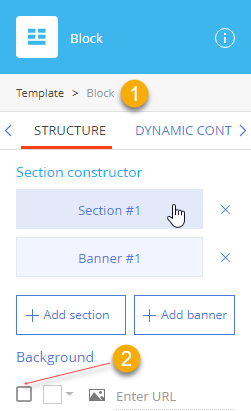
The [Structure] tab (Fig. 6) includes the following properties:
Note
Tabs other than the [Structure] tabs are only available in Creatio Marketing and Creatio CRM bundle.
| Property | Function |
|---|---|
| Breadcrumb navigation (1) | Use “breadcrumbs” at the top of the setup area to navigate the parent (template) element |
| Section constructor | Add, remove, and move the sections and banners of the block. To access the setup area of a section or banner, click the corresponding item in the section list. Click [Add section] or [Add banner] to add sections and banners. Click |
| Background | Set background image and/or color for the entire block. Note that sections and banners can have their own background settings that may cover the background of the block. Background style settings are disabled by default. Select the checkbox (2) to enable them. Clear this checkbox to disable all background settings of the current block. Click Click Note If the recipient’s email client fails to load the image, the recipient will see the background color instead. |
 to remove a section or banner (last section or banner cannot be removed).
 to open the color picker and select the background color.
 and enter the URL of the image to display on the background.
A banner is a single-column block “row”. The main purpose of the banner element is to display a background image and some content over it (Fig. 7). Unlike the [Block] element, you can align the banner background image.
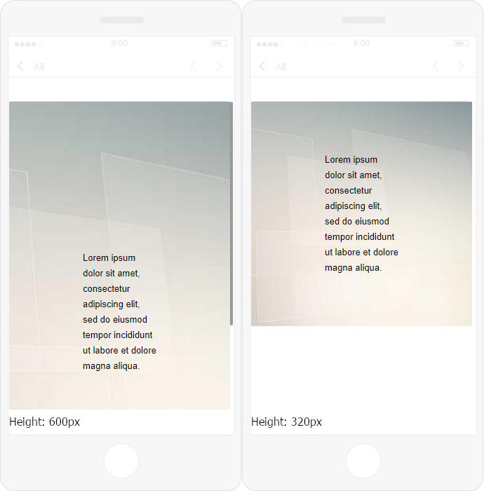
A banner has a fixed height. If it is set to a value that is too large, the banner may not fit the display vertically (Fig. 8).
Fig. 8 600px vs. 320 px banner
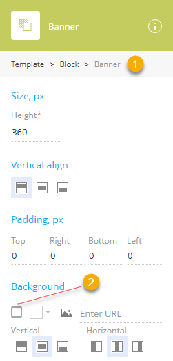
The [Banner] setup area comprises of the following setup groups: [Size, px], [Vertical align], [Padding, px], and [Background] (Fig. 9).
| Property | Function |
|---|---|
| Breadcrumb navigation (1) | Use “breadcrumbs” to navigate the parent (block and template) elements. |
| Size, px | Configure the height of the banner by specifying the [Height] field value. This value is used to set up the minimum height. If the height of the content of the banner exceeds this value, the banner will stretch vertically. |
| Vertical align | Align the contents of the banner vertically (top |
| Padding, px | Specify the distance (in pixels) between the content of the banner and each of its borders. Padding is specified separately for each side. |
| Background | Set background image and/or color for the entire banner. Note that elements dropped onto the banner can have their own background settings that may cover the background of the banner. Background style settings are disabled by default. Select the checkbox (2) to enable them. Clear this checkbox to disable all background settings of the current banner. Click Click Note If the recipient’s email client fails to load the image, the recipient will see the background color instead. The image will stretch or shrink to fit the banner. We recommend using large or vector images as a background. Align the background image of the banner vertically (top Note Alignment may produce no visible effect depending on the ratio of the image and the current ratio of the banner. |
 , middle
  , or bottom
  ).
). to open the color picker and select the background color.
 to enter the URL of the image to display on the background.
 , middle
  , or bottom
  ) or horizontally (left
  , center
  , or right
  ).
).A section (Fig. 10) is a multi-column block “row.” This is the default subordinate element of the [Block] element. A section does not have its own background image.
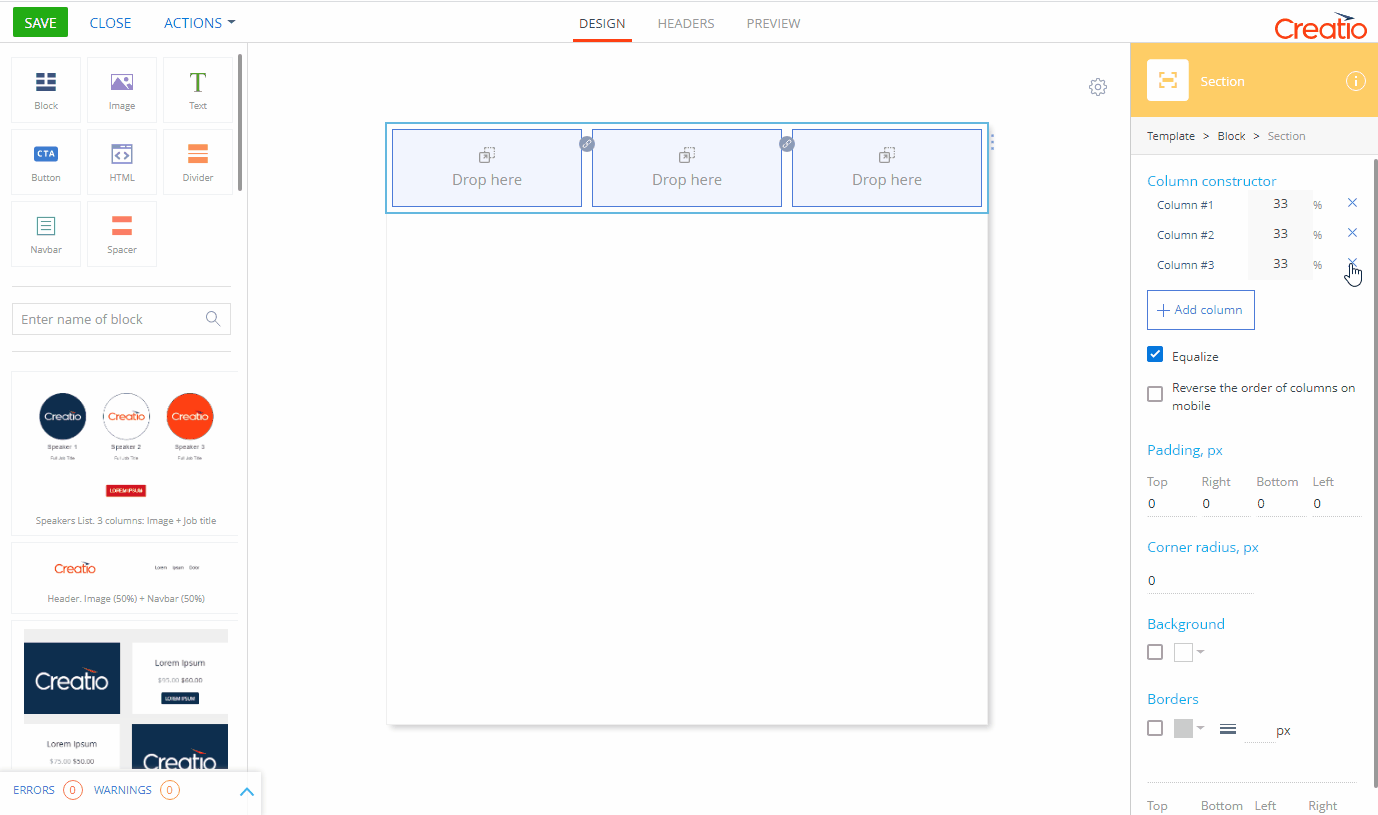
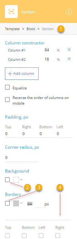
The [Section] setup area consists of several groups of settings: [Column constructor], [Padding, px], [Corner radius, px], [Background] and [Borders].
Fig. 11 Section setup area
| Property | Function |
|---|---|
| Breadcrumb navigation (1) | Use “breadcrumbs” at the top of the setup area to navigate the parent (block and template) elements. |
| Column constructor | Add and delete columns, specify their widths, or equalize them and reverse the order of the columns on mobile devices. To access the setup area of a column, click the corresponding item in the column list. Click the “%” field and specify a new value to change the width of a column. The width of the next adjacent column will be adjusted. Note The minimal column width is 5%. Click [Add column] to add a column. Click Select the [Equalize] checkbox to ensure that all of the columns have equivalent width. If you add or remove a column when this checkbox is selected, the widths of all columns will be adjusted to match each other. Select the [Reverse the order of columns on mobile] checkbox to reverse the order of ungrouped columns and column groups on mobile devices. Read more in the “Column layout on desktop and mobile” article. As a result, the last column or column group will be at the top, and the first column or column group at the bottom. Note This does not affect columns displayed side-by-side on mobile, i.e., columns inside column groups. |
| Padding, px | Specify the distance (in pixels) between the content of the section and each of its borders. Padding is specified separately for each side. |
| Corner radius, px | Specify the circular radius of the corners of the section. Leave this property empty for sharp corners. This defines the circular radius of all 4 corners of an element. Note Use the [HTML] element with inline or embedded CSS styles to specify elliptical corners and other exotic effects. |
| Background | Set background color for the entire section. Note that elements dropped onto the section can have their own background settings that may cover the background of the section. Background style settings are disabled by default. Select the checkbox (2) to enable them. Clear this checkbox to disable all background settings of the current section. Click |
| Borders | Configure the borders of the section. Border style settings are disabled by default. Select the checkbox (3) to enable them. Click Update the Use the drop-down menu (4) to select the border style. When the border settings are enabled, the “Solid” style is selected by default. The following styles are available:
Note The border is defined but invisible. The border width effectively equals 0.
Select or clear [Top], [Bottom], [Left] and [Right] checkboxes to enable or disable the border style settings for the corresponding border. |
 to remove a column (the last column cannot be removed).
 to open the color picker and select the background color.
 field to specify the border width. To hide the border, select the “Hidden” border style.
 – Hidden
 – Dotted
 – Dashed
 – Solid
 – Double
 – Groove
 – Ridge
 – Inset
 – Outset
A column is a structural element used to arrange other elements in a section. To add a column, click the [Add column] button the [Section] element setup area.
Fig. 12 Working with columns
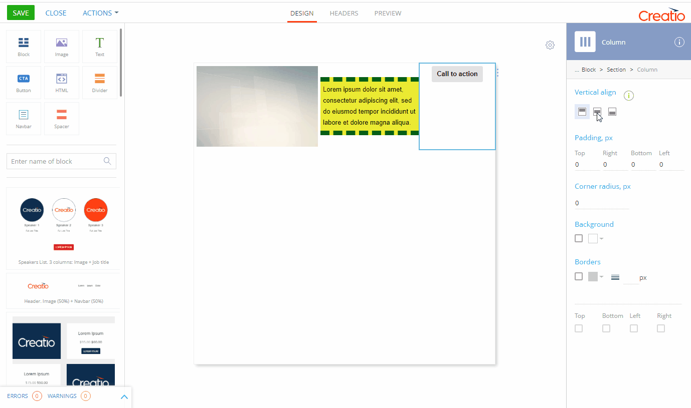
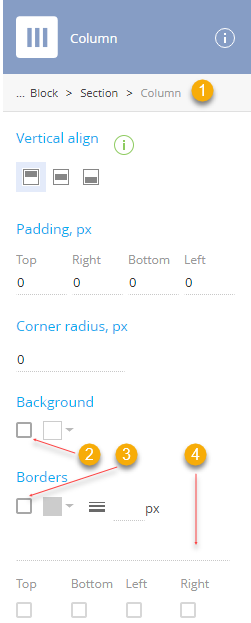
The [Column] setup area comprises of the following setup groups: [Vertical align], [Padding, px], [Corner radius, px], [Background] and [Borders].
Fig. 13 Column setup area
| Property | Function |
|---|---|
| Breadcrumb navigation (1) | Use “breadcrumbs” at the top of the setup area to navigate the parent (section, block, and template) elements |
| Vertical align | Align the contents of the column vertically (top Attention Vertical align for a column on mobile may not work in case when the vertical alignment of the highest column in the section is not set to middle. |
| Padding, px | Specify the distance (in pixels) between the content of the column and each of its borders. Padding is specified separately for each side. |
| Corner radius, px | Specify the circular radius of the corners of the column. Leave this property empty for sharp corners. This defines the circular radius of all 4 corners of an element. Note Use the [HTML] element with inline or embedded CSS styles to specify elliptical corners and other exotic effects. |
| Background | Set background color for the entire column. Note that elements dropped onto the column can have their own background settings that may cover the background of the column. Background style settings are disabled by default. Select the checkbox (2) to enable them. Clear this checkbox to disable all background settings of the current column. Click |
| Borders | Configure the borders of the column. Border style settings are disabled by default. Select the checkbox (3) to enable them. Click Update the Use the dropdown menu (4) to select the border style. When the border settings are enabled, the “Solid” style is selected by default. The following styles are available:
Note The border is defined but invisible. The border width effectively equals 0.
Select or clear [Top], [Bottom], [Left] and [Right] checkboxes to enable or disable the border style settings for the corresponding border. |
 , middle
  , or bottom
  ).
). to open the color picker and select the background color.
 field to specify the border width. To hide the border, select the “Hidden” border style.
 – Hidden
 – Dotted
 – Dashed
 – Solid
 – Double
 – Groove
 – Ridge
 – Inset
 – Outset
Column layout on desktop and mobile
On the desktop, the columns will be arranged exactly how they are displayed in the Content Designer (Fig. 14).
Fig. 14 The standard layout of a section with 6 columns

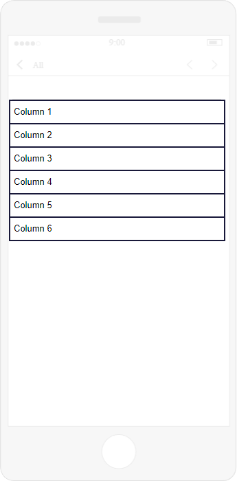
On mobile devices, columns are normally not displayed side by side. Instead, they are re-arranged vertically (Fig. 15).
Fig. 15 The mobile layout of a section with 6 columns
You can force columns to display side by side on mobile by grouping them. A column group is a sequence of columns displayed side-by-side on mobile.
To group two adjacent columns:
1.Select the [Section] element using the [Section constructor] of a [Block] element or the breadcrumbs navigation of a column or its child elements.  buttons will appear between columns (Fig. 16).
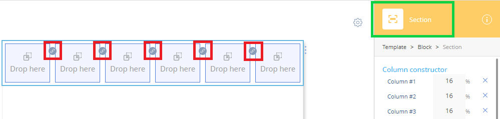
2.Click the  (Fig. 16) button between the columns that you want to group.
If one of the columns is already a part of a column group, the ungrouped column will become part of the column group. If both columns are parts of their respective column groups, both column groups will become one column group.
On mobile, grouped columns display side by side. Use the [Preview] tab at the top of the page to view how your email template displays on mobile.
You can also reverse the order of columns on mobile so that the last column is displayed at the top of the section and the first at the bottom. For example, if you have a two-column header with a logo on the right and a title on the left, a mobile device will normally display the title first and the logo second. However, if the order of columns is reversed, the logo will display on top.
To reverse the order of ungrouped columns and column groups on mobile devices, select the [Reverse the order of columns on mobile] checkbox (Fig. 17).
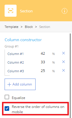
Fig. 18 Working with columns

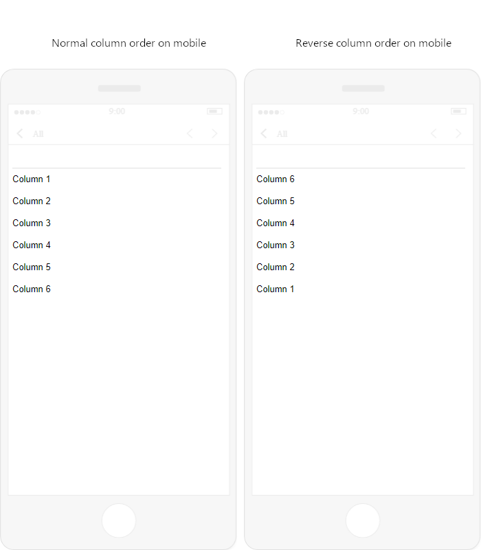
As a result, the last column or column group will be at the top of the section, and the first column or column group at the bottom.
Fig. 19 Normal column order vs. reverse column order
Note
This does not affect columns displayed side-by-side on mobile, i.e., columns inside column groups.
Next