Adding pop-up hints
Glossary Item Box

Introduction
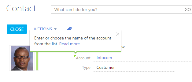
You can add pop-up hints to bpm’online elements - text messages providing additional information about the element functionality and rules of its population.
Pop-up hints can be divided into 3 main groups:
1. A pop-up hint to a field (if such hint is available, the field caption is marked by a small green triangle symbol. The hint appears when a cursor is hovered over the triangle or upon clicking the field caption.
2. A pop-up hint to other control elements (buttons, completion indicators, images). The hint appears when a cursor is hovered over the control element.
3. Information button  . The hint appears when a cursor is hovered over the information button.
General algorithm of adding pop-up hints to standard control elements:
- Create a replacing schema of the page or section.
- Add the pop-up hint text to the schema localizable string collection.
- Describe the necessary schema element modifications in the diff array.
Source code
You can download the package with case implementation using the following link.
Example 1
Case description
Add a pop-up hint to the [Save] button of contact edit page.
Case implementation algorithm
1. Creating a replacing contact page
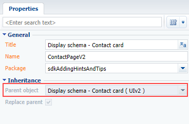
Create a replacing client module and specify [Display schema – Contact card] (ContactPageV2) as parent object (Fig. 1). Creating a replacing page is covered in the “Creating a custom client module schema” article.
Fig. 1. Properties of the replacing contact edit page
2. Adding a localized string with the pop-up hint text
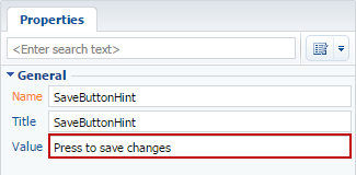
Add a string with the pop-up hint text to the collection of localizable strings of the edit page replacing schema. Properties of the created string (Fig. 2):
- [Name] – “SaveButtonHint”
- [Value] – “Press to save the changes”
Fig. 2. Properties of the custom localizable string
3. Adding a button configuration object to the diff array
There are several methods to add a pop-up hint to a control element.
Method 1
Add the hint property containing the pop-up hint text to the control element values property.
The source code of the contact edit page replacing schema when adding the pop-up hint using method 1:
define("ContactPageV2", [],
function () {
    return {
        // Name of the edit page object schema.
        entitySchemaName: "Contact",
        //Pop-up hint visualization setup.
        diff: /**SCHEMA_DIFF*/[
            // Metadata for adding pop-up hint to the button.
            {
                // Modification of the existing element.
                "operation": "merge",
                "parentName": "LeftContainer",
                "propertyName": "items",
                "name": "SaveButton",
                "values": {
                    // Pop-up hint for a button.
                    "hint": { "bindTo": "Resources.Strings.SaveButtonHint" }
                }
            }
        ]/**SCHEMA_DIFF*/
    };
});
Method 2
Add the tips array to control element values property. Add the pop-up hint configuration object to the tips array using the insert operation. Specify the content property, which is the pop-up hint text in the values property of this object. You can have a more individual approach to pop-up hint setup using this method. You can change the image style, connect the pop-up hint visibility to a view model event, add control elements, etc.
 |
ATTENTION The specified method works for itemType:
|
The source code of the contact edit page replacing schema when adding the pop-up hint using method 2:
define("ContactPageV2", [],
function () {
    return {
        // Name of the edit page object schema.
        entitySchemaName: "Contact",
        //Pop-up hint visualization setup.
        diff: /**SCHEMA_DIFF*/[
            // Metadata for adding pop-up hint to the button.
            {
                // Modification of the existing element.
                "operation": "merge",
                "parentName": "LeftContainer",
                "propertyName": "items",
                "name": "SaveButton",
                "values": {
                    // Pop-up hint array for a button.
                    "tips": []
                }
            },
            // Simple hint configuration object.
            {
                // Adding a new element.
                "operation": "insert",
                "parentName": "SaveButton",
                "propertyName": "tips",
                "name": "CustomShowedTip",
                "values": {
                    // Pop-up hint text.
                    "content": {"bindTo": "Resources.Strings.SaveButtonHint"}
                    // You can setup additional parameters of pop-up hint
                    // display and operation.
                }
            },
        ]/**SCHEMA_DIFF*/
    };
});
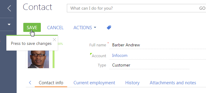
After you save the schema, a pop-up hint will appear next to the [Save] button on the contact edit page (Fig. 3).
Fig. 3. Case result demonstration
Example 2
Case description
Add a pop-up hint to the [Type] field of contact edit page.
Case implementation algorithm
1. Create a replacing contact page
Create a replacing client module and specify [Display schema – Contact card] (ContactPageV2) as parent object (Fig. 1).
2. Adding a localized string with the pop-up hint text
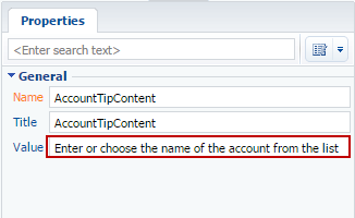
Add a string with the pop-up hint text to the collection of localizable strings of the edit page replacing schema. Properties of the created string (Fig. 4):
- [Name] – “TypeTipContent”
- [Value] – ‘Choose the type of contact from the list”
Fig. 4. Properties of the custom localizable string
3. Adding a field configuration object to the diff array
Add the tip property containing the content property to the values field property. The content property value will be the pop-up hint text.
Below is the source code of the page replacing schema.
define("ContactPageV2", [],
function () {
    return {
        // Name of the edit page object schema.
        entitySchemaName: "Contact",
        //Pop-up hint visualization setup.
        diff: /**SCHEMA_DIFF*/[
            // Metadata for adding pop-up hint to the field.
            {
                // Modification of the existing element.
                "operation": "merge",
                "name": "Type",
                "parentName": "ContactGeneralInfoBlock",
                "propertyName": "items",
                "values": {
                    // Field propery responsible for displaying the pop-up hint.
                    "tip": {
                        // Pop-up hint text.
                        "content": { "bindTo": "Resources.Strings.TypeTipContent" },
                        // Pop-up hint display mode.
                        // WIDE is the default mode - thickness of a green band,
                        // displayed in the pop-up hint.
                        "displayMode": Terrasoft.controls.TipEnums.displayMode.WIDE
                    }
                }
            }
        ]/**SCHEMA_DIFF*/
    };
});
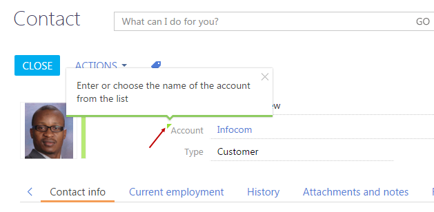
After you save the schema, a pop-up hint will appear in the [Type] field on the contact edit page (Fig. 5).
Fig. 5. Case result demonstration
Example 3
Case description
Add an information button to the [Full name] contact edit page.
Case implementation algorithm
1. Create a replacing contact page
Create a replacing client module and specify [Display schema – Contact card] (ContactPageV2) as parent object (Fig. 1).
2. Adding a localized string with the pop-up hint text
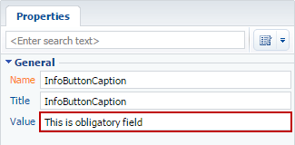
Add a string with the pop-up hint text to the collection of localizable strings of the edit page replacing schema. Properties of the created string (Fig. 6):
- [Name] – “InfoButtonCaption”
- [Value] – “This is obligatory field”
Fig. 6. Properties of the custom localizable string
3. Adding a button configuration object to the diff array
Add a new element with the Terrasoft.ViewItemType.INFORMATION_BUTTON type and the content property to the diff array. The content property value will be the pop-up hint text.
The source code of the edit page replacing schema:
define("ContactPageV2", [],
function () {
    return {
        // Name of the edit page object schema.
        entitySchemaName: "Contact",
        //Pop-up hint visualization setup.
        diff: /**SCHEMA_DIFF*/[
            // Metadata for adding pop-up hint to the button.
            {
                // Modification of the existing element.
                "operation": "merge",
                "parentName": "ProfileContainer",
                "propertyName": "items",
                "name": "AccountName",
                "values": {
                    "layout": { "column": 0, "row": 1, "colSpan": 22, "rowSpan": 1 }
                }
            },
            {
                // Adding a new element.
                "operation": "insert",
                "parentName": "ProfileContainer",
                "propertyName": "items",
                "name": "SimpleInfoButton",
                "values": {
                    "layout": { "column": 22, "row": 1, "colSpan": 1, "rowSpan": 1 },
                    "itemType": Terrasoft.ViewItemType.INFORMATION_BUTTON,
                    "content": { "bindTo": "Resources.Strings.InfoButtonCaption" }
                }
            }
        ]/**SCHEMA_DIFF*/
    };
});
After you save the schema, the pop-up hint will appear in the [Account] field on the contact edit page (Fig. 7).
Fig. 7. Case result demonstration


Example 4. Adding a link to web resource to the pop-up hint
You can add links to web resources or context help to pop-up hints. Add an html code of the link directly to the localizable string of the pop-up hint text (Fig. 8).
Fig. 8. Example of defining the pop-up hint with a link

Example of adding a direct link to web resource:
<a href="https://academy.bpmonline.com/" target="_blank">Learn more</a>
As a result, the pop-up hint will look as shown in figure 9.
Fig. 9. Example of displaying the pop-up hint with a link
