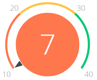
The “Gauge” dashboard tile (Fig. 1) displays the number returned as a result of a system query relative to the standard scale. For example, use this dashboard tile to display the number of conducted meetings of a manager if the desired rate is known. You can also use it to monitor the balance between the planned and actual number of calls an agent is required to make per day.

On the color scheme, the red interval displays the undesirable level of values, yellow – the satisfactory level and the green one displays the desirable level. The color of the gauge circle depends on the interval that the current value is in.
Gauges can display the following data types:
-
The total number of either all or filtered records of bpm’online object, for example, the number of calls per manager a day.
-
Minimum or maximum value of a numeric field, for example, minimum or maximum call duration.
-
Sum or the average value of a numeric field, for example, the total amount of paid invoices.
The settings of the “Gauge” dashboard tile are similar to Setting up the “Metric” dashboard tile, but you need to additionally set up the scale to measure the calculated value against.
The scale settings are located in the [How to display] field group on the gauge setup page.
1.In the [Style] field, specify the color of the gauge title.
2.In the [Display order] field, select “The more the better“ or “The less the better“.
The display order determines the order of “good”/”average”/”bad” segments on the gauge scale. In the first case the red interval will be displayed on the left, in the second case - on the right.
3.On the gauge scale (Fig. 2), specify:
a.The first two fields on the gauge scale limits the “maximum” segment (red or green, depending on the value in the [Display order] field).
b.The third value determines the maximum value that falls into the second (yellow) segment.
c.The fourth value determines the maximum value that falls into the third segment (red or green, depending on the value in the [Display order] field).
Fig. 2 Example of gauge scale setup

Once all fields on the [How to display] field group are populated, the gauge preview will be displayed.
Note
The “Gauge” dashboard tile now displays big numbers with separators in accordance with the user culture.
See also
•The “Sales pipeline” dashboard tile


