Overview of Freedom UI Designer and its elements
Freedom UI Designer is a visual drag-and-drop editor that lets you create and set up a fully responsive app layout (including mobile). You can create UIs from ready layout templates, such as pages with tabs and dashboards. You can also create a custom UI of any structure from scratch. Set up the pages in the new Freedom UI framework, which lets you modify the appearance of elements, manage data sources, and place page components arbitrarily.
Work in the Freedom UI Designer using no-code tools. UI design involves structuring the page with layout elements: tabs, areas, and columns. Depending on the information you want to display on the page, you can also set up charts, add fields, lists, buttons, and other components.
Google Chrome provides access to the full set of Freedom UI Designer capabilities, so we recommend using it rather than Safari.
To begin with the setup of Freedom UI pages, click the  button in the top right of the current app page → Edit page.
This opens the Freedom UI Designer (Fig. 1).
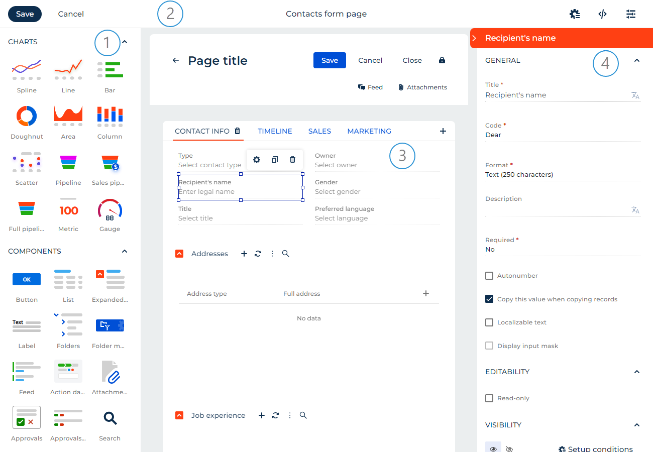
Element library (1). The library contains the tools required to set up a custom UI.
Action panel (2). Use the action panel to save the page design, cancel the changes, set up the business rules, open the source code and page property settings.
Canvas (3). The working area of the Freedom UI Designer. Drag elements from the library to the canvas to set up the page structure.
Setup area (4). Use the setup area to manage the properties of visual components, the behavior of buttons, expansion panels, charts, etc. Learn more about the settings in the description of each element. To open the setup area, double-click the relevant element or select the element on the canvas and click .
UI Designer elements
View the elements of the Designer in the table below:
Element types | Description |
|---|---|
Element group that manages the page data source: the object of the section where the page is located. | |
Elements that visualize statistics. The following chart types are available: spline, line, bar, doughnut, area, column, scatter, pipeline, sales pipeline, full pipeline, metric, gauge. | |
Elements that execute target page actions and solve a number of other problems: button, label, list, folders, action panel, etc. | |
Elements that structure the page: expansion panels, tabs, toggle panels, grid containers, flex containers. |
Data
Apps can contain pages that have different data sources. For example, a data source for a record page is a specific object. Creatio adds a data source automatically when you create an app. You can add an existing source or create a new source when you add an app page.
To add a new data source:
- Click Add data source.
- Select "New data source." This opens a window.
- Fill out the Name and Description fields of the data source in the window.
As a result, Creatio will add an object and connect it to the page as a data source. The Freedom UI Designer will display the data source in the Data group. The Code field will be populated automatically (Fig. 2).
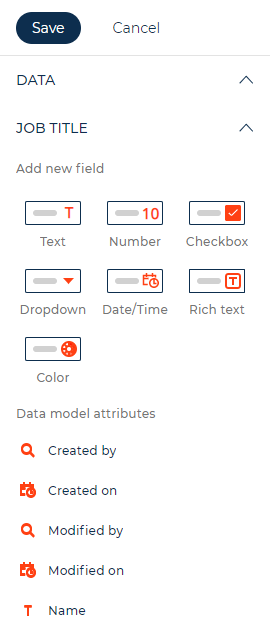
You can display data and enable users to enter data using fields and inputs.
Fields
Use fields to display data and enable users to enter data. When you set up fields, Creatio adds and modifies the corresponding attributes of the data model. After you set up a field and save the page, you can remove the field from the canvas without removing the corresponding attributes of the data model. To add existing fields to the page, drag them from the Data area to the relevant part of the canvas.
Creatio specifies the data source automatically. You can change it in the Advanced section of the field setup area if needed. If the new data source is a different attribute of the page data model, the field on the canvas changes to the field bound to the specified attribute. If the new data source is an attribute of a related object, Freedom UI Designer converts the field to an input.
You can add the following field types to the page in the UI Designer:
- Text. Enables users to enter letters, digits, and other characters.
- Number. Enables users to enter integers or fractions.
- Checkbox. Enables users to select either of the two values: "True" or "False." "True" value is a selected checkbox.
- Date/Time. Enables users to select date and/or time, depending on the selected format.
- Rich text. Enables users to enter rich text content, including clickable links, images, and tables. For example, this is useful for writing comments or knowledge base articles.
- Phone. Enables users to enter phone numbers. Functionally identical to the "Phone number" format type of the text field. Can apply the phone number pattern. If Creatio is integrated with a phone service, users can click the phone number to initiate a call from the communication panel. Otherwise, clicking the field runs the application that handles phone calls.
- Email. Enables users to enter email addresses as clickable "mailto:" links that are opened by the default email client. Can validate the email address format.
- Web link. Enables users to enter clickable URLs.
- Dropdown. Enables users to select values from a set list of options stored in a lookup or other data source. You can add a new lookup object when you add this field.
- Color. Enables users to specify a color value. For example, this is useful for product pages.
- Autonumber. Numbers new records automatically starting from 1, both when a user adds a record and a business process or integration add it. You can set the number prefix and change the quantity of digits in the number. Creatio reserves the number when you click a button that adds records. When you click a button that adds records again, Creatio reserves the subsequent number, even if the previous record was not saved.
- Image. Enables users to upload or view images. Can display images from different sources, for example, Creatio database or CDN.
The Freedom UI Designer supports various properties that provide flexible field setup options. Learn more about setting up fields in a separate guide: Fields and inputs.
Inputs
Use Input layout elements to display data and enable users to enter data. When you set up inputs, Creatio does not modify the attributes of the data model.
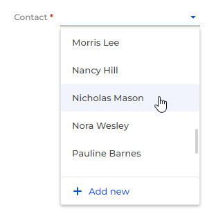
Specify the data source manually in the Advanced section of the input setup area. Inputs accept data from attributes of related objects. If you specify an attribute of the page data model, Freedom UI Designer converts the input on the canvas to a field.
Input setup is mostly similar to the field setup. However, input setup does not modify the structure of the data model.
You can set up inputs connected to the same page field differently. This includes settings in the element setup area and conditional properties defined by business rules.
The input types you can add correspond to field types except for the unique Slider input. It displays an integer within a range and enables users to slide the value up and down with a preset step value. Learn more about setting up the Slider in a separate article: Set up a Slider input.

Charts
Chart functionality in Freedom UI is mostly similar to analytics in the Dashboard section of the main Creatio application. However, Freedom UI charts have some unique features:
-
You can connect all charts except "Sales pipeline" and "Full pipeline" to lists, approval lists, or attachment lists. This filters chart data by records displayed in the connected component or the record selected in the list. For example, this lets you display data in case charts only for open cases.
Fig. 5 Charts connected to a list 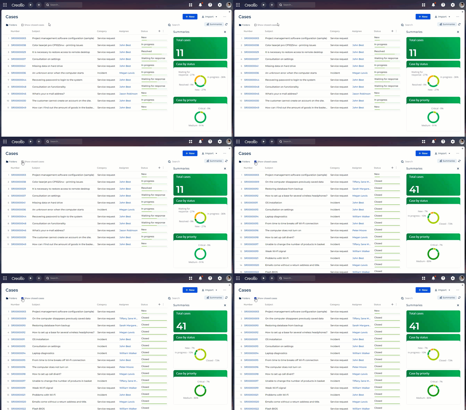
-
You can filter all charts except "Sales pipeline" and "Full pipeline" using the Quick filter component. For example, this lets you display data in case charts only for a particular agent.
Fig. 6 Filtering charts using the quick lookup filter 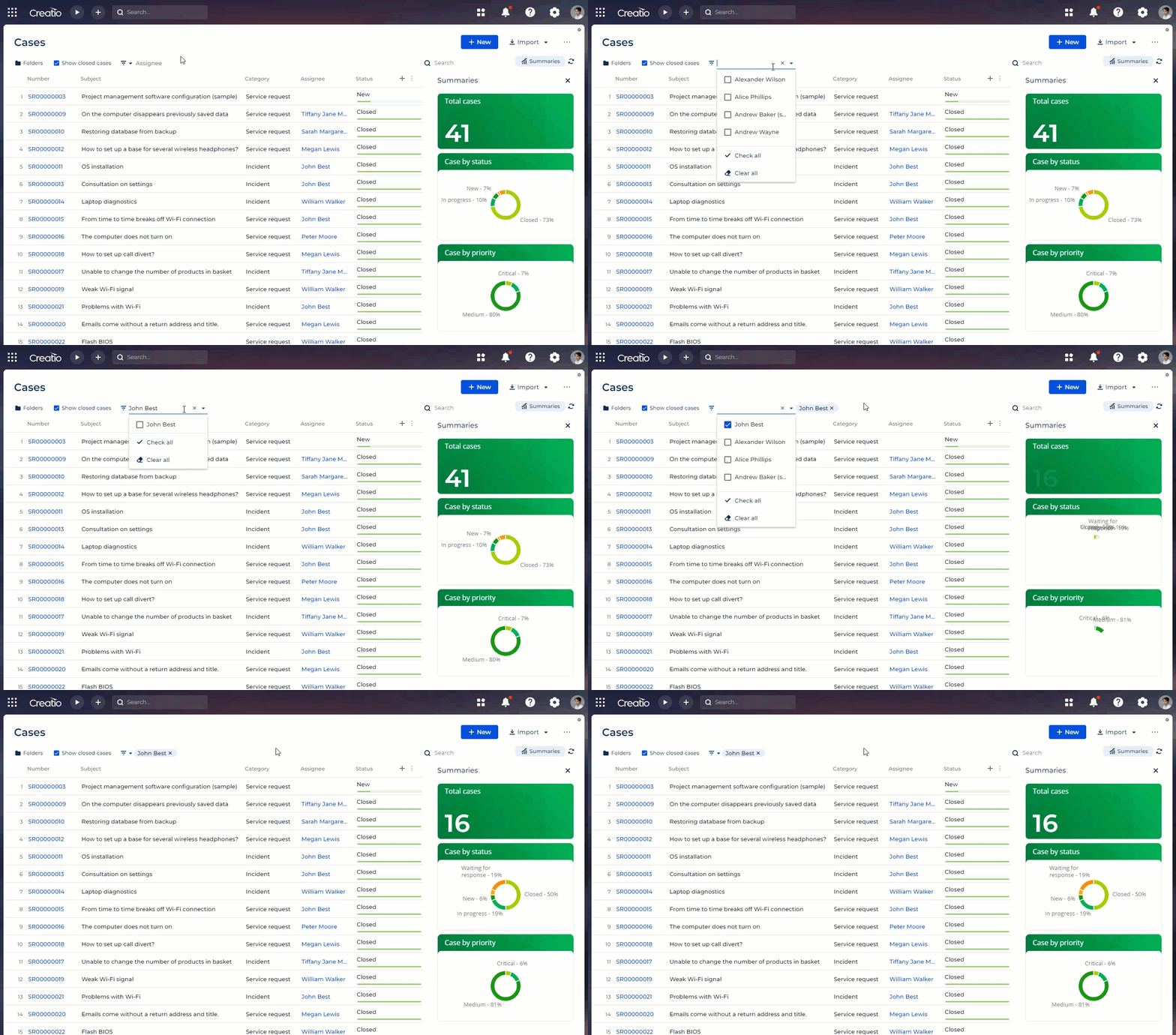
-
When you drill down chart data, you can customize the data list similarly to a Freedom UI section list as well as search for specific records (Fig. 7). Learn more about customizing Freedom UI lists in a separate article: Manage a list.
Fig. 7 Drilling down chart data 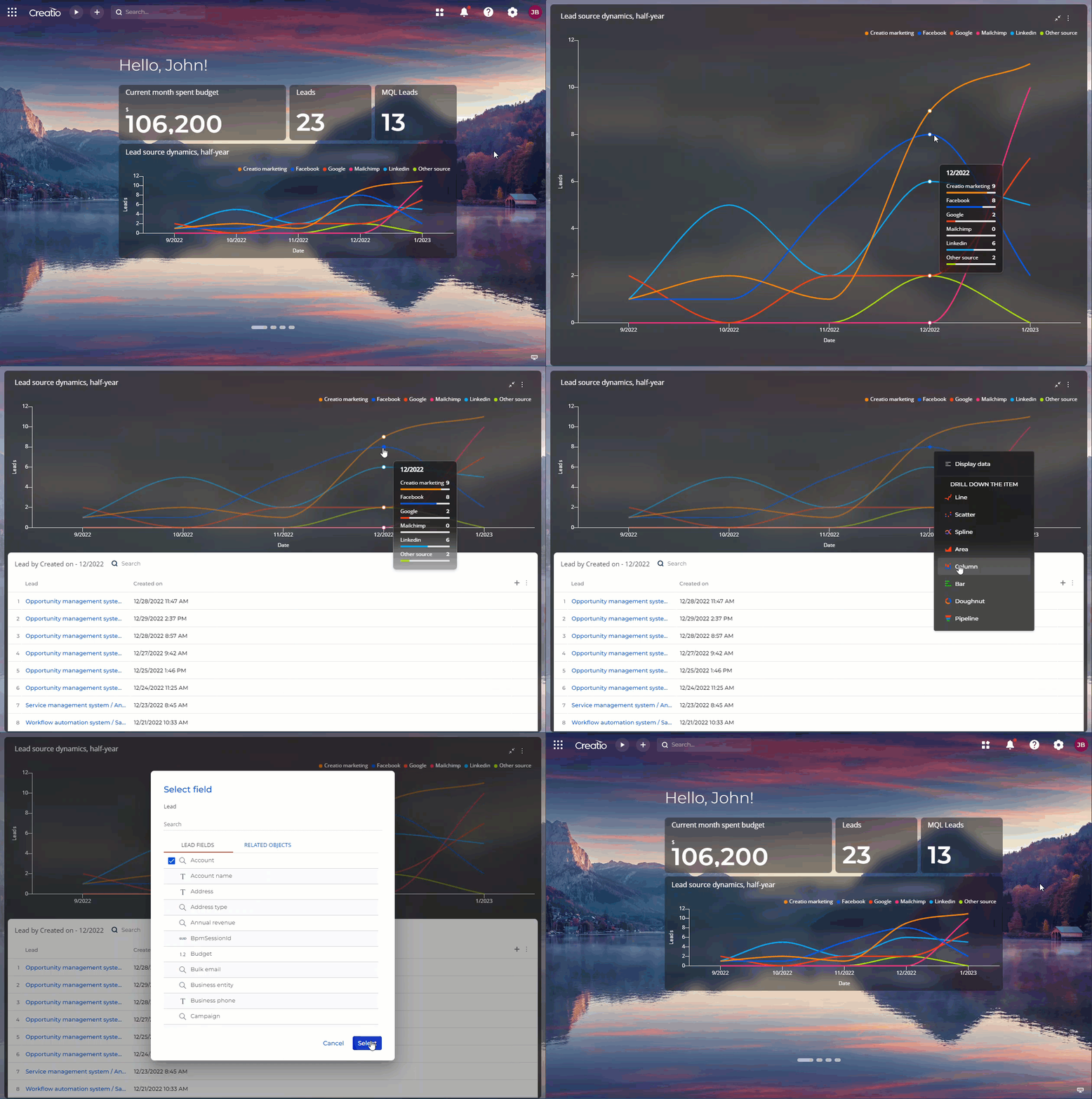
-
You can export chart data to Excel to process data easier. To do this, expand the dashboard and select Export to Excel in the context menu. The browser will download the data file to your computer (Fig. 8).
Fig. 8 Exporting chart data to Excel 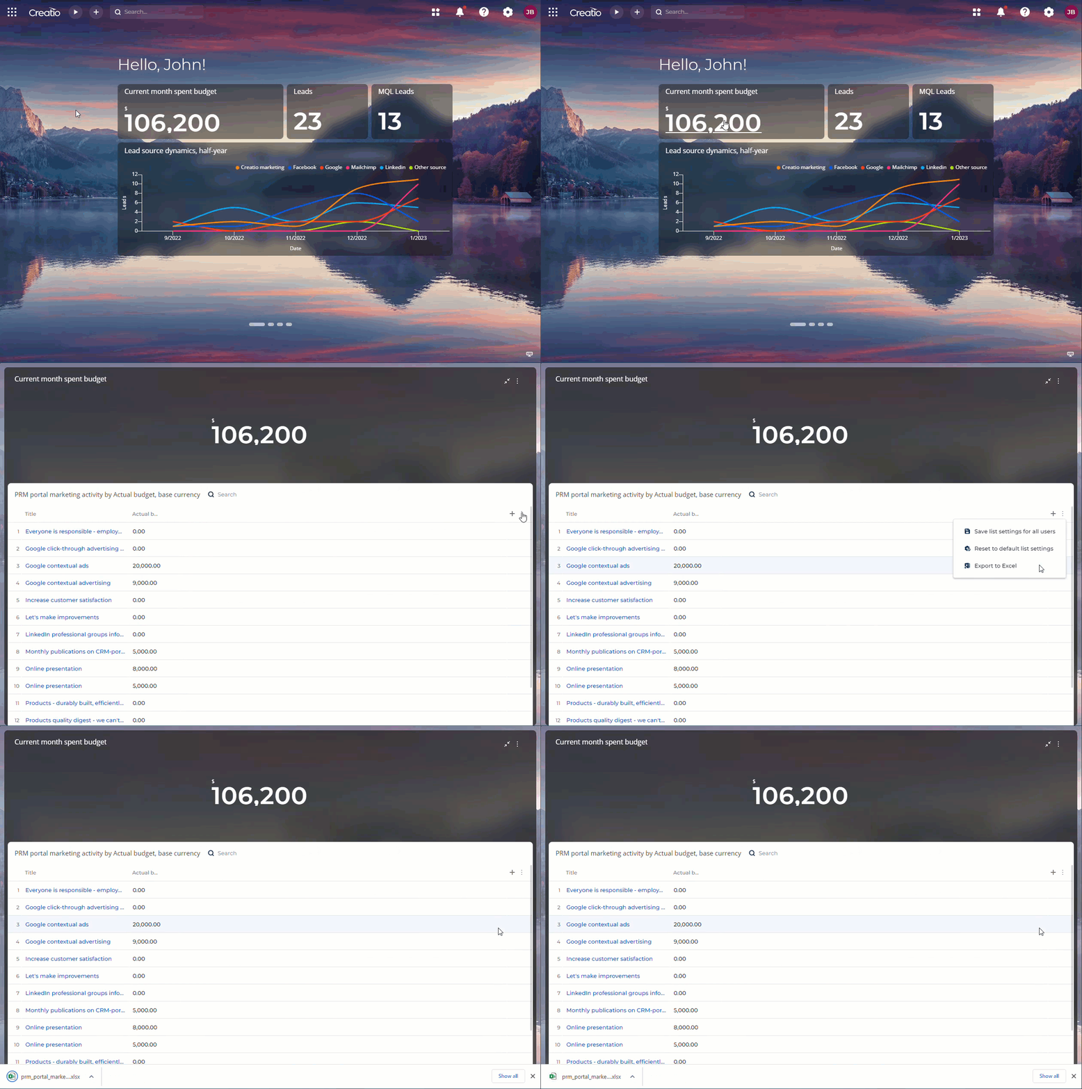
-
For charts that have multiple series, you can customize the header color and series color individually. Use the Chart color and Style fields to do this, respectively (optional) (Fig. 9).
Fig. 9 Setting up a chart that has several series 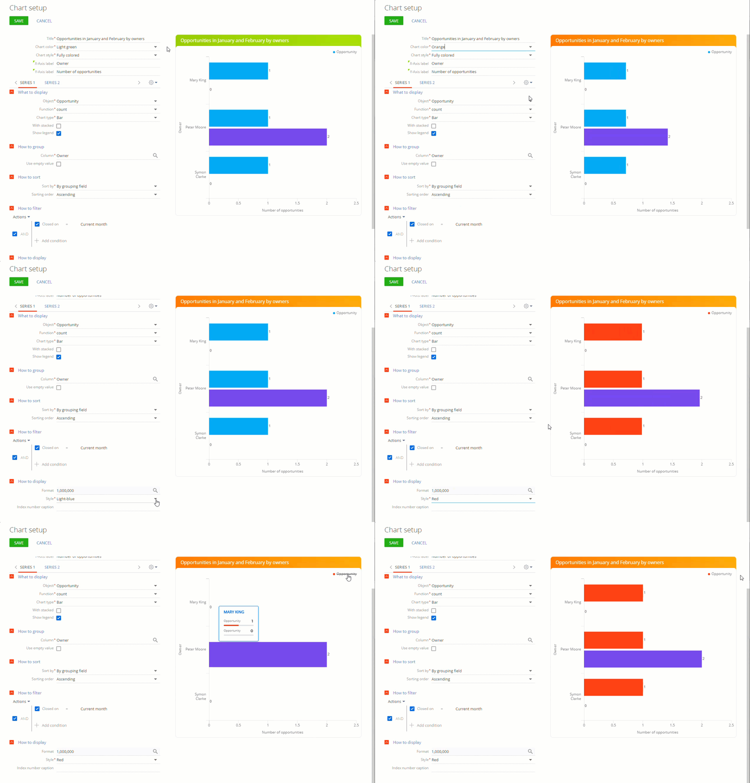
-
You can select from several fill options in the Chart style field for "Metric" and "Chart" dashboard headings (Fig. 10).
Fig. 10 Setting up the chart heading style 
-
The "Pie chart" type is replaced with the "Doughnut chart" type. Set up this chart similar to the pie chart (Fig. 11).
Fig. 11 Doughnut chart 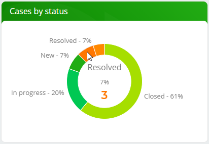
-
You can filter chart and metric data by the parameters of their location page. Configure the filter in the How to associate with page data field group. The setup process is similar to the How to associate with section data field group. For example, you can set up a budget composition chart on a request page and limit the chart data to the request whose page the user opens.
-
You can specify whether to display values of individual bars and columns on "Bar" and "Column" chart types, respectively.
Components
Button
Use the Button component to execute a page action. The following actions are available:
-
Open new record. Opens the form page of a new record that belongs to any Creatio object. You can create and edit the form page for any Creatio object as part of the button setup. It is possible to set different form pages for new records and existing records, for example, a mini page and full page, respectively. If different record types use different pages, for example, Activities section, you can specify the page to open.
The action can also populate the form page fields with specific values if needed.
-
Open existing record. Opens the form page of a specific record that belongs to any Creatio object. You can create and edit the form page for any Creatio object as part of the button setup. It is possible to set different form pages for new records and existing records, for example, a mini page and full page, respectively. If different record types use different pages, for example, the Activities section, you can specify the page to open.
-
Open specific page. Opens any Freedom UI page, including list pages, mini pages, and homepages. You can create and edit the page to open as part of the button setup.
-
Open duplicates page. Searches for duplicate records and displays the found duplicates on a separate page. You can connect the button to any section that supports the duplicate search functionality.
-
Save data. Saves changes without closing the page. Applies to all page data sources, for example, fields and editable lists.
-
Cancel changes. Cancels changes without closing the page. Applies to all page data sources, for example, fields and editable lists.
-
Refresh data. Refreshes data of a list object, attachment list, approval list, or gallery without refreshing the entire page.
-
Close page. Returns to the previous page the browser tab had open. If the current page is the first page the browser tab has open, no action is executed.
-
Run process. Runs the latest version of a business process. You can create and edit the process to run as part of the button setup.
-
Delete data. Deletes selected records from the List component that has multiselect turned on.
-
Upload file. Uploads a file to an attachment list. You can select from attachment lists that are present on the page. The upload mechanism is pre-configured and non-editable.
-
Add tags. Adds tags to records selected in the List component.
-
Remove tags. Removes tags from records selected in the List component.
-
Add records to static folder. Adds records selected in the List component to a static folder.
-
Remove records from static folder. Removes records selected in the List component from a static folder.
-
Add communication option. Adds a communication option to the Communication options component. The action is available only if you have Customer 360 app installed.
-
Data import. Imports data to any Creatio object. The import mechanism is pre-configured and non-editable.
-
Export to Excel. Downloads list data as an *.xlsx file. You can select from lists that are present on the page except for attachment lists. The export mechanism is pre-configured and non-editable.
-
Set up access rights. Configures access permissions to the form page where the button is placed. Works only on form pages. The permission setup mechanism is pre-configured and non-editable.
-
Set calendar time scale. Changes the time scale of the Calendar component to the specified value.
-
Show record's relationship. Opens the relationship chart of an account or contact record.
-
Send invite. Enables meeting organizers to send calendar invitations to meeting participants. Requires calendar synchronization to be configured.
-
Continue in other page. Opens the default form page for the data source without saving the record yet. This is particularly useful for mini pages.
-
Print report. Generates a printable report file. Learn more: Set up Microsoft Word report - general procedure.
-
Creatio.ai action. Activates a Creatio.ai action specified in the prompt in the button settings.
-
Create an email. Opens the mini page that contains message composer. The action lets you define connections to add automatically when an email is sent. For example, link the email activity sent from the case to the account and contact related to the case.
You can customize button caption, visual style, and size as well as add an icon to a button. You can also set up multi-level button menus. A menu item title can contain text, an icon, or both. You can copy existing menu items to accelerate the setup process. You can also copy existing buttons together with their settings.
Learn more about setting up buttons in a separate article: Set up Button components.

List
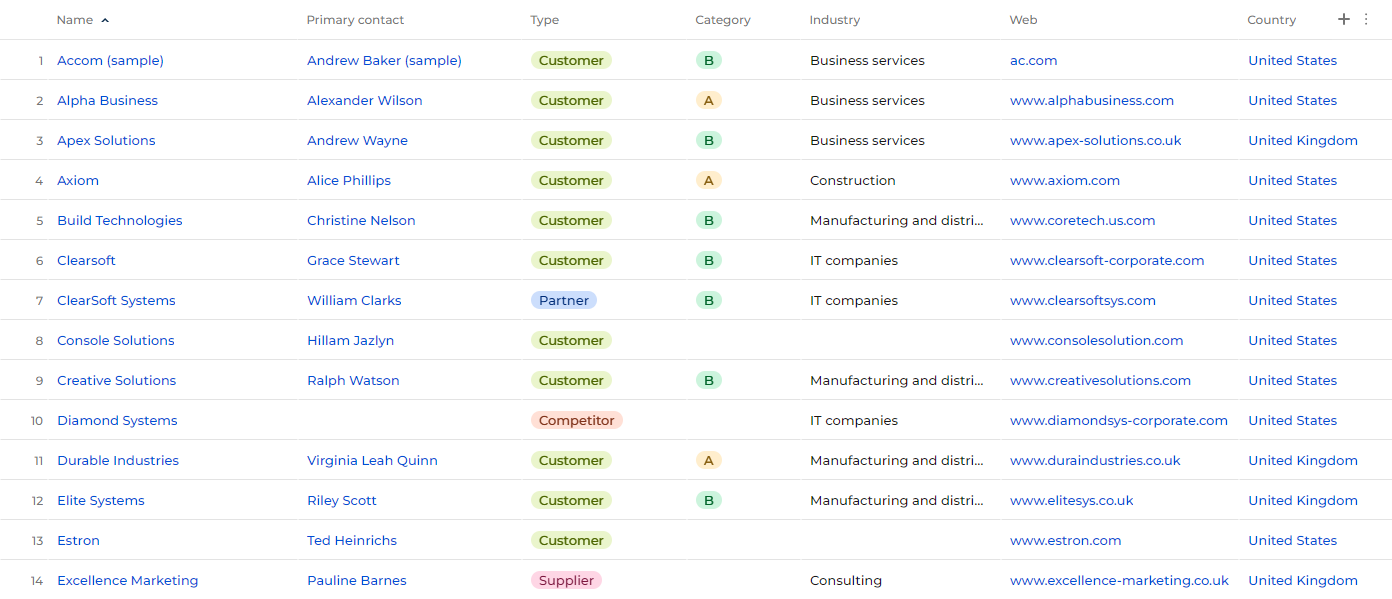
Use the List component to add a list of the selected object’s data based on pre-configured filters.
You can connect lists to other page components that work with data. This includes approval lists, attachment lists, other lists, or charts except "Sales pipeline" and "Full pipeline." The connected components filter their data by records displayed in the list. For example, this lets you filter the list of cases by the list of displayed agents. Components can be linked via direct connection, for example, the city of a contact. If you connect a list to another list, you can also filter data by the record selected in the list.
Users can add, hide, freeze, and resize list columns while working in an app. Creatio saves the list settings in the user profile, therefore the settings are applied every time an app is opened. It is also possible to apply list settings to every app user. Restore the default settings in a single click via the Reset to default settings button. Learn more about managing lists in a separate article: Manage a list.
Learn more about setting up lists in a separate article: Set up List components.
Expanded list
Expanded list is an Expansion panel layout element that has List, Search, and multiple Button components that control the list attached. Once you select a list object, Freedom UI Designer automatically links the Search component and buttons to the object. The title of the expansion panel is updated automatically as well provided that you have not changed the title manually. Otherwise, setup process of the expansion panel and components attached to it is identical to standalone elements.
Label
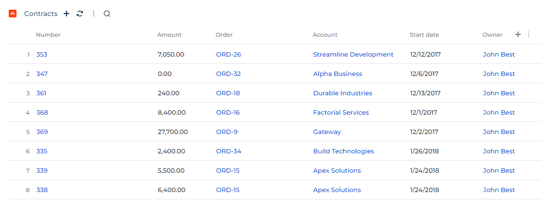
Use the Label component to add arbitrary text to the page, create individual headings for element groups, or display data of the current user contact. Learn more about setting up labels in a separate article: Set up a Label component.

Folders
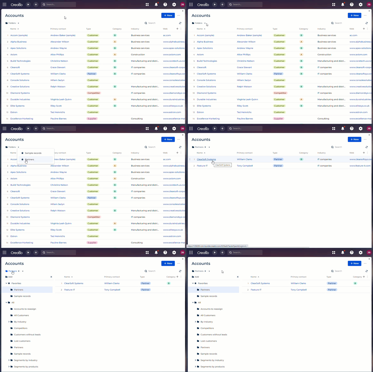
Use the Folders component to configure the folder structure that segments records by the specified filters. If you create a Freedom UI app for an object that has a Classic UI section, you can reuse folders of the Classic UI section in the Freedom UI Folders component. This streamlines the migration of Classic UI sections to Freedom UI.
Manage Freedom UI folders similarly to folders in the classic Creatio UI. Learn more in a separate article: Folders.
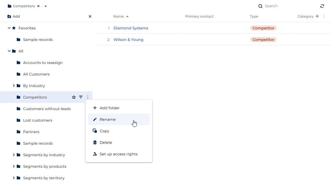
Folder management menu
Use the Folder management menu component to enable users to open the page folder tree as well as reach favorite folders quickly. If the page contains the Folders component without the management menu, users will be unable to reopen the folder tree after closing it.
Communication options
The component is available if you have Customer 360 app installed.
Use the Communication options component to enable users to manage record communication options, for example, email, phone, and web link.
The component comprises Expansion panel, Button, Flex container, Grid container, and Communication options componets. Setup procedure for all components except for Communication options is identical to standalone elements.
Feed
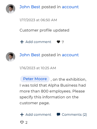
Use the Feed component to enable internal and external users to post and read comments that support rich text and user mention via "@." Authors can edit or delete their posts or attachments. You can select between the following feed types:
- "Record." Display posts and comments connected to a specific record. For example, a lead.
- "User." Display the index of posts and comments that mention the current user or those to which the user is subscribed.
Action dashboard
The component is available in Creatio version 8.0.8 and earlier. Action dashboards are still available on existing pages in Creatio version 8.0.9 and later, but you cannot add them to new pages. Instead, use Progress bar and Next steps components that let you set up user workflow much more flexibly. Learn more about the components in different sections: Progress bar, Next steps.
Use the Action dashboard component to edit the dynamic case that organizes the workflow in the app. You can define the list of actions users can execute directly from the page using a mini page, for example, schedule a task, write an email, summarize the call results, post a message in the record feed.
If the data source is specified in the element setup area (for example, when you add an action dashboard to the canvas, Freedom UI Designer sets the element data source to the page data source automatically), click the Set up cases button to open the Case Designer. Specify the case stages, as well as steps and tasks required to complete the case in the Designer. Learn more in a separate guide: Case Designer workflows.

Attachments
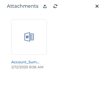
Use the Attachments component to enable users to upload and download files. You can bind the files to the current record or related objects. You can also tag specific attachments to filter them or display multiple attachment lists on a single page, for example, required request files and additional request files.
The component comprises Expansion panel, Button, Flex container, and Attachment list components. Setup procedure for all components except for the Attachment list is identical to standalone components. Learn more about setting up attachments in a separate article: Set up an Attachments component.
Gallery
The component is available for beta testing in Creatio version 8.0.2 Atlas and later. To evaluate new Creatio capabilities, enable the "ShowDesignerDemoItems" feature in a test environment yourself using Feature Toggle mechanism or request Creatio support to enable the feature. Contact us if you have feedback, we appreciate it: beta@creatio.com
Use the Gallery component to display visual data of any Creatio object on a page. For example, you can display the index of meeting participants or order products as a gallery. Besides images, you can display record caption and brief description text in the gallery (Fig. 22).

Approvals
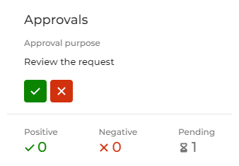
Use the Approvals component to enable users to approve or deny records. You can hide the component from the page if the current user has no approvals assigned to them.
The component behavior is pre-configured and non-editable. After you add the component to the page, set up the approval mechanism in a business process or case. Learn more in separate articles: Configure a document approval process, Set up an approval case.
Approvals list
Use the Approvals list component to enable users to view the entire approval process of a specific record as a list to ensure transparency. The component is an Expansion panel element that has Approvals list, Search, and multiple Button components attached. The setup process of the expansion panel and most components attached to it is identical to standalone components. The behavior of the Approvals list component is pre-configured and non-editable.

Progress bar
Use the Progress bar component to enable users to track and change case stages. The element is connected to the page data source automatically. Click the Set up cases button to open the Case Designer. Specify the case stages as well as steps and tasks required to complete the case in the Designer. Learn more in a separate guide: Case Designer workflows.

Next steps
Use the Next steps component to view and manage activities and tasks for the current record as tiles. The activities and tasks can be generated by cases or added manually. The component completes activities and displays new activities based on the stage in the Progress bar component. You can connect activities of emails sent using the component to the value of a data model attribute and activity column if needed. The component also lets you do the following:
- add a task or email
- complete an activity manually
- approve a record
- view the task owner and open their contact page
The component comprises Expansion panel, Button, Flex container, Grid container, and Next steps components. Setup procedure for all components except for Next steps is identical to standalone elements. The behavior of the Next steps component is pre-configured and non-editable.

Search
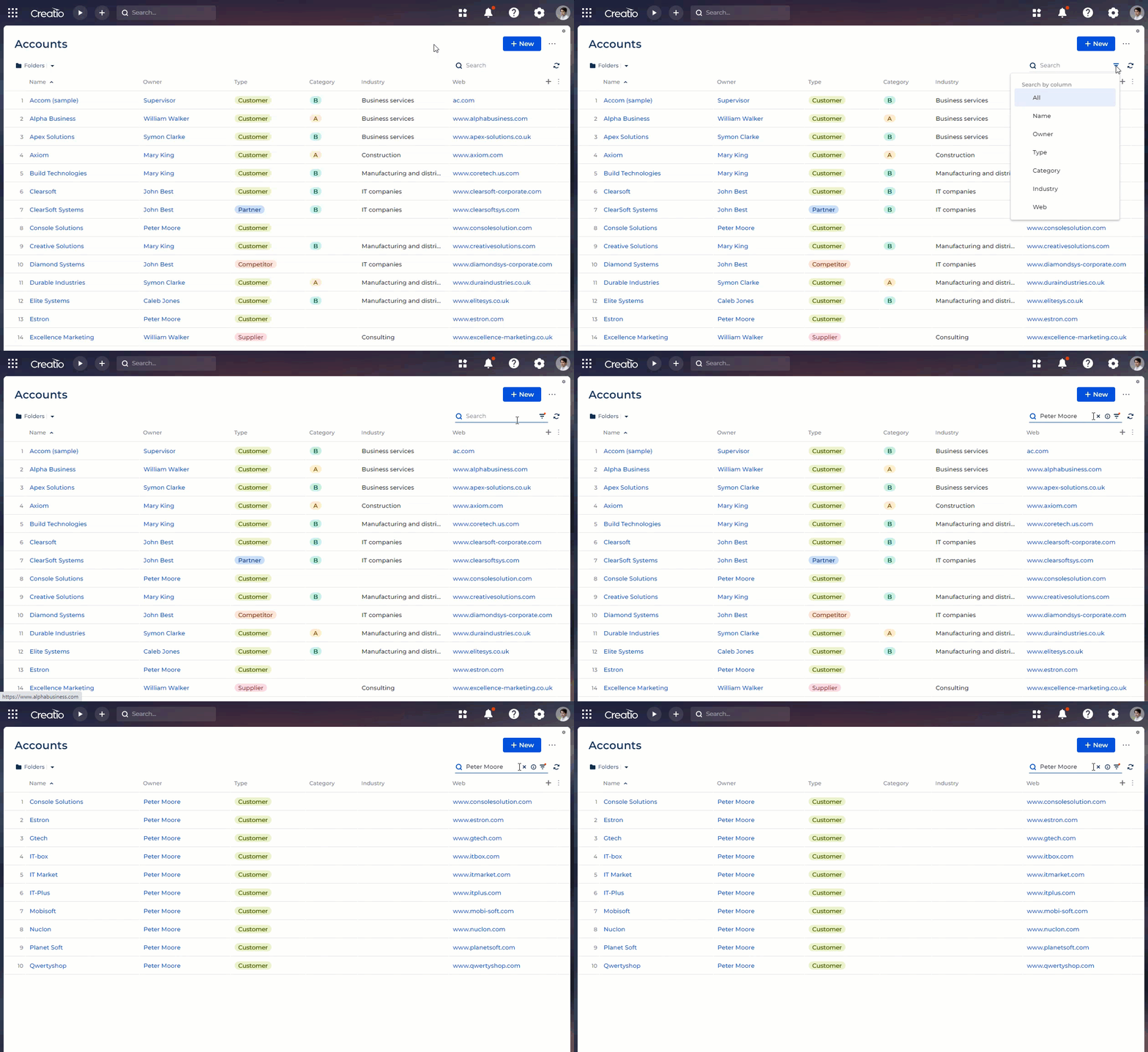
Use the Search component to enable users to search for records by all visible columns or specific visible columns in any Freedom UI list, attachment list, or approval list. The Expanded list and Approvals list components include the component by default.
Quick filter
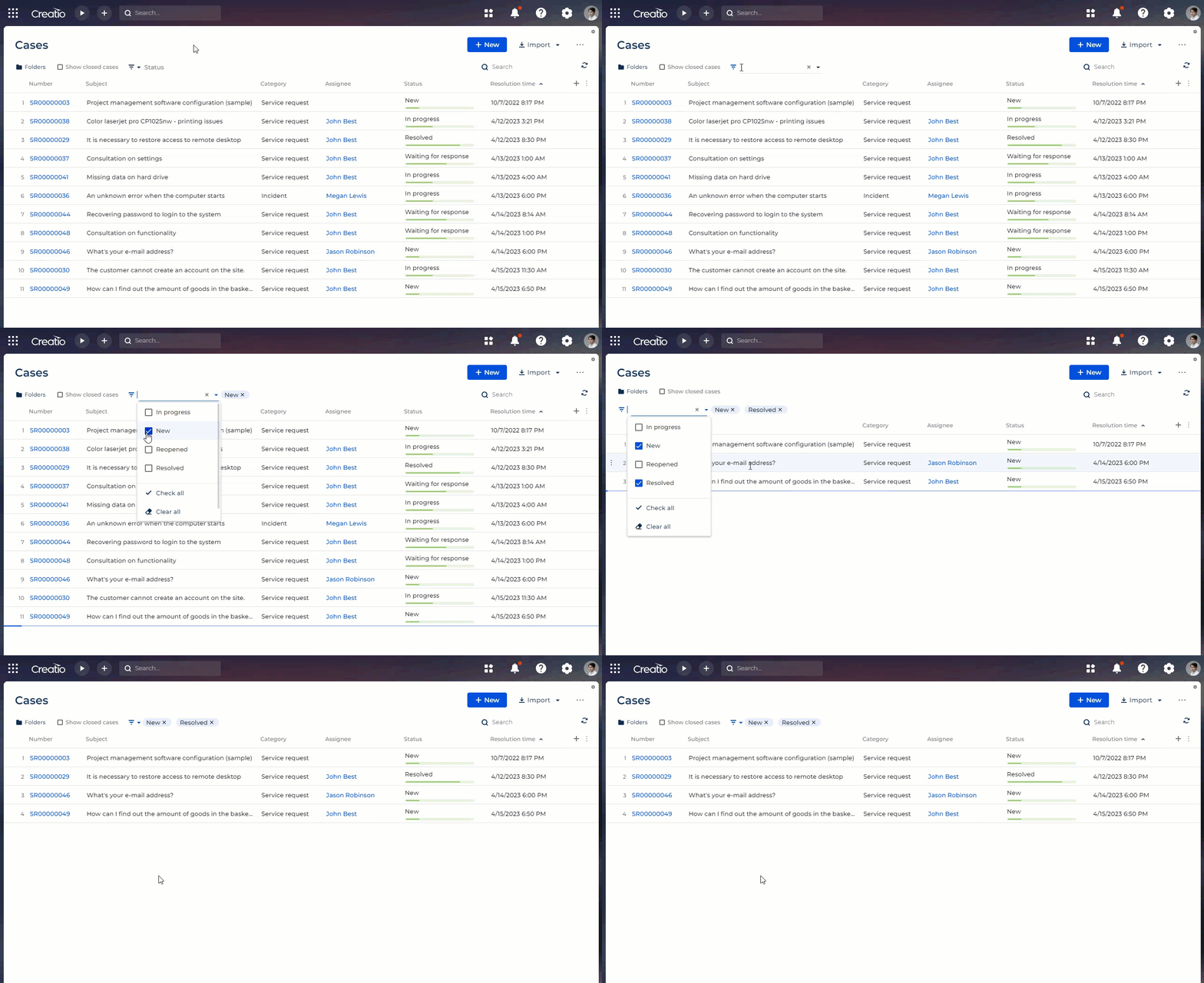
Use the Quick filter component to enable users to filter the values of any list, calendar, or chart except for "Sales pipeline" and "Full pipeline" by a manually defined condition, date/time range, or the value of any lookup. Learn more about setting up quick filters in a separate article: Set up Quick filter components.
Tags
Use the Tags component to add and manage tags of any entity. Tags can have different permission types and custom colors. The component also supports quick lookup filters.

Summaries
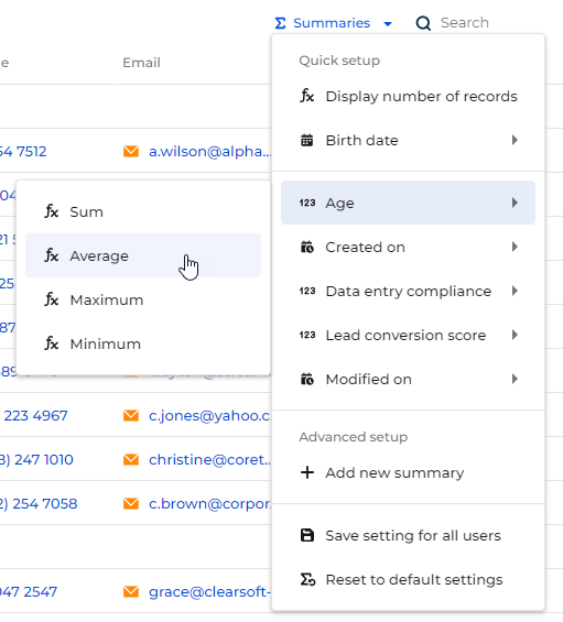
Use the Summaries component to view list summaries, for example, the number of records or the maximum value of a field.
Calendar
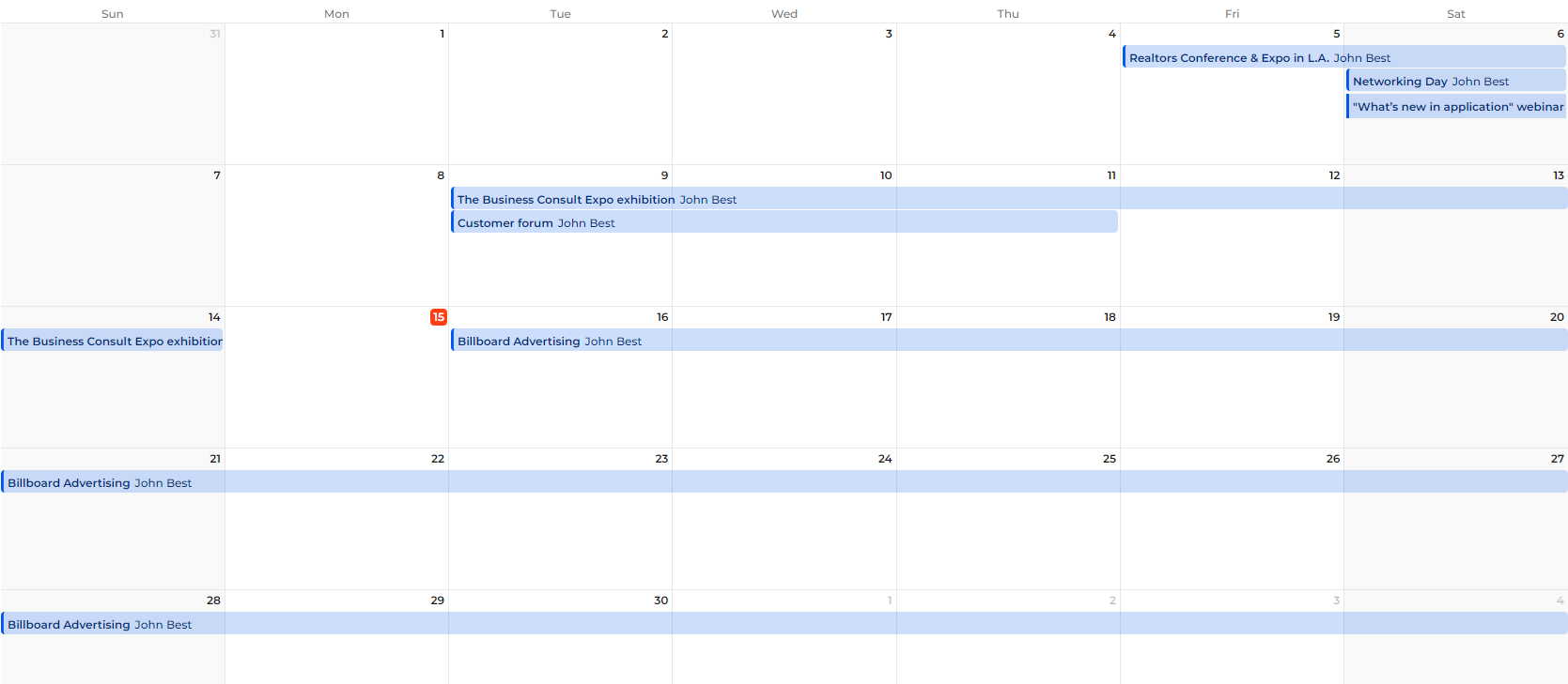
Use the Calendar component to view and manage records that have start and end dates as tiles. This is particularly useful for any kind of tasks and activities.
You can select the primary and secondary fields to display on tiles. The component includes the current time indicator. You can also configure working hours to display in the component. The component includes different display modes based on selection period:
- day
- week
- month
- multi-month
Learn more about setting up the component in a separate article: Set up a Calendar component
Message composer
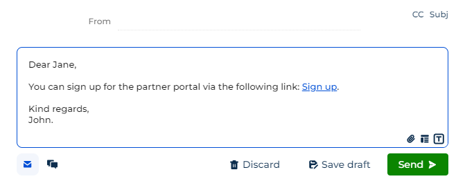
Use the Message composer component to send emails and post feed messages. Both communication channels support rich text, including images. You can connect email activity records to the value of a data model attribute and activity column if needed. The email channel includes the following features as well:
- Attachments. The upload of attachments is restricted based on the values of "Attachment max size" ("MaxFileSize" code), "File Security Mode" ("FileSecurityMode" code), and "MaxAttachmentSize" system settings.
- Templates. Learn more: Work with message templates.
- Drafts. The component also saves drafts automatically when you close the tab or open a different page.
- Email forwarding.
- Email thread expansion.
The Timeline component also includes the message composer functionality.
Timeline
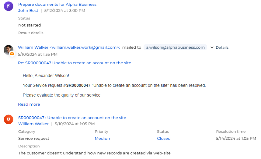
Use the Timeline component to enable users to view the history of communication regarding a data source as well as records linked to it in chronological order. You can specify the sorting column for most objects in the timeline except for "Feed" and "File" that are always sorted by creation date. You can filter timeline records by record type, date, owner, and whether it is a system message as well as hide any filter if needed. Users can like and comment feed records in the timeline. The component also includes the message composer functionality.
To display additional objects in the timeline, select the "Show in Timeline component by default" checkbox for the relevant object in the Object Designer. Learn more about the Object Designer in the developer documentation: Object.
The timeline displays the primary display value and creation date of linked records. You can customize the columns to display in the timeline addon of the relevant object using low-code tools. Learn more in the developer documentation: Customize an object column to display in the Timeline component.
Timer
Use the Timer component to count down to or up from specific date and time in the time zone of the user. For example, this is useful if you want to display the case response deadline. Learn more about setting up timers in a separate article: Set up timers.

Playbook
The component is available if you have the Knowledge base app installed.
Use the Playbook component to display articles as hints on a specific stage of a dynamic case. For example, display the article about presentation on the Presentation stage of the opportunity case.
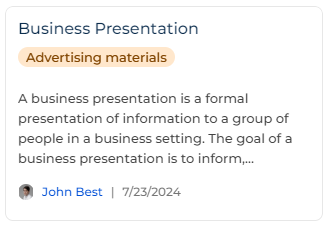
Learn more about setting up playbook hints: Set up playbook articles.
Local time
Use the Local time component to display the current time within a time zone. You can use any time zone field as a data source. Learn more about setting up local time in a separate article: Set up a Local time component.

Account compact profile
The component is available if you have the Customer 360 app installed.
Use the Account compact profile component to display main data of an account:
- logo
- name
- also known as
- local time
- country
The component behavior is pre-configured and non-editable.

Contact compact profile
The component is available if you have the Customer 360 app installed.
Use the Contact compact profile component to display main data of a contact:
- photo
- full name
- birth date
- age
- local time
- country
The component behavior is pre-configured and non-editable.

Layout elements
Expansion panel
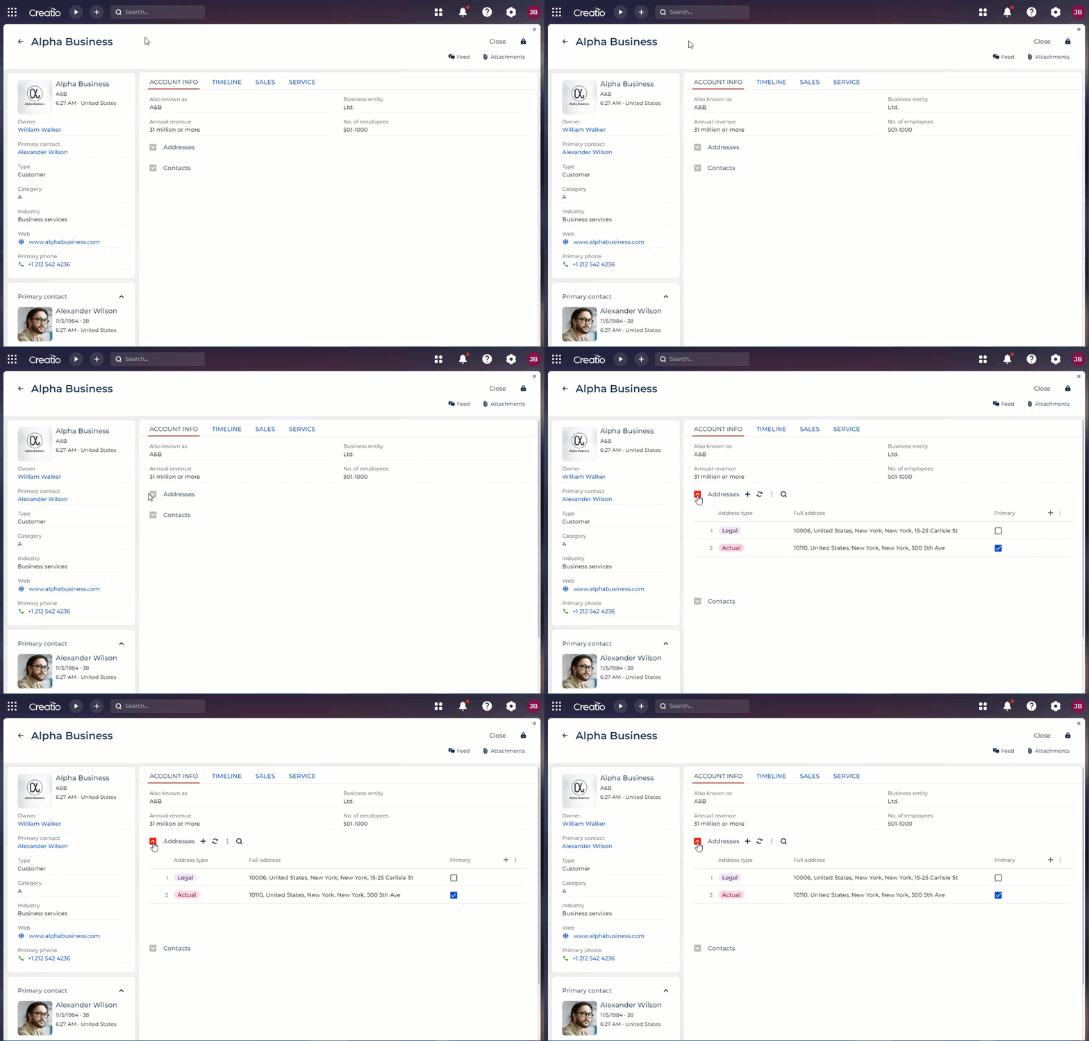
Use the Expansion panel layout element to add page elements grouped by a single criterion. You can attach any elements available in the Freedom UI Designer to the expansion panel title or the area within the expansion panel. Learn more about setting up expansion panels in a separate article: Set up an Expansion panel layout element.
You can customize the internal layout of the expansion panel: column number, background color, spacing, etc. To do this, select the area within the expansion panel and click the  button. The customization is similar to the Grid container layout element. Learn more about setting up grid containers in a separate article: Set up a Grid container layout element.
Tabs
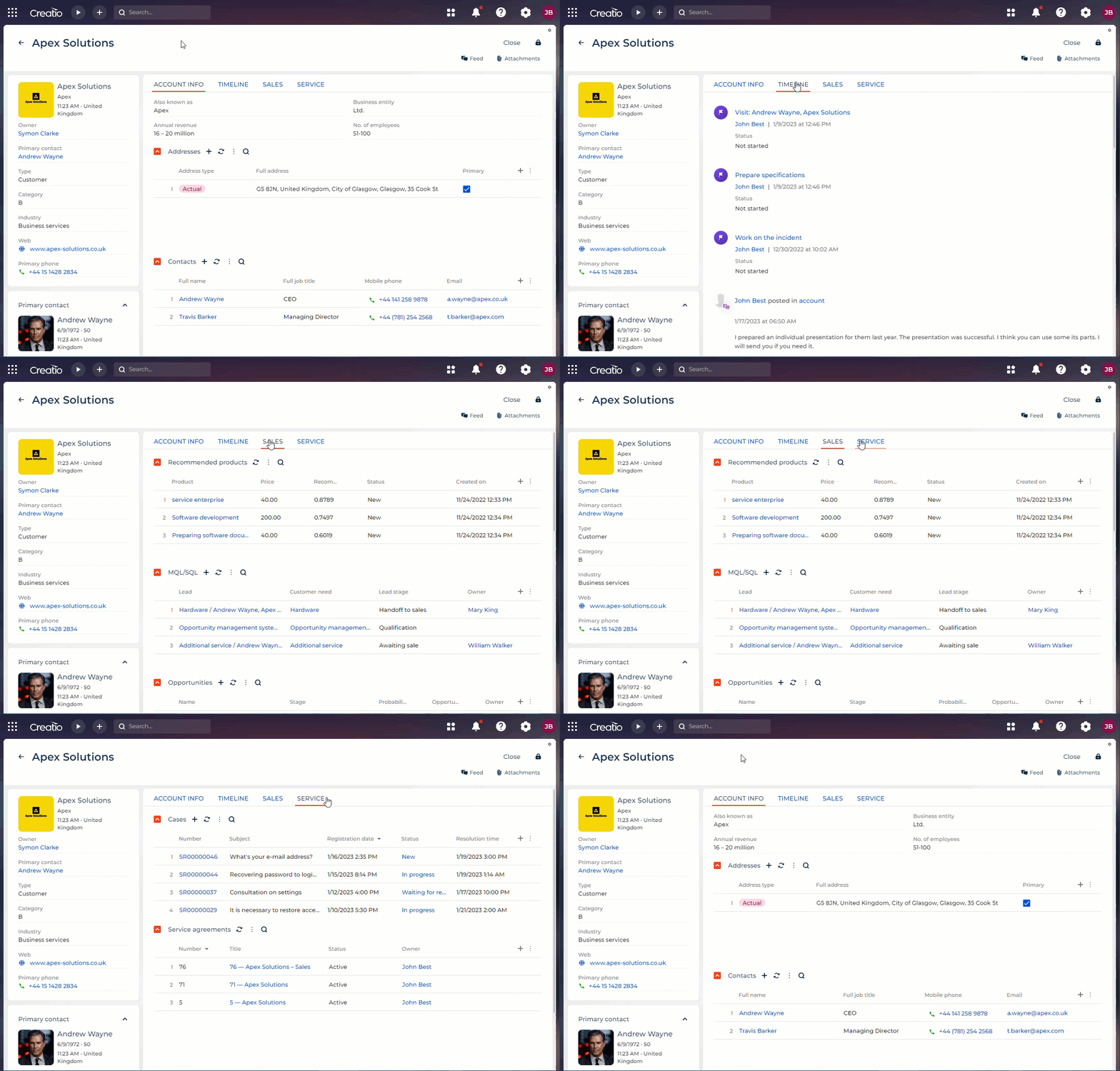
Use the Tabs layout element to add a tab area to the page. The area lets you display content grouped by multiple criteria. That way, you can publish more required information without overcrowding the page. You can reorder tabs and attach any elements available in the Freedom UI Designer to tabs, including other tabs. To do this, drag the tab to the needed position. Learn more about setting up tabs in a separate article: Set up a Tabs layout element.
You can customize the internal layout of each tab: column number, background color, spacing, etc. To do this, select the area within a tab and click the  button. The customization is similar to the Grid container layout element. Learn more about setting up grid containers in a separate article: Set up a Grid container layout element.
Toggle panel
Use the Toggle panel layout element to add a tab area to the page. Compared to the similar Tabs element, toggle panel has the following unique features that let you create more advanced page functionality:
- Toggle panel is controlled by buttons you can place anywhere on the page.
- You can click the active tab button to hide the panel. Click any tab button to display the panel again. The panel is hidden by default.
This lets you save more workspace by placing elements that are usually only needed on demand, such as a feed or attachment list.
The element setup process is similar to the Tabs layout element. Learn more about setting up tabs in a separate article: Set up a Tabs layout element.

Area and columns
Area and Columns layout elements are different configuration options of the Grid container element. Grid containers have a fixed layout that can contain up to 12 columns. You can attach any Freedom UI element to a grid container, including other grid containers.
Areas let you divide the page visually into multiple sections. Use areas to add page blocks that group any combination of other elements. For example, fields, charts, buttons, and other areas. Use columns to change layout parameters for areas, expansion panels, or tabs flexibly as well as arrange page content vertically.
Learn more about setting up grid containers in a separate article: Set up a Grid container layout element.

Flex container
Use flex containers to group elements in a certain direction without binding the elements to a fixed layout. For example, flex containers are a convenient option for button placement.
The Freedom UI Designer includes the following flex container types:
- Flex row. Lets you place elements horizontally. For example, buttons.
- Flex column. Lets you place as many elements as needed vertically.
To transform a flex row into a flex column and vice versa, click the corresponding buttons in the Direction block of the setup area. Learn more about setting up flex containers in a separate article: Set up a Flex container layout element.

See also
Install applications from the Marketplace