Set up a Tabs layout element
Use Tabs layout elements to group Freedom UI elements by multiple criteria, for example, general record information, approvals, attachments, timeline, and feed.
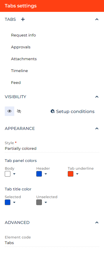
Add the Tabs layout element that includes tabs for request info, approvals, attachments, timeline, and feed to the request page. Add icons to tabs.
-
Drag a Tabs layout element to the canvas and open the element setup area.
-
Modify the existing tabs. To do this:
- Click the title of a tab in the Tabs block.
- Enter "Request info" in the Title parameter. You can click the
 button to the right to localize the title to other languages you are going to use in the app. Learn more about localizing Freedom UI elements in a separate article: Localize a Freedom UI element.
 - Click the Use icon toggle to add an icon to the tab.
- Select the
 icon in the Icon parameter.
 - Select whether to display the icon to the left or the right of the title in the Position parameter. For this example, leave the icon displayed to the left.
- View the unique element code in the page schema in the Element code parameter. Creatio uses this code in page schemas. You can change it if needed. This helps software developers to customize the app easier, especially if you have multiple similar elements on the page. For this example, leave the code as is.
- Repeat the steps for the Approvals tab. Add the
 icon to the tab.
-
Add and set up new tabs. To do this:
- Click the
 button to the right of the Tabs block title. This adds a tab and opens its setup area.
 - Repeat the substeps b–f from the previous step for each tab. Name the tabs Attachments, Timeline, and Feed. Add
 ,
,  , and
, and  icons to the tabs, respectively.
- Click the
-
Click the
 or
or  button in the Visibility group to make the layout element visible or invisible by default on the page, respectively. For this example, leave the layout element visible.
 -
Click Setup conditions in the Visibility group to set up element business rules. For this example, do not add business rules. Learn more about setting up business rules in a separate article: Set up business rules.
-
Select the tab panel style in the Style parameter. For this example, select "Partially colored."
-
Select the background colors of tabs and tab panel in the Tab panel colors parameter. For this example, leave the body color white, set the header to blue, and set the tab underline color to red.
-
Select the color of tab titles in the Tab title color parameter. For this example, set the selected color to blue and unselected color to gray.
-
View the unique element code in the page schema in the Element code parameter. Creatio uses this code in page schemas. You can change it if needed. This helps software developers to customize the app easier, especially if you have multiple similar elements on the page. For this example, leave the code as is.
As a result, Creatio will add the Tabs component that includes tabs for request info, approvals, attachments, timeline, and feed to the request page. The tabs will have icons to the left of titles.
See also
Overview of Freedom UI Designer and its elements