Set up an Attachments component
Use Attachments components to manage record attachments. This is particularly useful for scanned documents.
Set up the Attachments component that enables users to upload and download receipts and invoices to the request page. The component must have a gallery view and accept *.jpg, *.pdf, and *.png files up to 8 MB.
-
Drag an Attachments component to the canvas. The component comprises expansion panel, upload button, refresh button, flex container, search, and attachment list. You can rearrange these components arbitrarily.
-
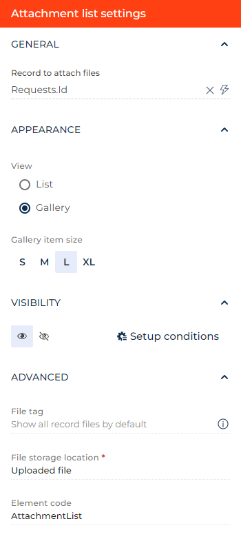
Open the setup area of the attachment list:
- Specify the object to attach the files in the Record to attach files parameter. The object of the current record is selected by default. For this example, leave the parameter as is.
- Select the view type of the attachment list in the Appearance group. List and gallery view are available. For this example, select Gallery.
- Specify the gallery item size for the gallery view in the Gallery item size parameter. For this example, select "L."
- Enter a file tag in the File tag parameter. If the parameter contains a tag, the component assigns the tag to each uploaded attachment and displays only the attachments that have the corresponding tag. Otherwise, the component displays every record attachment. This is useful if you need to add multiple attachment lists to a single object. For this example, enter "Expense compensation."
- Click the
 or
or  button in the Visibility group to make the component visible or invisible by default on the page, respectively. For this example, leave the component visible.
 - Click Setup conditions in the Visibility group to set up element business rules. For this example, do not add business rules. Learn more about setting up business rules in a separate article: Set up business rules.
- Specify where to store the attachments in the Table to store the files parameter. For this example, leave the parameter as is.
- View the unique component code in the page schema in the Element code parameter. Creatio uses this code in page schemas. You can change it if needed. This helps software developers to customize the app easier, especially if you have multiple similar components on the page. For this example, leave the code as is.
-
Set up the expansion panel. You can do it similarly to other Expansion panel elements Learn more in a separate article: Set up an Expansion panel layout element. For this example, leave the layout element as is.
-
Set up the
 Upload button. You can do it similarly to other Button components. Learn more in a separate article: Set up Button components. For this example, change the following parameters:
- Set What is the maximum allowed file size in MB? to "8." If you leave the parameter empty, the component uses the maximum size from the "Attachment max size" ("MaxFileSize" code) system setting.
- Set What file extensions are allowed to upload? to ".jpg, .pdf, .png." If you leave the parameter empty, the component accepts the file extensions from the "File extensions AllowList" ("FileExtensionsAllowList" code) system setting.
-
Set up the
 Refresh button. You can do it similarly to other Button components. Learn more in a separate article: Set up Button components. For this example, leave the parameter as is.
 -
Set up the search bar. You can do it similarly to other Search components.
As a result, Creatio will add the Attachments component to the request page. Creatio will display the component as a gallery. The component will accept *.jpg, *.pdf, and *.png files up to 8 MB.
See also
Overview of Freedom UI Designer and its elements