Set up a Flex container layout element
Level: beginner
Use Flex row and Flex column flex containers to group elements into a layout that adjusts automatically based on the element and screen size. This is particularly useful for combinations of buttons.
Example
Add a flex row to the request page. Ensure the row is noticeable easily.
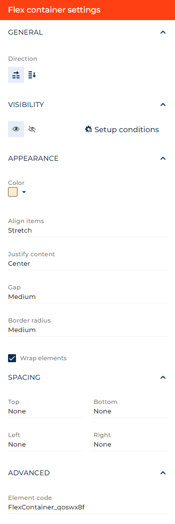
- Drag a Flex row layout element to the canvas and open the element setup area.
- Click the
 icon in the Direction block to transform the flex row into the flex column. For this example, do not transform the row.
 - Click the
 or
or  button in the Visibility group to make the layout element visible or invisible by default on the page, respectively. For this example, leave the layout element visible.
 - Click Setup conditions in the Visibility group to set up element business rules. For this example, do not add business rules. Learn more about setting up business rules in a separate article: Set up business rules.
- Select the background color of the element in the Color parameter. For this example, select light orange (#FDEDCC hex code).
- Select the type of the element alignment perpendicular to the container direction in the Align items parameter. For this example, leave the alignment at "Stretch."
- Select the type of the element alignment parallel to the container direction in the Justify content parameter. For this example, select "Center."
- Select the distance between elements in the Gap parameter. For this example, select "Medium."
- Specify the radii of element corners in the Border radius parameter. For this example, select "Medium."
- Specify the container behavior when shrunk horizontally in the Wrap elements checkbox. Clear the checkbox to add a horizontal scroll bar, select the checkbox to wrap the elements within the container. The former is useful if you want to place a folder tree and list on a single row. For this example, turn wrapping on.
- Specify the internal margins in the Spacing group. For this example, leave all the margins at "None."
- View the unique element code in the page schema in the Element code parameter. Creatio uses this code in page schemas. You can change it if needed. This helps software developers to customize the app easier, especially if you have multiple similar elements on the page. For this example, leave the code as is.
As a result, Creatio will add a light orange flex row to the request page.
See also
Overview of Freedom UI Designer and its elements