Pipeline movement dashboard
Sales teams often know their current pipeline numbers but not how those numbers came to be. A quarter's pipeline total can shift for many reasons — deals moving forward, falling behind, or closing. Without a way to see that movement, assessing pipeline health means digging through individual opportunity records by hand.
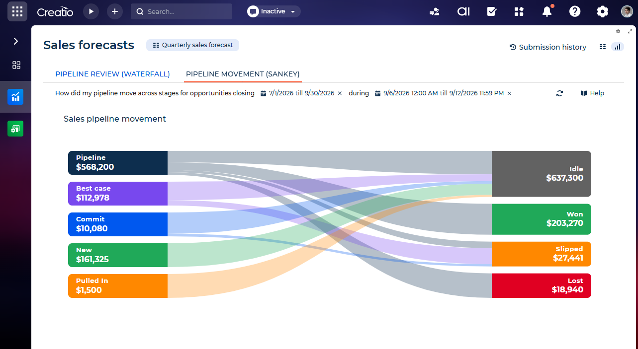
The Pipeline movement dashboard shows exactly how your pipeline moved between two points in time. It shows which opportunities advanced, which fell behind, and which closed, all in a single visual flow. Where the Waterfall chart answers "what changed and by how much," the Pipeline movement chart answers which forecast category deals moved from and which they moved to. The two charts are complementary and share the same historical data layer and period model. Learn more: Revenue intelligence overview.
Reconstructing pipeline movement
The chart compares your pipeline at two points in time — the start and end of the selected Change Period — and shows how opportunities moved between forecast categories across that window. This comparison doesn't rely on two stored snapshots. Instead, Creatio reconstructs both points in time from a historical data layer that records how each opportunity's key fields changed over time. The width of every node and every flow is proportional to the related amount, so larger movements stand out immediately.
Dashboard location
Creatio displays the chart in the Sales forecasts section, on the Dashboards view, under the Pipeline Movement (Sankey) tab. Below the chart, Creatio shows the base opportunity drill-down grid. Clicking a left-side category, a right-side category, or a specific flow filters the grid to the related opportunity records. The tab summarizes the current view in a single sentence — for example, "How did my pipeline move across categories for opportunities closing [fiscal period] during [change period]?"
Creatio's navigation panel also has a separate, older Forecasts item (forecast by customer, product, or sales manager) positioned near Sales forecasts. The two are unrelated features built for different purposes — make sure you're in the right section before you start. Learn more: Revenue intelligence overview.
Periods that drive the calculation
Every view of the chart depends on the following periods, and Creatio needs both to calculate the movement correctly:
- Fiscal Period — defines what you analyze: opportunities whose close date falls into the selected fiscal or calendar period.
- Change Period — defines when updates happened: the window in which opportunities were created or modified.
All calculations use historical values read from the Opportunity history, not current values — specifically the historical "Closed on," "Opportunity amount," "Stage," and "Forecast category."
Grouping opportunities into categories
On the left side, categories show where each opportunity stood at the start of the change period:
Category (left side) | What it means |
|---|---|
Pipeline | Open deals in the early stages that still need development. |
Best Case | Open deals that are fully qualified with an embedded close plan but still have work to do. |
Commit | Open deals going well and expected to close successfully; they slip only in exceptional cases. |
New | Deals newly added to the selected period during the change period: created within the window with a close date in the period, or reopened within the current period. |
Pulled In | Deals whose close date moved from a later period into the selected period. Example: forecast for Q4, moved into Q3. |
Pushed In | Deals whose close date moved from an earlier period into the selected period, often cleanup of overdue deals. Also includes deals reopened from a past period. |
On the right side, categories show where each opportunity ended up at the end of the change period:
Category (right side) | What it means |
|---|---|
Upgraded | Open deals that progressed to a later forecast category. Example: "Pipeline" → "Best Case." |
Idle | Open deals that stayed in the same forecast category from start to end of the period. |
Downgraded | Open deals that regressed to an earlier forecast category. Example: "Commit" → "Best Case." |
Won | Deals marked "Closed Won" during the period. They exit the open pipeline as booked. |
Lost | Deals marked "Closed Lost" during the period. They drop out of the open pipeline. |
Slipped | Open deals whose close date moved out of the current period into a future one. Example: Q3 → Q4. |
Calculating amounts and flow widths
An opportunity's amount can change within the window, so the chart tracks the start-of-period amount and the end-of-period amount separately. Left-side nodes and flows use each opportunity's amount at the start of the change period; right-side nodes and flows use the amount at the end. Each connecting flow uses the amount that matches the business meaning of the movement.
Interacting with the chart
Click a left-side node, a right-side node, or a flow to highlight its related flows on the opposite side and see where a category moved. Clicking never changes the chart layout. A focused node shows a tooltip with a View data button — click it to filter the opportunity grid below the chart to the records related to that node or flow.
Availability and configuration
To use the ready-to-use chart, install the Sales Forecasts composable app from Creatio Marketplace. With base Creatio objects and fields, the chart works out of the box. If your sales process uses custom objects or field names, see Enable historical tracking for custom fields to make sure the chart calculates correctly for them too.
You cannot add this chart to a custom page yourself using the Freedom UI Designer — it's only available on the pre-built Sales forecasts section page.