Use the bpm’online dashboards to analyze section statistics. There are several ways to visualize statistics in the system, such as charts, calculated indicators, special lists. For example, you can track the current status of the employees' tasks, display various ratings, etc.
Dashboards are available:
-
In the Dashboards view of bpm’online sections (Fig. 1). This view displays the general statistics for the section records (taking the current filters into account), such as, for example, top 5 overdue activities of current owner in the [Activities] section.
Fig. 1 Opening the [Dashboards] view in the [Activities] section

-
On record pages. Here you can configure displaying of any analytical data of bpm'online records, such as the number of communications with a contact for current month.
-
In the [Dashboards] section. The section displays system-wide analytics based on the data from different bpm’online sections. The analytics in the [Dashboards] section may include elements from the [Analytics] view of other sections.
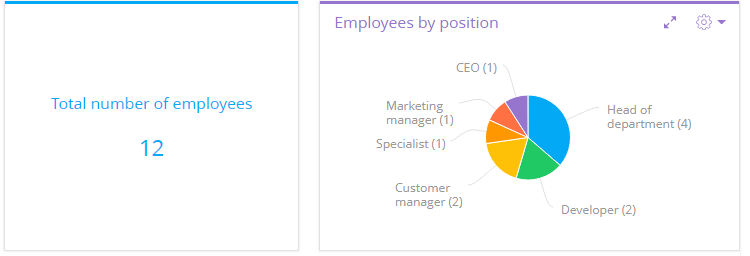
Analytical data is visualized via special dashboard tiles, each of which is a separate chart, list or metric (Fig. 2).
Fig. 2 Examples of dashboard tiles

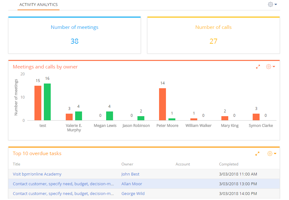
Dashboard tiles are placed on dashboard tabs (Fig. 3).
Fig. 3 An example of a dashboard tab

The dashboard tiles, their titles and contents are fully customizable. You can add custom dashboard tabs and populate them with dashboard tiles (Fig. 4). For example, the [Employees] tab can display statistics on the efficiency of your employees, and the [Tasks] tab can show information about employees' activities.
Fig. 4 Selecting a dashboard tab

Note
Detailed instructions on setting up dashboard tabs and dashboard tiles are available in separate chapters.
Contents
Video tutorials


