Overview of Freedom UI Mobile Designer and its elements
This functionality is available for Creatio 8.3.2 and later.
Freedom UI Mobile Designer is a visual drag-and-drop editor that lets you create and set up an app layout for the Creatio Mobile app. You can create UIs from ready layout templates, such as pages with tabs and expansion panels. You can also create a custom UI of any structure from scratch. Set up the pages in the new Freedom UI Mobile Designer that lets you modify the appearance of elements, manage data sources, and place page components arbitrarily.
We recommend using Freedom UI Mobile Designer only for newly created apps. Avoid adding mobile pages to apps that were created earlier. Google Chrome provides access to the full set of Freedom UI Mobile Designer capabilities, so we recommend using it rather than Safari.
Work in the Freedom UI Mobile Designer using no-code tools. UI design involves structuring the page with layout elements: tabs, areas, and flex containers. Depending on the information you want to display on the page, you can add fields, lists, buttons, and other components.
To start customizing mobile pages:
- Create a new app or open an existing app that already includes mobile pages. Instructions: Create an app manually.
- Select the mobile page to customize. Instructions: Set up mobile pages in Freedom UI Mobile Designer.
This opens the Freedom UI Mobile Designer (Fig. 1).
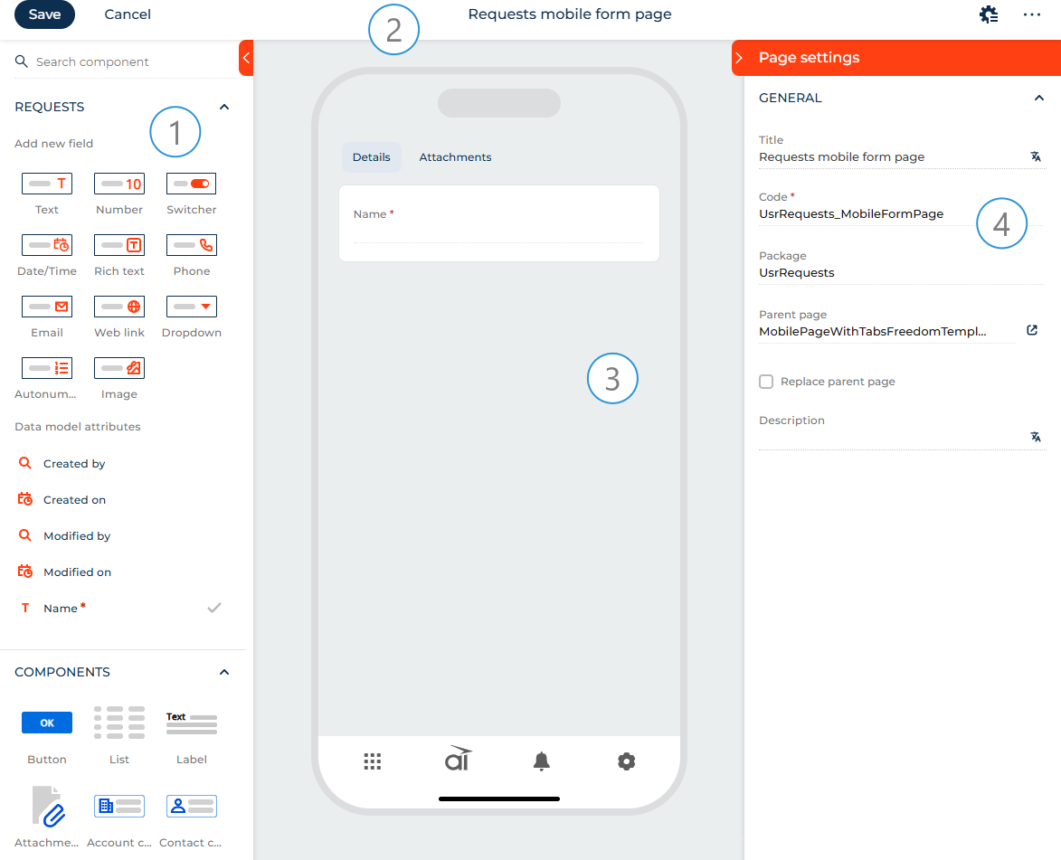
Element library (1). The library contains the tools required to set up a custom UI. The element library includes the main list of elements. If you need additional flexibility, you can configure additional components and layout elements using low-code tools in the source code of the Freedom UI mobile page. Learn more: Freedom UI Mobile components and layout elements (developer documentation).
Action panel (2). Use the action panel to save the page design, cancel the changes, set up the business rules, open the source code and page settings.
Canvas (3). The working area of the Freedom UI Mobile Designer. Drag elements from the library to the canvas to set up the page structure. Out of the box, each mobile page template uses a single-column layout to ensure proper display on smaller screens.
Setup area (4). Use the setup area to manage the element parameters, the behavior of buttons, expansion panels, tabs, etc. Learn more about the element parameters in the description of each element. To open the setup area, single-tap the relevant element or select the element on the canvas and tap  . The setup area includes the main list of element parameters. If you need additional flexibility, you can configure additional element parameters using low-code tools in the source code of the Freedom UI mobile page. Learn more: Customize Freedom UI page for Creatio Mobile (developer documentation).
Designer elements
View the elements of the Designer in the table below:
Element types | Description |
|---|---|
Element group that manages the page data source: the object of the app where the page is located. | |
Elements that execute target page actions and solve a number of other business problems: button, label, list, attachments, etc. | |
Elements that structure the page: expansion panels, tabs, areas, flex containers. |
Data
Apps can contain pages that have different data sources. For example, a data source for a form and list page is a specific object. Creatio adds a data source automatically when you create an app. Each mobile page works with a single data source. When you create a mobile page using a template, you can connect a data source to it.
To add a new data source:
- Tap Add data source.
- Select "New data source." This opens a window.
- Fill out the Name and Description fields of the data source in the window.
As a result, Creatio will add an object and connect it to the mobile page as a data source. The Freedom UI Mobile Designer will display the data source in the Data group. The Code field will be populated automatically (Fig. 2).
You can display data and enable users to enter data using fields and inputs.
Freedom UI pages and Freedom UI mobile pages use the same data sources. This means that data sources configured for a Freedom UI page are automatically available on the corresponding Freedom UI mobile page.
Fields
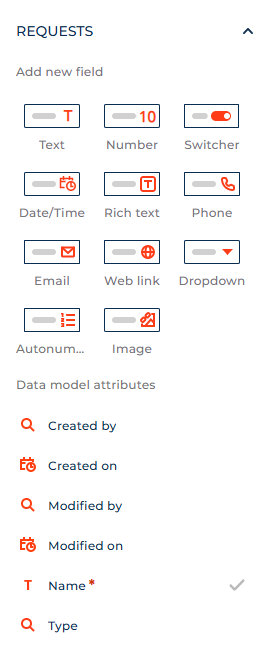
Use fields to display data and enable users to enter data. When you set up fields, Creatio adds and modifies the corresponding attributes of the data model. After you set up a field and save the page, you can remove the field from the canvas without removing the corresponding attributes of the data model. To add existing fields to the page, drag them from the Data model attributes group of the element library to the canvas.
Creatio specifies the data source automatically. You can change it in the Advanced section of the field setup area if needed. If the new data source is a different attribute of the page data model, the field on the canvas changes to the field bound to the specified attribute. If the new data source is an attribute of a related object, Freedom UI Mobile Designer converts the field to an input.
You can add the following field types to the mobile page in the Freedom UI Mobile Designer:
- Text. Enables users to enter letters, digits, and other characters.
- Number. Enables users to enter integers or fractions.
- Switcher. Enables users to toggle between states. Out of the box, the switcher is untoggled.
- Date/Time. Enables users to select date and/or time, depending on the selected format.
- Rich text. Enables users to enter rich text content, including tappable links. For example, this is useful for writing comments or knowledge base articles.
- Phone. Enables users to enter phone numbers. Functionally identical to the "Phone number" format type of the "Text" type field. Can apply the phone number pattern. Tap the phone number to open the device phone app.
- Email. Enables users to enter email addresses as tappable "mailto:" links that are opened by the default email client. Can validate the email address format.
- Web link. Enables users to enter tappable URLs.
- Dropdown. Enables users to select values from a set list of options stored in a lookup or other data source. You can add a new lookup object when you add this field.
- Autonumber. Numbers new records automatically starting from 1, both when a user adds a record and a business process or integration add it. You can set the number prefix and change the quantity of digits in the number. Creatio reserves the number when you tap a button that adds records. When you tap a button that adds records again, Creatio reserves the subsequent number, even if the previous record was not saved. The Autonumber field has no corresponding input.
- Image. Enables users to upload or view images. Can display images from different sources, for example, Creatio database or CDN.
The Freedom UI Mobile Designer supports various parameters that provide flexible field setup options. The setup is similar to Freedom UI pages. However, some parameters are different on mobile pages and can be configured using low-code tools. Learn more: Fields and inputs, Freedom UI Mobile components and layout elements (developer documentation).
Inputs
Use Inputs to display data and enable users to enter data. When you set up inputs, Creatio does not modify the attributes of the data model.
Specify the data source manually in the Advanced section of the input setup area. Inputs accept data from attributes of related objects. If you specify an attribute of the page data model, Freedom UI Mobile Designer converts the input on the canvas to a field.
Input setup is mostly similar to the field setup. However, input setup does not modify the structure of the data model.
You can set up inputs connected to the same page field differently. This includes parameters in the element setup area and conditional parameters defined by business rules.
The input types you can add correspond to field types with the exception of the Slider input which has no corresponding field type. The Slider displays an integer within a range and enables users to slide the value up and down with a preset step value. The setup is similar to Freedom UI pages. However, some parameters are different on mobile pages and can be configured using low-code tools. Learn more: Set up a Slider input, Slider component (developer documentation).
The Freedom UI Mobile Designer supports various parameters that provide flexible input setup options. The setup is similar to Freedom UI pages. However, some parameters are different on mobile pages and can be configured using low-code tools. Learn more: Fields and inputs, Field component (developer documentation).
Components
Button
Use the Button component to execute a page action. The following actions are available:
- Open new record. Opens the form page of a new record that belongs to any Creatio object. You can create and edit the form page for any Creatio object as part of the button setup. The action can also populate the form page fields with specific values if needed.
- Open existing record. Opens the form page of a specific record that belongs to any Creatio object. You can create and edit the form page for any Creatio object as part of the button setup.
- Open specific page. Opens any Freedom UI mobile page, including list pages. You can create and edit the page to open as part of the button setup.
- Save data. Saves changes without closing the page. Applies to all page data sources, for example, fields and lists.
- Cancel changes. Cancels changes without closing the page. Applies to all page data sources, for example, fields and lists.
- Close page. Returns to the previous page. If the current page is the first page open, closes the app.
- Delete record. Deletes selected records from the List component.
- Refresh data. Refreshes data of a list object or attachment list without refreshing the entire page. You can specify which data sources to refresh. Since dependent data sources and sources created live are always refreshed, they are not displayed in the list of data sources to refresh.
- Upload file. Uploads a file to an attachment list. You can select from attachment lists that are present on the page. The upload mechanism is pre-configured and non-editable but you can customize the upload size limits, allowed file extensions, and which upload sources are available to mobile users.
- Open Barcode scanner. Opens a fullscreen scanner to scan a single QR code or barcode. This action is specific to mobile pages. The scanner closes automatically after scanning. The scanned value can be saved into a field on the page (including fields from related records). To scan multiple codes without closing the scanner, add the Barcode scanner component. Learn more: Scan QR and bar codes in Creatio Mobile (developer documentation).
You can customize button caption, visual style, and size as well as add an icon to a button. You can also set up two-level button menus. A menu item title can contain text, an icon, or both. You can copy existing menu items to accelerate the setup process. You can also copy existing buttons together with their parameters.
The Freedom UI Mobile Designer supports various parameters that provide flexible button setup options. The setup is similar to Freedom UI pages. However, some parameters are different on mobile pages and can be configured using low-code tools. Learn more: Set up Button components, Button component (developer documentation).
List
Use the List component to add a list of the selected object's data based on pre-configured filters.
You can connect lists to other page components that work with data. This includes attachment lists. The connected components filter their data by records displayed in the list. For example, this lets you filter the list of cases by the list of displayed agents. Components can be linked via direct connection, for example, the city of a contact. If you connect a list to another list, you can also filter data by the record selected in the list. You can configure which columns are displayed in the list.
The Freedom UI Mobile Designer supports various parameters that provide flexible list setup options. The setup is similar to Freedom UI pages. However, some parameters are different on mobile pages and can be configured using low-code tools. Learn more: Set up List components, List component (developer documentation).
Label
Use the Label component to add arbitrary text to the page, create individual headings for element groups, or display data of the current user contact.
The Freedom UI Mobile Designer supports various parameters that provide flexible label setup options. The setup is similar to Freedom UI pages. However, some parameters are different on mobile pages. Learn more: Set up a Label component.
Attachments
Use the Attachments component to enable users to upload files and delete uploaded files. You can bind the files to the current record or related objects.
The Freedom UI Mobile Designer supports various parameters that provide flexible attachments setup options. The setup is similar to Freedom UI pages. However, some parameters are different on mobile pages and can be configured using low-code tools. Learn more: Set up an Attachments component, Work with attachments, Attachment component (developer documentation).
Account compact profile
The Account compact profile component is available in the Freedom UI Mobile Designer if you have the Customer 360 app installed. After you add the component to the canvas, bind it to the account data by selecting a "Lookup" type field that contains the Account lookup in the Data source field of the setup area.
Use the Account compact profile component to display main data of an account:
- logo
- name
- also known as
- country
The component behavior is pre-configured and non-editable. Learn more: Account compact profile component (developer documentation).
Contact compact profile
The Contact compact profile component is available in the Freedom UI Mobile Designer if you have the Customer 360 app installed. After you add the component to the canvas, bind it to the contact data by selecting a "Lookup" type field that contains the Contact lookup in the Data source field of the setup area.
Use the Contact compact profile component to display main data of a contact:
- photo
- full name
- birth date
- country
The component behavior is pre-configured and non-editable. Learn more: Contact compact profile component (developer documentation).
Barcode scanner
Use the Barcode scanner component to embed scanner into a page and scan multiple QR or bar codes to retrieve, validate, or populate data from physical labels quickly. This component is specific to mobile pages. Displays an embedded scanner that remains open for scanning multiple codes. You can use this component when you need to scan multiple codes without closing the scanner or use the "Open Barcode scanner" button action for single-scan workflows where the scanner closes automatically after scanning.
The scanned value can be saved to a selected field from the page data source or from related objects. Customizing the barcode scanning window requires low-code tools. Learn more: Scan QR and bar codes in Creatio Mobile, BarcodeScanner component (developer documentation).
Layout elements
Expansion panel
Use the Expansion panel layout element to add page elements grouped by a single criterion. You can attach any elements available in the Freedom UI Mobile Designer to the expansion panel title or the area within the expansion panel.
You can customize the internal layout of the expansion panel: column number, background color, spacing, etc. To do this, select the area within the expansion panel and click the button. The customization is similar to the Grid container layout element. Learn more: Set up a Grid container layout element.
The Freedom UI Mobile Designer supports various parameters that provide flexible expansion panel setup options. The setup is similar to Freedom UI pages. However, some parameters are different on mobile pages and can be configured using low-code tools. Learn more: Set up an Expansion panel layout element, Expansion panel element (developer documentation).
Tabs
Use the Tabs layout element to add a tab area to the page. The area lets you display content grouped by multiple criteria. That way, you can publish more required information without overcrowding the page. You can reorder tabs and attach any elements available in the Freedom UI Mobile Designer to tabs, including other tabs. To do this, drag the tab to the needed position.
The Freedom UI Mobile Designer supports various parameters that provide flexible tabs setup options. The setup is similar to Freedom UI pages. However, some parameters are different on mobile pages and can be configured using low-code tools. Learn more: Set up a Tabs layout element, Tabs element (developer documentation).
You can customize the internal layout of each tab. To do this, select the area within a tab and click the button. The customization is similar to the Grid container layout element in Freedom UI Designer. Learn more: Set up a Grid container layout element.
Area
Use Area layout element to divide the page visually into multiple sections. Areas let you add page blocks that group any combination of other elements, such as fields, buttons, and lists. You can attach any Freedom UI element to an area.
The Freedom UI Mobile Designer supports various parameters that provide flexible area setup options. The customization is similar to the Grid container layout element in Freedom UI Designer. However, some parameters are different on mobile pages and can be configured using low-code tools. Learn more: Set up a Grid container layout element, Area element (developer documentation).
Flex container
Use flex containers to group elements in a certain direction without binding the elements to a fixed layout. For example, flex containers are a convenient option for button placement.
The Freedom UI Mobile Designer includes the following flex container types:
- Flex row. Lets you place elements horizontally. For example, buttons.
- Flex column. Lets you place as many elements as needed vertically.
To transform a flex row into a flex column and vice versa, tap the corresponding buttons in the Direction block of the setup area.
The Freedom UI Mobile Designer supports various parameters that provide flexible flex container setup options. The setup is similar to Freedom UI pages. However, some parameters are different on mobile pages and can be configured using low-code tools. Learn more: Set up a Flex container layout element, Flex container element (developer documentation).
See also
Set up mobile pages in Freedom UI Mobile Designer
Set up the mobile app emulator (developer documentation)
Scan QR and bar codes in Creatio Mobile (developer documentation)
Customize Freedom UI page (developer documentation)