Create an email template
The functionality is relevant to Classic UI.
A template is the content your target audience will receive via email. You can create templates that display the same content for all recipients (static content) and templates whose content changes depending on the audience segment (dynamic content).
You can only edit the template before you start sending the email.
Create email templates in the Content Designer, a visual block-based drag&drop editor that allows you to create and set up email templates that look great on desktop and mobile devices.
You can use the Content Designer to design templates with complex layouts, such as marketing emails, newsletters, greeting cards, etc. Working in the Content Designer does not require an in-depth understanding of HTML. Creatio generates the code automatically based on the layout that you design in the visual editor.
An email template consists of a series of content blocks with text, images, buttons, separators, and their different combinations. We recommend taking a look at the pre-configured blocks before you start working on a template. If these blocks do not meet your needs, you can edit them or create custom blocks. You can personalize the email content to foster a trust-based relationship with your customers and increase brand loyalty.
Follow these steps to create an email template:
- Outline the email structure using the pre-configured blocks.
- Add custom content.
- Apply the styles and formatting.
The setup procedure described below is similar for all types of email templates, with or without dynamic content. You can also upload ready-made templates to the Content Designer.
Create a mobile-optimized company newsletter template. The template must have a header with the navigation bar, a banner, top 3 features or products, and a call to action button.
Create a new template
-
Go to the Marketing workplace and open the Email section.
-
Click Add and select the type of email you want to create: a bulk email or trigger email.
-
This will open a new page. Specify the name of the new email on the page.
-
Click the Open designer button (Fig. 1). Creatio will save the email automatically.
Fig. 1 Navigate to the email template setup 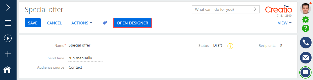
-
Set up the email structure. Outline the structure from scratch or use a pre-configured template.
-
Follow the instructions in the Set up the template in the Content Designer section to outline the email structure.
-
Click Actions → Select from lookup to use the structure of a pre-configured template (Fig. 2). A box will pop up. Select the template of the structure in the box.
Fig. 2 Add a pre-configured template to the email 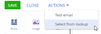
-
-
Once you outline the template structure, add your content to the email. Learn more: Set up the template in the Content Designer
Set up the template in the Content Designer
-
Set up the template header (Fig. 3):
Fig. 3 Adding a header to the template 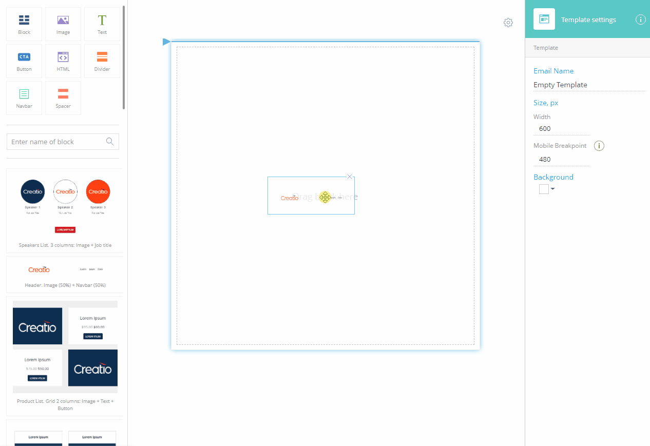
-
Drag the "Header. Image (50%) + Navbar (50%)" element from the block library to the working area.
-
Click the navlinks to edit their captions.
-
Specify the destination of each link in the setup area on the right. Remove the "#" prefix to treat the value as a URL. Leave the prefix to treat the value as a local anchor.
-
Click Navbar →
 to remove the unnecessary navlinks. Click Add link to add more navlinks.
 -
Select the Hamburger menu checkbox to display the navigation menu as a collapsible hamburger menu on mobile devices.
-
Click
 to right-align the menu.
 -
Click Section and select the Reverse the order of columns on mobile checkbox to push the logo under the navigation on mobile devices.
If the Reverse order of mobile checkbox remains cleared, the image in the left column will display above the navigation menu on mobile devices.
-
-
Set up a banner (Fig. 4):
Fig. 4 Adding a banner 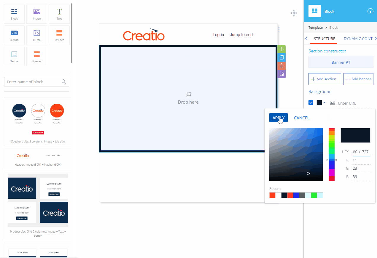
-
Drag the Block element from the element library to the working area.
-
Click Add banner in the setup area on the right.
-
Click
 to the right of Section #1 in the block setup area to remove the section.
 -
Select the checkbox in the background setup area.
-
Click
 , select the background color, and click Apply.note
We recommend setting up a background image of the banner after adding and configuring the banner elements. The background image is invisible if there are no elements in the banner. Also, the content may affect the banner height and, consequently, the way the background image is displayed.
-
-
Add an image to the top of the banner (Fig. 5):
Fig. 5 Adding an image 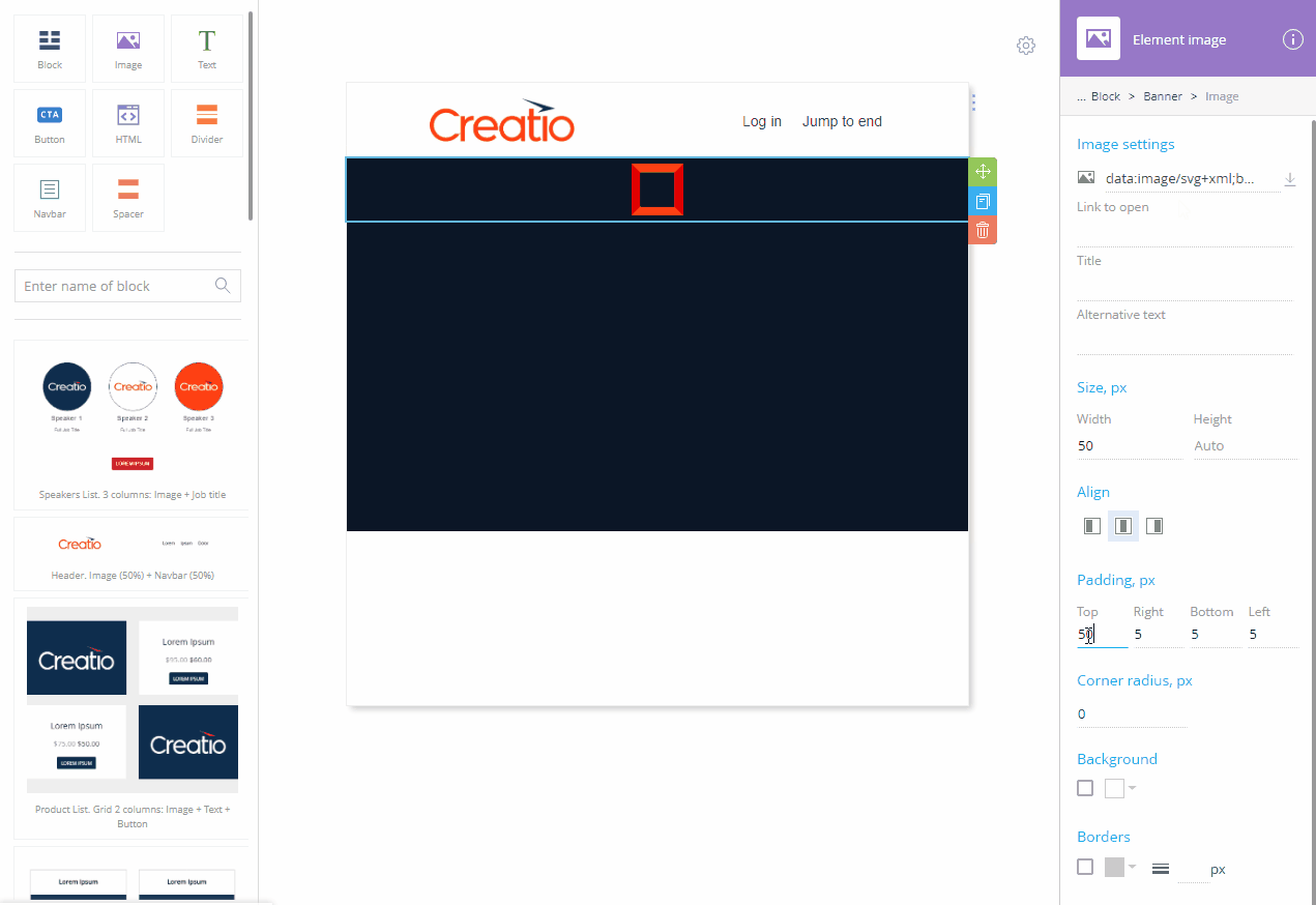
-
Drag the Image element from the library to the working area.
-
Click
 to clear the
  field in the element setup area.
 -
Upload the image from your computer, provide the image URL, or specify a data URI containing the image.
-
If necessary, specify the image dimensions in the Size, px area.
noteThe images with dimensions specified may be displayed incorrectly in older email client versions.
-
Specify the desired padding settings.
-
-
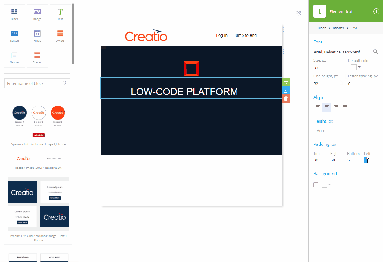
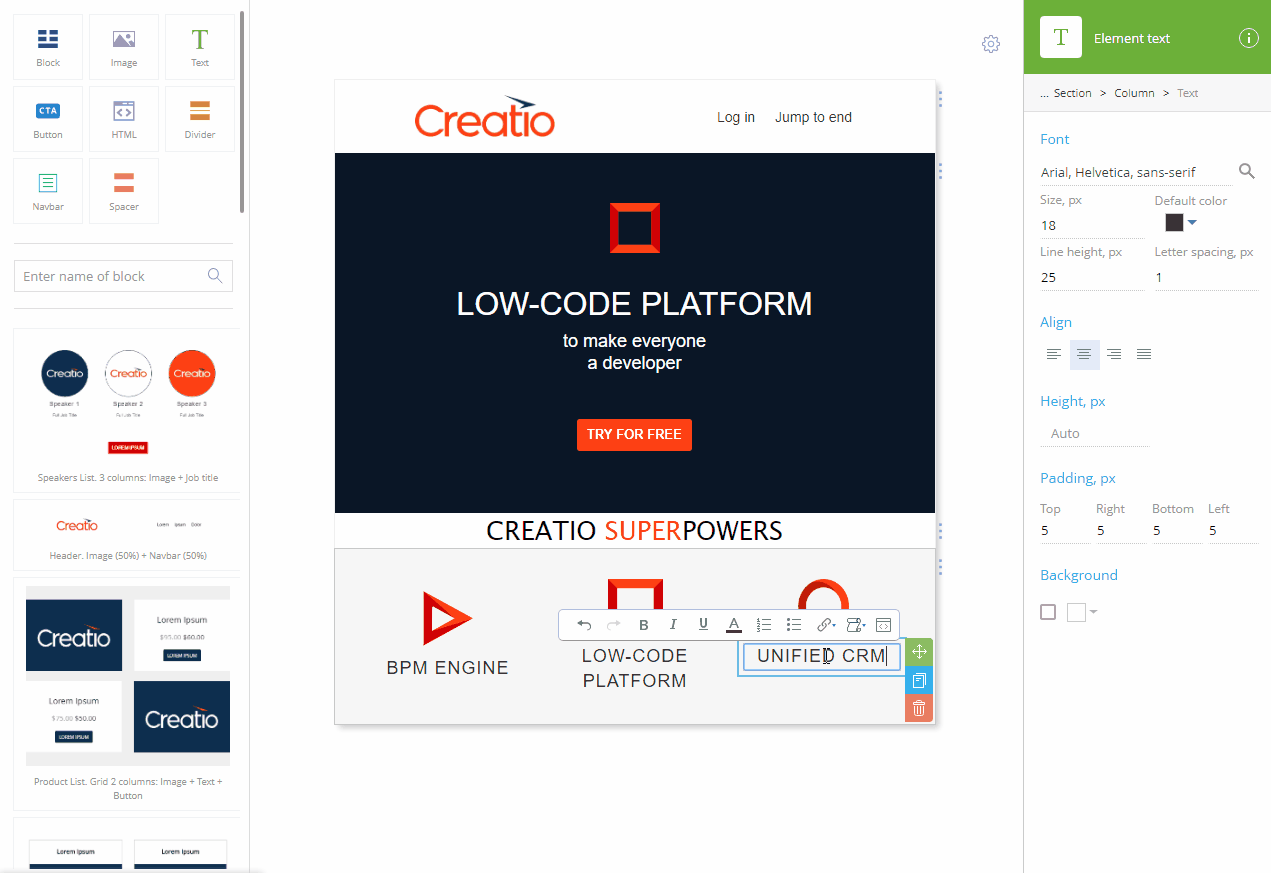
Add a title to the banner (Fig. 6):
Fig. 6 Adding a title 
-
Drag the Text element from the library to the working area.
-
Click
 in the Font property of the element setup area to open the font color picker. Select the font color in the color picker and click Apply.
 -
Replace the placeholder text with the title text.
-
Specify the font size in the Size, px field.
-
Click
 to align the text.
 -
Specify the desired padding settings.
-
-
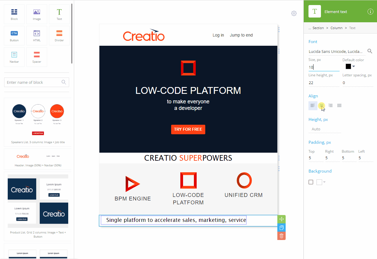
Add a subtitle to the banner (Fig. 7):
Fig. 7 Adding a subtitle 
-
Drag the Text element from the library to the working area.
-
Repeat steps b through f from the title setup instruction, using a different value for the font size.
-
-
Add a button to the banner (Fig. 8):
Fig. 8 Adding a CTA button 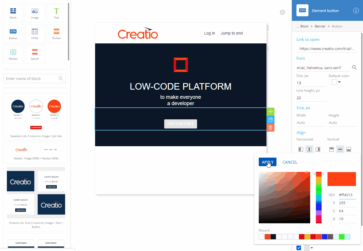
-
Drag the Button element from the library to the working area.
-
Replace the placeholder text with your CTA.
-
Specify the destination URL in the Link to open field.
-
Click
 in the Font property of the element setup area to open the font color picker. Select the font color in the color picker and click Apply.
-
-
Specify the desired margin settings.
-
Click
 in the Background area. Specify the background color of the CTA button and click Apply.
 -
Add a background image to the banner (Fig. 9):
Fig. 9 Adding a background image to the banner 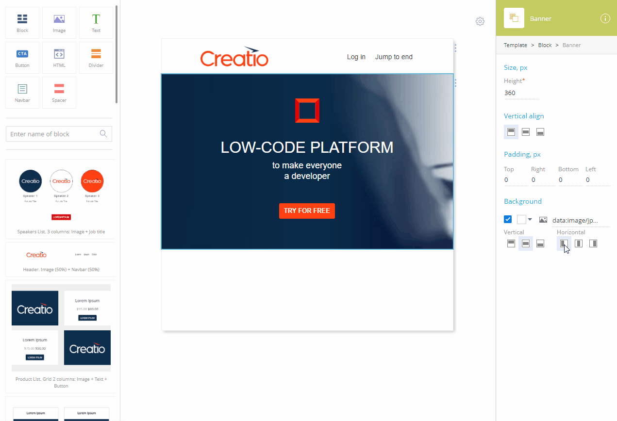
-
Use the breadcrumbs to open the banner setup area.
-
Click
 to clear the
  field in the Background area.
 -
Upload the image from your computer, provide the image URL, or specify a data URI containing the image.
-
Use the
 ,
,  , or
, or  buttons to align the image vertically and the
  ,
,  , or
, or  buttons to align the image horizontally.
The background image will keep the aspect ratio but will stretch or shrink to fill the banner otherwise. Depending on the banner aspect ratio, you can align the image either horizontally or vertically, but not both.
-
-
Add a subtitle (Fig. 10):
-
Drag the Block element from the library to the working area.
-
Drag the Text element to the Block element.
-
Replace the placeholder text with your subtitle.
-
Specify the font of the subtitle in the Font area.
-
Specify the font size in the Size, px field.
-
Click
 to align the text center.
 -
Add a feature block (Fig. 11).
-
Drag the "Product list. 3 columns: Image + Text + Button" block to the working area.
-
Delete the unneeded elements.
-
Replace the placeholder column text with the description of your products.
-
Add the summary text (Fig. 12) the same way you added the subtitle after the banner on step 9.
- Save the template.
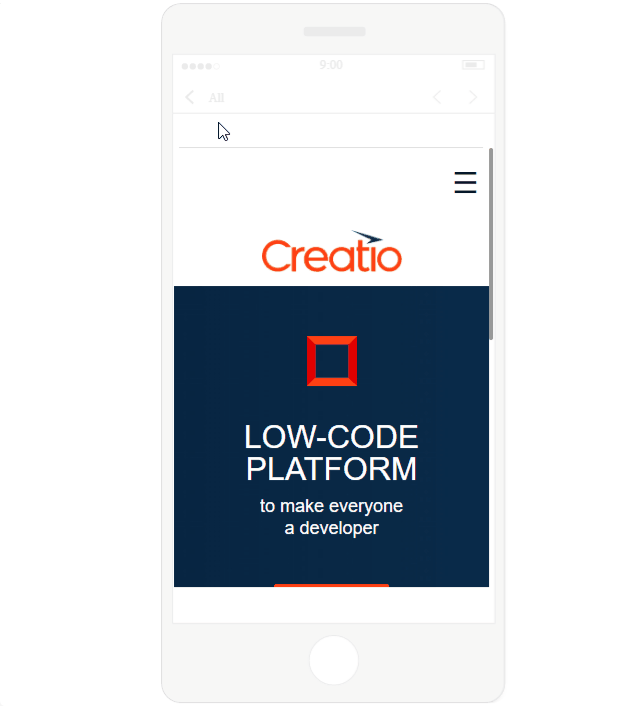
As a result, a new template will be created. The templates are optimized for desktop and mobile by default (Fig. 13)
See also
Set up fonts in the Content Designer