


Adding the [Attachments] detail
Glossary Item Box

Introduction
The [Attachments] detail is designed for storing files and links to web resources and knowledge base articles related to a section record. The detail is available in all Creatio sections (see: “Attachments”). The main functionality of the detail is implemented in the FileDetailV2 schema of the UIv2 package.
To add a detail to the edit page of a custom section record, do the following:
1. Create a regular detail in the detail wizard using the object schema of the [Section object name]File section (see: “Creating a new section”).
2. Change the parent for the detail list schema.
3. In the wizard, add the detail to the the edit page of a custom section record.
4. Perform additional detail configurations.
Case description
Add the [Attachments] details to the record edit page of the custom [Photos] section. All schemas of the [Photos] section and the [Attachments] details should be stored in a custom package (for example, sdkDetailAttachment).
NOTE
To create a section, use the section wizard (see: “Creating a new section” and “Section wizard”).
ATTENTION
If the development needs to be carried out in a custom package, it needs to be specified in the [Current package] system setting. Otherwise, the wizard will save the changes to the [Custom] package.
Case implementation algorithm
1. Create a detail, using the [Section object name]File section object schema.
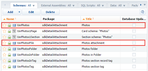
As a result (Fig. 1), a number of client modules and object schemas will be created in the custom package. The name of the schema of the main section object is UsrPhotos (Fig. 2). The schema name of the section object that you want to use for the details is UsrPhotosFile.
Fig. 1. The [Photos] section properties in the section wizard
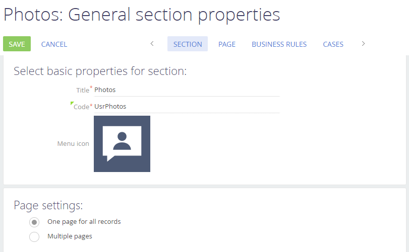
Fig. 2. Schemas created by the section wizard in the user package
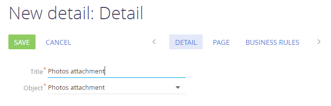
Creating details in a wizard is described in more detail in the “Creating a detail in wizards” article. Choose the detail title and the [Photos attachment] object as the default one in the detail wizard (Fig. 3). The transition to the second step in the wizard is optional.
Fig. 3. Detail properties in the wizard
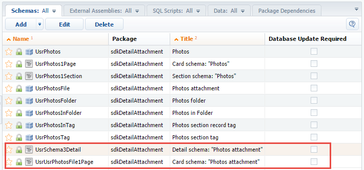
As a result, the custom package will have a schema of the detail list client module and a schema of the detail edit page (Fig. 4).
Fig. 4. Schemas created by the section wizard in the user package
NOTE
Schema names are generated automatically and may be different from those shown on Fig. 4.
2. Change the parent for the detail list schema.
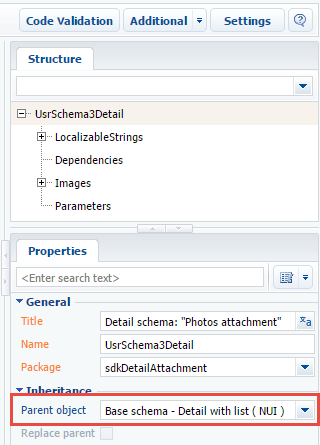
The detail with an edit page is created. The [Base schema - Detail with list] schema of the NUI package is the parent object of the client module schema of the UsrSchema3Detail detail list (Fig. 5).
Fig. 5. A default parent object
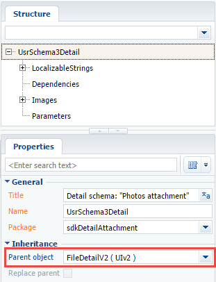
To implement the [Files and Links] detail functionality in the custom detail, specify the FileDetailV2 schema as the parent object of the UsrSchema3Detail schema (Fig. 6).
Fig. 6. The parent object – the FileDetailV2 schema
NOTE
The procedure of specifying a parent object is covered in the “Creating a custom client module schema”.
Save the schema to apply changes.
3. In the wizard, add the detail to the the edit page of a custom section record.
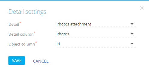
Adding a detail to the record edit page using the detail wizard is described in the “Creating a detail in wizards” article. When you add a detail in the wizard, configure the link between the detail columns and the main section object (Fig. 7).
Fig. 7. Configuring the link between the detail columns and the main section object
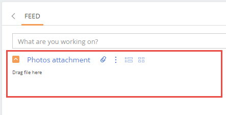
Upon refreshing, the detail will be displayed on a record edit page (Fig. 8).
Fig. 8. A detail on an edit page
NOTE
You can add details to any edit page tab. Additionally, you can create a separate [Attachments] tab for the detail.
4. Perform additional detail configurations
After completing the previous steps, the detail is fully functional, but looks different from the [Attachments] detail of the base application sections. To make the custom detail look similar to the standard one, you need to define CSS styles for it.
ATTENTION
The client module schema of the UsrSchema3Detail detail list is a schema of the view model. Defining styles in it is impossible. It is necessary to create a new module schema, define the styles and add the created module to module dependencies of a detail.
Create a new module schema in a custom package with the following property values:
- [Title] – “UsrSchema3DetailCSS”.
- [Name] – “UsrSchema3DetailCSS”.
- [Package] – “sdkDetailAttachment”.
Add the following CSS selectors to the LESS tab of the module designer:
div[id*="UsrSchema3Detail"] {
    .grid-status-message-empty {
        display: none;
    }
    .grid-empty > .grid-bottom-spinner-space {
        height: 5px;
    }
    .dropzone {
        height: 35px;
        width: 100%;
        border: 1px dashed #999999;
        text-align: center;
        line-height: 35px;
    }
    .dropzone-hover {
        border: 1px dashed #4b7fc7;
    }
    .DragAndDropLabel {
        font-size: 1.8em;
        color: rgb(110, 110, 112);
    }
}

div[data-item-marker*="added-detail"] {
    div[data-item-marker*="tiled"], div[data-item-marker*="listed"] {
        .entity-image-class {
            width: 165px;
        }
        .entity-image-container-class {
            float: right;
            width: 128px;
            height: 128px;
            text-align: center;
            line-height: 128px;
        }
        .entity-image-view-class {
            max-width: 128px;
            max-height: 128px;
            vertical-align: middle;
        }
        .images-list-class {
            min-height: 0.5em;
        }
        .images-list-class > .selectable {
            margin-right: 10px;
            display: inline-block;
        }
        .entity-label {
            display: block;
            max-width: 128px;
            margin-bottom: 10px;
            text-align: center;
        }
        .entity-link-container-class > a {
            font-size: 1.4em;
            line-height: 1.5em;
            display: block;
            max-width: 128px;
            margin-bottom: 10px;
            color: #444;
            text-decoration: none;
            text-overflow: ellipsis;
            overflow: hidden;
            white-space: nowrap;
        }
        .entity-link-container-class > a:hover {
            color: #0e84cf;
        }
        .entity-link-container-class {
            float: right;
            width: 128px;
            text-align: center;
        }
        .select-entity-container-class {
            float: left;
            width: 2em;
        }
        .listed-mode-button {
            border-top-right-radius: 1px;
            border-bottom-right-radius: 1px;
        }
        .tiled-mode-button {
            border-top-left-radius: 1px;
            border-bottom-left-radius: 1px;
        }
        .tiled-mode-button, .listed-mode-button {
            padding-left: 0.308em;
            padding-right: 0.462em;
        }
    }
    .button-pressed {
        background: #fff;

        .t-btn-image {
            background-position: 0 16px !important;
        }
    }
    div[data-item-marker*="tiled"] {
        .tiled-mode-button {
            .button-pressed;
        }
    }
    div[data-item-marker*="listed"] {
        .listed-mode-button {
            .button-pressed;
        }
    }
}
NOTE
The styles defined in the source code above almost completely coincide with the styles defined in the schema of the FileDetailCssModule module in the UIv2 package. They are intended for the FileDetailV2 schema used as the parent object.
You can not use the FileDetailCssModule module directly, because the markers and identifiers of the HTML elements of the standard detail and the detail created by the wizard are different.
Save the schema to apply changes.
To use the created module and its styles in a detail UsrSchema3Detail detail schema, add it to the dependency of the module defined in the detail schema.
The source code of the modified schema:
div[id*="UsrSchema3Detail"] {
    .grid-status-message-empty {
        display: none;
    }
    .grid-empty > .grid-bottom-spinner-space {
        height: 5px;
    }
    .dropzone {
        height: 35px;
        width: 100%;
        border: 1px dashed #999999;
        text-align: center;
        line-height: 35px;
    }
    .dropzone-hover {
        border: 1px dashed #4b7fc7;
    }
    .DragAndDropLabel {
        font-size: 1.8em;
        color: rgb(110, 110, 112);
    }
}

div[data-item-marker*="added-detail"] {
    div[data-item-marker*="tiled"], div[data-item-marker*="listed"] {
        .entity-image-class {
            width: 165px;
        }
        .entity-image-container-class {
            float: right;
            width: 128px;
            height: 128px;
            text-align: center;
            line-height: 128px;
        }
        .entity-image-view-class {
            max-width: 128px;
            max-height: 128px;
            vertical-align: middle;
        }
        .images-list-class {
            min-height: 0.5em;
        }
        .images-list-class > .selectable {
            margin-right: 10px;
            display: inline-block;
        }
        .entity-label {
            display: block;
            max-width: 128px;
            margin-bottom: 10px;
            text-align: center;
        }
        .entity-link-container-class > a {
            font-size: 1.4em;
            line-height: 1.5em;
            display: block;
            max-width: 128px;
            margin-bottom: 10px;
            color: #444;
            text-decoration: none;
            text-overflow: ellipsis;
            overflow: hidden;
            white-space: nowrap;
        }
        .entity-link-container-class > a:hover {
            color: #0e84cf;
        }
        .entity-link-container-class {
            float: right;
            width: 128px;
            text-align: center;
        }
        .select-entity-container-class {
            float: left;
            width: 2em;
        }
        .listed-mode-button {
            border-top-right-radius: 1px;
            border-bottom-right-radius: 1px;
        }
        .tiled-mode-button {
            border-top-left-radius: 1px;
            border-bottom-left-radius: 1px;
        }
        .tiled-mode-button, .listed-mode-button {
            padding-left: 0.308em;
            padding-right: 0.462em;
        }
    }
    .button-pressed {
        background: #fff;

        .t-btn-image {
            background-position: 0 16px !important;
        }
    }
    div[data-item-marker*="tiled"] {
        .tiled-mode-button {
            .button-pressed;
        }
    }
    div[data-item-marker*="listed"] {
        .listed-mode-button {
            .button-pressed;
        }
    }
}
Save the schema to apply changes.
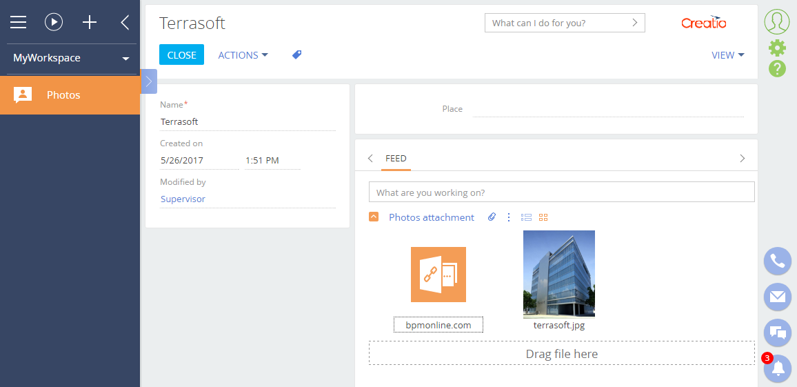
As a result, the edit page of the custom [Photos] section will display an [Attachments] detail, almost identical to the base one (Fig. 9).
Fig. 9. Case result