
Button containers
Creatio implements the following button container types:
- Action button container. Holds section page action buttons. Holds standard button containers and the dropdown menu button container.
- Standard button container. Holds the Save, Cancel, and Tags buttons, as well as the dropdown menu of the Actions button.
- Dropdown menu button container. Holds the dropdown menu of the Print and View buttons.
Buttons containers are different for section pages, record pages, and the page that adds new records.
View the meta names of button containers in the table below.
UI element name | Containers | ||
|---|---|---|---|
Action button container | Standard button container | Dropdown menu button container | |
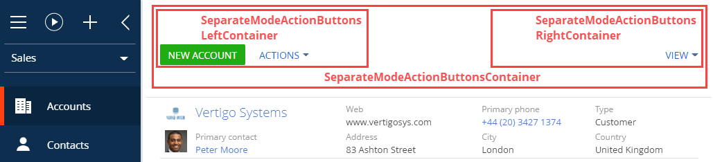
| Section page | Separate | Separate | Separate |
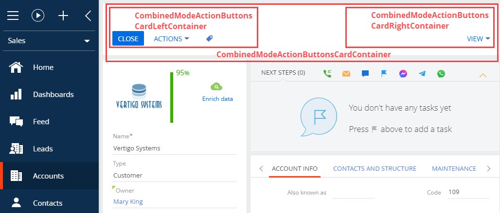
| Record page | Combined | Combined | Combined |
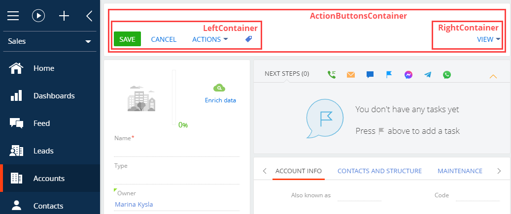
| Page that adds new records | Action | Left | Right |
View Section page button containers in the figure below.
View Record page button containers in the figure below.
View the button containers of the page that adds new records in the figure below.
New button
The procedure for adding a button varies depending on the button type.
Creatio implements the following button types:
- simple button
- color picker button
Add a simple button to the record or section page.
- Create a replacement view model of the section or record page to place the button. To do this, follow the procedure covered in a separate article: Develop configuration elements.
- Add a localizable string with the name of the button to the replacement model schema.
- Implement the button logic in the replacement model.
- Implement the following in the methods property:
- The handler method triggered by a button click.
- Auxiliary methods required for the control’s operation. These can be methods that regulate the visibility or availability of the control.
- Add a configuration object with the settings that determine the button position on the section or record page to the diff array of modifications. In the array, specify the container to place the button.
- Implement the following in the methods property:
Add a color picker button
- Create a replacement object schema To do this, follow the procedure covered in a separate article: Develop configuration elements.
- Add a column of the Text (50 characters) type to the replacement object schema. The column will store the data about the picked color. To do this, follow the procedure covered in a separate article: Develop configuration elements.
- Create a replacement view model of the section or record page to place the button. To do this, follow the procedure covered in a separate article: Develop configuration elements.
- Implement the button logic in the replacement model.
- Implement the following in the methods property:
- The handler method triggered by a button click.
- Auxiliary methods required for the control’s operation. These can be methods that regulate the visibility or availability of the control.
- Add a configuration object with the settings that determine the button position on the section or record page to the diff array of modifications.
- Specify the COLOR_BUTTON type in the itemType property.
- Bind the added replacement object’s schema column in the value property.
- Implement the following in the methods property:
Add a tooltip to a button
Tooltips are text messages that provide the user with additional information about the button functionality. Hover over a button to bring up its tooltip.
To add a tooltip to a button:
- Create a replacement view model of the section or record page to place the button. To do this, follow the procedure covered in a separate article: Develop configuration elements.
- Add a localizable string with the name of the button to the replacement model schema.
- Implement the tooltip in the diff array of changes to the replacement view model schema.
You can add tooltips to a button configuration object in several ways:
- Use the hint property.
- Use the tips property.
To add a tooltip to a button using the hint property, add a hint property with the tooltip text to the values property of the control.
To add a tooltip to a button using the tips property:
- Add a tips property to the values property of the control.
- Add a tooltip configuration object to the tips array using the insert operation.
- Add a content property with the tooltip text to the values property of the tooltip configuration object.
Using the tips property to add a tooltip to a button lets you:
- change the display style
- bind the tooltip visibility to a view model event
- add controls, etc.
The types of elements that let you use the tips property:
- Terrasoft.ViewItemType.BUTTON
- Terrasoft.ViewItemType.LABEL
- Terrasoft.ViewItemType.COLOR_BUTTON
- Terrasoft.ViewItemType.HYPERLINK
- Terrasoft.ViewItemType.INFORMATION_BUTTON
- Elements that have the generator property specified

Create a replacement section view model schema
- Go to the Configuration section and select a custom package to add the schema.
-
Click Add → Replacing view model on the section list toolbar.
/scr_add_replacing_module.png)
-
Fill out the schema properties.
- Set Code to "AccountSectionV2."
- Set Title to "Account section."
- Set Parent object to "AccountSectionV2."

-
Add a localizable string.
- Click
/scr_add_button.png) in the context menu of the Localizable strings node.
in the context menu of the Localizable strings node. -
Fill out the localizable string properties.
- Set Code to "OpenPrimaryContactButtonCaption."
- Set Value to "Primary contact."
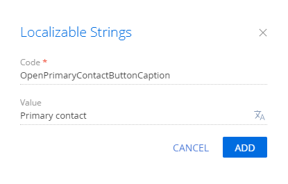
- Click Add to add a localizable string.
- Click
-
Implement the button logic.
-
Implement the following methods in the methods property:
- isAccountPrimaryContactSet() – checks whether the Primary contact field of the page is filled.
- onOpenPrimaryContactClick() – the button click handler method. Opens the primary contact page.
- Add a configuration object with the settings that determine the button position to the diff array of modifications.
Reference the selected record via the ActiveRow attribute of the section view model. The attribute returns the value of the primary column of the selected record. In turn, you can use this value to get values loaded into the list of the fields of the selected object. For example, values loaded from the view data collection of the section list are stored in the GridData property of the list view model.
View the source code of the replacing view model schema of the section page below.
-
- Click Save on the Designer’s toolbar.
Outcome of the example
To view the outcome of the example:
- Clear the browser cache.
- Refresh the Accounts section page.
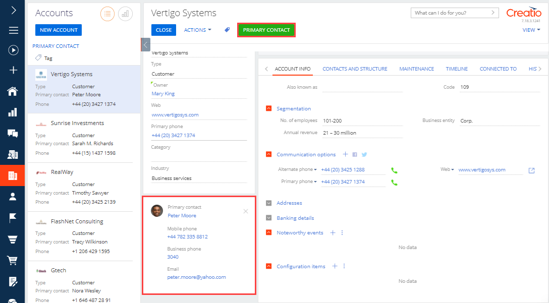
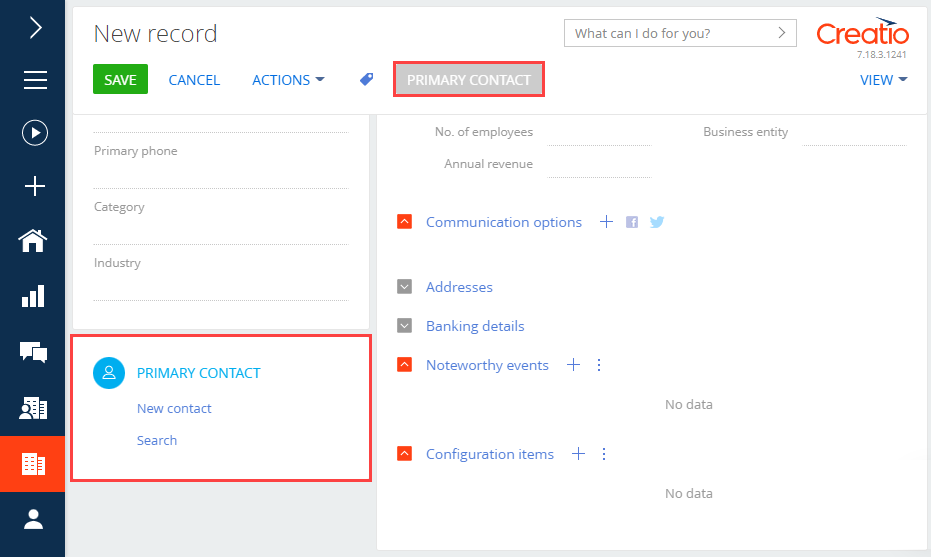
As a result, Creatio will add the Primary contact button to the toolbar of the Accounts section. The button activates when you select the account that has a primary contact from the section list.
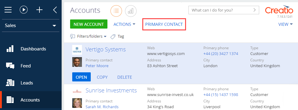
Click Primary contact to open the page of the active account’s primary contact.

Create a replacement section view model schema
- Go to the Configuration section and select a custom package to add the schema.
-
Click Add → Replacing view model on the section list toolbar.
-
Fill out the schema properties.
- Set Code to "AccountSectionV2."
- Set Title to "Account section."
- Set Parent object to "AccountSectionV2."

-
Add a localizable string.
- Click in the context menu of the Localizable strings node.
-
Fill out the localizable string properties.
- Set Code to "OpenPrimaryContactButtonCaption."
- Set Value to "Primary contact."
- To add a localizable string, click Add.
- Click
-
Implement the button business logic.
- In the attributes property, add the ButtonEnabled attribute of the Terrasoft.DataValueType.BOOLEAN type, which preserves the accessibility state of the button.
-
Implement the following methods in the methods property.
- onOpenPrimaryContactClick() – opens the primary contact page.
- onCardRendered() – listens to events emitted by loading data into the list and by changing the active list record. The method is executed after the account page is rendered in the combined mode.
- isPrimaryContactExist() – defines the existence of the primary contact for active list record.
- setButtonEnabled() – sets the value of the ButtonEnabled attribute depending on whether the main contact of the account is available.
- Add a configuration object with the settings that determine the button position in the diff array of modifications.
The source code of the replacement view model of the section page is available below:
- Click Save on the Designer toolbar.
Outcome of the example
To view the outcome of the example, refresh the page in the Accounts section.
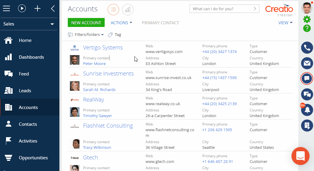
As a result of executing the example, the Primary contact button will been added to the toolbar of the Accounts section.
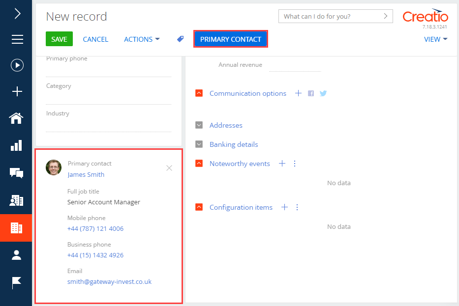
If the primary contact is specified for an account, click Primary contact to open the page of this contact.
If no primary contact is specified for an account, the Primary contact button is inactive.
1. Change the way to add an account
By default, you need to add an account using a mini-page.
To add an account using a full page:
- Click
 to open the System Designer.
 - Click System settings in the System setup block.
- Select the Enable account mini page add mode (the HasAccountMiniPageAddMode code) system setting.
-
Clear the Default value checkbox.

- Log out from and log back into Creatio.
2. Create a replacing view model schema of the account page
- Go to the Configuration section and select a custom package to which to add the schema.
-
Click Add → Replacing view model on the section list toolbar.
-
Fill out the schema properties.
- Set Code to "AccountPageV2."
- Set Title to "Account edit page."
- Set Parent object to "AccountPageV2."

-
Add a localizable string.
- Click in the context menu of the Localizable strings node.
-
Fill out the localizable string properties.
- Set Code to "OpenPrimaryContactButtonCaption."
- Set Value to "Primary contact."
- Click Add to add a localizable string.
- Click
-
Implement the button logic.
-
Implement the following methods in the methods property:
- isAccountPrimaryContactSet() – checks whether the Primary contact field of the page is filled.
- onOpenPrimaryContactClick() – the button click handler method. Opens the primary contact page.
- Add a configuration object with the settings that determine the button position to the diff array of modifications.
View the source code of the replacing view model schema of the account page below.
-
- Click Save on the Designer’s toolbar.
Outcome of the example
To view the outcome of the example:
- Refresh the Accounts section page.
- Click New account on the toolbar of the Accounts section.
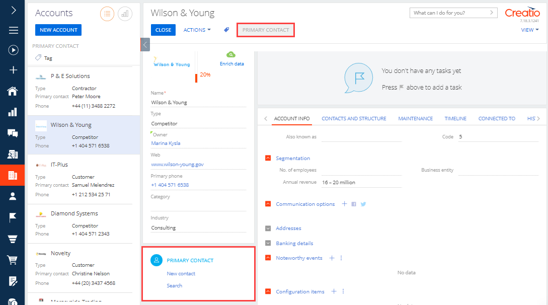
As a result, Creatio will add an inactive Primary contact button to the toolbar of the page that adds new accounts.
The Primary contact button activates after you specify the primary contact of the account. Click Primary contact to open the primary contact page.
1. Create a replacement object schema
- Go to the Configuration section and select a custom package to add the schema.
-
Click Add → Replacing object on the section list toolbar.
/scr_add_entity_schema_replaced.png)
-
Fill out the schema properties.
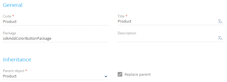
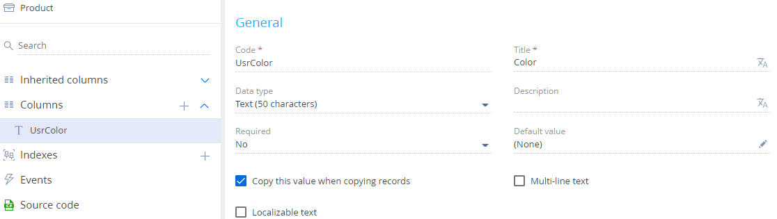
- Set Code to "Product."
- Set Title to "Product."
- Set Parent object to "Product."
-
Add a column to the schema.
- Click
 in the context menu of the Columns node of the object structure.
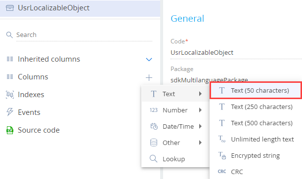
 -
Click Text → Text (50 characters) in the dropdown menu.
-
Fill out the properties of the added column.
- Set Code to "UsrColor."
- Set Title to " Color."
- Click
- Click Save, then Publish on the Object Designer’s toolbar.
2. Create a view model schema of the replacement product page
- Go to the Configuration section and select a custom package to add the schema.
-
Click Add → Replacing view model on the section list toolbar.
-
Fill out the schema properties.
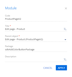
- Set Code to "ProductPageV2."
- Set Title to "Edit page - Product."
- Set Parent object to "ProductPageV2."
-
Set up the button layout. To do this, add a configuration object with the settings that determine the button position to the diff array of modifications.
View the source code of the replacement view model of the product page below.
- Click Save on the Designer’s toolbar.
Outcome of the example
To view the outcome of the example:
- Refresh the Products section page.
- Open the product page.
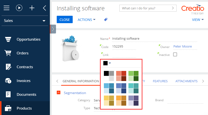
As a result, Creatio will add a color picker button to the product page.
Create a replacing view model schema of the contact page
- Go to the Configuration section and select a custom package to add the schema.
-
Click Add → Replacing view model on the section list toolbar.
-
Fill out the schema properties.
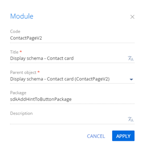
- Set Code to "ContactPageV2."
- Set Title to "Display schema — Contact card."
- Set Parent object to "ContactPageV2."
-
Add a localizable string that contains the tooltip text.
- Click in the context menu of the Localizable strings node.
-
Fill out the localizable string properties.
- Set Code to "SaveButtonHint."
- Set Value to "Press to save changes."
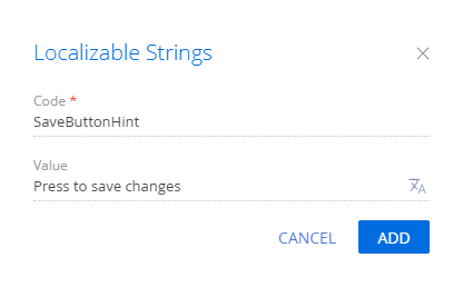
- Click Add to add a localizable string.
- Click
-
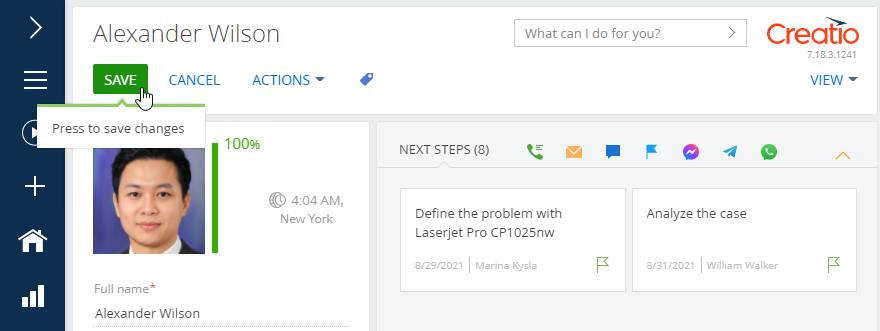
Set up the tooltip for the Save button of the contact page. To do this, add the configuration object of the button on the page to the diff array of modifications.
View the source code of the replacement view model of the contact page below. There are different ways to add a tooltip to a button configuration object.
- Click Save on the Designer’s toolbar.
Outcome of the example
As a result, Creatio will add a tooltip to the Save button of the contact page.
Create a schema of the replacing section view model
- Go to the Configuration section and select a custom package to add the schema.
-
Click Add → Replacing view model on the section list toolbar.
-
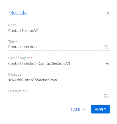
Fill out the schema properties.
- Set Code to "ContactSectionV2."
- Set Title to "Contact section."
- Set Parent object to "ContactSectionV2."
-
Add a localizable string.
- Click in the context menu of the Localizable strings node.
-
Fill out the localizable string properties.
- Set Code to "ShowAgeOfContactButtonCaption."
- Set Value to "Show age."

- Click Add to add a localizable string.
- Click
-
Implement the button logic.
-
Implement the following methods in the methods property:
- onActiveRowAction() – assigns a handler method to the button located in the row of the active section record.
- onShowAgeButtonClicked() – the button click handler method. Returns the contact age in the pop-up box.
- Add a configuration object with the settings that determine the button position to the diff array of modifications.
Reference the selected record via the ActiveRow attribute of the section view model. The attribute returns the value of the primary column of the selected record. In turn, you can use the value of the primary column of the selected record to get the values loaded into the field list of the selected object.
View the source code of the replacing view model of the section page below:
-
- Click Save on the Designer’s toolbar.
Outcome of the example
To view the outcome of the example:
- Clear the browser cache.
- Refresh the Contacts section page.
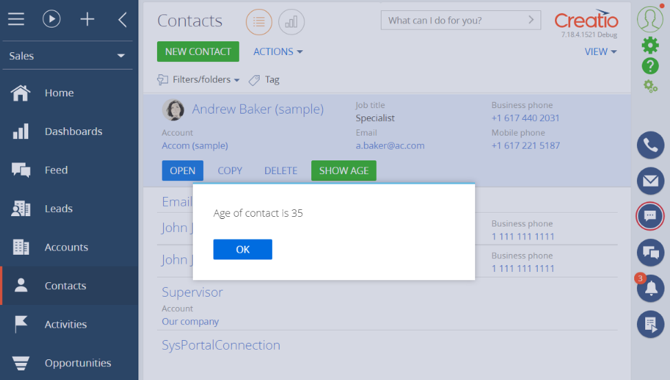
As a result, Creatio will add the Show Age button to the row of the active record in the Contacts section. Click Show Age to open a pop-up box that displays the contact age.
The purpose of the diff modification array of the button object is to configure the button layout on the record page by using a configuration object. Set up the layout in the view model schema of the record page. Learn more about the schema properties in a different article: Client schema.
Properties
The button operation.
| set | Sets the button value using the values parameter. |
| merge | Merges the values from the parent, replaced, and replacing schemas. The properties from the values parameter of the last descendant override the other values. |
| remove | Deletes the button from the schema. |
| move | Moves the button to a different parent element. |
| insert | Adds the button to the schema. |
The meta name of the parent control element to place the button. If it is a functional button, LeftContainer and RightContainer can act as parent containers.
The name of the parent element’s parameter. Specify the items value for the button.
The meta name of the added button.
A configuration object that contains settings for additional properties of the button.
| item |
The element type. Set by the Terrasoft.ViewItemType enumeration. Use the BUTTON value for the button. |
| caption | The button caption. We recommend setting the caption values by binding them to a localized schema string. |
| click | Binds the button click handler method. |
| layout | The object that contains the settings for the button location in the grid. |
| enabled | Controls the button availability (active status). |
| visible | Controls button visibility. |
| style |
The component style. Set by the Terrasoft.controls.ButtonEnums.style enumeration. Available values (Terrasoft.controls.ButtonEnums.style)
Default style. The button color is green. The button color is red. The button color is blue. The button color is grey. The button is transparent. The value from older Creatio versions. |