Set up dashboards
Once you add a dashboard to a section or to a record page, you can start setting up dashboard tiles. Creatio includes many dashboard tiles fit for a wide variety of analytical business tasks:
- Chart. You can use it to clearly display dynamics and percentages, for instance, monthly sales dynamics or customer distribution by industry. Read more >>>
- Metric. You can use it to display a single numeric value, for example, the total number of current employees. Read more >>>
- List. You can use it to display a custom list of Creatio records, for example, top 3 employees. Read more >>>
- Pivot table. This is a view option for “List” tiles. You can use it to display data as a table with grouping fields in its rows and columns. The intersected cells display the calculated summary data. Read more >>>
- Widget. You can use it to embed custom widgets set up by a developer, such as exchange rates or weather forecasts. Read more >>>
- Gauge. You can use it to display a single numeric value relative to a custom scale. It is great for tracking KPIs, such as the number of agent calls. Read more >>>
- Web page. You can use it to display a web page as a dashboard tile. It can be a search engine page, an online currency converter, or your corporate web site. Read more >>>
- Sales pipeline. You can use it to analyze the stage-based opportunity funnel for a specific time period. This dashboard tile is available in Creatio products that include the Opportunities section. Read more >>>
- Full pipeline. You can use it to analyze the complete life cycle of a customer need in Creatio by tracking the corresponding lead and opportunity stages for a specific time period. This dashboard tile is available in Creatio products that include the Opportunities section. Read more >>>
If your company employees use different Creatio localizations (“cultures”), you need to set up the dashboards and tiles in the base culture to let everyone access them. Dashboards configured in a different localization will not be available for users working with another culture.
Set up chart
The “Chart” dashboard tile displays Creatio dynamics and percentages. For example, you can use a chart to display the distribution of events by types (Fig. 1).
Learn more: Analyze chart.
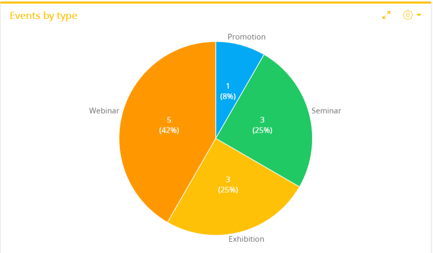
Chart setup procedure
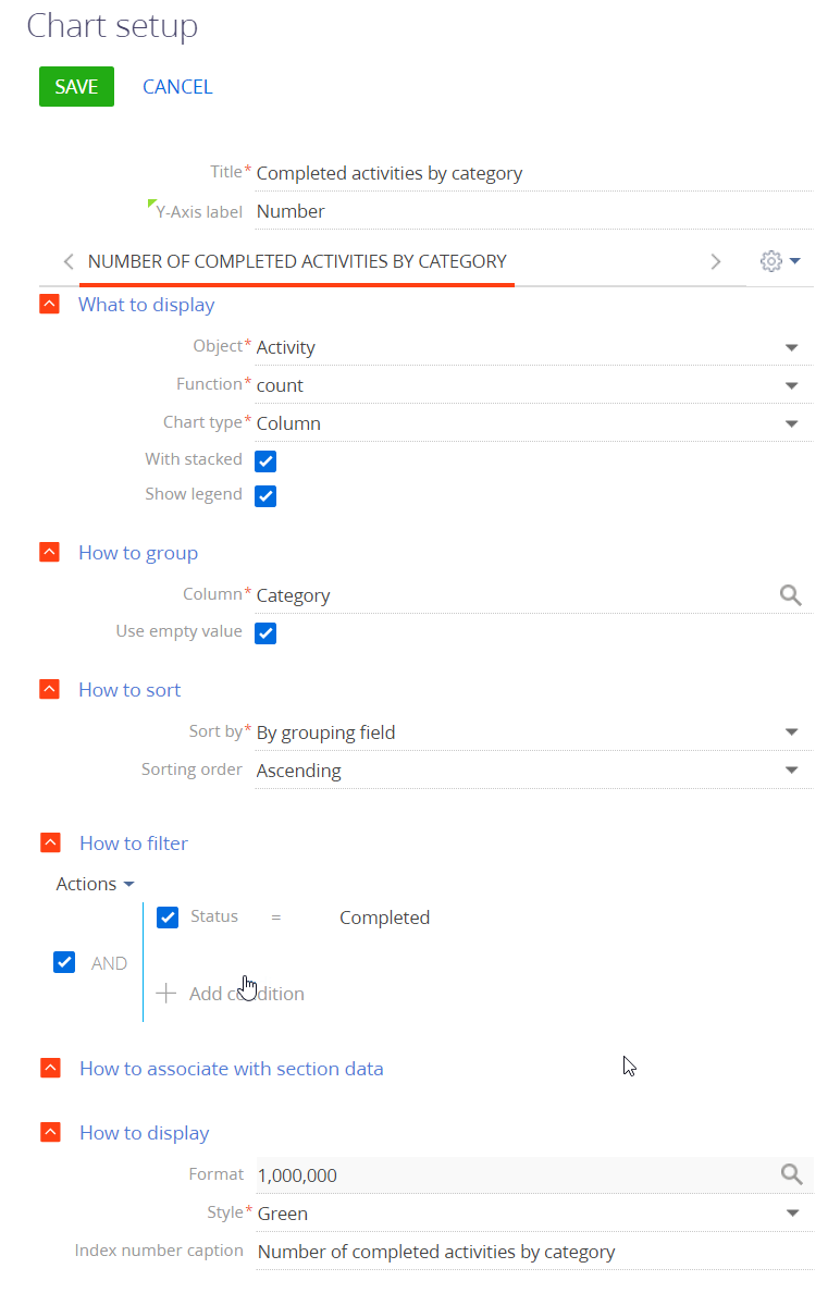
You can customize the chart's parameters on the setup page. (Fig. 2).
-
Fill out the fields at the top of the page:
- Title – the chart name that will be displayed on the dashboard tile. This is a required field.
- X-axis label and Y-axis label – the labels of X and Y axes on the chart. These fields are only displayed for charts with axes (“Spline,” “Line,” “Area chart,” and “Scatter chart”).
-
Fill out the fields in the What to display field group:
-
Object – a Creatio object (a section, a detail, or a lookup) to be used as a data source. For example, select the “Activity” object to calculate the average call duration (calls are activities of the “Call” category). This is a required field.
-
Function – how the chart will process the source data. This is a required field. You can choose among the following options:
- “count” – use this option to generate a chart by the number of Creatio object's records. For example, you can check the number of activities by type.
- “maximum,” “minimum,” and “average” – use these options the check the corresponding values of the data source's numeric column or a date column. For example, you can calculate the average employee activity duration.
- “sum” – use this option to display the sum of values in a numeric column. For instance, you can calculate the duration of employee's activities within a week.
-
Column – a column the function will use for the calculations. You can specify a numeric or a date column. For example, specify the “Duration (minutes)” column to calculate the average call duration by manager (Fig. 3). This field will not display if you select “count” in the Function field. This is a required field for all the other options.
Fig. 3 Setting up chart's What to display field group 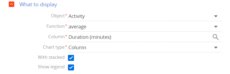
-
Chart type – the chart's structure, for example, “Bar chart” or “Pie chart.” This is a required field.
-
With stacked – select this checkbox to display the chart as a stacked area chart. These kinds of charts display each column/bar as a total sum of separate data categories. The size of each column is proportionate to the value of the corresponding data element. Stacked area charts are useful if you need to compare not only the separate data values but also the total sums. For example, the chart can simultaneously display the total sum of opportunity amounts on each stage by different employees or the contribution of each stage to the total sum.
The With stacked checkbox displays for the “Column” and “Bar” chart types. If you set up a chart with several series, they will share the same With stacked value. For instance, if you select this checkbox for one of the series, the chart will automatically select it for all the other series with the “Column” or “Bar” chart types. Similarly, if you deselect it in one of the series, the chart will automatically deselect them for all the other series.
-
Show legend – select the checkbox to display the chart's legend. The legend displays the chart color and the text from the Index number caption field at the bottom of the chart setup page. If the Index number caption field is empty, the legend displays the name of the object used as a data source.
The Show legend checkbox displays for the following chart types: “Spline,” “Line,” “Bar,” “Area,” “Column,” or “Scatter.”
-
-
Fill out the fields in the How to group field group.
-
Column – the column by which the chart values are grouped. Every value of this column will be a separate chart element: bar, sector, etc. This is a required field. For instance, to calculate the number of new activities within a specific time period, set the field to “Created on.” You can group data by any column of the chart's object.
-
Format – the date format the chart will use, for example, “Week” or “Month & year.” This field is displayed if you select a date column in the Column field of the How to group block. For example, to review the number of new activities by month, specify “Month & year” in the Format field and “Created on” in the Column field (Fig. 4).
Fig. 4 Setting up chart's How to group field group 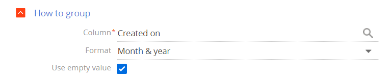
-
Use empty value – if you select this checkbox, the chart will include the records with an empty grouping column (Fig. 5).
Fig. 5 “Opportunities by category” chart that includes empty values 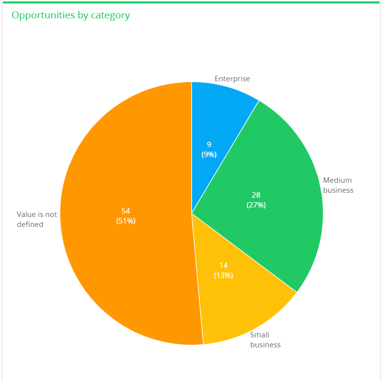
-
-
Fill out the fields in the How to sort field group:
-
Sort by – the value by which the chart elements are sorted. For instance, the “Activities by owner” chart groups the values by the Owner field. Each chart block in this chart represents a number of activities. Select “By grouping field” to sort the chart elements alphabetically (in this case by the Owner field) or select “By selection result” to sort them by the number of activities.
-
Sorting order – determines the display order of the chart values. For instance, select “Ascending” to display the values in alphabetical order (Fig. 6).
Fig. 6 Setting up chart's How to sort field group 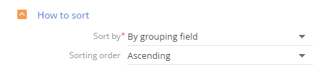
-
-
Specify the data filtering conditions in the How to filter field group.
For example, set the time frame in the filter conditions, such as “Created on = Current month,” to create a chart that shows how many contacts were added within a specific time period (Fig. 7).
Fig. 7 Setting up chart's How to filter field group 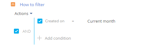
The filter becomes available once you fill out the Object field.
noteLearn more about the advanced filter in the Filters article.
-
Fill out the fields in the How to associate with section data field group:
Connect … object with … section by field – fill out the field if you need to apply the filters set in the section itself to the chart data. If you leave this field empty, the chart will ignore the section filters. The field is populated automatically if you use the object of the dashboard's record page as the chart's data source. The field becomes available after you fill out the Object field. It does not display when setting up charts in the Dashboards section.
Let's take a more in-depth look at the several possible relations between the chart and the section records:
-
The chart uses the current section's records (the chart object matches the section object). For example, you create a chart in the Activities section and select “Activity” in the Object field. In this case, the connection field is automatically populated with the Id column.
If you select the Id in the field (Fig. 8), the chart will use the records that correspond to the section's filter conditions. For example, if you apply a filter by completed activities, the chart will only display the data for the completed activities.
Fig. 8 Connecting chart to section by Id field 
If you clear the connection field, the chart will display the data for all section records regardless of the section's filter conditions.
-
The chart uses records from a different section (the chart object is different from the section object). For example, you created an “Activities by owner” chart in the Contacts section to display the number of activities by different owners. In this case the connection field lets you select among several chart object columns that are connected to the current section's object.
If you fill out the Connect… field, the chart will only use the records that match the filter conditions specified in the current section. For instance, you can select the “Owner” column for the “Activities by owner” chart (Fig. 9). If you set a filter for the Contacts section, the chart will only display the data for the activities where the owner matches that filter.
Fig. 9 Connecting chart to section by Owner field 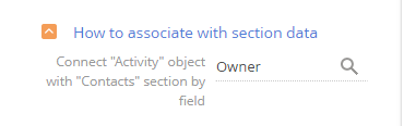
If you leave the connection field empty, the chart will display the data for all section records regardless of the current section's filter conditions.
If the chart's data is not connected to the section's data, leave the Connect… field empty. For example, create an “Activities by owner” chart in the Knowledge base section.
-
-
Fill out the fields in the How to display field group:
-
Format – changes the number of digits after the decimal point for numeric values. The setup is done in a pop-up window. Click
 to open it. For example, set this field's value to “1” to display a number with a single digit after the decimal point. To only display the whole part of the number, set the value to “0.” If the chart has more than one series, you can set a different value for each one.
 -
Style – changes the color of the dashboard tile header and the chart elements.
-
X-Axis label, Y-Axis label – these fields set the X and Y axes' labels for each chart series. They only appear for chart types that contain axes (“Spline,” “Line,” “Area chart,” and “Scatter chart”) (Fig. 10).
-
Index number caption – sets the text at the top of the dashboard for each chart series.
This field displays for the following chart types: “Column,” “Bar,” “Pie,” and “Pipeline.”
Fig. 10 Setting up How to display field group for “Spline,” “Line,” “Area chart,” and “Scatter chart” chart types 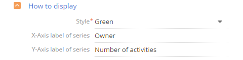
-
The values of the X-axis label and Y-axis label fields at the top of the chart setup page override the values of X-Axis label of series and Y-Axis label of series fields in the How to display field group at the bottom of the page.
Display several series on chart
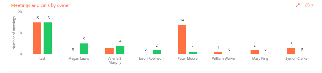
You can display several sets of data called “series” on your chart. For example, you can display employee meetings and calls on separate series (Fig. 11).
To add a series to a chart:
-
Select Add series in the
 button's menu on the chart setup page.
 -
Fill out the required fields on the new series' tab.
-
Save the chart setup page and the dashboard setup page.
This will make the chart display the new data series.
If you select a chart type that is incompatible with the other series, Creatio will display a warning and use the chart type that was selected first. For example, the warning will appear if you select a “Line” chart for the first series and a “Bar” chart for the second series. Both charts will be displayed as a “Line” chart (Fig. 12).
If you select the With stacked checkbox in one of the series with “Column” or “Bar” chart type, the checkbox will also be applied to all other series of the “Column” or “Bar” chart type. In that case the chart will display as a stacked column chart or a stacked bar chart.
Fig. 12 Chart compatibility 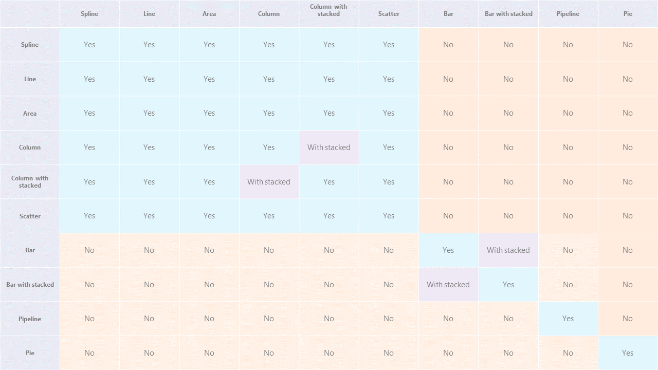
To copy a series and create a new series with similar settings:
-
Navigate to the tab of the series you would like to copy.
-
Select Copy series in the
 button menu on the chart setup page.
 -
Save the chart setup page and the dashboard setup page.
This will make the chart setup page display a copy of the old series. You can edit the new series however you need, e. g. change the column the function will use, modify the data display period, etc.
To delete a series:
- Navigate to the tab of the series you would like to delete.
- Select Delete series in the
 button menu on the chart setup page.
 - Save the chart setup page and the dashboard setup page.
Set up metric
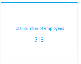
The “Metric” dashboard tile (Fig. 13) displays a calculated numeric value or a date based on Creatio data, for example, the number of employees in the department.
Metrics can display the following data types:
- The total number of records in an object, filtered or unfiltered. For example, the number of all employee contacts in Creatio.
- The minimum or maximum value of a numeric field or a date field. For example, the minimum or maximum call duration.
- The sum or the average value of a numeric field, for example, the sum of invoice payments.
Metric setup procedure
You can customize the metric's parameters on the setup page.
-
Fill out the Title field with the desired title.
-
Fill out the fields in the What to display field group:
Fig. 14 Setting up the metric's What to display field group 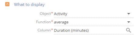
-
Object – Creatio object to be used as a data source This is a required field.
-
Function – how the metric will process the source data. This is a required field. You can choose among the following options:
- “count” – the number of object records. For example, total number of employee records in Creatio.
- “sum” – the sum of a data column's values. For example, the total duration of employees' calls.
- “average,” “minimum,” “maximum” – the corresponding values of a data column. For example, the average duration of employees' calls. The “average” function is not available for all columns.
-
Column – the column the function will use for calculations. This is a required field. You can specify a numeric or a date column. For instance, select the “Duration (minutes)” column to calculate your employees' average call duration. This field will not display if you select “count” in the Function field.
-
-
Specify the filtering conditions in the How to filter field group:
For example, you can display your employees' average call duration during the previous month by setting the conditions to: “Created on = Previous month” (Fig. 15).
Fig. 15 Setting up metric's How to filter field group 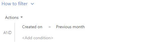
The filter becomes available once you fill out the Object field.
noteLearn more about the advanced filter in the Filters article.
-
Fill out the fields in the How to associate with section data field group:
Connect … object with … section by field – fill out the field if you need to apply the filters set in the section itself to the metric data. The metric will not use the section filters if you leave this field empty. The field is not available when setting up metrics in the Dashboards section until you fill out the Object field.
Read more about possible relations between the data source and the section's object in the chart setup section.
-
Fill out the fields in the How to display field group:
Fig. 16 Metric data format setup window 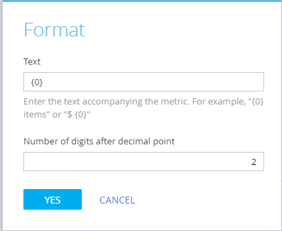
- Style – the color of the title and the value
- Font size – the metric's text size. You can select between “Default” and “Large.”
- Format – changes the number of digits after the decimal point for numeric values. Perform the setup in a pop-up window (Fig. 16). Click
 to open it.
-
Specify the text to accompany the metric's value in the pop-up's Text field. For example, if the metric should read “Total employees: 513” where 513 is the actual data, enter the following: “Total employees: 0.” If the metric should read “513 employees,” enter the following: “0 employees.”
noteIf you enter the variable incorrectly, the metric will not display the numeric value. To restore the variable, clear the field and click Yes in the pop-up.
-
Specify how many digits after the decimal point the metric should display in the Number of digits after decimal points field. Set the value to “0” to display only the integer part of the number.
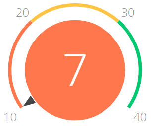
Set up gauge
The “Gauge” dashboard tile (Fig. 17) displays a value based on Creatio data relative to a custom scale.
Learn more: Analyze gauge.
Gauge setup procedure
You can customize the gauge's parameters on the setup page. Setting up the “Gauge” dashboard tile is similar to setting up the “Metric” dashboard tile, but you also need to set up a scale to put the data into context. To do this:
-
Open the How to display field group on the gauge setup page.
-
Specify the gauge title color in the Style field.
-
Select “The more the better” or “The less the better” in the Display order field.
The values affect the scale section order. In the former case, the red section displays on the left, in the latter case, on the right.
-
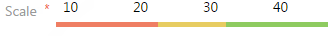
Specify the following for the scale (Fig. 18):
-
Specify how many digits after the decimal point the gauge should display in the Format field. Set the value to “0” to display only the integer part of the number.
Perform the setup in a pop-up window. Click
 in the Format field to open it.
Once you fill out all the fields in the How to display field group, Creatio will display the gauge preview.
noteThe “Gauge” dashboard tile displays large numbers with separators as per the user's culture settings.
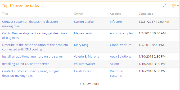
Set up list
The “List” dashboard tile (Fig. 19) displays information based on Creatio data as a list with a set number of records.
Learn more: Analyze list.
List setup procedure
You can customize the list's parameters on the setup page.
-
Fill out the fields at the top of the page:
- Title – the list's name that will be displayed on the dashboard. This is a required field.
- Object – Creatio object to be used as a data source. This is a required field.
-
Navigate to the Column setup tab and select the columns the list will display. The column setup works similarly to the column setup in the record list.
noteThe column setup area will be available after you populate the Object field.
-
Navigate to the Display options tab and set up how the list will display the data.
-
Fill out the fields in the How to sort field group:
-
Number of records – how many records the list will display (Fig. 20).
-
Sorting order – the sorting order of the list. For instance, display the values of the Owner column in alphabetical order.
-
Sorting column – the column the list will use for sorting. You can select any column available in the Column setup tab.
Fig. 20 Setting up “Top 10 overdue tasks” list'sHow to sortfield group 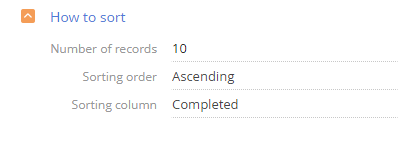
-
-
Fill out the fields in the How to filter field group:
For instance, you can make the list display only overdue activities by setting the filter to “Due < Current hour” and “Status = Not started; In progress” (Fig. 21).
Fig. 21 Setting up “Top 10 overdue tasks” list'sHow to filterfield group 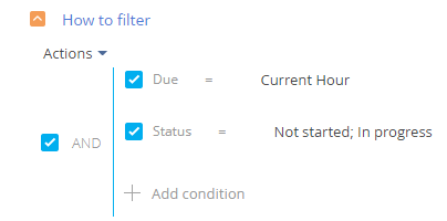
The filter becomes available once you fill out the Object field.
noteLearn more about the advanced filter in the Filters article.
-
Fill out the fields in the How to associate with section data field group:
Connect … object with … section by field – fill out the field to apply the filters set in the section itself to the list data. If you leave this field empty, the list will ignore the section filters. The field becomes available after you fill out the Object field. It does not display when setting up lists in the Dashboards section.
Read more about the different possible relations between the data source and the section's object in the Set up chart section.
-
Fill out the field in the How to display field group:
Style – the tile header's color. This is a required field.
Set up pivot table
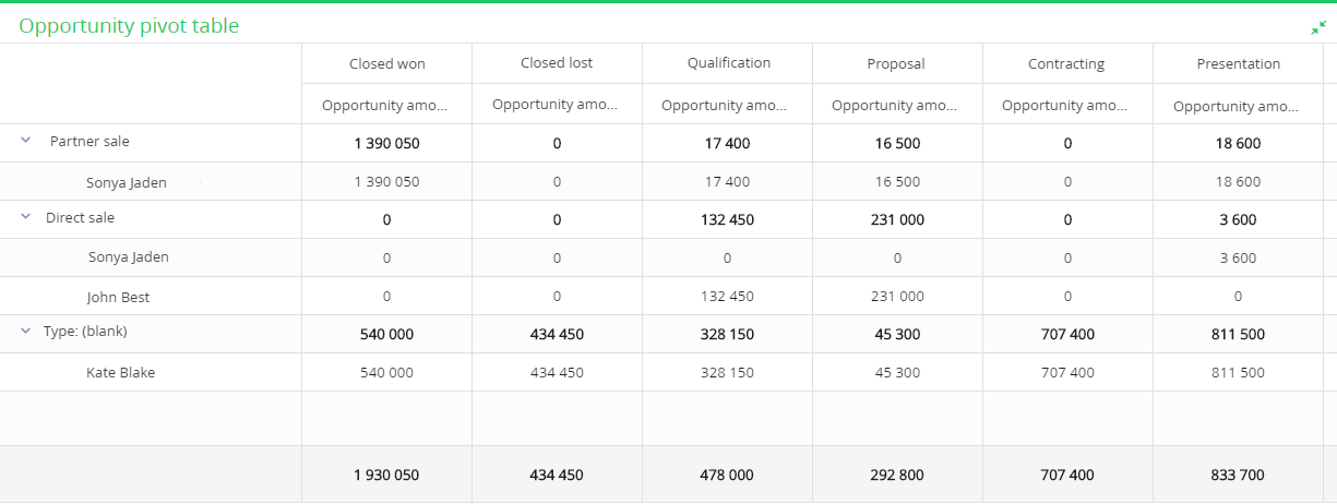
A pivot table (Fig. 22) is a view option for the “List” dashboard tile. It displays data as a table with grouping fields in its rows and columns. The intersected cells display the calculated summary data. For instance, you can use a pivot table to analyze opportunities by regions or employees.
Learn more: Analyze list.
The pivot tables will only work in the current versions of Chrome, Firefox, Safari, and Edge.
Pivot table setup procedure
Calculate the summary budget of direct and partner opportunities by owners and accounts.
To do this:
-
Set up a “List” dashboard and specify all the columns you need to display in the Column setup tab. In this case, these are the following columns: Type, Owner, Account, Budget (Fig. 23).
Fig. 23 Setting up list columns 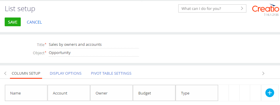
-
Navigate to the Pivot table settings tab and drag all the relevant columns from the All dimensions block to the corresponding blocks of the pivot table (Fig. 24).
To move a column to a different block, drag&drop it with the mouse pointer. You can also delete a column by clicking
 and draging from the All dimensions block to the correct block once again.
Fig. 24 Setting up pivot table 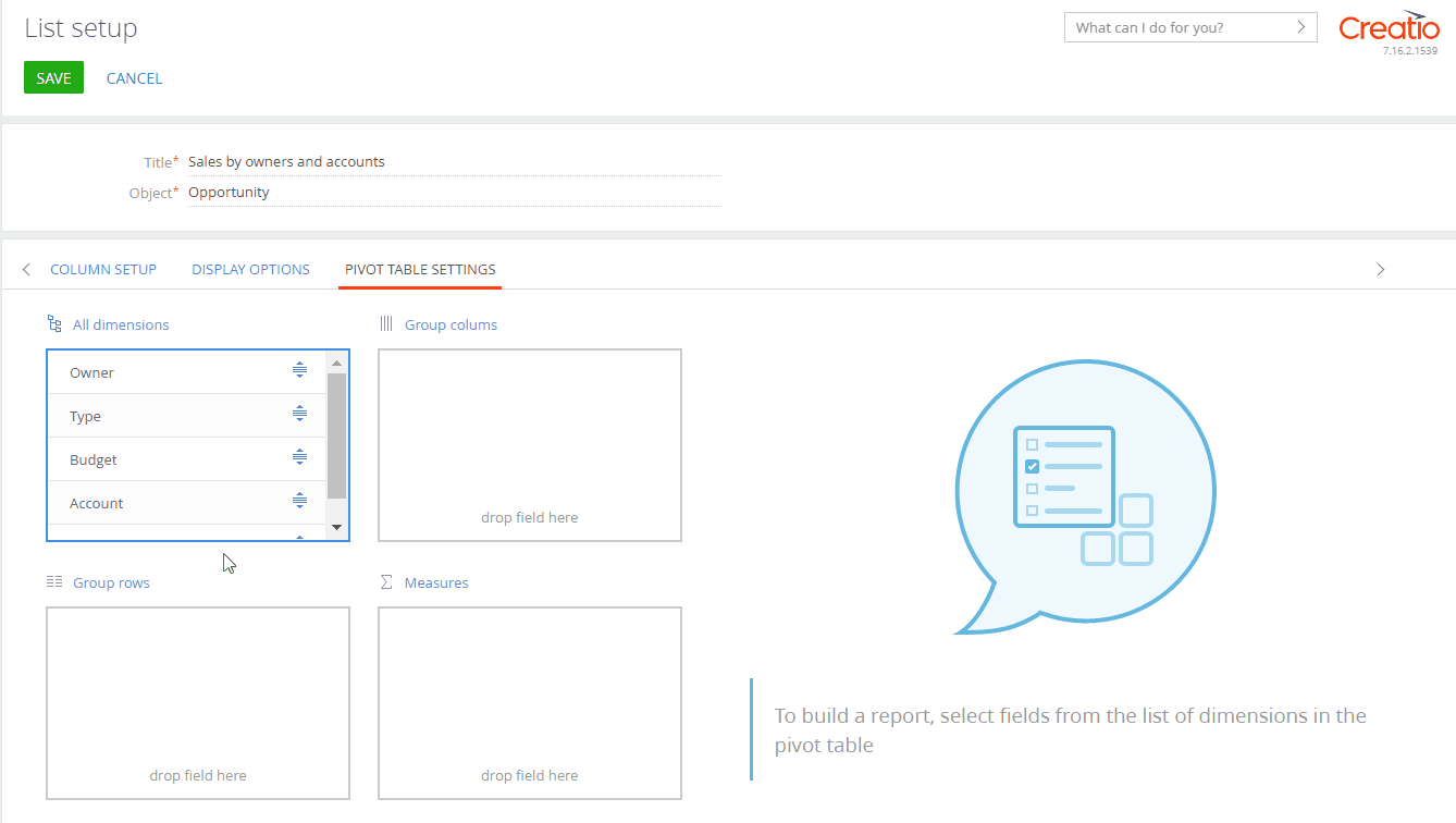
-
The Group rows block lets you group data in the table rows. The higher is the column in the block, the higher the grouping level. To change the grouping level, drag&drop the column to the relevant position. In this case you need to move the Type and Owner columns to this block.
noteYou can set up a pivot table with an unlimited number of rows, however, Creatio can only display up to 10 000 rows at a time. Try restructuring the table to display all of the rows. For example, you can delete the less important level of detail.
-
The Group columns block lets you group data in the table columns. The higher is the column in the block, the higher the grouping level. To change the grouping level, drag&drop the column to the relevant position. In this case you need to move the Account column to this block.
noteThe pivot table can display up to 250 columns at a time. If there are more columns in your table, change the display format to include fewer levels of detail or set filter conditions.
-
The Measures block provides various functions to calculate the values by column. For instance, you can count the number of populated fields or sum up their values. By default, Creatio calculates the sum of values for numeric columns and counts populated fields for other column types.
To change the calculation function, click
 on the relevant column This will open a pop-up window (Fig. 25). Select the function you need there and click Save to apply it. In this case you need to drag the Budget column to this block and set its calculation function to “Amount.”
Fig. 25 Setting up calculation function 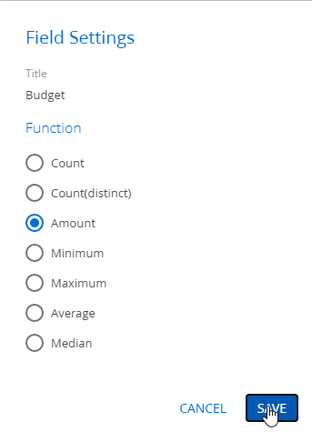
-
Click Save to apply the settings.
This will add a pivot table to your dashboard. You can change the grouping of rows, columns and values if necessary. To do this, drag&drop the columns to the relevant blocks with the mouse. Creatio will restructure the table automatically.
Click to display a “List” tile instead of a pivot table, remove the columns from the Group rows, Group columns and Measures blocks on the Pivot table settings tab.
Set up formula calculations
The pivot tables support calculated fields: columns that use formulas for automatic calculation. For example, this field can calculate a salesperson's bonus money based on the contract amount or the no tax product price. Learn more: Formulas in business logic and pivot tables.
You need to calculate a salesperson's bonus per account. The bonus is 10% of the opportunity amount.
To do this:
-
Follow steps 1–3 from the Pivot table setup procedure block to set up a pivot table by owners and accounts.
-
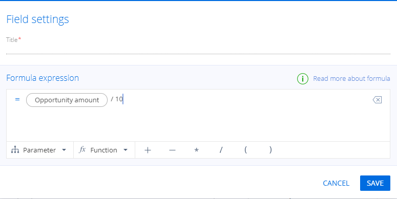
Click Add calculated field (Fig. 26) to add a calculated field that will calculate the bonus.
This will open the formula setup window. The formula can use numerical constants, the table's numerical fields (parameters) and mathematical operators.
Fig. 26 Adding calculated field 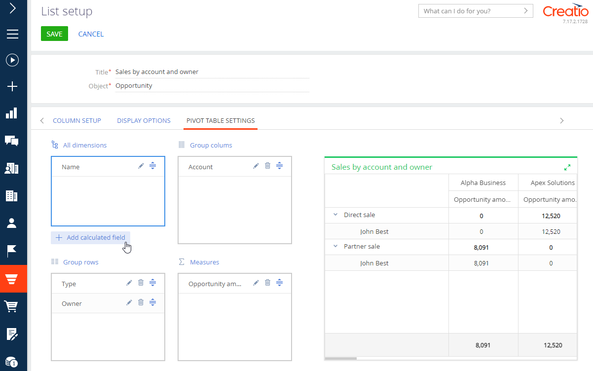
-
You can use any numerical parameter from the pivot table in the formula setup window. For example, select the “Opportunity amount” parameter.
-
Use the mathematical operator panel and the keyboard to create a bonus-calculating formula (Fig. 27).
-
Click Save. This will add a new column to the All dimensions block.
-
Drag&drop the column to the Measures block.
This will add the calculated field to the pivot table.
Keep in mind that formulas have the following limitations:
- You cannot add a formula with only a single column, i. e. with only a numerical parameter.
- You cannot only use a fractional number as a numerical constant. Add mathematical operations or numerical parameters.
- The numbers in the formula can contain up to 13 digits.
Learn more about working with formulas in the Formulas in business logic and pivot tables article.
Set up widget
The “Widget” dashboard tile displays custom data visualization modules. For example, currency exchange rate widgets. Use these modules to display pivot information and analyze your Creatio sections' static data.
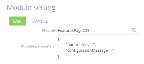
You can specify the following on the widget setup page (Fig. 28):
- Module – the custom data visualization module the tile will use.
- Module parameters – the parameters for further visual customization.
Widgets are added and set up by developers. Learn more: Dashboard widgets (developer documentation).
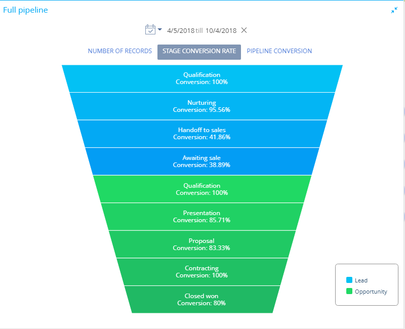
Set up full pipeline
The “Full pipeline” dashboard tile displays the complete sales life cycle by stage, from lead registration to the closed opportunity (Fig. 29).
Learn more: Analyze pipeline.
Full pipeline setup procedure
You can customize the full pipeline's parameters on the setup page.
-
Fill out the Title field with the desired title.
-
Specify the filtering conditions in the How to filter leads? field group:
For example, you can display the conversion dynamics only for leads registered on a specific landing page or for leads with a specific customer need.
-
Specify the filtering conditions in the How to filter opportunities? field group:
For instance, you can display the conversion dynamics only for leads handed off to sales and with orders.
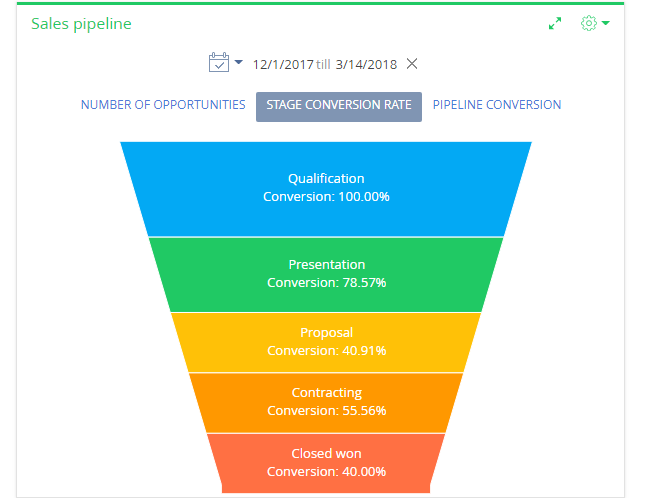
Set up sales pipeline
The “Sales pipeline” dashboard tile displays the opportunity dynamics by stage (Fig. 30).
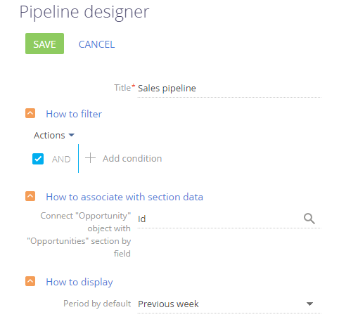
Sales pipeline setup procedure
You can customize the full pipeline's parameters on the setup page (Fig. 31).
-
Fill out the Title field with the desired title. This is a required field.
-
Specify the filtering conditions in the How to filter field group:
For example, you can display the dynamics of a particular owner's opportunities. The sales pipeline does not include opportunities with the following statuses: Closed lost, Closed rejected and Closed rerouted.
-
Fill out the fields in the How to associate with section data field group:
Connect … object with … section by field – fill out the field if you need to apply the filters set in the section itself to the chart data.
noteCreatio generates a sales pipeline based on the Opportunity object's stage field.
If you leave this field empty, the sales pipelines will ignore the section filters.
This field is not available when setting up sales pipelines in the Dashboards section.
-
Fill out the fields in the How to display field group:
Period by default – the filtering period to be used in the pipeline's quick filter by default. For instance, “Current month.”
noteLearn more about the quick filter in the Filters article.
Set up web page
The “Web page” dashboard tile displays web pages on the dashboard. For example, you can display a search engine page, an online currency converter or your corporate web site.
Web page setup procedure
Use the Web page designer to customize the tile. You can open the designer after adding a new “Web page” tile to the dashboard page or by editing an existing tile.
To set up the tile:
-
Specify the dashboard tile's title in the Title field.
-
Fill out the Page URL field with the relevant web page's URL. The link must include the data transfer protocol type (“HTTP,” “HTTPS”).
If your Creatio application is served over the secure data transfer protocol (“HTTPS”), the link must contain the HTTPS scheme as well. Pages served over HTTP will not display on Creatio sites served over HTTPS.
If your Creatio application is served over HTTP, you can add pages served over both HTTP and HTTPS.
noteTo add a YouTube video to the dashboard, use the link specified in the Embed tab that opens when you click the Share button on the video's page.
-
You can add CSS code to the Styles field to customize the dashboard tile border's width or color. Keep in mind that this field only supports CSS, HTML styles will not work. For instance, if you add the following code:
border-width: medium; border-color: red; border-style: solid, – the border will have an average width and it will be colored red.noteIf you cannot see the web page on the dashboard after setting the tile up, the site owner may have disallowed to display that page in third-party iframes. Some sites enable these restrictions as a part of their security policy. You can check for these restrictions in the browser console. You can open it by pressing F12 in most browsers. The display in third-party iframes is restricted if the console displays the following errors: X-Frame-Options: DENY or X-Frame-Options: SAMEORIGIN.
See also
Add analytics to a record page