Add analytics to a record page
You can configure displaying of dashboard tiles on any record page tab or in the record profile. The following types of dashboards are available on record pages:
The analytics can be added on the section record page using the section wizard or detail wizard.
The settings of dashboard tiles on record pages are similar to those of the corresponding regular tiles You can find more information about the setup in tile descriptions.
Create a chart that would display dynamics of communications with the customer on the History tab of the contact page.
-
In the View menu of the contact page, select the Open section wizard action.
-
Open the page designer by clicking the Page button on the wizard navigation panel (Fig. 1).
Fig. 1 Page designer 
-
Click the History tab (the one that will display the diagram) on the right side of the wizard panel (Fig. 2).
Fig. 2 Switching to the History tab 
-
Add a new field group, which will contain the diagram by clicking the New filed group button at the bottom of the page. Locate the field group at the top of the History tab page.
noteIf you need to add analytics on a page detail, use the detail wizard instead of the section wizard.
-
Expand the "Add widget" block and select a dashboard tile. In this case, it is the "Chart" tile. Drag it on the tab (Fig. 3). Areas, where you can add the chart, will be highlighted in blue.
Fig. 3 Adding a chart on the contact page 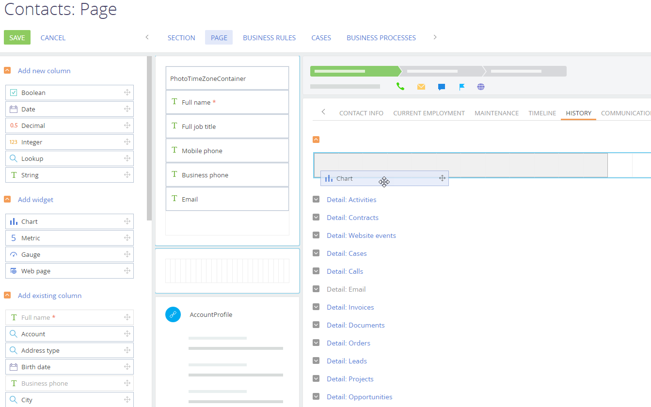
-
On the opened setup page (Fig. 4), specify parameters for the chart with two series that would display the number of calls and emails of the contact for the current month. Set the parameters as follows:
-
Title – "Calls and emails for the current month."
-
Object – for the first series, it is the "Call" object, and for the second series, it is the "Activity" object.
-
Function – "Count."
-
Chart type – "Line."
-
Grouping by the "End date" column for calls and the "Due" column for activities.
-
Configure filters. Specify the "End date = Current month" for calls. Specify two conditions for activities: "Type = Email" and "Due = Current month."
-
Associate the object with the section by the "Id" column of the "Contact" object.
-
Save your settings.
Fig. 4 Setting up the Calls and emails for the current month chart 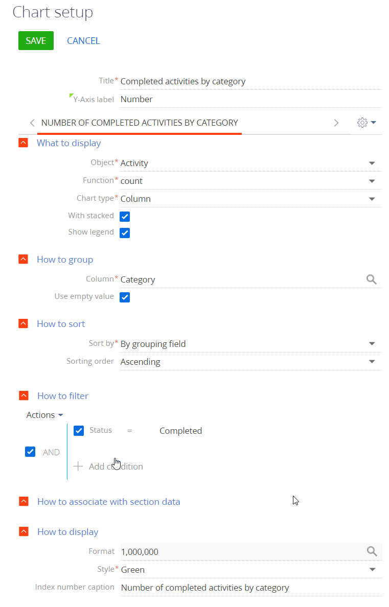
More information about the "Chart" dashboard configuration is available in the Set up dashboards article.
-
-
For correct displaying of the data, adjust the size of the chart (Fig. 5).
Fig. 5 Resizing the chart 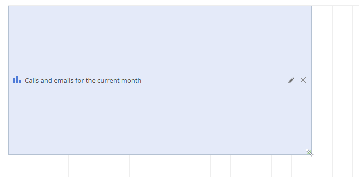
As a result, the chart showing the dynamics of communications with the contact for the current month will be displayed on the contact page (Fig. 6).
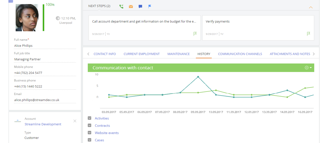
You can display the data used for building the chart as a list. Read more >>>