


The “List” dashboard component (Fig. 1) displays system information as a list with the specified number of records.
Fig. 1 The “List” dashboard tile
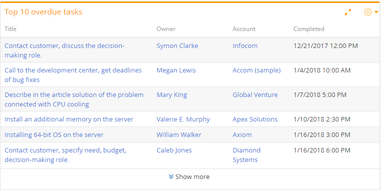
The list displays records of a particular object with custom filter and sorting settings.
Values of lookup columns that display records from Creatio sections are displayed as links to the corresponding records. For example, a primary column for the “Activity” object is the [Title] column. Thus, activity titles will be displayed as links to the corresponding activity pages.
Note
The column titles in the “List” dashboard tile correspond to Creatio column titles.
To manage how the data are viewed, use the toolbar buttons located at the top-right of the dashboard tile.
-
 – opens dashboard tile menu. You can export the dashboard tile list to Excel via the [Export to Excel] menu command. The [Show as multi-line text] or [Sow as single line text] menu commands enable you to set up the text display mode on the list dashboard tile.
 -
 – opens the dashboard tile in the full screen mode. Click the button again to go back to original size.
Note
You can also close a maximized dashboard by pressing the Essc key on the keyboard.
-
The [Show more] link enables viewing all the available data if their number exceeds the number displayed on the dashboard tile.
Note
By default, the “List” contains the number of records that was specified in the [Number of records] field on the [Display options] tab of the “List” dashboard setup page. Clicking the “Show more” link will expand the dashboard tile to your entire browser window and automatically load additional records to the list.
Setting up the “List” dashboard tile
A list setup page will open when you add or edit a list on a dashboard. You can set up the primary list parameters here – data, title, filters and display conditions. Populate the [Title] and [Object] fields at the top of the page.
[Title] – the name that will be displayed on the dashboard for this tile.
[Object] – Creatio object whose records are displayed in the list.
On the [Column setup] tab, set up the columns that will be displayed on the tile. List setup is described in a separate chapter.
Note
Column setup area is only available if the [Object] field is populated.
Set up the data display conditions on the [Display options] tab.
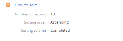
How to sort
[Number of records] – the number of records that will be displayed in the list (Fig. 2).
[Sorting order] – the order in which the values are displayed in the list by the column selected in the [Sorting column] field.
[Sorting column] – the column used for sorting records in the list. You can select columns added on the list column setup page.
Fig. 2 Example of the [How to sort] field group setup in the “Top 10 overdue tasks”
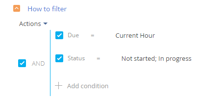
How to filter
Use standard filter to select the records that will be displayed in the list. For example, to display the overdue activities, set up the “Due < Current hour” and “Status=Not started; In progress” filters (Fig. 3).
Fig. 3 Example of the [How to filter] field group setup in the “Top 10 overdue tasks”
The filter is only available if the [Object] field is populated.
Note
You can find more information about the advanced filter in a separate article.
How to associate with section data
[Connect ... object with ... section by field] – populate the field if you want to display the records connected to the currently displayed section records. If you leave this field empty, the filters applied in the section will not affect the records in the “list” dashboard. The field is displayed if the [Object] field is populated and is not available in the [Dashboards] section.
More information about connecting the dashboard records to the section records is available in a separate article. Read more >>>
How to display
[Style] – color of the dashboard tile title.
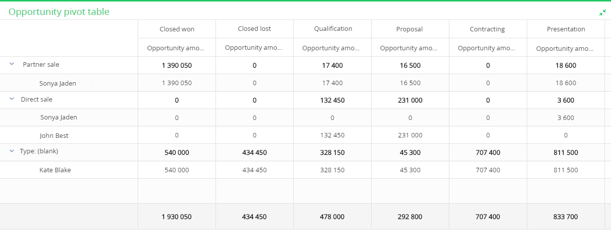
A pivot table (Fig. 4) is a view option provided for the dashboards of the “List” type. It displays data as a table with grouping fields in its rows and columns. The intersected cells display the calculated summary data. You can use the pivot tables to analyze sales by regions or employees.
Fig. 4 A “pivot table” dashboard tile view
Attention
The pivot tables only work in the current versions of Chrome, Firefox and Safari browsers.
Set up a “pivot table” dashboard tile view
Example
Calculate the summary budgets of direct and partner sales by owners and accounts.
To calculate the summary budgets:
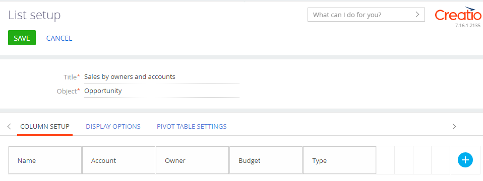
1.Set a “list” dashboard and specify all columns, whose values you need to display on the [Column setup] tab. In our example, these are the following columns:. [Type]; [Owner]; [Account]; [Budget] (Fig. 5). Learn more about working with lists in the “Setting up the “List” dashboard tile” block.
Fig. 5 Setting up list columns
2.Click the [Pivot table settings] tab and drag the needed columns from the [All dimensions] block to the corresponding blocks (Fig. 1).
Fig. 6 Setting up a pivot table
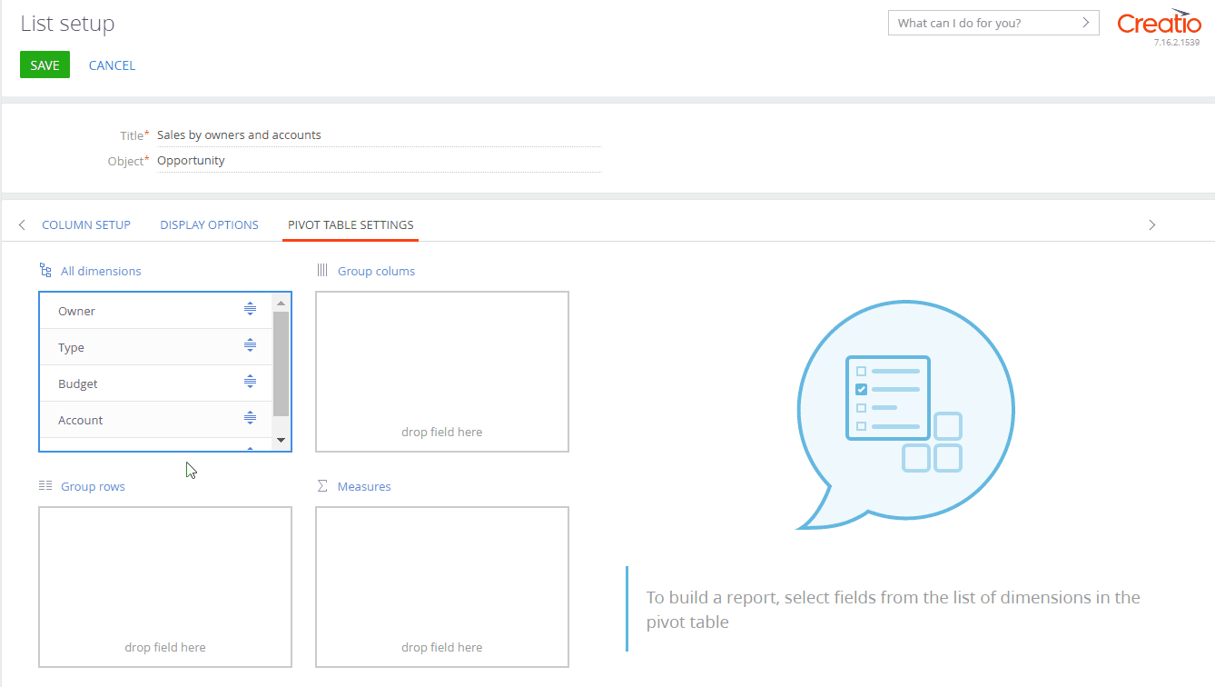
a.The [Group rows] block enables grouping the columns in pivot table rows. The higher the column is placed in the block, the higher the grouping level. To change the level of grouping, drag the column to the needed place in the block. In our example, drag the [Type] and [Owner] columns to the [Group rows] block.
Note
You can set up a pivot table with an unlimited number of rows, however, only 10 000 rows can be displayed at a time. To see all the rows, restructure the table by deleting some of the levels that are less important.
b.The [Group columns] block enables grouping by columns in a pivot table. The higher the column is placed in the block, the higher the grouping level. To change the level of grouping, drag the column to the needed place in the block. In our example, drag the [Account] column to this block.
Note
The pivot table can display no more than 250 columns at a time. If your table contains more columns, try changing the display format to include fewer levels or set a filter condition.
c.The [Measures] block enables calculating the amount or the number of values by column. By default, Creatio calculates the amount for numeric columns and the number for other column types.
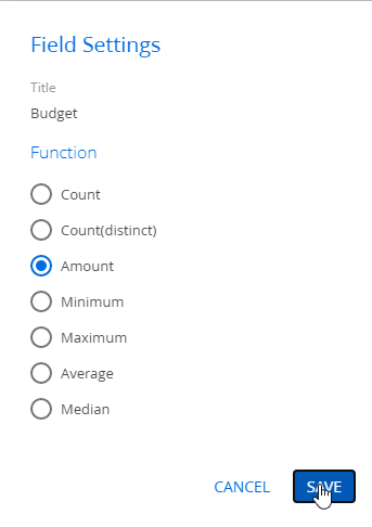
To change the value calculation function, click  for the needed column. As a result, a window for selecting the calculation function will open (Fig. 7). Select the function and click [Save]. In our example, drag the [Budget] column to this block and set its calculation function to “Amount”.
Fig. 7 Setting up the calculation function of a column
Note
Drag&drop a column to move it to another block. You can also delete the column by clicking  and drag it back to the needed block from the [All dimensions] block.
3.Click [Save].
As a result, a pivot table will display. You will be able to change the grouping of rows, columns and values if needed. Drag the columns to the needed blocks using the mouse, the table will restructure automatically.
Note
To display a “List” dashboard in the regular view instead of the pivot table view, delete the column names from the [Group rows], [Group columns], and [Measures] blocks on the [Pivot table settings] tab by clicking  .
.
See also
•The “Sales pipeline” dashboard tile