Work with record pages
All information about a record is available on its page. Information can be displayed as fields, inputs, lists, charts, or specialized Freedom UI components.
Fields and inputs store specific values in various formats and enable data selection from drop-down menus or lookups.
Expansion panels organize components using collapsible sections. Learn more: Set up an Expansion panel layout element.
A list displays data in table format with configurable filters and columns that can be connected to other components. Learn more: Work with record lists.
A chart displays visual analytics and business metrics. Learn more: View analytics.
A typical record page consists of multiple areas that have structured details containing record data (Fig. 1). A record page can contain the following:
- General panel
- Toggle buttons
- Page tabs
- Tags
- Actions
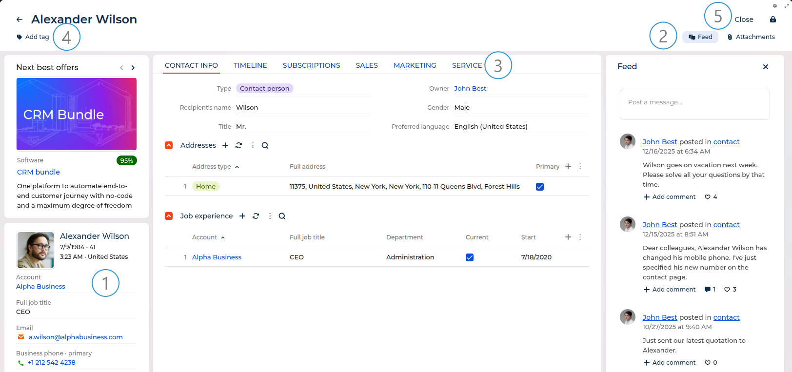
General panel (1)
The general panel displays the most important information about a record in the main sections of Creatio.
Toggle buttons (2)
The toggle buttons provide quick access to associated data, for example, connections, playbook, next steps, feed updates, and attachments. This panel is available on some pages and lets you manage communications and content related to the record without going away from the current view.
The Next steps button is available for sections that use DCM and provides access to a list of tasks that are scheduled automatically according to the case. Using the Next steps, you can do the following:
- Approve documents (orders, memos, etc.) directly from the next steps
- Work with the record while communicating with customers
- Follow opportunity history and lead registration data
- Create tasks
- Create emails
- Add new steps
The next steps can contain other case elements, such as user conversations and other pages that the case is supposed to open.
The Feed button opens a panel that displays user-published messages related to the record.
The Attachments button opens a panel that displays uploaded content related to the record.
Page tabs (3)
Detailed information about the record is displayed on separate tabs. For example, the History tab contains the history of activities, calls, messages, and information about connected records.
Tags (4)
Tags help you manually segment records for easier organization and filtering. You can assign tags to individual records directly from the record page by clicking the Add tag button on the toolbar. Tags can be one of the following types:
- Personal tags: visible only to you
- Corporate tags: visible to all employees
- Public tags: visible to employees and external users
Each record can have multiple tags at a single time, and you can search and filter records by tags using folders and filters. Learn more: Work with tags.
Actions (5)
The component group contains buttons that perform actions with the record. The following actions are available:
- You can save data, cancel changes, or close the page.
- The Actions menu lets you set access rights and subscribe to updates for a selected record. With the help of the action menu, you can also perform other tasks that depend on the section, for example, update a contact using social network data, create an order based on opportunity, or set up access rights.
- The
 button opens the Freedom UI Designer if you have permissions to use it.
 - The
 button expands the record to fill the available browser window space.
Certain sections can contain additional actions, for example, running a business process.