Application UI provides a way for users to interact with your Creatio application. It is a set of pages and boxes that have various controls. Users can interact with controls, for example, using a keyboard and mouse. You can create and set up custom UIs of any structure and place elements anywhere on the canvas. For example, set up tabs that display analytics in the section list.
The UI Designer is a WYSIWYG editor that lets you create and set up mobile responsive appearance of apps. The pages are set up in a new UI framework, which lets you modify the element appearance, manage data sources, and place page components arbitrarily.
You can use the UI Designer to customize lists and pages of any structure. Use no-code tools to work in the UI Designer. UI creation involves structuring the page with tabs, areas, columns. Depending on the information you want to display on the page, you can also set up charts, add fields, data sources, buttons, and other components.
To begin the setup, click  in the top right of an open application page → Set up page.
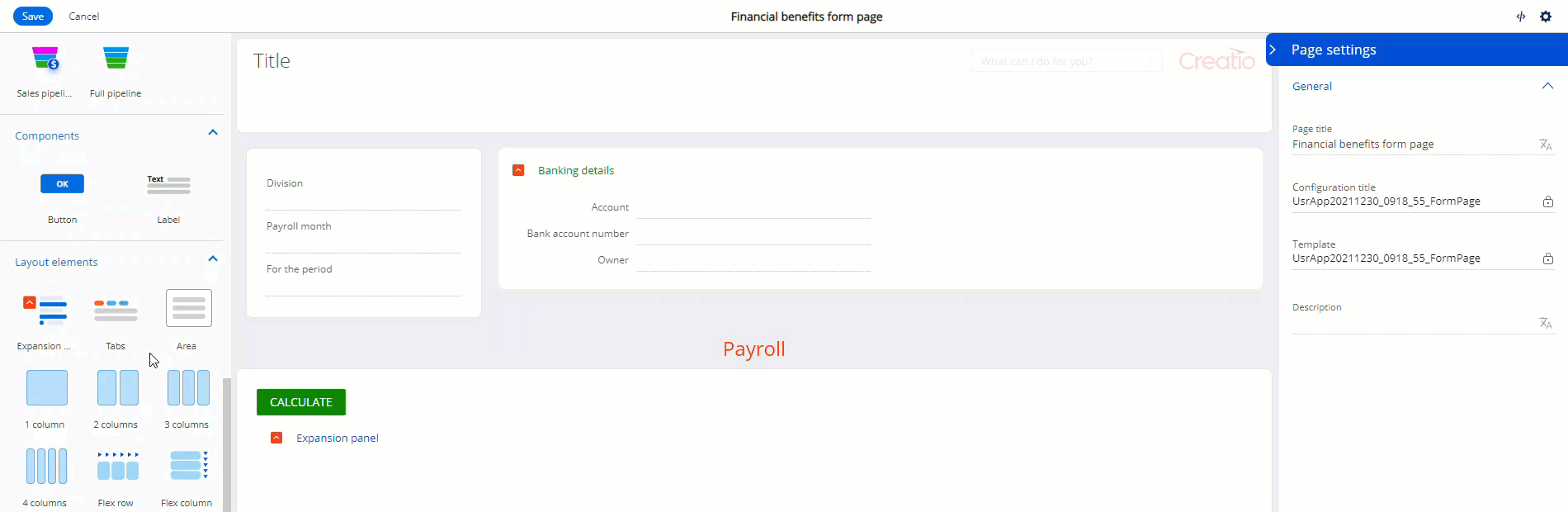
This opens the UI Designer (Fig. 1).
Element library (1). Component library contains the tools required to set up a custom UI.
Action panel (2). Use the action panel to save the page design, cancel the changes, open the source code, display page settings.
Canvas (3). The working area of the UI Designer. Drag elements from the library to the canvas to set up the page structure (Fig. 2).
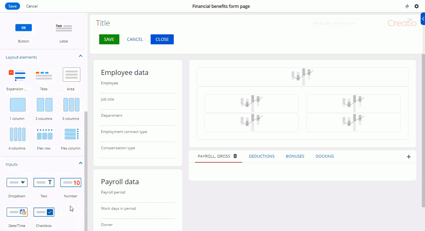
Setup area (4). Use the setup area to manage the properties of visual components, the behavior of buttons, expansion panels, charts, etc. Learn more about the settings in the description of each element. To open the setup area, double-click the relevant element or select the element on the canvas and click  .
.
UI Designer elements
Create UIs in the UI Designer using page elements: fields, charts, buttons, text, and their various combinations.
View the elements of the UI Designer in the table below:
|
Element types |
Description |
|---|---|
| Layout elements |
Elements that structure the page: expansion panels, tabs, areas, columns. |
| Data | Elements that display the fields of the current object. The fields of the current object cannot be deleted. |
| Inputs |
Elements that display data and let you enter data. The following field types are available: text, number, dropdown, date/time, checkbox. |
| Components |
Elements that execute target page actions and solve a number of other problems: button, label. |
| Charts |
Elements that visualize statistics. The following chart types are available: spline, line, bar, doughnut, area, column, scatter, pipeline, metric, sales pipeline, full pipeline. |
Layout elements
Expansion panel
Use the Expansion panel layout element to add page elements grouped by certain criteria (Fig. 3).
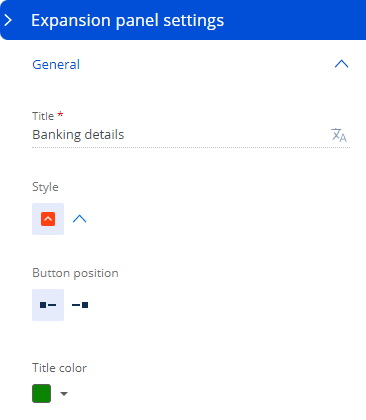
Manage the expansion panel style in the setup area: color, fonts, etc. To do this, fill out the following parameters:
- Specify the element title to display on the section page in the Title field. The field is required.
- Specify the style of the expansion panel title in the Style field:
 or
or  .
. - Select whether to display the button that expands/collapses the element to the left or the right of the title in the Button position field.
- Select the color of the expansion panel title in the Title color field (Fig. 4).
You can attach any elements available in the UI Designer to the expansion panel.
Tabs
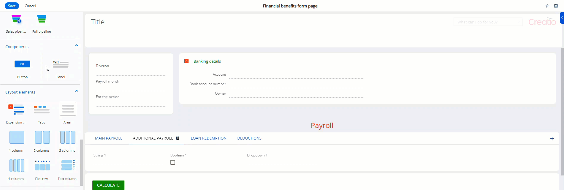
Use the Tabs layout element to add a tab area to the page. The area lets you display content in several thematic or structural groups.
The element lets you structure individual information blocks on the page by placing them on different tabs. That way, you can publish more required information without overcrowding the page.
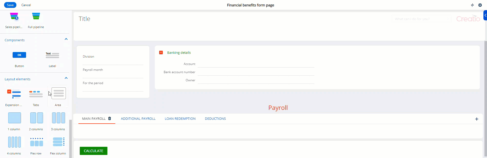
You can reorder tabs and attach any elements available in the UI Designer to tabs, including other tabs. (Fig. 5).
To add a new tab, click  in the top right of the tab area.
To delete a tab, click  to the right of its title.
To edit the tab name, double-click the current title and enter a new title.
Area
Area layout element is a container that has a layout. Use the element to add page blocks that group any combination of other elements. For example, fields, charts, buttons, and other areas. Areas let you divide the page visiually into multiple sections. An area can contain various content elements.
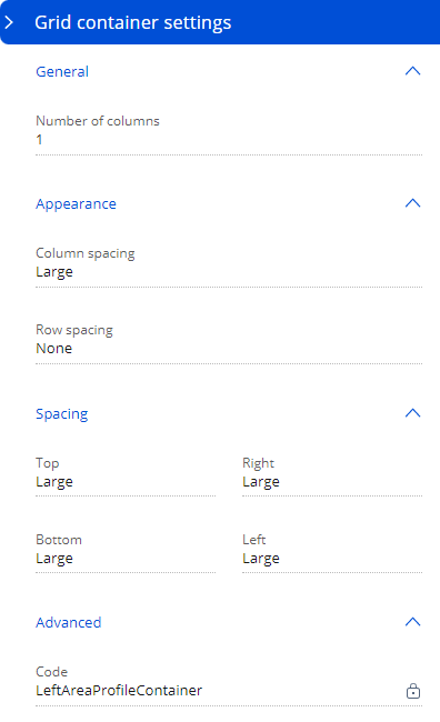
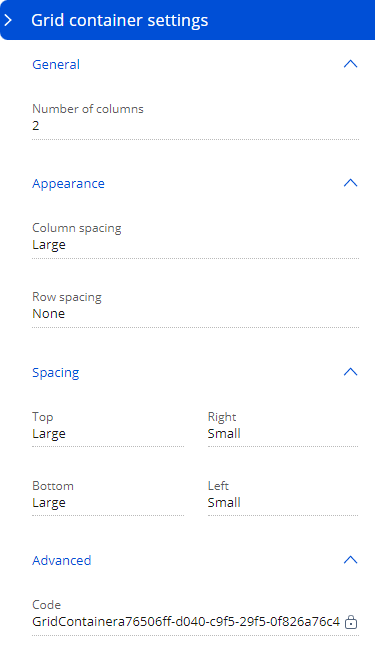
Set the area display parameters in the setup area (Fig. 7):
- Specify into how many columns to divide the block in the Number of columns field. The setting determines the number of columns to place other elements.
- Select the distance between columns in the Column spacing field.
- Select the distance between rows in the Row spacing field.
- Set the internal margins in the Spacing group.
Columns
Columns (grid) layout element lets you change layout parameters for areas, expansion panels, or tabs flexibly. The section can include up to four columns that have set spacing. Columns can arrange page content vertically. If the design requires it, you can use a different number of columns in different page areas.
Set the column display parameters in the setup area (Fig. 7):
- Specify into how many columns to divide the block in the Number of columns field. The setting determines the number of columns to place other elements.
- Select the distance between columns in the Column spacing field.
- Select the distance between rows in the Row spacing field.
- Set the internal margins in the Spacing group.
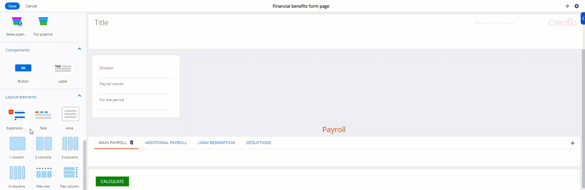
Flex container
Use flex containers to group elements in a certain direction without binding the elements to a fixed layout. For example, flex containers are a convenient option for button placement (Fig. 9).
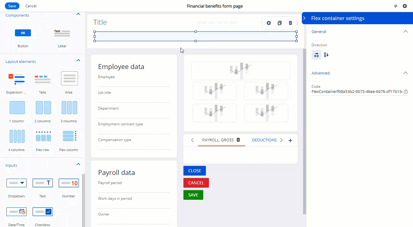
The UI designer includes the following flex container types:
-
Flex row. Lets you place elements horizontally. For example, buttons.
-
Flex column. Lets you place as many elements as needed vertically.
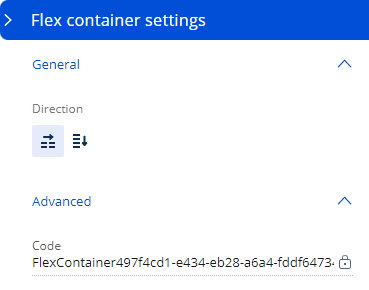
To transform a flex row into a flex column and vice versa, click the corresponding buttons in the Direction block of the setup area (Fig. 10).
Data elements
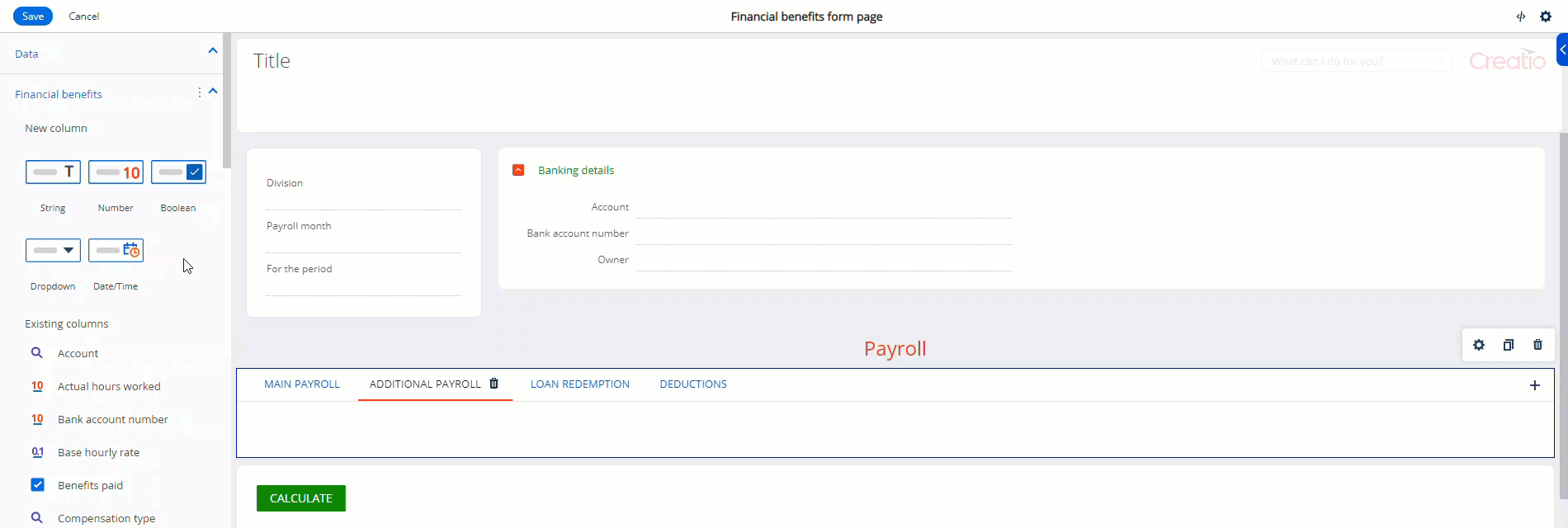
Manage object columns
Use Data layout element to display data on the page or manage input fields. You can create new attributes in the data source or use existing fields. The area is split in two parts: new columns and existing columns.
To add existing fields to the page, drag them from the Data area to the relevant part of the canvas.
Creatio specifies the data source automatically.
Fields
Use the Fields layout element to display data and enable users to enter data.
Creatio adds a new column to the data source after you add a new field to the app page and save the changes.
You can add the following fields types to the page in the UI Designer (Fig. 11):
- String. Enables users to enter letters, digits, and other characters.
- Number. Enables users to enter integers or fractions.
- Dropdown. Enables users to select values from a set list of options stored in a lookup or other data source.
- Date/Time. Enables users to select date and/or time, depending on the selected format.
- Boolean. Enables users to select either of the two values: “True” or “False.” “True” value is a selected checkbox.
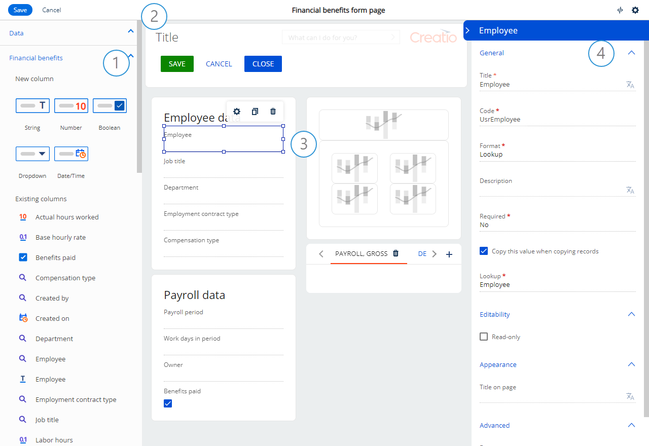
The UI designer supports various properties that provide flexible field setup options. For example, requirement flag, read-only mode, multi-line mode, etc. Set these properties in the field setup area (Fig. 12):
- Select the Read-only checkbox in the Editability group to make the field non-editable.
- Enter the title the users will see on the app page in the Title on page field in the Appearance group.
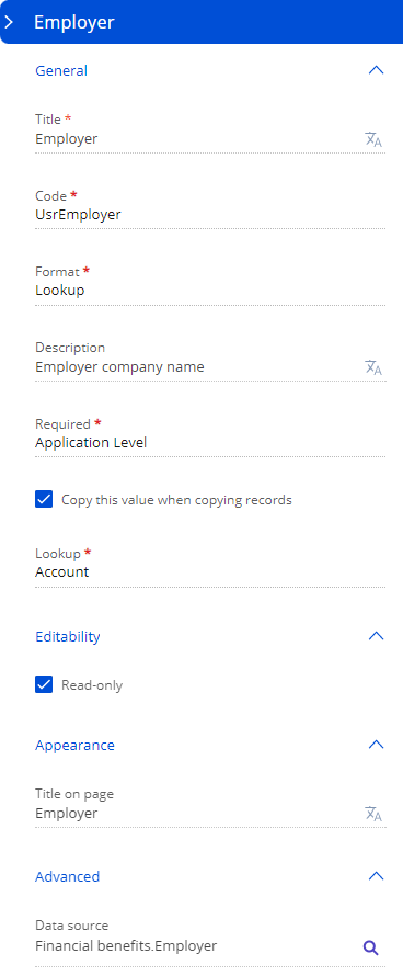
- Specify the data source from which to populate the field in the Data source field in the Advanced group. Once you do this, Creatio will bring up the General group and populate the following fields automatically:
- Title. Displays the field name the users will see. For example, “Employer.” The field is required.
- Code. Displays the unique name Creatio will use to create an object column. For example, the code for the Employer field can be “UsrEmployer.” The code can only contain alphanumeric characters. The field becomes locked after you save the changes or switch to editing the section page.
- Format. Sets the display format of text, numbers, dates, and time values. The field is required.
- Description. Displays additional information about the field.
- Required. Flags the field as required on the app page. The field is required.
- Lookup. Specifies the object from which the app requests available field options. The field is required.
- Copy this value when copying records. Enables copying the field data when copying the record.
Components
Button
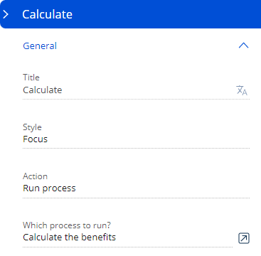
Use the Button layout element to execute a page action. For example, save the changes or run a process.
Set display and operation parameters of a button in the setup area (Fig. 13):
- Enter the button caption in the Title field.
-
Select the button fill color in the Style field. This lets you color code the intended function of a button.
-
Specify the action to execute when the user clicks the button in the Action field: save the record, close the page, cancel the changes, or run a process.
-
Select an existing process in the Which process to run? field or set up a new process. The field appears if you specify “Run process” in the Action field.
If the selected process uses parameters, How to run the process? field appears. To run the process for the selected page, specify the process parameter in which to pass the ID of the current record in the additional field that appears.
Label
Use the Label layout element to add arbitrary text to the page, as well as create individual headings for element groups (Fig. 14).
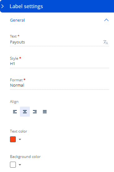
Edit label text and alignment, font style and format, as well as select text and background color in the element setup area (Fig. 15):
- Enter the label text to display on the app page in the Text field. The field is required.
- Select the label style to display on the app page in the Style field. For example, “H1.” The field is required.
- Select the font format in the Format field. For example, “Semibold.” The field is required.
- Select the text alignment option in the Align field: left, center, right, justify.
- Select the text color in the Text color field.
- Select the label background color in the Background color field.
Charts
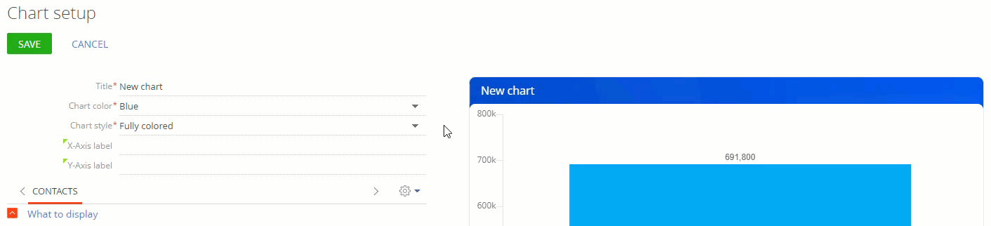
Chart setup in the UI Designer is mostly similar to analytics setup in the Dashboard section of the main Creatio application. However, charts in the UI designer have some unique features:
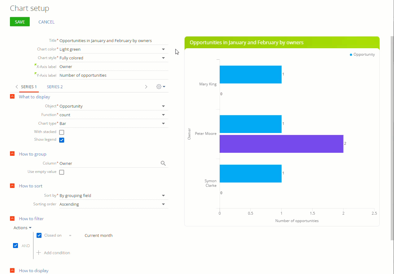
- For charts with multiple series, you can customize the header color and series color separately. Use the Chart color and Style fields to do this, respectively (Fig. 16).
Fig. 16 Setting up a chart with several series
- You can select from several fill options in the Chart style field for “Metric” and “Chart” dashboard headings (Fig. 17).
Fig. 17 Setting up the chart header style
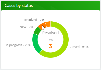
- The “Pie chart” type is replaced with the “Doughnut chart” type. Set up this chart similarly to the pie chart (Fig. 18).
Fig. 18 A doughnut chart