Implement a custom Freedom UI component using coding agent
This functionality is available for Creatio 8.3.4 and later.
Add a custom Rating component to the contact page. The component must be used to rate contacts directly on the contact page.
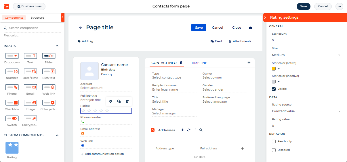
The component must have its own setup area to configure the following parameters directly in the Freedom UI Designer:
- Star count — the maximum number of stars to display. Out of the box, the value is set to "5."
- Size — the component size. Available values: "Small," "Medium," "Large." Out of the box, the value is set to "Medium."
- Star color (active) — the color of filled stars. Out of the box, the value is set to "#FFC107."
- Star color (inactive) — the color of unfilled stars. Out of the box, the value is set to "#D1D5DB."
- Visible — whether to display the component. Out of the box, the checkbox is selected.
- Rating source — the source of the rating value. Available values: "Constant," "Data source."
- Rating value — the constant rating value to display when Rating source is set to "Constant." Out of the box, the value is set to "0."
- Data source — the name of the object that reflects rating.
- Data source attribute — the name of the object column that stores rating value.
- Read-only — display the rating value without allowing the user to change it. Out of the box, the checkbox is cleared.
- Disabled — prevent the user from interacting with the component. Out of the box, the checkbox is cleared.
Implement the component and its setup area using Claude Code. Both components must be based on a remote module created in the Angular framework.
1. Create an Angular project
To create an Angular project, follow the instructions: Create an Angular project (developer documentation).
For this example:
<%projectName%>macro is set to "sdk_custom_component_ai."<%vendorPrefix%>macro is set to "usr."
As a result, the Angular project for developing a custom UI component using a remote module is created.
2. Install npm packages
To install npm packages, follow the instructions: Install npm packages.
As a result, required npm packages are installed.
3. Create a custom Freedom UI component
-
Open the Claude Code tab in the Visual Studio Code that has the Angular project open.
-
Describe the task to the coding agent. Make sure your coding agent and model are supported. Learn more: Supported agents and models.
For this example, use the following prompt. Make sure your prompt covers required functional blocks. Learn more: Create a custom Freedom UI component.
Create the "Rating" componentCreate a custom Rating component for Creatio Freedom UI using a remote module.Read AI_GUIDES from @creatio librariesBusiness purpose:Allow users to rate a record directly on a Freedom UI page using a star-based rating control.Component name:RatingUse prefix defined in project.Standalone component: NoRuntime behavior:Display a row of stars.The number of stars is controlled by Star count.The selected value is controlled by Rating value.When the user clicks a star, update the rating value.Filled stars must represent the selected value.Empty stars must represent unselected values.If Read-only is enabled, display the value but do not allow changes.If Disabled is enabled, prevent interaction and apply disabled visual styling.If Visible is disabled, do not render the component.Setup area component:Create a setup area for the component in Freedom UI Designer.Use prefix defined in project.Standalone component: NoSetup area title: "Rating settings"General settings:- Star count, default 5- Size: Small, Medium, Large; default Medium- Star color (active), default #FFC107- Star color (inactive), default #D1D5DB- Visible, default trueData settings:- Rating source (dropdown with two options: "Constant value" and "Data source")- If Rating source is Constant value:- Rating value, default 0- If Rating source is Data source:- Data source (required field, mark with a required indicator/red asterisk)- Data source attribute (required field, mark with a required indicator/red asterisk)- Rating value should be a view model attribute that takes its value from the data source using the specified data source attribute path. At runtime, the rating value comes from this view model attribute.Behavior settings:- Read-only, default false- Disabled, default falseValidation:Design-time validation:- Star count must be between 1 and 10.- Rating value must be between 0 and Star count.- When Rating source is Data source, mark Data source and Data source attribute as required fields individually (each shows its own required indicator/red asterisk instead of a combined error message).Runtime validation:- Clamp Rating value into the range 0..Star count.- Do not allow value changes when Read-only is enabled.- Do not allow value changes when Disabled is enabled.Accessibility:- The component must be keyboard reachable.- ArrowRight and ArrowUp increase the rating by 1.- ArrowLeft and ArrowDown decrease the rating by 1.- Home sets the rating to 0.- End sets the rating to Star count.- Add accessible labels for the control and current value.Styling:- Apply the default design-system style used across the platform for group titles (General / Data / Behavior):- uppercase text- bold font weight- dark navy/blue color (same as standard section headers, e.g. "GENERAL", "EDITABILITY")- collapse/expand chevron icon aligned to the right- horizontal divider line below the titleAfter implementation:- build the project;- fix build errors;
As a result, the corresponding component files are generated in the project.
4. Add the custom Freedom UI component to the Freedom UI Designer
To add the custom Freedom UI component to the Freedom UI Designer, describe the task to the coding agent.
For this example, use the following prompt.
Register the Rating component in the Freedom UI Designer component library.

Read AI_GUIDES from @creatio libraries

Use the existing remote module project.

Requirements:
- Use the Creatio Designer integration APIs available in the project.
- Use @creatio/interface-designer where required.
- Caption: Rating
- Add an icon for the component.
- Setup area title: "Rating settings" (previously "Rating Properties").
- Apply the default design-system style to the group labels (General / Data / Behavior):
  uppercase, bold, dark navy color, collapsible with a chevron icon, divider line below — matching the standard style of other setup area sections (e.g. "GENERAL", "EDITABILITY").
- Add default values:
  - Rating value: 0
  - Star count: 5
  - Star color (active): #FFC107
  - Star color (inactive): #D1D5DB
  - Read-only: false
  - Disabled: false
  - Visible: true
  - Size: Medium

After implementation:
- build the project;
- fix build errors;
As a result, the Rating component registration is added to the project.
5. Build the project
To build the project, follow the instructions: Build the project.
As a result, the build is added to the "dist" directory of the Angular project. The build has the "sdk_custom_component_ai" name.
6. Upload the changes to Creatio
To upload the changes to Creatio, follow the instructions: Upload the changes to Creatio.
For this example, the environment is "10X."
As a result, the Rating component appears in the Freedom UI Designer element library, and no-code creators can add it to Freedom UI pages.
7. Add the custom Freedom UI component to the Freedom UI page
-
Open the Customer 360 app in the Application Designer.
-
Open the Contacts form page.
-
Add a label for the contact rating.
-
Drag the Label component to the canvas.
-
Fill out the component parameters.
Parameter
Value
Text
Rating
Style
Caption
Text color
#757575 Element code
UsrRatingLabel
-
-
Drag the Rating component to the canvas. Leave default values for component parameters.
-
Click Save.
As a result, the custom Rating component is configured directly in the Freedom UI Designer via a setup area. The setup area includes the parameters described in the example conditions.
Changes made in the setup area are reflected on the canvas immediately.
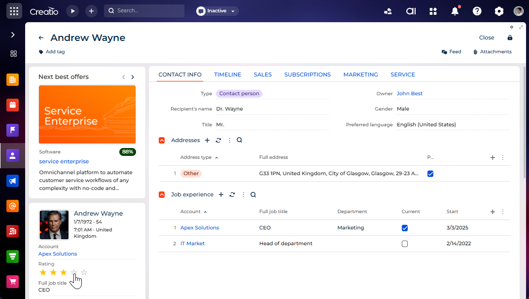
View the result
- Open the Contacts section.
- Open a contact that has an arbitrary name. For example, "Andrew Wayne."
As a result, Creatio displays the custom Rating component in the contact profile on the contact page. The component enables rating contacts. The component has its own setup area that is displayed in the Freedom UI Designer. Both the component and the setup area are implemented using Claude Code. The component is based on a remote module created in the Angular framework. View the result >>>
See also
Custom Freedom UI component implemented using remote module (developer documentation)
Custom Freedom UI component implemented using coding agents