View analytics
Use the Creatio analytics to work with static data. Visualize data using Freedom UI widgets. For example, you can track the current status of the employees' tasks, display various ratings, etc.
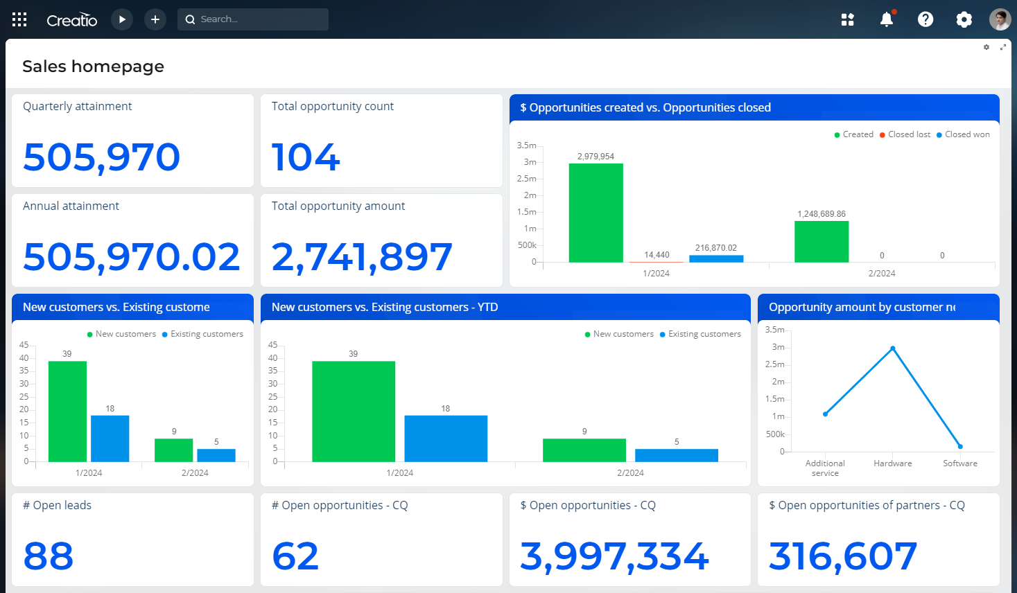
You can view analytics on any Freedom UI page that has Widget components added. Out of the box, Creatio also displays multiple widgets on homepages. These pages display the general record stats, for example, the number of active opportunities per sales rep.
Analytical data is visualized via special Widget components, each of which is a separate analytics widget.
Analyze chart
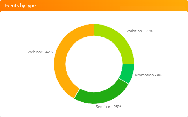
The Chart widget displays Creatio dynamics and percentages. For example, you can use a chart to display distribution of events by types (Fig. 2).
You can change the data display mode of an existing chart widget.
-
Diagram mode: spline, line, pie, etc. Read more >>>
-
List mode: record list used as a basis for building a chart. Read more >>>
Use the toolbar buttons at the top right of the widget to change the chart type or switch to the list mode.
-
 : chart menu.
 -
 : opens the widget in fullscreen mode. Click the button again to go back to original size. You can also close a maximized dashboard by pressing the Esc key on the keyboard.
You can drill down a chart element (for example, a doughnut chart section or a bar chart bar) and display its data as a separate chart or list. To do this, click the necessary chart element.
Changes of the chart view properties made by a user (for example, switching to a list view mode or changing the chart type) will not be saved when reloading the page. Creatio will only save the changes made in the list settings.
Learn more about working with charts: Set up widgets.
View the chart in the diagram mode
The diagram mode is the default mode of the Chart widgets.
In this mode, the button menu contains additional menu items:
-
Show data by series: switches the chart to the list view mode.
-
Change chart type: displays the information for building a chart using another chart type (Fig. 3).
Fig. 3 Select the chart type in the diagram mode 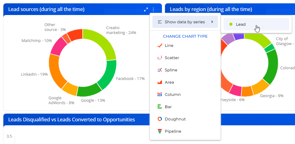
View the chart in the list mode
All charts except for “Pipeline” can be displayed as a list (Fig. 4).
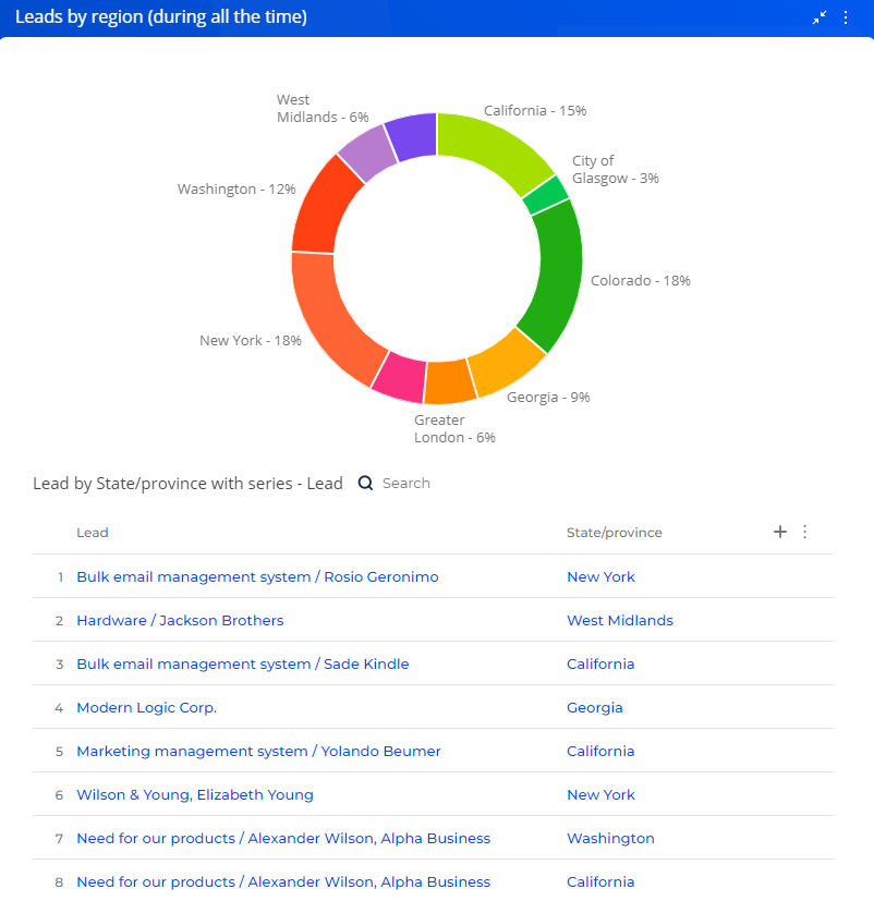
To switch to the list mode, use the Show data by series item from the menu or from the chart element menu.
-
To display all chart data in the list mode, click
→ Show data by series → select the needed series. -
To display data of a specific chart element (a section, column, or metric) in the list mode, click the element and select Display data in the menu that opens (Fig. 5).
Fig. 5 Switch to the list mode of the “Exhibition” element. 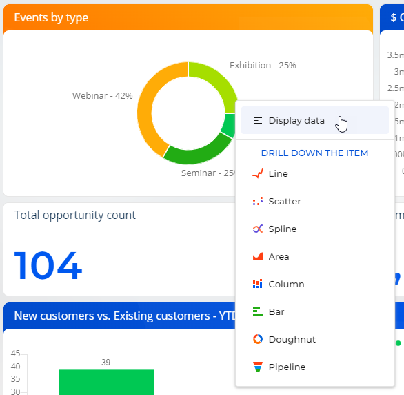
You can take the following steps in the list mode:
- Set up the columns.
- Sort data by the displayed columns.
- Export data to Excel.
To switch back to the chart mode, click  .
.
Drill down the chart
You can bring up additional information about any element of Spline, Line, Bar, Doughnut, Area, Column, and Scatter charts, such as a column, an area, or a segment. For example, when analyzing a Bar chart that displays employees by departments, you can drill down the R&D department and display the number of positions in the R&D department.
Any element of the new chart can be drilled down as well. For example, you can display how developers are grouped by their role in decision-making.
To drill down a chart element:
-
Click the needed chart element.
-
Select a chart type in the menu (Fig. 6). This opens a window.
Fig. 6 Chart menu. Change the chart view 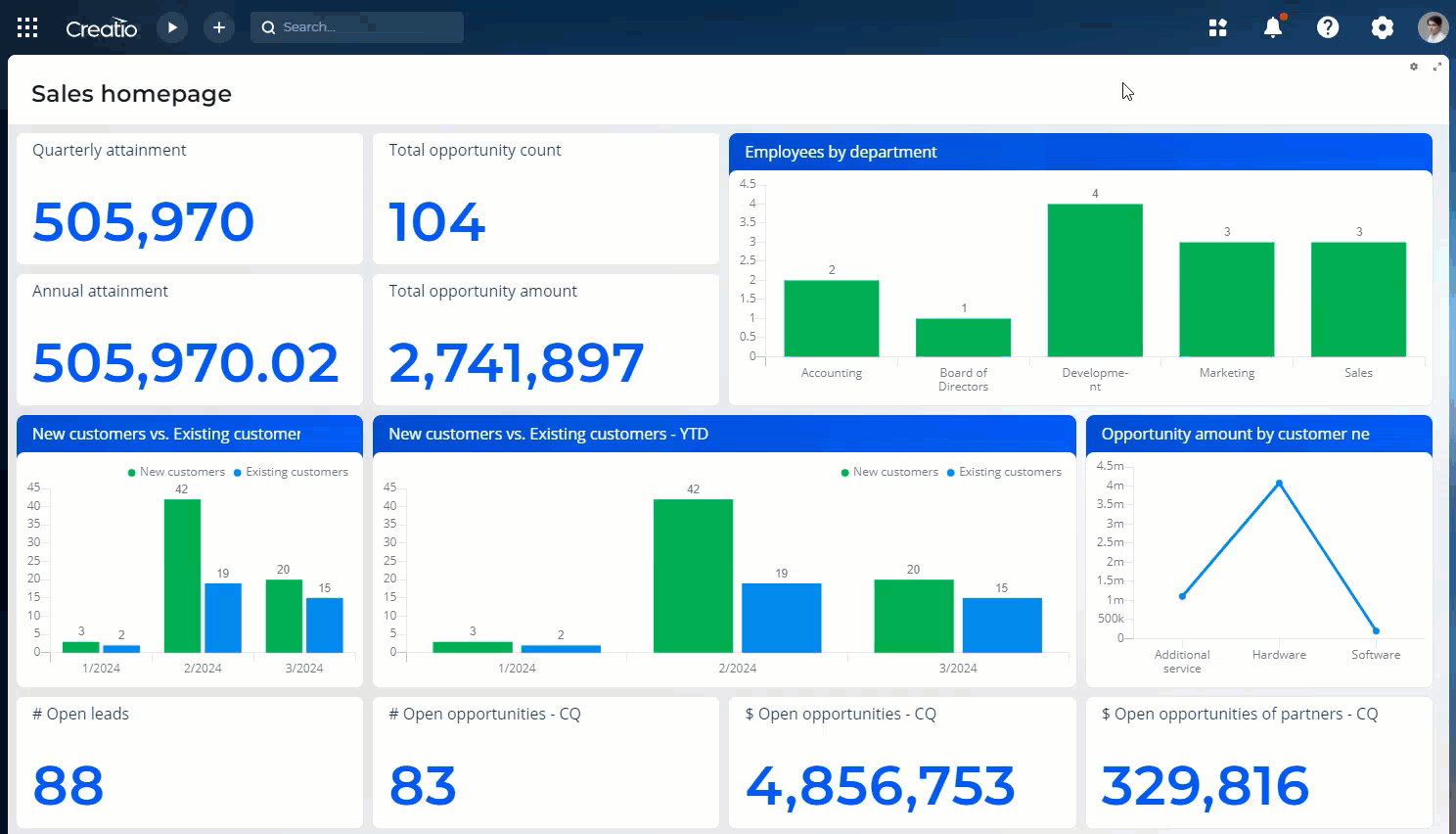
-
Specify the column to base the chart, for example, the “Job” column of the current object.
As a result, the widget will display how the employees of the R&D department are grouped by positions.
Click the
 button of the widget to return to the previous chart.
Analyze gauge
The “Gauge” chart (Fig. 7) displays a metric in relation to an arbitrary scale. For example, use this widget to display the number of meetings a sales rep conducted if the desired rate is known. You can also use it to monitor the balance between the planned and actual number of calls an agent is required to make per day.
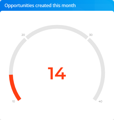
On the color scheme, three colored intervals display undesirable, satisfactory, and desirable levels of values. The color of the gauge value depends on the interval in which the current value is located.
Gauges can display the following data types:
- The total number of all or filtered records of a Creatio object, for example, the number of daily calls per sales rep.
- Minimum or maximum value of a numeric field, for example, minimum or maximum call duration.
- Sum or the average value of a numeric field, for example, the total amount of paid invoices.
Learn more about working with the gauge: Set up widgets.
Analyze pipeline
The “Sales pipeline” and “Full pipeline” widgets are available in the Sales Team Creatio and Sales Enterprise Creatio products. Learn more: Work with sales pipeline.
These widgets are not types of the “Pipeline” chart and are configured differently.
Analyze full pipeline
Use this widget to analyze sales dynamics by stage, from lead qualification to closure of the corresponding opportunity (Fig. 8).
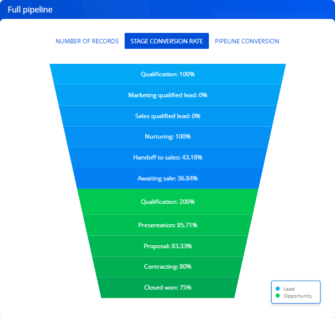
The height of pipeline slices corresponds to the number of leads and opportunities that are currently at the corresponding stage. You can configure the list of stages displayed on the widget in the Lead stage and the Opportunity stages lookups.
The full pipeline can display data in the following views:
-
Number of records. Displays how the leads and registered opportunities are grouped by stages.
For example, of all leads that were registered, only 150 reached the Sales qualified lead stage. Thus, the pipeline displays 150 leads at the Sales qualified lead stage.
-
Stage conversion rate. Displays the percentage of leads and opportunities that advanced to a higher stage.
For example, the Contracting stage includes 20 opportunities. If 10 out of these 20 opportunities advanced to a stage higher than the Contracting stage, the stage conversion rate is 50%.
-
Pipeline conversion. Displays the percentage of leads/opportunities at a certain stage relative to the total number of leads.
For example, 100 leads were registered, 5 out of these 100 leads reached the Closed won stage. Consequently, the Closed won stage conversion makes up 5% relative to the total number of registered leads.
Learn more about working with full pipelines: Set up widgets.
Analyze sales pipeline
The “Sales pipeline” chart is primarily designed to analyze sales dynamics by stage (Fig. 9).
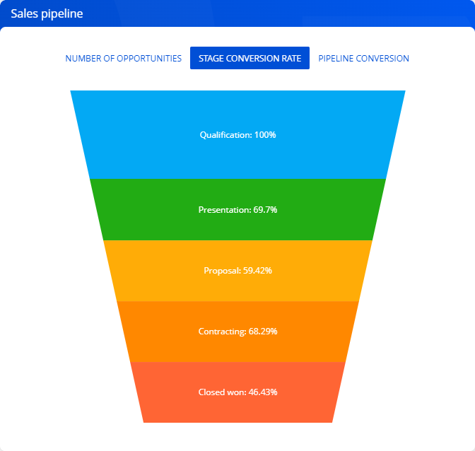
The height of pipeline slices corresponds to the number of current opportunities at the corresponding stage. You can configure the list of stages displayed on the widget in the Opportunity stages lookup. The pipeline does not take into account opportunities that have ”Closed lost,” ”Closed rejected,” and ”Closed rerouted” statuses.
The sales pipeline can display data in the following views:
-
Number of opportunities. Displays how the opportunities are grouped by stages.
For example, Proposal stage includes 15 opportunities. Thus, the pipeline displays 15 opportunities at this stage.
-
Stage conversion rate. Displays the percentage of opportunities that have moved from a stage to a higher stage.
For example, the Contracting stage includes 20 opportunities. If 10 out of these 20 opportunities moved to a higher stage than the Contracting stage, the Contracting stage conversion rate is 50%.
-
Pipeline conversion. Displays the percentage of opportunities at a certain stage relative to the total number of opportunities.
For example, 100 opportunities started and 55 of them passed the Presentation stage, so the conversion rate of the Presentation stage is 55%.
Learn more about working with sales pipelines: Set up widgets.
See also
Add analytics to a record page