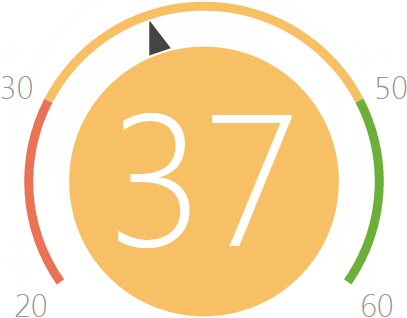
The “Gauge” dashboard component
The “Gauge” dashboard component (Fig. 12) displays the number returned as a result of a system query relative to the standard scale. For example, use this dashboard component to display the number of conducted meetings of a manager if the desired rate has been set up. You can also use it to monitor the balance between the planned and actual number of calls per agent in a day.
Fig. 12 The “Gauge” dashboard component
On the color schema, the red interval displays the minimum level of values, yellow – the satisfactory level and the green one displays the sufficient level. The color of the gauge circle depends on the interval that the current value is in.
Gauges can display the following data types:
The total number of either all or filtered records of a system object, for example, the number of conducted calls of an agent in a day.
Minimum or maximum value of a numeric field, for example, minimum or maximum call duration.
Sum or the average value of a numeric field, for example, the total amount of paid invoices, if your system allows you to manage invoices.
Gauge standard scale setup
Go to the [How to display] field group on the gauge designer page to set up the standard scale of the gauge.
1.In the [Style] field, specify the color of the gauge title
2.In the [Display order] field, select one of the following options: “The more the better“ to display, for example, the planned number of meetings, or “The less the better“ to display, for example, the average duration of a call.
The selected order will define how the standard intervals are located on the scale. If the first option is selected, the red interval will be displayed on the left. If the second display order is selected, the interval will be displayed on the right .
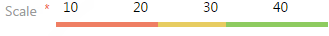
3.On the gauge scale (Fig. 13), specify:
a.The minimum value on the gauge, for example, a manager has to conduct at least 10 meetings per month;
b.The average value on the gauge, for example, 20-30 meetings.
c.The maximum value is 40.
Fig. 13 Setting up a gauge scale.
Once all fields on the [How to display] fields group are filled in, the color schema of the gauge will be displayed.
Note
Setting up the “Gauge“ dashboard component is similar to setting up the “Metric“ dashboard component” and is described in a separate chapter.