Requirements for icons of custom Freedom UI page components
In Creatio, you can expand the out-of-the-box set of Freedom UI page components with custom UI components. Learn more: Custom UI component based on a classic Creatio page element, Custom UI component implemented using remote module.
We recommend adding the custom UI component to the library of the Freedom UI Designer if you are going to use the component as part of no-code development. Make sure the icon of the custom UI component meets the requirements specified in this article. The exact list of requirements depends on the implemented UI component type. Learn more: Overview of Freedom UI Designer and its elements.
Requirements for icons of custom components and layout elements
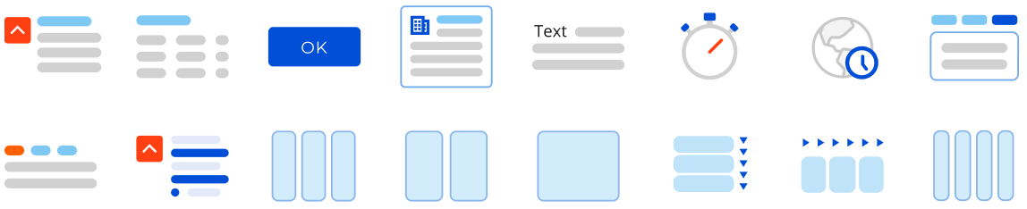
View example icons of out-of-the-box components and layout elements that meet the requirements below.
The icon structure is as follows.
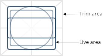
Make sure the icons of custom components and layout elements meet the following requirements:
-
Format: *.svg.
-
Style of a trim area: background must be transparent.
-
If needed, use #70ACEE to display a live area.
-
Other recommended colors: #004FD6, #E3E9F9, #80C8F5, #7FC8F4, #D1D1D1, #FF4013, #181818, #FFFFFF.
-
Size.
Trim area
72x64 pixels or larger proportionally
Live area
56x50 pixels
-
Recommended line width of a live area: 2.5 pixels. You can also use the base line width of 2 pixels.
-
Use a rectangle tool to display a row on the live area. Rectangle style: 5-6 pixels wide, rounded corners.
-
Font of the icon text: Open Sans regular, 10pt.
-
If needed, use lines 1 pixel wide to display a container on the icon.
-
The icon must visualize the functionality instead of displaying the component layout on the Freedom UI page. The exceptions are components that modify the page structure. For example, Toggle panel element, Tabs element, etc.
-
Radius of live area corners: 3 pixels.
-
Focus is on the center of the icon.
-
The icon detailing matches the other icons.
Requirements for icons of custom inputs
View example icons of out-of-the-box inputs that meet the requirements below.

The icon structure is as follows.
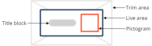
Make sure the icons of custom inputs meet the following requirements:
-
Format: *.svg.
-
Style of a trim area: background must be transparent.
-
Color.
Live area
Color: #0D2E4E
Background color: #FFFFFF
Pictogram
Primary color: #FF4013
Additional color: #FFFFFF
Title block
#D1D1D1 -
Size.
Trim area
72x40 pixels or larger proportionally
Live area
56x24 pixels
Pictogram
16x16 pixels
Title block
24x6 pixels
-
Line width of a pictogram: 1.5 pixels.
-
If needed, use a line 1 pixel wide to display a container on the icon.
-
The icon must visualize the functionality of the input on the Freedom UI page.
-
Corner radius.
Live area
1 pixel
Pictogram
0–1 pixel
Title block
3 pixels
-
The icon detailing matches the other icons.
See also
Custom UI component based on a classic Creatio page element
Custom UI component implemented using remote module
Overview of Freedom UI Designer and its elements (user documentation)