Email Designer elements
Email Designer is a visual drag-and-drop editor that lets you create and set up email templates. You can use it to design templates with complex layouts — marketing emails, newsletters, promotional campaigns, and more — without writing HTML code. Creatio generates the code automatically based on the layout you design in the visual editor. Templates display correctly on both desktop and mobile devices.
To open the Email Designer, go to the Design content tab on the email page and click Design content.
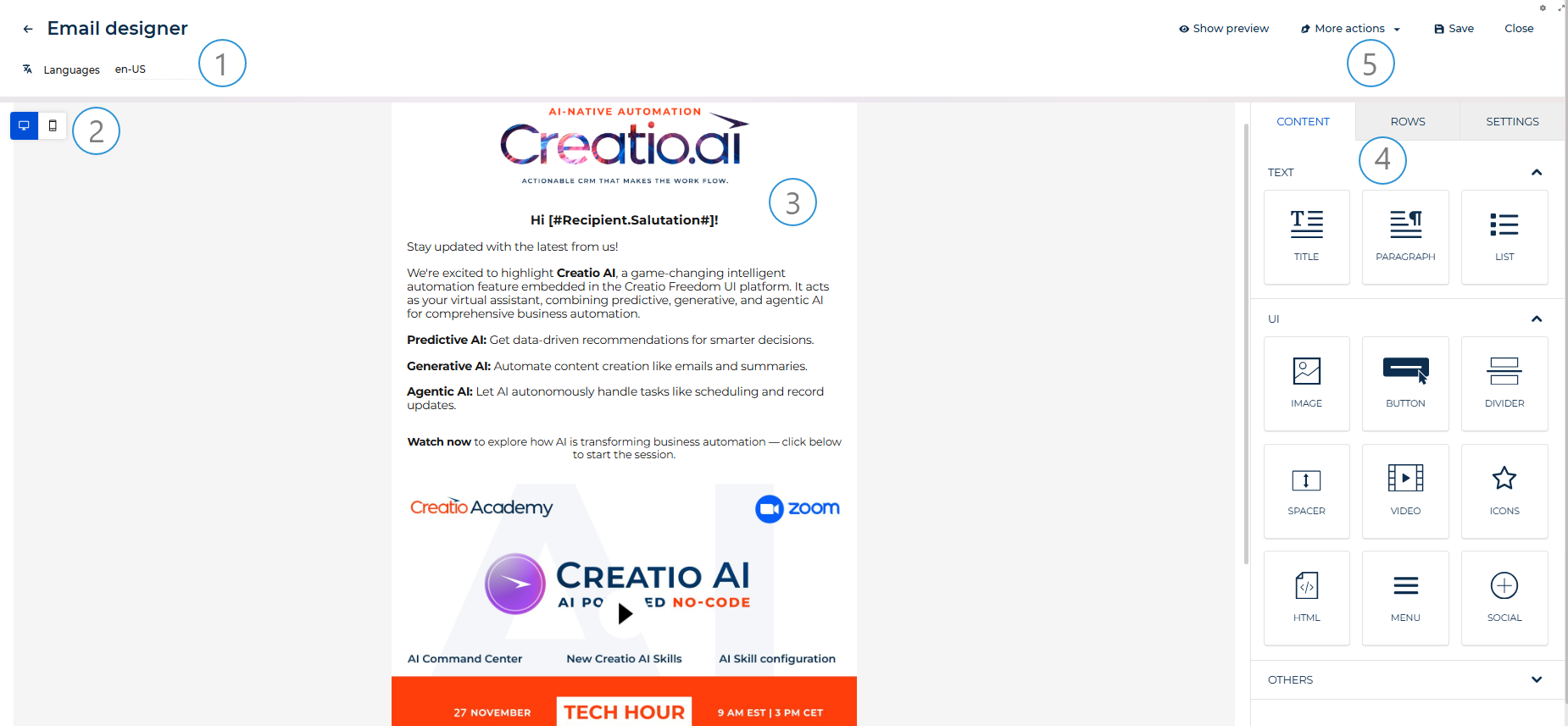
Languages (1). Displays the language of the template version currently open in the designer. Click to open the dropdown, which lists all configured language versions and provides a link to Multilingual settings. Switch between language versions to edit each one separately. Learn more: Multilingual emails.
Desktop / mobile toggle (2). Use the toggle in the upper left corner of the canvas to switch between desktop and mobile view. The mobile view reduces the content area to 320px.
Canvas (3). The working area of the Email Designer. Drag rows from the Rows tab and content elements from the Content tab onto the canvas to build the template structure.
Property panel (4). The panel has the following tabs: Content, Rows, and Settings.
The Content tab lists all available content elements grouped into the following categories: Text (Title, Paragraph, List), UI (Image, Button, Divider, Spacer, Video, Icons, HTML, Menu, Social), and Others (GIFs, Stickers). Drag any element onto the canvas to add it to the design. When you select a content element on the canvas, the tab displays the properties of that element.
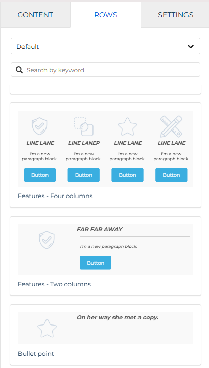
The Rows tab serves the following purposes: it is a library of row templates you can drag onto the canvas, and it displays the Row Properties section when you select a row on the canvas. Each row can contain one to six columns, which lets you place content elements side by side. Use the category dropdown to switch between Empty (standard column layout options), Default (predefined content block templates), and your saved rows from the content block library.
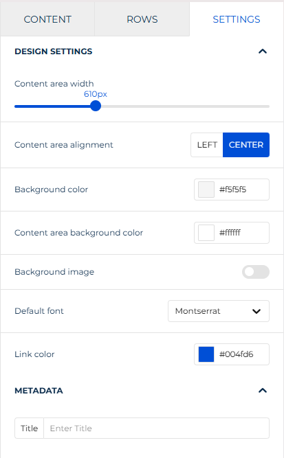
The Settings tab contains global parameters that apply to the entire template design and are inherited by all rows and elements unless overridden at the element level.
Actions (5). Use the buttons in the top right corner to manage the template:
-
Show preview. Opens a preview of the template as it will appear to recipients.
-
More actions. Provides additional options:
- Show merge tag preview. Replaces merge tags with sample values so you can check how personalized content will look to recipients.
- Show structure. Displays the structural outline of rows and columns on the canvas.
-
Save. Saves the current state of the template.
-
Close. Closes the Email Designer and returns to the email page.
Designer elements
View the elements of the Email Designer in the table below:
Element | Description |
|---|---|
Structural container that defines the horizontal layout of a section. | |
Heading text. | |
Body text with rich text formatting. | |
Bulleted or numbered list. | |
Static or linked image. | |
Clickable call-to-action button with a configurable link. | |
Horizontal line that separates rows. | |
Empty vertical or horizontal space. | |
Clickable video thumbnail linked to YouTube or Vimeo. | |
Small images with optional text and links. | |
Custom HTML code block. | |
Navigation bar with configurable links. | |
Set of social media icon links. | |
Animated images from Giphy. | |
Small decorative GIFs from Giphy. |
Design settings
The Settings tab contains global parameters that apply to the entire template design. These parameters are inherited by all rows and content elements unless overridden at the element level.
Property | Description |
|---|---|
Content area width | Width of the email content area in pixels. Configured via a slider. Most email clients render emails at 600px, so values above that may cause horizontal scrolling on some clients. |
Content area alignment | Whether to align the content area to the left or center of the email canvas. |
Background color | Background color of the entire email canvas, including the area outside the content column. |
Content area background color | Background color of the content column only. Overrides the canvas background color for the content area. |
Background image | Background image of the entire email canvas. When toggled on, overrides the background color. |
Default font | Font family used by all text elements unless overridden at the element level. |
Link color | Default color for linked text across the entire design. You can specify a hex code or select the color from a color palette. |
The Metadata section below Design Settings contains a Title field for the internal email title used by Creatio. This value is not displayed to recipients.
Row
Use Row properties to configure the background, borders, layout, and column structure of each row on the canvas.
Select a row on the canvas to view and configure its parameters in the Row Properties section of the Rows tab.
Backgrounds
Property | Description |
|---|---|
Row background color | Background color of the entire row area, including the space outside the content area. |
Content area background color | Background color of the content area inside the row. |
Row background image | Background image of the row. When toggled on, the following options become available:
Background image support varies across email clients. Choose a fallback content area background color for optimal results. |
Borders
Property | Description |
|---|---|
Content area border | Border of the content area. Configure border style, width, and color. Enable More options to configure each side — Top, Right, Bottom, Left — independently. |
Content area rounded corners | Corner radii of the content area. Enable More options to configure each corner — Top-left, Top-right, Bottom-left, Bottom-right — independently. |
Layout
Property | Description |
|---|---|
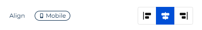
Vertical align | How to align content vertically within the row columns. |
Stack on mobile | Whether to stack columns vertically on mobile. When toggled on, columns display one below the other instead of side by side. |
Stack order on mobile | The order in which columns stack on mobile. Available when Stack on mobile is on. |
Hide on | Whether to hide the row on desktop or mobile view. |
Dynamic content
Property | Description |
|---|---|
Display condition | Condition that controls whether the row is shown to a specific audience segment. If no condition is applied, the row is visible to all recipients. Click Set up conditions to configure the condition. |
Cards style
Property | Description |
|---|---|
Spacing | Distance between cards in the row. |
Cards rounded corners | Corner radii of the cards. Enable More options to configure each corner — Top-left, Top-right, Bottom-left, Bottom-right — independently. |
Columns structure
The Columns structure section displays the current column layout of the row. Click + Add new to add a column. Drag columns to reorder them.
Select a column to configure its parameters:
Property | Description |
|---|---|
Column background | Background color of the column. |
Padding | Distance between the column content and the column border. Enable More options to configure each side independently. |
Border | Border of the column. Configure border style, width, and color. Enable More options to configure each side independently. |
Content block library
The content block library stores rows you save while working in the Email Designer. Saved rows are available across all your template designs, so you can build consistent, on-brand emails without recreating the same sections from scratch each time. Before non-administrator users can save rows, an administrator must add at least one category to the Content designer row category lookup. Learn more: Manage lookup values.
Save your row
To save a row, select it on the canvas and click the  button in the row actions toolbar.
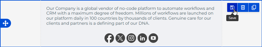
A mini page opens to fill out the row details:
Property | Description |
|---|---|
Name | Name of the saved row as it appears in the content block library. |
Category | Group used to organize saved rows in the library. Rows saved to the same category are listed together in the Rows tab, sorted from newest to oldest. |
Once saved, the row is available in the Rows tab. The tab has a category dropdown at the top:
- "Empty" — standard column layout options.
- "Default" — predefined content block templates.
- Any custom category — rows saved to that category.
Use the Search by keyword field to filter rows by name within the selected category.
To add a saved row to your design, drag it from the Rows tab onto the canvas. Editing a reused row affects the current design only.
Edit a saved row
To update the content of a saved row, open any design that contains it, make the changes directly on the canvas, and save the row again under the same name and category. This overwrites the previous version in the library. Changes made to a row instance on the canvas affect the current design only. To reflect the updates in the library, save the row again explicitly.
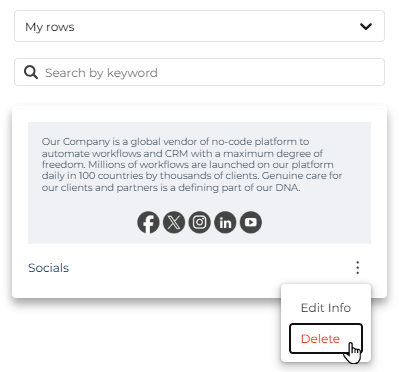
To edit the name or category of a saved row, go to the Rows tab, select the relevant category, and click the three-dot button next to the row name. Select Edit Info from the menu.
Delete a saved row
To delete a saved row from the library, go to the Rows tab, select the relevant category, and click the three-dot button next to the row name. Select Delete from the menu.
Title
Use the Title element to display email headings.

Click the text to configure it in the rich text toolbar. Configure other element parameters in the property panel.
Property | Description |
|---|---|
Title | Hierarchy of the heading. Available values: H1, H2, H3. |
Font family | Font type. |
Font weight | Weight of the font. Available values: "Thin," "Regular," "Bold," "Black." This setting is independent from text effects configured in the rich text toolbar. |
Font size | Size of the title. |
Text color | Color of the normal text. You can specify a hex code or select the color from a color palette. |
Link color | Color of the linked text. You can specify a hex code or select the color from a color palette. |
Align | How to align the text. |
Line height | Distance between lines. |
Letter spacing | Distance between letters. |
Text direction | Whether the text goes left to right or right to left. |
Padding | Distance between the text border and element border. |
Hide on | Whether to hide the element on desktop or mobile view. |
Paragraph
Use the Paragraph element to display rich text.

Click the text to configure it in the rich text toolbar. Configure other element parameters in the property panel.
Property | Description |
|---|---|
Font family | Font type. |
Font weight | Weight of the font. Available values: "Thin," "Regular," "Bold," "Black." This setting is independent from text effects configured in the rich text toolbar. |
Font size | Size of the text. |
Text color | Color of the normal text. You can specify a hex code or select the color from a color palette. |
Link color | Color of the linked text. You can specify a hex code or select the color from a color palette. |
Align | How to align the text. |
Paragraph spacing | Distance between paragraphs. |
Line height | Distance between lines. |
Letter spacing | Distance between letters. |
Text direction | Whether the text goes left to right or right to left. |
Padding | Distance between the text border and element border. |
Hide on | Whether to hide the element on desktop or mobile view. |
List
Use the List element to display ordered or unordered lists.

Click the text to configure list items in the rich text toolbar. Configure other element parameters in the property panel.
Property | Description |
|---|---|
List type | Whether the list is ordered or unordered. |
List style type | Style of the list markers. Available values depend on the selected list type. |
Font family | Font type. |
Font weight | Weight of the font. Available values: "Thin," "Regular," "Bold," "Black." This setting is independent from text effects configured in the rich text toolbar. |
Font size | Size of the list text. |
Text color | Color of the normal text. You can specify a hex code or select the color from a color palette. |
Link color | Color of the linked text. You can specify a hex code or select the color from a color palette. |
Align | How to align the list. |
List items spacing | Distance between list items. |
Nested items indent | Indentation of nested list items. |
Line height | Distance between lines. |
Letter spacing | Distance between letters. |
Text direction | Whether the text goes left to right or right to left. |
Padding | Distance between the text border and element border. Enable More options to configure each side independently. |
Hide on | Whether to hide the element on desktop or mobile view. |
Image
Use the Image element to display images. The images can be visual elements as well as be linked to serve as a call to action. You can select from stock photos that have Creative Commons Zero license or upload your own images.

Configure the element in the property panel.
Property | Description |
|---|---|
Auto width | Whether to calculate image width automatically or set a static value. When toggled off, the Full width on mobile option becomes available to override the custom width in mobile view. |
Align | How to align the image. |
Dynamic image | Whether to use a dynamic image provided externally, for example, for A/B testing. When toggled on, enter the dynamic image URL in the Dynamic Url field. When dynamic image is enabled, the Url field becomes the location of a placeholder image shown only in the editor. The Dynamic Url is used in the HTML code. The size of the dynamic image is set based on the placeholder, so use a placeholder of the same size. You can use an external service to create dynamic images. For example, Niftyimages, Fresh Relevance, CountdownMail, etc. |
Apply effects | Opens the built-in image editor. Becomes available after you select the image file. Learn more: Edit an image. |
Change image | Opens the file manager to select or upload an image. |
Url | URL of the selected image. Displays the image path after you select a file via the file manager. |
Alt text | Brief summary of the image in text form required for accessibility purposes. |
Image rounded corners | Corner radii of the image. Enable More options to configure each corner independently. |
Image link | Link action triggered when a recipient clicks the image. Available values: "Open web page," "Send email," "Make call," "Send SMS." The exact parameters depend on the selected action. The "Send SMS" action is not supported by Gmail, Outlook, and Yahoo, which block or strip |
Padding | Distance between the image border and element border. Enable More options to configure each side independently. |
Hide on | Whether to hide the element on desktop or mobile view. |
Upload or select an image
When you add an Image element to the canvas or select an existing one, the property panel shows the following options: Change image to open the file manager, and Apply effects & more to open the image editor.
In the file manager, you can upload your own image or search for free stock photos from Pexels and Pixabay directly in the designer. Both services provide images under the Creative Commons Zero (CC0) license, which means you can use them in commercial emails without attribution. To find a photo, click Search free photos in the top bar of the file manager, enter a keyword, and click Import next to the image you want. The imported photo is saved to your file manager and can be reused in other designs.
Edit an image
The built-in image editor lets you adjust images without leaving the designer. Click Apply effects & more when an image element is selected to open the editor.
The editor includes the following tools:
Filter applies a predefined color effect to the image, such as grayscale, sepia, vintage, or brightness adjustment. Useful for giving a batch of product photos a consistent visual tone across a newsletter.
Resize lets you change the image dimensions. You can enter exact pixel values or use percentage-based sizing. Enable Maintain Aspect Ratio to avoid distorting the image.
Crop cuts the image to a specific area. Standard aspect ratio presets are available: 3:2, 5:3, 4:3, 5:4, 6:4, 7:5, 10:8, and 16:9.
Transform flips or rotates the image.
Draw, Text, Shapes add freehand drawings, text labels, or geometric shapes on top of the image.
Stickers overlays decorative elements from preset categories: Doodles, Emoticons, Places, Stars, Clouds, Bubbles, Seasonal.
Frame adds a decorative border around the image.
Corners rounds the image corners. To get a transparent background around rounded corners, use a PNG image.
Click Save in the top right corner of the editor to apply the changes and return to the designer.
Button
Use the Button element to display clickable call-to-action buttons.

Click the button to configure the button caption in the toolbar. Configure other element parameters in the property panel.
Property | Description |
|---|---|
Link type | Action triggered when a recipient clicks the button. Available values: "Open web page," "Send email," "Make call," "Send SMS." The exact parameters depend on the selected action. The "Send SMS" action is not supported by Gmail, Outlook, and Yahoo, which block or strip |
Url | URL the button links to. Available when Link type is set to "Open web page." |
Auto width | Whether to calculate button width automatically or set a static value. |
Font family | Font type. |
Font weight | Weight of the font. Available values: "Thin," "Regular," "Bold," "Black." This setting is independent from text effects configured in the toolbar. |
Font size | Size of the caption. |
Background color | Color of the button. |
Text color | Color of the caption. |
Align | How to align the button. |
Line height | Distance between lines. |
Letter spacing | Distance between letters. |
Text direction | Whether the caption goes left to right or right to left. |
Border radius | Corner radii of the button. |
Content padding | Distance between the caption and the border of the button. Enable More options to configure each side independently. |
Border | Border of the button. Configure border style, width, and color. Enable More options to configure each side independently. |
Padding | Distance between the button border and element border. Enable More options to configure each side independently. |
Hide on | Whether to hide the element on desktop or mobile view. |
Divider
Use the Divider element to separate email rows.

Configure the element parameters in the property panel.
Property | Description |
|---|---|
Transparent | Whether to make the divider line transparent. |
Line | Style, width, and color of the divider line. |
Width | Width of the divider line, in percentage of the total email width. |
Align | How to align the divider line. |
Padding | Distance between the divider and element border. Enable More options to configure each side independently. |
Hide on | Whether to hide the element on desktop or mobile view. |
Spacer
Use the Spacer element to add empty space vertically or horizontally.

Configure the spacer parameters in the property panel.
Property | Description |
|---|---|
Height | Height of the spacer element. |
Padding | Distance between the spacer and element border. |
Hide on | Whether to hide the element on desktop or mobile view. |
Video
Use the Video element to display a clickable video thumbnail linked to a YouTube or Vimeo video.

Configure the element parameters in the property panel.
Property | Description |
|---|---|
Url | URL of the YouTube or Vimeo video. The designer automatically generates a preview image and overlays a play icon. When a recipient clicks the thumbnail, the video opens in a new tab. |
Title | Text displayed when holding the pointer over the thumbnail. |
Play icon type | Shape of the play icon. Available values: "Round Solid," "Round Outline," "Rectangle Solid," "Rectangle Outline," "Square Solid," "Square Outline," "Arrow Only." |
Play icon color | Color scheme of the play icon. Available values: "Light," "Dark." |
Play icon size | Size of the play icon in pixels. |
Padding | Distance between the video and element border. Enable More options to configure each side independently. |
Hide on | Whether to hide the element on desktop or mobile view. |
The designer supports the following privacy settings and aspect ratios:
Supported platforms | Privacy settings | Aspect ratios |
|---|---|---|
YouTube | Public, Unlisted | 4:3, 16:9, 9:16 (Shorts), 21:9, 9:21 |
Vimeo | Public, Unlisted |
For YouTube videos, you can link to a specific timestamp by adding a time parameter to the URL, for example, ?t=90 to start at 1 minute 30 seconds.
The video does not play inside the designer preview. To check how it looks, right-click the element and select Open in a new tab.
Icons
Use the Icons element to add small images that can serve as a visual representation of content or as calls to action. You can select from stock photos that have Creative Commons Zero license or upload your own images.
Configure the icon parameters in the property panel. Click Add new icon to add an icon to the collection. Select an icon to configure its individual parameters.
Property | Description |
|---|---|
Change image | Opens the file manager to select or upload an icon image. |
Apply effects | Opens the built-in image editor. Learn more: Edit an image. |
Image url | URL of the icon image. |
Alt text | Brief summary of the icon in text form required for accessibility purposes. |
Icon text | Text displayed next to the icon. |
Link type | Action triggered when a recipient clicks the icon. Available values: "Open web page," "Send email," "Make call," "Send SMS." The exact parameters depend on the selected action. The "Send SMS" action is not supported by Gmail, Outlook, and Yahoo, which block or strip |
Url | URL the icon links to. Available when Link type is set to "Open web page." |
Target | Whether to open the link in the current page or a new tab. |
Title | Text displayed when a user holds the pointer over the icon. |
Font family | Font type for the icon text. |
Font weight | Weight of the font for the icon text. Available values: "Thin," "Regular," "Bold," "Black." |
Font size | Size of the icon text. |
Text color | Color of the icon text. You can specify a hex code or select the color from a color palette. |
Align | How to align the icons. |
Letter spacing | Distance between letters of the icon text. |
Icon size | Size of the icons in pixels. |
Icon spacing | Distance between icons. |
Icon padding | Padding around each icon. Enable More options to configure each side independently. |
Padding | Distance between the icon collection border and element border. Enable More options to configure each side independently. |
Hide on | Whether to hide the element on desktop or mobile view. |
HTML
Use the HTML element to embed custom code, for example, to code your own part of the email. The element includes sanitization. This means a service checks custom HTML and cleans it up to avoid inadvertent introduction of unsafe content.

Configure the element parameters in the property panel.
Property | Description |
|---|---|
Hide on | Whether to hide the element on desktop or mobile view. |
Menu
Use the Menu element to add navigation links to your email, for example, links to sections of your website.

Configure the element parameters in the property panel. Click Add new item to add a menu item. Select an item to configure its individual parameters.
Property | Description |
|---|---|
Text | Caption of the menu item. |
Link type | Action triggered when a recipient clicks the menu item. Available values: "Open web page," "Send email," "Make call," "Send SMS." The exact parameters depend on the selected action. The "Send SMS" action is not supported by Gmail, Outlook, and Yahoo, which block or strip |
Url | URL the menu item links to. Available when Link type is set to "Open web page." |
Target | Whether to open the link in the current page or a new tab. |
Title | Text displayed when a user holds the pointer over the menu item. |
Font family | Font type. |
Font weight | Weight of the font. Available values: "Thin," "Regular," "Bold," "Black." |
Font size | Size of the menu text. |
Text color | Color of the normal text. You can specify a hex code or select the color from a color palette. |
Link color | Color of the linked text. You can specify a hex code or select the color from a color palette. |
Align | How to align the menu. |
Letter spacing | Distance between letters. |
Layout | How to arrange the menu items. |
Mobile menu | Whether to display a compact hamburger-style menu on mobile. When toggled on, configure the icon size, icon type, foreground color, and background color of the mobile menu button. |
Items padding | Padding around each menu item. Enable More options to configure each side independently. |
Padding | Distance between the menu and element border. Enable More options to configure each side independently. |
Hide on | Whether to hide the element on desktop or mobile view. |
Social
Use the Social element to set up a set of links to social media.

Configure the element parameters in the property panel.
Property | Description |
|---|---|
Select icon collection | Select the icon style that best fits your email. |
Configure icon collection | You can drag icons up or down the list using the drag button. |
Title | The text available when a user holds the pointer over the icon. Available when you click the More options toggle. |
Alt text | Brief summary of the icon in text form required for accessibility purposes. Available after you click the More options toggle. |
Url | Link to your social media profile. |
Align | How to align the icons. |
Icon spacing | Distance between the icons. |
Padding | Distance between the icon border and element border. |
Hide on | Whether to hide the element on desktop or mobile view. |
GIFs
Use the GIFs element to display animated images from Giphy.

Configure the element parameters in the property panel.
Property | Description |
|---|---|
Search for gifs with Giphy | Opens the Giphy browser to search and select a GIF. |
Auto width | Whether to calculate image width automatically or set a static value. When toggled off, the Full width on mobile option becomes available to override the custom width in mobile view. |
Align | How to align the GIF. |
Dynamic image | Whether to use a dynamic image provided externally. When toggled on, enter the dynamic image URL in the Dynamic Url field. When dynamic image is enabled, the Url field becomes the location of a placeholder image shown only in the editor. The Dynamic Url is used in the HTML code. The size of the dynamic image is set based on the placeholder, so use a placeholder of the same size. |
Alt text | Brief summary of the GIF in text form required for accessibility purposes. |
Image rounded corners | Corner radii of the GIF. Enable More options to configure each corner independently. |
Image link | Link action triggered when a recipient clicks the GIF. Available values: "Open web page," "Send email," "Make call," "Send SMS." The exact parameters depend on the selected action. The "Send SMS" action is not supported by Gmail, Outlook, and Yahoo, which block or strip |
Url | URL the GIF links to. Available when Image link is set to "Open web page." |
Padding | Distance between the GIF border and element border. Enable More options to configure each side independently. |
Hide on | Whether to hide the element on desktop or mobile view. |
Stickers
Use the Stickers element to display small GIFs from Giphy.

Configure the element parameters in the property panel.
Property | Description |
|---|---|
Search for stickers with Giphy | Opens the Giphy browser to search and select a sticker. |
Auto width | Whether to calculate sticker width automatically or set a static value. When toggled off, the Full width on mobile option becomes available to override the custom width in mobile view. |
Align | How to align the sticker. |
Dynamic image | Whether to use a dynamic image provided externally. When toggled on, enter the dynamic image URL in the Dynamic Url field. When dynamic image is enabled, the Url field becomes the location of a placeholder image shown only in the editor. The Dynamic Url is used in the HTML code. The size of the dynamic image is set based on the placeholder, so use a placeholder of the same size. |
Alt text | Brief summary of the sticker in text form required for accessibility purposes. |
Image rounded corners | Corner radii of the sticker. Enable More options to configure each corner independently. |
Image link | Link action triggered when a recipient clicks the sticker. Available values: "Open web page," "Send email," "Make call," "Send SMS." The exact parameters depend on the selected action. The "Send SMS" action is not supported by Gmail, Outlook, and Yahoo, which block or strip |
Url | URL the sticker links to. Available when Image link is set to "Open web page." |
Padding | Distance between the sticker border and element border. Enable More options to configure each side independently. |
Hide on | Whether to hide the element on desktop or mobile view. |
Optimize design for mobile
The designer canvas has the following views: desktop and mobile. Switch between them using the toggle icons in the upper left corner of the canvas.
Some element settings can be configured independently for mobile: alignment, button width, padding, spacer height, and text size. These settings are marked with a Mobile label in the setup panel. When you adjust a mobile-specific setting, the label turns purple to indicate that a mobile override is active. Settings without the Mobile label apply to both desktop and mobile versions simultaneously.
If your email uses device-specific content — for example, a full-width banner for desktop and a cropped version for mobile — you can use the Hide on parameter in each element's setup panel to control which device sees which version. Elements hidden in the current view mode appear translucent on the canvas. To see all hidden elements regardless of the view mode, enable the visibility toggle ( ) next to the view mode switch.