Ensure color accessibility in Freedom UI
Creatio provides WCAG-compliant colors for Freedom UI to keep widgets, tabs, and other elements readable for all users, including those with visual impairments and those using low-contrast displays.
Contrast and accessibility
Contrast is the difference in brightness between a foreground element (text, icon, or chart line) and its background. It is measured as a ratio from 1:1 (no contrast) to 21:1 (maximum contrast, for example, black on white).
WCAG sets the following minimum contrast ratios:
- 4.5:1 for standard and small text
- 3:1 for large text
To validate a specific color pair, use Contrast Checker.
Color in Freedom UI
In Freedom UI, color choices affect readability most in widgets, tabs, and Area backgrounds that include text or chart values.
The Color parameter for widgets in the Freedom UI Designer and Dashboard Designer already shows only WCAG-compliant colors, so selecting any color produces an accessible result. Pipeline, Sales pipeline, Full pipeline, Doughnut, and Progress bar widgets use preset color sequences that are not user-configurable.
For tabs and Area backgrounds, select colors manually and validate contrast before applying. Learn more: Accessible colors reference.
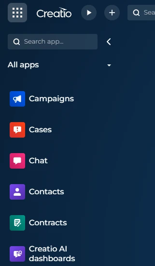
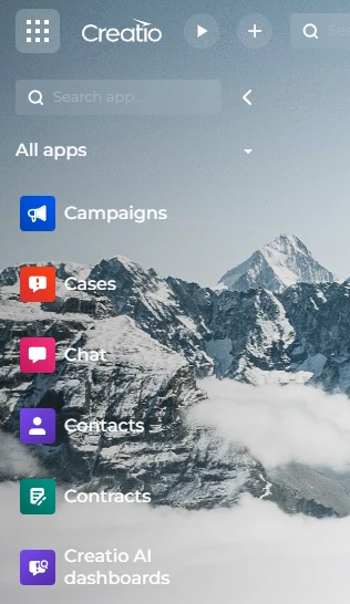
Desktop background
The desktop background affects readability of widgets and text across the entire UI. Use a dark solid color to preserve readability (Fig. 1, recommended). Avoid light wallpapers because they can reduce the contrast of overlay text and widget values (Fig. 2, not recommended).
If a light wallpaper reduces contrast, administrators can configure an accessible desktop color in the Appearance setup section in the System Designer. Users can then enable it by selecting the Use accessible desktop color checkbox on the Accessibility settings tab of the user profile page.
Learn more: Customize the Freedom UI.
Accessible color examples
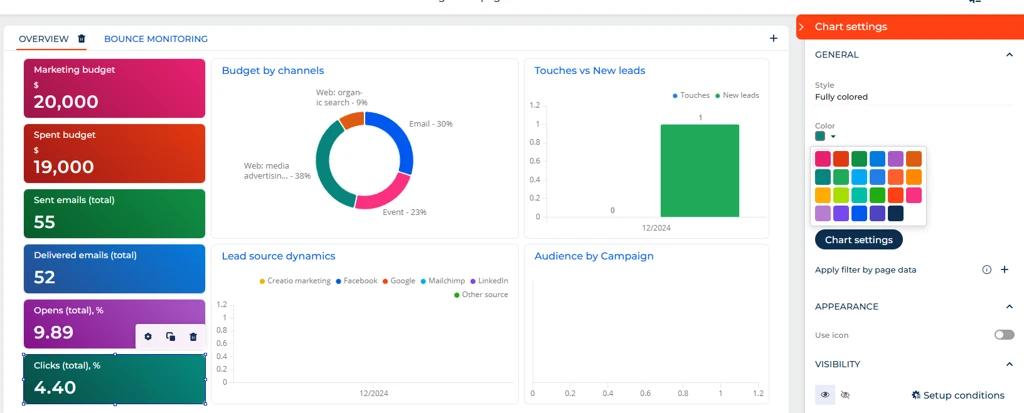
Select any color from the Color parameter to produce a WCAG-compliant result (Fig. 3).
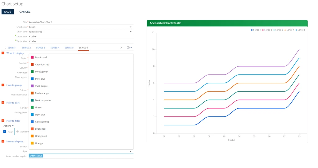
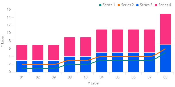
For bars (including stacked bars), lines, and stacked areas with multiple series, apply colors in the recommended order: Blue, Burnt coral, Dark turquoise, Rusty orange, Light blue, Purple. This order maximizes visual distinction between adjacent series (Fig. 4).
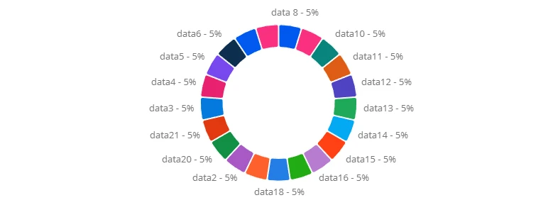
Doughnuts use predefined color sequences based on the number of values. These colors are not user-configurable and are already WCAG-compliant (Fig. 5).
Pipeline, Sales pipeline, and Full pipeline widgets also use predefined accessible colors based on the number of stages (Fig. 6).

Contrast risks
Some configurations create contrast risks even with accessible colors.
If you combine bars and lines on the same chart, similar colors appear close together and may fall below WCAG contrast thresholds (Fig. 7). If you use a light desktop background image behind widget blocks, text and values on top may lose sufficient contrast. Glassmorphism effects also weaken contrast ratios.
Validate such combinations with the Contrast Checker.
See also
Ensure accessibility through WCAG
Voluntary Product Accessibility Template (VPAT)
Web Content Accessibility Guidelines (WCAG) 2.2 (official W3C documentation)