Set up widgets
Creatio includes many types of widgets that solve a wide variety of analytical business problems:
- Chart (Spline, Line, Bar, Doughnut, Area, Column, Scatter, Pipeline). You can use it to clearly display dynamics and percentages, for instance, monthly sales dynamics or customer distribution by industry. Read more >>>
- Sales pipeline. You can use it to analyze the stage-based opportunity funnel. This widget is available in Creatio products that include the Lead and Opportunity Management app. Read more >>>
- Full pipeline. You can use it to analyze the complete life cycle of a customer need in Creatio by tracking the corresponding lead and opportunity stages. This widget is available in Creatio products that include the Lead and Opportunity Management app. Read more >>>
- Metric. You can use it to display a single value, for example, the total number of current employees. Read more >>>
- Gauge. You can use it to display a single numeric value relative to a custom scale. It is great for tracking KPIs, such as the number of agent calls. Read more >>>
You can add a widget to any Freedom UI page and customize it using Freedom UI Designer. Click Chart settings to open the widget setup page. Learn more: Overview of Freedom UI Designer and its elements. The setup page includes setup parameters and chart preview. The preview displays a part of available data and might not correspond with live widget fully.
Widgets display large numbers with separators as per the user's culture settings.
Set up chart
Charts display Creatio dynamics and percentages. For example, you can use a "Doughnut" chart to display the distribution of events by types (Fig. 1).
Learn more: Analyze chart.
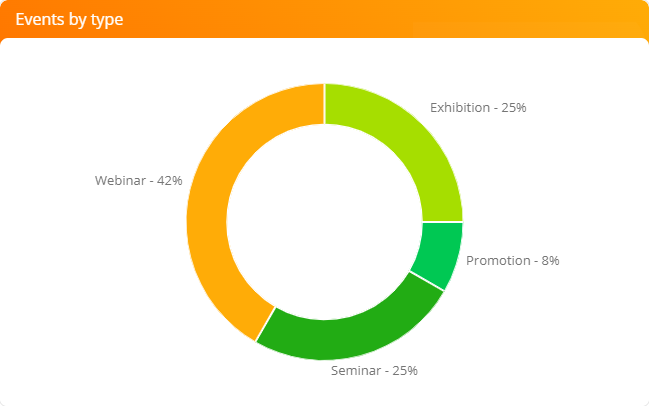
Chart setup procedure
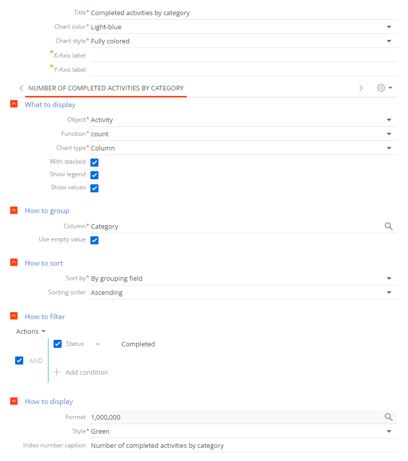
You can customize the chart's parameters on the setup page. (Fig. 2).
-
Fill out the general parameters:
Field
Field value
Title
Enter the chart name to display on the widget. The field is required.
Chart color
Select the color of the chart.
Chart style
Select the style of the chart widget.
X-Axis label
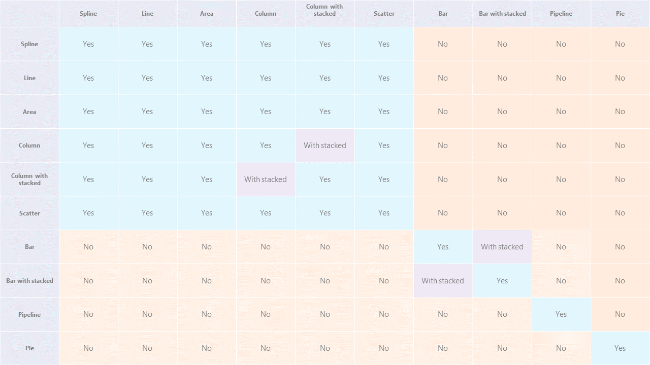
Enter the labels of X and Y axes on the chart. These fields are only displayed for charts with axes ("Spline," "Line," "Bar," "Area," "Column," and "Scatter").
Y-Axis label
-
Fill out the fields in the What to display field group:
Fig. 3 Set up chart's What to display field group 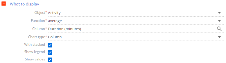
Field
Field value
Object
Enter the Creatio object to be used as a data source. For example, select the "Activity" object to calculate the average call duration (calls are activities of the "Call" category). The field is required.
Function
Select how the chart will process the source data. The field is required. You can select from the following options:
- "count." Use this option to generate a chart by the number of Creatio object's records. For example, you can check the number of activities by type.
- "sum." Use this option to display the sum of values in a numeric column. For instance, you can calculate the duration of employee's activities within a week.
- "average," "maximum," and "minimum." Use these options the check the corresponding values of the data source's numeric column or a date column. For example, you can calculate the average employee activity duration.
Column
Select the column the function will use for the calculations. You can specify a numeric or a date column. For example, specify the "Duration (minutes)" column to calculate the average call duration by manager (Fig. 3). Creatio does not display this field if you select "count" in the Function field. The field is required for all other options.
Chart type
Change the chart structure if needed, for example, to "Bar" or "Doughnut." The field is required.
With stacked
Select this checkbox to display the chart as a stacked area chart. These kinds of charts display each column/bar as a total sum of separate data categories. The size of each column is proportionate to the value of the corresponding data element. Stacked area charts are useful if you need to compare not only the separate data values but also the total sums. For example, the chart can simultaneously display the total sum of opportunity amounts on each stage by different employees or the contribution of each stage to the total sum.
The With stacked checkbox is available for the "Column" and "Bar" chart types. If you set up a chart that have multiple series, they will share the same With stacked value. For instance, if you select this checkbox for one of the series, the chart automatically selects it for all other series that have the "Column" or "Bar" chart types. Similarly, if you deselect it in one of the series, the chart automatically deselects them for all other series.
Show legend
Select the checkbox to display the chart legend. The legend displays the chart color and the text from the Index number caption field at the bottom of the chart setup page. If the Index number caption field is empty, the legend displays the name of the object used as a data source.
The Show legend checkbox is available for the following chart types: "Spline," "Line," "Bar," "Area," "Column," and "Scatter."
Show values
Clear the checkbox to not display the values of individual bars and columns.
The Show values checkbox is available for "Bar" and "Column" chart types.
-
Fill out the fields in the How to group field group.
Fig. 4 Set up chart's How to group field group 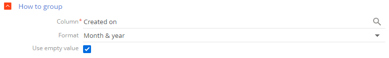
Field
Field value
Column
Select the column to group the chart values. Every value of this column will be a separate chart element: bar, sector, etc. For example, to calculate the number of new activities within a specific time period, set the field to "Created on." You can group data by any column of the chart's object. The field is required.
Format
Select the date format the chart will use, for example, "Week" or "Month & year." This field is displayed if you select a date column in the Column field of the How to group block. For example, to review the number of new activities by month, specify "Month & year" in the Format field and "Created on" in the Column field (Fig. 4).
Use empty value
Select this checkbox to display records that have an empty grouping column on the chart (Fig. 5).
Fig. 5 Opportunities by category chart that includes empty values 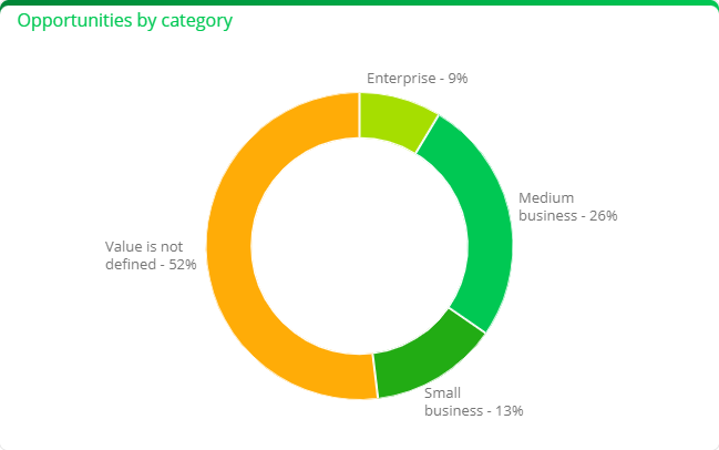
-
Fill out the fields in the How to sort field group:
Fig. 6 Set up chart's How to sort field group 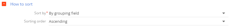
Field
Field value
Sort by
Select the value to sort the chart elements. For example, the "Activities by owner" chart groups the values by the Owner field. Each chart block in this chart represents a number of activities. Select "By grouping field" to sort the chart elements alphabetically (in this case by the Owner field) or select "By selection result" to sort them by the number of activities. The field is required.
Sorting order
Specify the display order of the chart values. For instance, select "Ascending" to display the values in alphabetical order (Fig. 6)
-
Specify the data filtering conditions in the How to filter field group.
For example, set the time frame in the filter conditions, such as "Created on = Current month," to create a chart that shows how many contacts were added within a specific period (Fig. 7).
Fig. 7 Set chart's How to filter field group 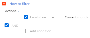
The filter becomes available once you fill out the Object field.
noteLearn more about the advanced filter: Filters.
-
Fill out the fields in the How to display field group:
Fig. 10 How to display field group as displayed for Spline, Line, Bar, Area, and Scatter chart types 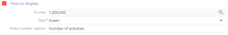
Field
Field value
Format
Specify the number of digits after the decimal point for numeric values. The setup is done in a pop-up window. Click
 to open it. For example, set this field's value to "1" to display a number with a single digit after the decimal point. To only display the whole part of the number, set the value to "0." If the chart has more than one series, you can set a different value for each series.
Style
Select the color of the chart elements. The field is required.
The field is available for the following chart types: "Spline," "Line," "Bar," "Area," "Column," and "Scatter."
Index number caption
Enter the text to display at the top of the dashboard for each chart series.
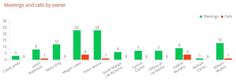
Display multiple series on chart
You can display multiple sets of data called "series" on your chart. For example, you can display employee meetings and calls on separate series (Fig. 11).
To add a series to a chart:
- Click
 on the chart setup page → Add series.
 - Fill out the required fields on the tab of the new series.
- Save the chart setup page and Freedom UI page.
As a result, Creatio will display the new data series on the chart.
If you select a chart type that is incompatible with other series, Creatio will display a warning and use the chart type that was selected first. For example, the warning will appear if you select a "Line" chart for the first series and a "Bar" chart for the second series. Both charts will be displayed as a "Line" chart (Fig. 12).
If you select the With stacked checkbox in one of the series with "Column" or "Bar" chart type, the checkbox will also be applied to all other series of the "Column" or "Bar" chart type. In that case the chart will display as a stacked column chart or a stacked bar chart.
To copy a series and create a new series that has similar settings:
- Open the tab of the series to copy.
- Click
 on the chart setup page → Copy series.
 - Save the chart setup page and the Freedom UI page.
As a result, the chart setup page will display a copy of the old series. You can edit the new series however you need, e. g., change the column the function will use, modify the data display period, etc.
To delete a series:
- Open the tab of the series to delete.
- Click
 on the chart setup page → Delete series.
 - Save the chart setup page and the Freedom UI page.
Set up sales pipeline
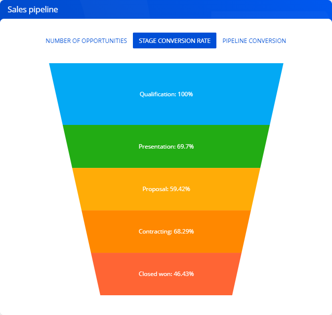
The "Sales pipeline" chart displays the opportunity dynamics by stage (Fig. 13).
Sales pipeline setup procedure
You can customize the parameters of the sales pipeline on the setup page (Fig. 14).
-
Fill out the general parameters.
Field
Field value
Title
Enter the desired title. Creatio displays it above the metric. The field is required.
Funnel color
Select the color of the pipeline widget. The field is required.
Funnel style
Select the style of the pipeline widget. The field is required.
-
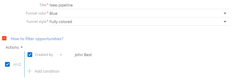
Specify the filtering conditions in the How to filter opportunitites? field group. For example, you can display the dynamics of a particular owner's opportunities. The sales pipeline does not include opportunities with the following statuses: Closed lost, Closed rejected and Closed rerouted. Learn more about the advanced filter: Filters.
Set up full pipeline
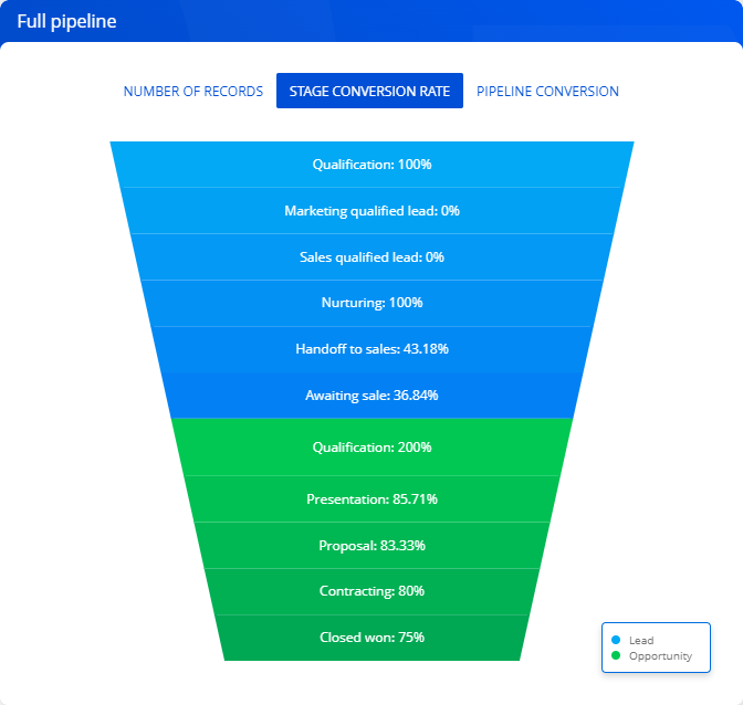
The "Full pipeline" chart displays the complete sales life cycle by stage, from lead registration to the closed opportunity (Fig. 15).
Learn more: Analyze pipeline.
Full pipeline setup procedure
You can customize the parameters of the full pipeline on the setup page.
-
Fill out the general parameters.
Field
Field value
Title
Enter the desired title. Creatio displays it above the pipeline. The field is required.
Funnel color
Select the color of the pipeline widget. The field is required.
Funnel style
Select the style of the pipeline widget. The field is required.
-
Specify the filtering conditions in the How to filter leads? field group. For example, you can display the conversion dynamics only for leads registered on a specific landing page or for leads with a specific customer need. Learn more about the advanced filter: Filters.
-
Specify the filtering conditions in the How to filter opportunities? field group. For example, you can display the conversion dynamics only for leads that were handed off to sales and have orders. Learn more about the advanced filter: Filters.
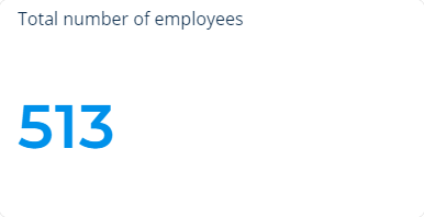
Set up metric
The "Metric" widget type (Fig. 16) displays a calculated numeric value or a date based on Creatio data, for example, the number of employees in the department.
Metrics can display the following data types:
- The total number of records in an object, filtered or unfiltered. For example, the number of all employee contacts in Creatio.
- The minimum or maximum value of a numeric field or a date field. For example, the minimum or maximum call duration.
- The sum or the average value of a numeric field, for example, the sum of invoice payments.
Metric setup procedure
You can customize the metric's parameters on the setup page.
-
Fill out the general parameters.
Field
Field value
Title
Enter the desired title. Creatio displays it above the metric. The field is required.
Color
Select the color of the metric. The field is required.
Metric style
Select the style of the metric widget. The field is required.
-
Fill out the fields in the What to display field group:
Fig. 14 Setting up the metric's What to display field group 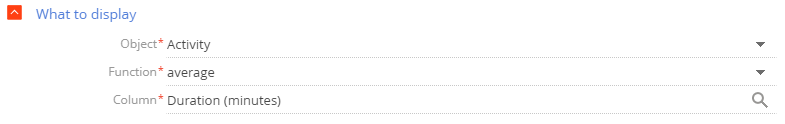
Field
Field value
Object
Enter the Creatio object to be used as a data source. The field is required.
Function
Specify how the metric will process the source data. The field is required. You can choose among the following options:
- "count." Display the number of object records. For example, total number of employee records in Creatio.
- "sum." Display the sum of values in a data column. For example, the total duration of employees' calls.
- "average," "minimum," "maximum." Display the corresponding values of a data column. For example, the average duration of employees' calls. The "average" function is not available for all columns.
Column
Select the column the function will use for calculations. You can specify a numeric or a date column. For instance, select the "Duration (minutes)" column to calculate average call duration of your employees. The field is required. Creatio does not display the field if you select "count" in the Function field.
-
Specify the filtering conditions in the How to filter field group:
Fig. 15 Setting up metric's How to filter field group 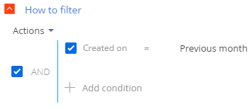
For example, you can display average call duration of your employees during the previous month by setting the conditions to: "Created on = Previous month" (Fig. 15).
The filter becomes available once you fill out the Object field.
noteLearn more about the advanced filter: Filters.
-
Fill out the fields in the How to display field group:
Fig. 16 Metric data format setup window 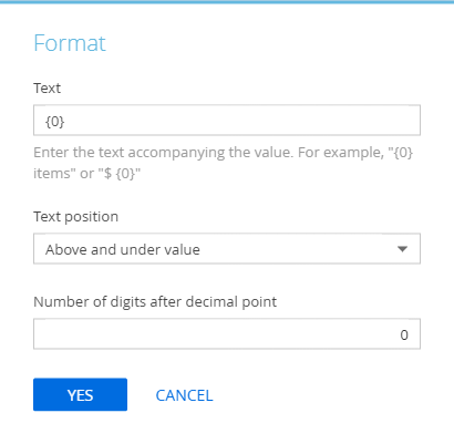
Field
Field value
Format
Set the number of digits after the decimal point for numeric values. Perform the setup in a pop-up window (Fig. 16). Click
 to open it.
Specify the text to accompany the metric's value in the pop-up's Text field. For example, if the metric must read "Total employees: 513" where 513 is the actual data, enter the following: "Total employees: 0." If the metric should read "513 employees," enter the following: "0 employees."
noteIf you enter the variable incorrectly, the metric will not display the numeric value. To restore the variable, clear the field and click Yes in the pop-up.
Specify where to display the text relative to the value in the Text position field.
Size
Select the size of the metric content.
-
Specify how many digits after the decimal point the metric must display in the Number of digits after decimal points field. Set the value to "0" to display only the integer part of the number.
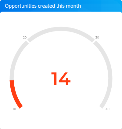
Set up gauge
The "Gauge" dashboard tile (Fig. 17) displays a value based on Creatio data relative to a custom scale.
Learn more: Analyze gauge.
Gauge setup procedure
You can customize the gauge parameters on the setup page. Gauge setup is similar to metric setup, but you also need to configure a scale to put data into context. To do this:
-
Open the How to display field group on the gauge setup page.
-
Select "The more the better" or "The less the better" in the Display order field.
The values affect the scale section order. In the former case, the gauge displays the section that indicates problems on the left, in the latter case, on the right.
-
Specify the following for the scale (Fig. 18):
- Minimum value. For example, a manager needs to conduct at least 10 calls per month;
- Average values. For instance, the average number of monthly calls is between 20 and 30;
- Maximum value. For instance, 40.
Fig. 18 Set up the gauge scale 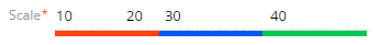
-
Specify the gauge scale colors in the Color field.
-
Specify how many digits after the decimal point the gauge must display in the Format field. Set the value to "0" to display only the integer part of the number.
Perform the setup in a pop-up window. Click
 in the Format field to open it.
Once you fill out all the fields in the How to display field group, Creatio will display the gauge preview.
See also
Add analytics to a record page
Tech Hour: UI/ UX Building pages in Freedom UI Designer
Tech Hour: UI/ UX Best practices in Creatio