Set up a Label component
Use Label components to add captions to pages and page areas as well as to display information that contains the current user data.
Set up a Label component that displays the first name of the current user to the HR KPI panel on a list page.

-
Drag a Label component to the canvas and open the component setup area.
-
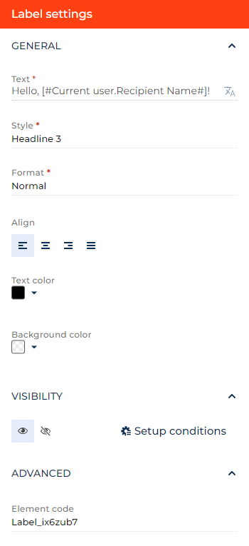
Enter the label text to display on the app page in the Text parameter. You can use macros that follow the [#CurrentUser.<Field>#] pattern, where
<Field>is a field included in the Current user group of email macros. Learn more about macros in a separate article: Personalize email content with macros.For this example, enter "Hello, [#CurrentUser.Recipient Name#]!" You can click the
 button to the right to localize the text to other languages you are going to use in the app. Learn more about localizing Freedom UI elements in a separate article: Localize a Freedom UI element.
 -
Select the label style to display on the app page in the Style parameter. Required. For this example, select "Headline 3."
-
Select the font format in the Format parameter. Required. For this example, select "Normal."
-
Select the text alignment option in the Align parameter. For this example, select left.
-
Select the text color in the Text color parameter. For this example, change the color to black.
-
Select the label background color in the Background color parameter. For this example, leave the color transparent.
-
Click the
 or
or  button in the Visibility group to make the component visible or invisible by default on the page, respectively. For this example, leave the component visible.
 -
Click Setup conditions in the Visibility group to set up element business rules. For this example, do not add business rules. Learn more about setting up business rules in a separate article: Set up business rules.
-
Specify the HTML heading parameter the label uses in the Heading level parameter. This is used for accessibility purposes.
-
View the unique component code in the page schema in the Element code parameter. Creatio uses this code in page schemas. You can change it if needed. This helps software developers to customize the app easier, especially if you have multiple similar components on the page. For this example, leave the code as is.
As a result, Creatio will add a label that displays the business phone of the current user contact to the request page.
See also
Overview of Freedom UI Designer and its elements