Add template elements
Image
The Image element (Fig. 1) displays images. This element consists of two parts: the image itself, and the image container.
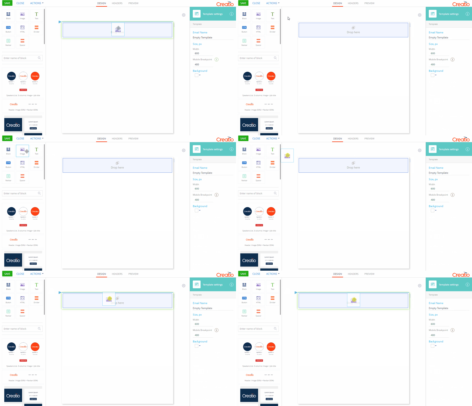
Use the setup area on the right to configure the image and the image container.

Property | Function |
|---|---|
Breadcrumb navigation (1) | Use "breadcrumbs" at the top of the setup area to navigate the parent (column, section, banner, block, and template) elements. |
Image settings | Use the The Image element supports Data URIs. You can insert a base64-encoded image instead of a URL. Base64-encoded images are part of the HTML code of the message and are not normally filtered by email clients that prevent external images from loading by default. Link to open – specify a URL to use the image as a hyperlink. Title – specify the text to display when the user hovers the mouse pointer over the image. The title text is often used to describe things unclear at first glance. Alternative text – specify the alternative text. In some email clients, a specific setting might disable images in the incoming emails. As a result, recipients will see alternative text instead of images. Populate the Alternate Text field with a description of the image so that recipients can see it instead of the icon to replace the missing image. |
Size, px | Specify the width and height of the image. By default, both Width and Height parameters have the "Auto" value. If you leave this parameter unchanged, the image will either stretch or shrink to fit the container. Change one of the values to resize the image and keep the ratio. Change both values to force resize the image to the specified height and width disregarding the ratio. |
Align | Align the image horizontally (left Alignment may produce no visible effect depending on the ratio of the image and the current ratio of the parent container. |
Padding, px | Specify the distance (in pixels) between the image and each of the borders of the container. Padding is specified separately for each side. |
Corner radius | Specify the circular radius of the corners of the image. Leave this property empty for sharp corners. This defines the circular radius of all 4 corners of the image. Use the HTML element with inline or embedded CSS styles to specify elliptical corners and other exotic effects. |
Background | Set background color for the entire image. Background style settings are disabled by default. Select the checkbox (2) to enable them. Clear this checkbox to disable all background settings of the current image. Click |
Borders | Configure the borders of the image. Border style settings are disabled by default. Select the checkbox (3) to enable them. Click Update the Use the dropdown menu (4) to select the border style. When the border settings are enabled, the "Solid" style is selected by default. The following styles are available:
Select or clear Top, Bottom, Left and Right checkboxes to enable or disable the border style settings for the corresponding border. |
Button
The Button element (Fig. 3) is designed for making clickable call-to-action buttons. Button elements are also referred to as a "call to action" (CTA) and are basically links presented as visually identifiable buttons.

There is a difference between Button element and the HTML <button> element.
To insert the HTML <button> element, please use the HTML element.
Use the setup area on the right to configure the button text, background, and shape.

Property | Function |
|---|---|
Breadcrumb navigation (1) | Use "breadcrumbs" at the top of the setup area to navigate the parent (column, section, banner, block, and template) elements. |
Link to open | The URL specified in the Link to open area opens when a recipient clicks the button. |
Font | Use this settings group to configure the font settings of the CTA button caption. Size, px – specify the width and height of the button in pixels. Click Line height, px – specify the spacing between the lines and the borders of the button. The maximum height is 250px; the minimum line height cannot be less than the size of the font. Letter spacing, px – specify the spacing between the characters in pixels. |
Size, px | Specify the width and height of the button in pixels. |
Align | Adjust the horizontal ( Selecting various vertical alignment settings is likely to produce no visible effect when trying them with the default sample CTA button because of the insufficient height. |
Margin, px | Specify the distance (in pixels) between the borders of the CTA button and the adjacent borders of parent and sister elements. In the Content Designer, you must specify the margin setting for each side individually. |
Padding, px | Specify the distance (in pixels) between the CTA text and each of the borders of the container. Padding is specified separately for each side. |
Corner radius | Specify the circular radius of the corners of the button. Leave this property empty for sharp corners. This defines the circular radius of all 4 corners of the button. Use the HTML element with inline or embedded CSS styles to specify elliptical corners and other exotic effects. |
Background | Set the button background color. Background style settings are enabled by default. Clear the checkbox (2) to enable them. Select this checkbox to enable all background settings of the current button. Click |
Borders | Configure the borders of the button. Border style settings are disabled by default. Select the checkbox (3) to enable them. Click Update the Use the dropdown menu (4) to select the border style. When the border settings are enabled, the "Solid" style is selected by default. The following styles are available:
Select or clear Top, Bottom, Left and Right checkboxes to enable or disable the border style settings for the corresponding border. |
Text
The Text element (Fig. 5) is used to add message text. This element has two configuration areas: the setup area and the rich text toolbar on the Text element itself.

In the setup area, you can configure the baseline font settings and the style settings of the Text element.
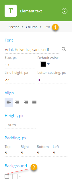
Property | Function |
|---|---|
Breadcrumb navigation (1) | Use "breadcrumbs" at the top of the setup area to navigate the parent (column, section, banner, block, and template) elements. |
Font | Use this settings group to configure the baseline font settings of the Text element. Content builder font set – select the font family of the text from the list of registered font families. To modify the list of fonts used in your template, update the "Content builder font set" lookup. Learn more: Set up fonts in the Content Designer. Size, px – specify the width and height of the button in pixels. Click Line height, px – specify the spacing between the lines and the borders of the button. The maximum height is 250px; the minimum line height cannot be less than the size of the font. Letter spacing, px – specify the spacing between the characters in pixels. |
Size, px | Size, px – specify the width and height of the text in pixels. |
Align | Align the baseline text horizontally (left |
Height, px | Specify the height of the text container (in pixels). This field is used to specify the fixed height of the text container. It will not stretch or shrink to fit the text inside. |
Padding, px | Specify the distance (in pixels) between the text and each of the borders of the container. Padding is specified separately for each side. |
Background | Set background color for the text. Background style settings are disabled by default. Select the checkbox (2) to enable them. Clear this checkbox to disable all background settings of the current spacer. Click |
Divider
The Divider element (Fig. 7) is used for separating adjacent elements with horizontal lines or margins.

You can use the setup area to configure the height of the divider and the color and width of the horizontal line.
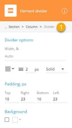
Property | Function |
|---|---|
Breadcrumb navigation (1) | Use "breadcrumbs" at the top of the setup area to navigate the parent (column, section, banner, block, and template) elements. |
Divider options | Use this settings group to configure the width of the horizontal line, its color, width, and style. |
Padding, px | Specify the distance (in pixels) between the horizontal line and each of the borders of the divider. Padding is specified separately for each side. |
Background | Use this settings group to toggle background options on and off, and to select the background color. |
Navbar
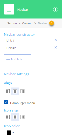
The Navbar element (Fig. 9) is a navigation bar containing a list of menu links. The navbar element can be configured differently for mobiles.
Property | Function |
|---|---|
Breadcrumb navigation (1) | Use "breadcrumbs" at the top of the setup area to navigate the parent (column, section, banner, block and template) elements. |
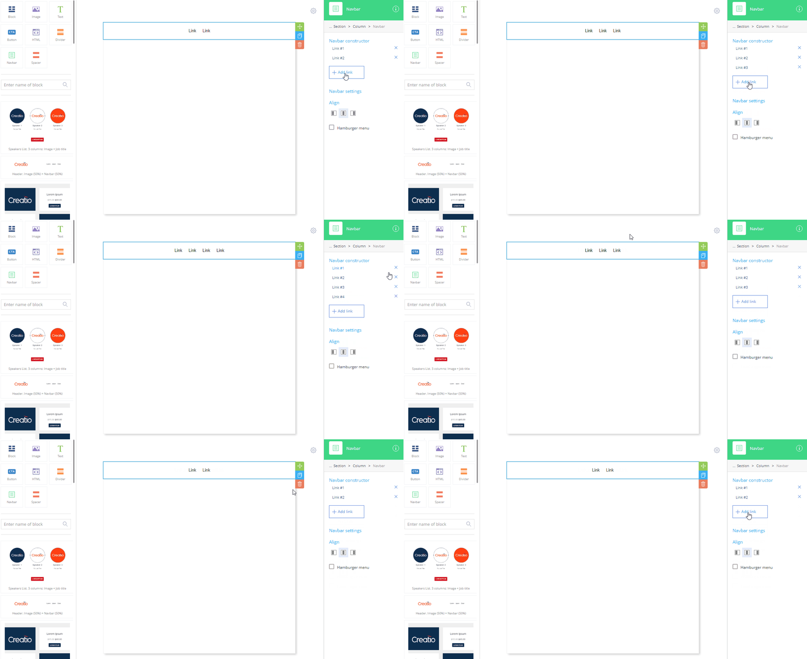
Navbar constructor | Add, remove, and move the navigation links. To access the setup area of a navlink, click the corresponding item in the navlink list. Click Add link to add a link Click |
Align | Align the navlinks in the navbar. |
Hamburger menu | Enable "hamburger" menu on mobile devices, displaying menu links one over another. |
Icon align | Align the hamburger menu icon horizontally (left |
Icon color | Click |
Navlink
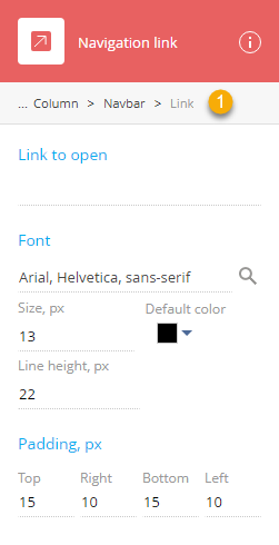
The Navlink element (Fig. 11) is a navigation link for the parent navigation bar containing a list of navigation links.
Property | Function |
|---|---|
Breadcrumb navigation (1) | Use "breadcrumbs" at the top of the setup area to navigate the parent (column, section, banner, block and template) elements. |
Link to open | Provide the URL to the desired destination in the Link to open field. |
Font | Use this settings group to configure the font settings of the link. Content builder font set – select the font family of the menu link from the list of registered font families. To modify the list of fonts used in your template, update the "Content builder font set" lookup. Read more in the Set up fonts in the Content Designer article. Size, px – specify the width and height of the font in pixels. Click Line height, px – specify the spacing between the lines and the borders of the button. The maximum line height is 250px; the minimum line height cannot be less than the size of the font. |
Padding, px | Specify the distance (in pixels) between the text and each of the borders of the container. Padding is specified separately for each side. |
Spacer
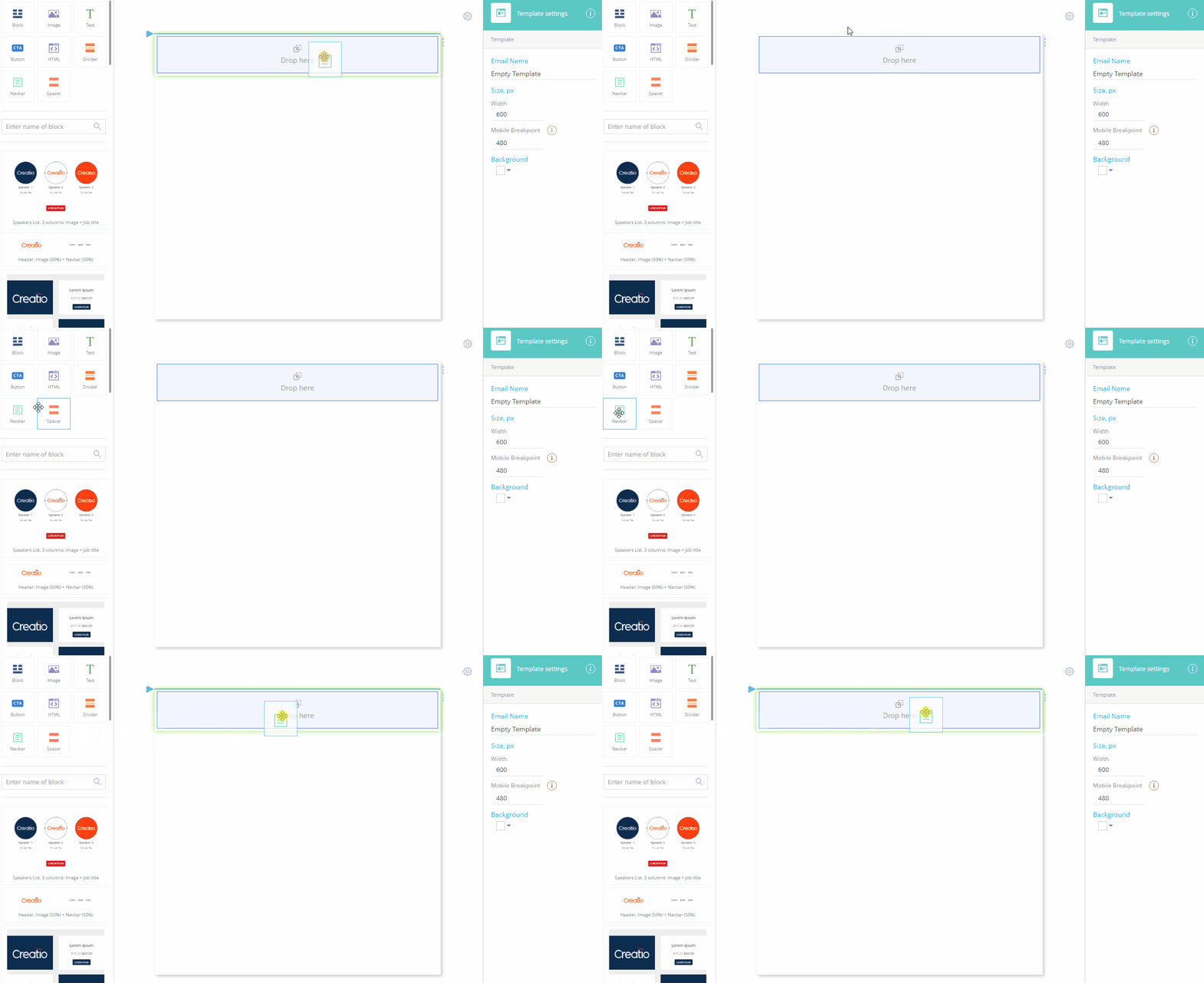
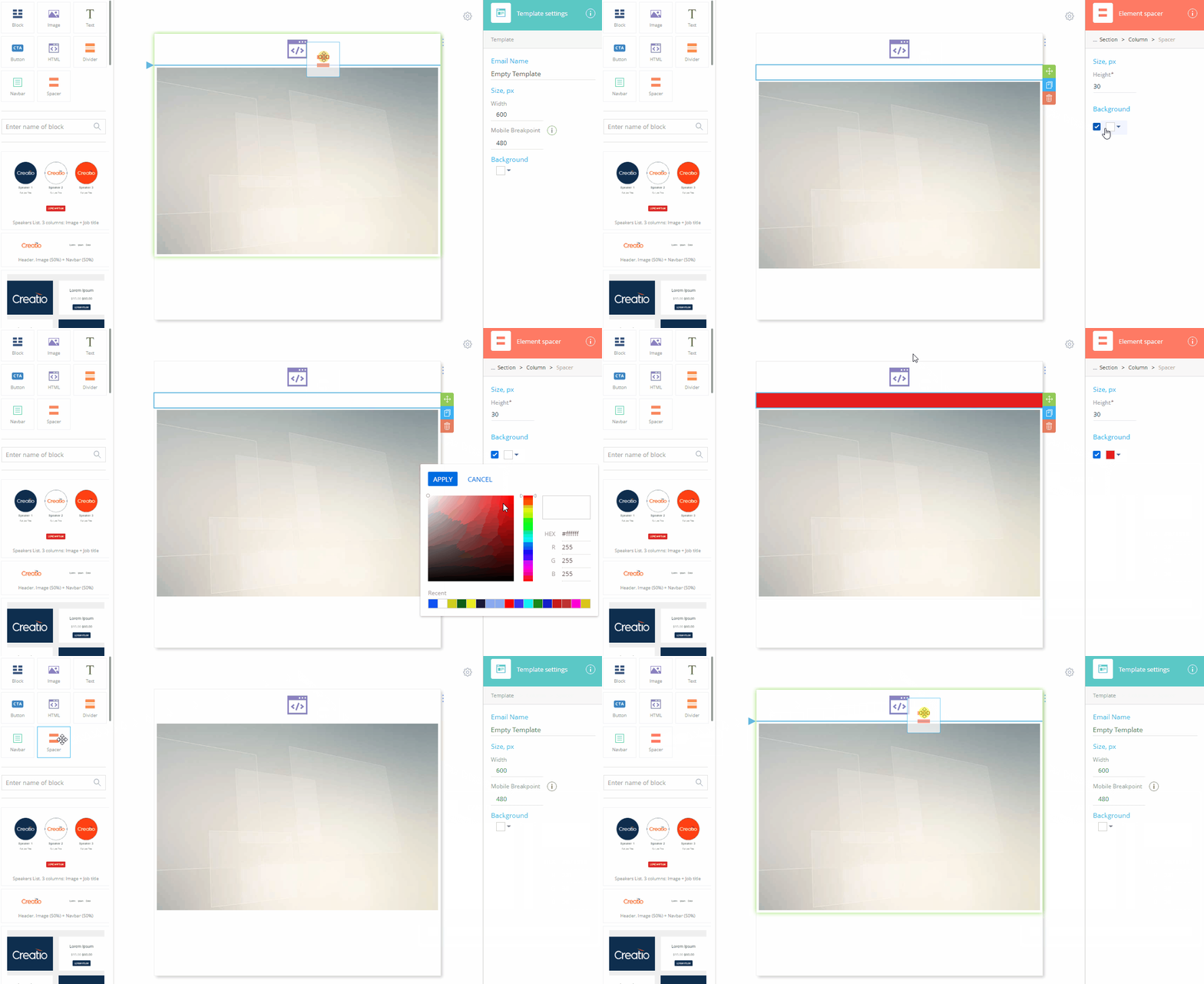
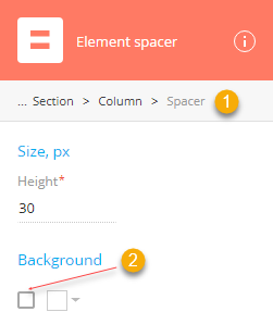
The Spacer element (Fig. 13) is used for separating adjacent elements with empty spacer (an invisible horizontal line).
Property | Function |
|---|---|
Breadcrumb navigation (1) | Use "breadcrumbs" at the top of the setup area to navigate the parent (column, section, banner, block, and template) elements. |
Size, px | Update the Height field to specify the thickness of the spacer. |
Background | Set background color for the spacer. Background style settings are disabled by default. Select the checkbox (2) to enable them. Clear this checkbox to disable all background settings of the current spacer. Click |
 field to upload an image from your computer or insert the URI of an image. Template Designer supports *.png, *.jpeg, *.jpg, and *.gif image formats.
 , center
  , or right
  ).
). to open the color picker and select the background color. The background completely fills the entire graphics container. For example, if the padding setting values are not set to 0, the background color should be visible around the image. If the image has transparent areas, the background color will be visible through them.
 to open the color picker and select the border color.
 – Hidden. The border is defined but invisible. The border width effectively equals 0.
 – Dotted
 – Dashed
 – Solid
 – Double
 – Groove
 – Ridge
 – Inset
 – Outset
 to open the color picker and select the font color.
 left,
left,  to open the color picker and select the background color.
 to open the color picker and select the font color.
 to open the color picker and select the background color.
 , center
  or right
  ). This property is only available if the hamburger menu is enabled.
 to open the color picker and select the background color.