Use the Creatio analytics to work with static data. Visualize data using charts, metrics, lists and other elements. For example, you can track the current status of the employees' tasks, display various ratings, etc.
You can view analytics as follows:
-
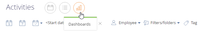
In the Dashboards view of Creatio sections (Fig. 1). This view displays the general statistics for the section records (taking the current filters into account), For example, the number of active opportunities per sales rep.
-
On a record page. Here you can view the preliminary configured dashboards by any Creatio record. such as the number of communications with a contact for current month.
-
In the Dashboards section. The section displays system-wide analytics based on the data from different Creatio sections. For example, you can view the list of best employees of the current month.
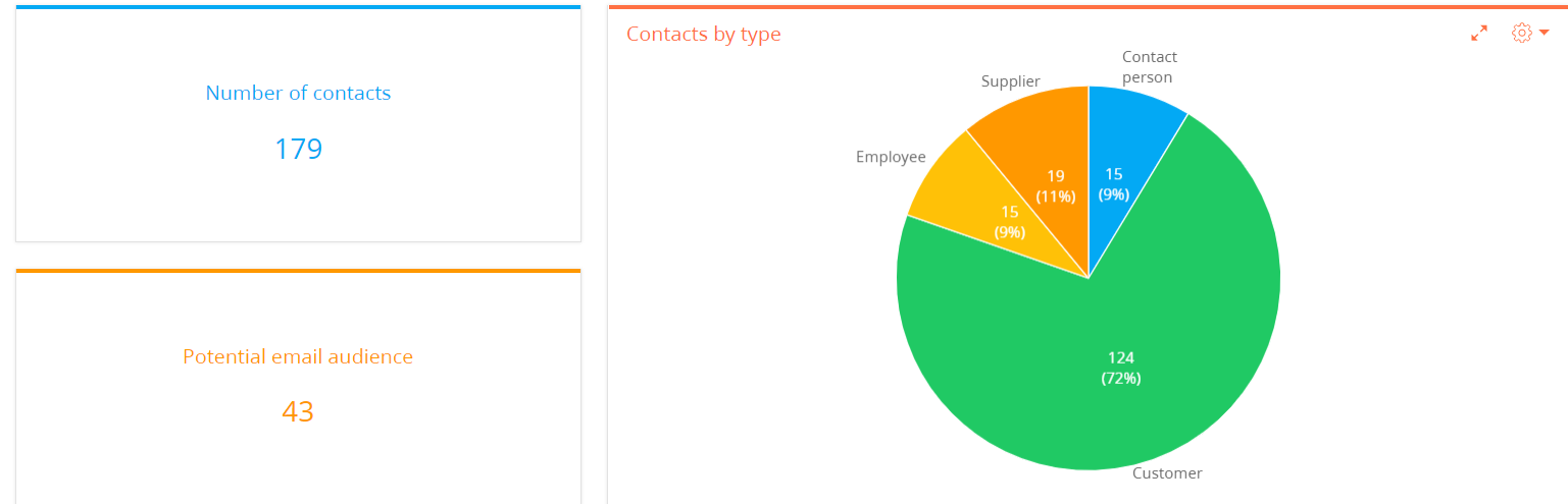
Analytical data is visualized via special dashboard tiles, each of which is a separate chart, list or metric (Fig. 2).
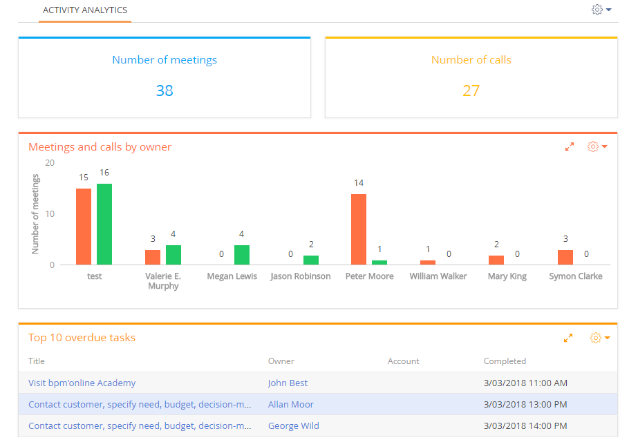
Dashboard tiles are placed on dashboard tabs (Fig. 3).
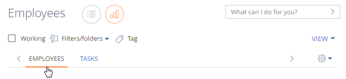
The dashboard tiles, their titles and contents are fully customizable. You can add custom dashboard tabs and populate them with dashboard tiles (Fig. 4). For example, the Employees tab can display statistics on the efficiency of your employees, and the Tasks tab can show information about employees' activities.
Analyze chart
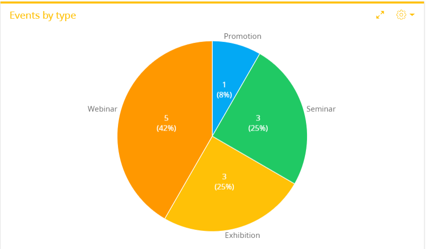
The “Chart” dashboard tile displays Creatio dynamics and percentages. For example, you can use a chart dashboard to display distribution of events by types (Fig. 5).
You can change the data display mode of an existing chart tile.
-
Diagram mode – spline, line, pie, etc. Read more >>>
-
List mode – record list used as a basis for building a chart. Read more >>>
Use the toolbar buttons at the top-right of the dashboard tile to change the chart type or switch to the list mode.
-
 – chart menu The menu items vary depending on the dashboard display mode.
 -
 – opens the dashboard tile in the full-screen mode. Click the button again to go back to original size. You can also close a maximized dashboard by pressing the Esc key on the keyboard.
 -
 – switch back from the list mode to the diagram mode. For instance, you can get back from the list type to the chart type view mode.
You can “drill down” a chart element (for example, a pie chart section or a bar chart column) and display its data as a separate chart or list. To do this, click the necessary chart element.
Learn more about working with charts in the Set up dashboards article.
View the chart in the diagram mode
The diagram mode is the default mode of the “Chart” dashboard tile.
In this mode, the  button menu contains additional menu items:
-
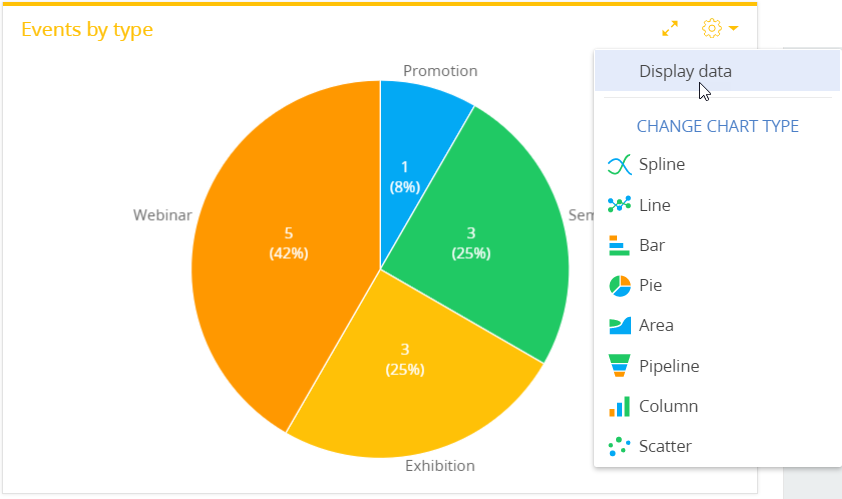
Display data – switches the chart to the list view mode.
-
Change chart type – displays the information for building a chart using another diagram type (Fig. 6).
The diagram can display up to 50 values by default. If you have more values, an icon ( ) in the left top corner of the dashboard notifies you about exceeding the data volume for display. You can click this icon to display all values.
View the chart in the list mode
A “Chart” dashboard tile can be displayed as a list (Fig. 7).
To switch to the list mode, use the Display data item from the  menu or from the chart element menu.
-
To display all chart data in the list mode, click
 button and select Display data.
 -
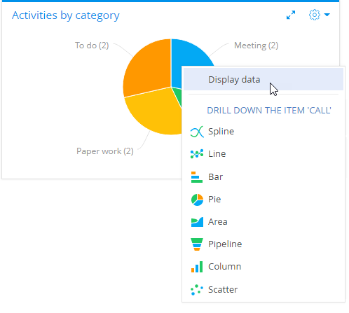
To display the data of a specific chart element (a section or a column) in the list mode, click the element and select Display data in the opened menu (Fig. 8).
In the list mode, you can:
-
Set up the columns.
-
Sort data by the displayed columns.
-
Export data to Excel.
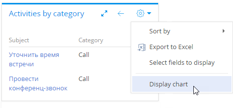
To switch back to the chart mode, use the Display chart command (Fig. 9) or click the  button.
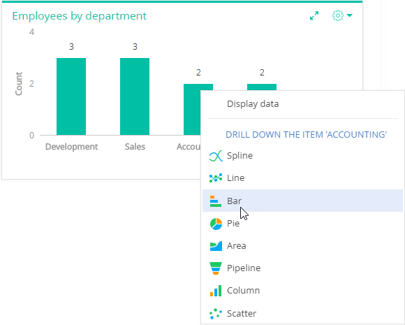
Drill down the chart
You can bring up additional information about any chart element, such as a column, an area, or a segment. For example, when analyzing a chart, which displays employees by departments, you can “drill down” the R&D department and display the number of positions in the R&D department.
Any element of the new chart can be “drilled down” as well. For example, you can display how developers are grouped by their role in decision-making.
To “drill down” a chart element:
-
Click the needed chart element.
-
Select a chart type in the menu (Fig. 10).
-
In the opened window, specify the column the chart should be based on, for example, the “Job” column of the current object.
As a result, the dashboard tile will display how the employees of the R&D department are grouped by positions.
Click the
 button of the dashboard tile to return to the previous chart.
Analyze gauge
The “Gauge” dashboard tile (Fig. 11) displays a metric in relation to an arbitrary scale. For example, use this dashboard tile to display the number of conducted meetings of a manager if the desired rate is known. You can also use it to monitor the balance between the planned and actual number of calls an agent is required to make per day.
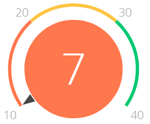
On the color scheme, the red interval displays the undesirable level of values, yellow – the satisfactory level and the green one display the desirable level. The color of the gauge circle depends on the interval that the current value is in.
Gauges can display the following data types:
-
The total number of either all or filtered records of Creatio object, for example, the number of calls per manager a day.
-
Minimum or maximum value of a numeric field, for example, minimum or maximum call duration.
-
Sum or the average value of a numeric field, for example, the total amount of paid invoices.
Learn more about working with the gauge in the Set up dashboards article.
Analyze list
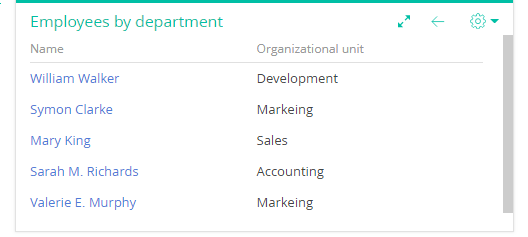
The “List” dashboard tile (Fig. 12) displays Creatio information as a list with the specified number of records.
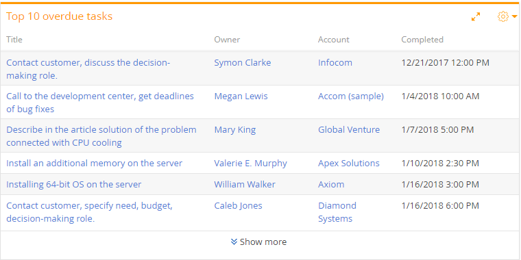
The list displays records of a particular object with custom filter and sorting settings.
If any of the columns is a primary column for displaying in the object, its values become links to the corresponding records. For example, a primary column for the “Activity” object is the Title column. Thus, activity titles will be displayed as links to the corresponding activity pages. The column titles in the “List” dashboard tile correspond to Creatio column titles.
To manage how the data are viewed, use the toolbar buttons located at the top-right of the dashboard tile.
-
 – list menu. Use the Export to Excel menu command to export list in Excel. The Show as multi-line text or Sow as single line text menu commands enable you to set up the text display mode on the list dashboard tile.
 -
 – opens the dashboard tile in the full-screen mode. Click the button again to go back to original size.
-
The Show more link enables viewing all the available data if their number exceeds the number displayed on the dashboard tile.
By default, the list contains the number of records that was specified in the Number of records field on the Display options tab of the “List” dashboard setup page. Clicking the “Show more” link will expand the dashboard tile to your entire browser window and automatically load additional records to the list.
Learn more about working with lists in the Set up dashboards article.
A pivot table is a view option provided for the dashboards of the “List” type (Fig. 13). It displays data as a table with grouping fields in its rows and columns. The intersected cells display the calculated summary data. You can use the pivot tables to analyze sales by region or employees.
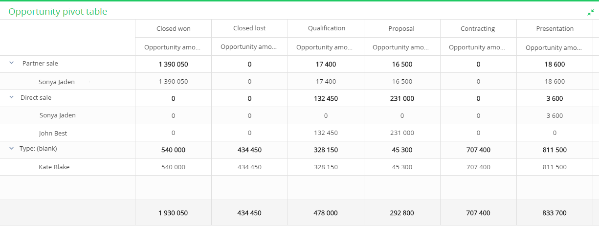
Learn more about working with pivot tables in the Set up dashboards article.
Analyze pipeline
The “Sales pipeline” and “Full pipeline” dashboards are available in the Sales Team Creatio and Sales Enterprise Creatio products. Learn more about analyzing successful sales and planning future opportunities in the Work with sales pipeline article.
These dashboards are not types of the “Pipeline” diagram of the “Chart” dashboard and are configured separately.
Analyze full pipeline
This dashboard tile is used to analyze sales dynamics by stage, starting with lead registration and up to closing of the corresponding opportunity (Fig. 14).
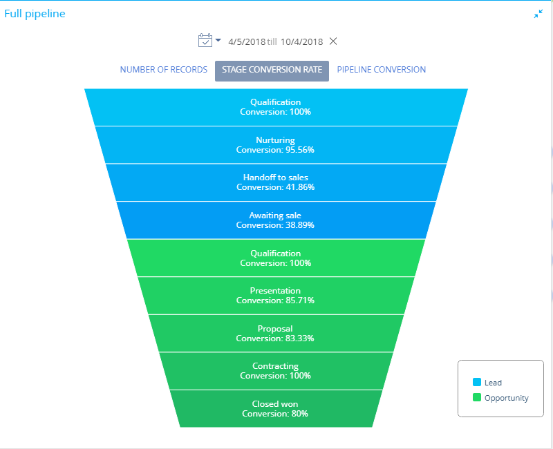
The diagram element height corresponds to the number of leads and opportunities that are currently at the corresponding stage. The list of stages displayed on the diagram can be configured in the Lead stage and the Opportunity stages lookups.
The full pipeline has its own quick filter, which you can use to display data for a certain period of time, e.g., for the current month. You can find more information about the quick filter in the Quick filter article.
The full pipeline can display data in the following views:
-
Number of records view displays how the leads and the registered opportunities that started during the specified time are grouped by stages by the end of that period.
For example, of all leads that were registered during the specified period, only 150 have reached the Qualification stage by the end of the period. Thus, the pipeline will display 150 leads at the Qualification stage. -
Stage conversion rate displays the percentage of leads and opportunities that have advanced to a higher stage during the specified time.
For example, there were 20 opportunities at the Contracting stage during the specified period. If by the end of the specified period 10 out of these 20 opportunities have advanced to a stage higher than the Contracting stage, the stage conversion rate will be 50%. -
Pipeline conversion displays the percentage of leads/opportunities at a certain stage, during the specified period against the total number of leads that started during this period.
For example, 100 leads were registered during the specified period, 5 out of these 100 leads reached the Closed won stage. Consequently, the Closed won stage conversion makes up 5% against the total number of registered leads.
Learn more about working with full pipelines in the Set up dashboards article.
Analyze sales pipeline
The “Sales pipeline” dashboard tile is primarily designed to analyze sales dynamics by stage (Fig. 15).
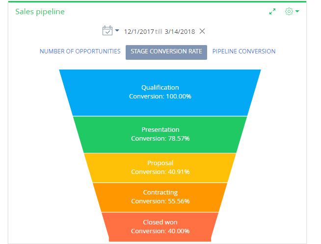
The diagram element height corresponds to the number of current opportunities at the corresponding stage. The list of stages displayed on the diagram is configured in the Opportunity stages lookup. Opportunities with ”Closed lost”, ”Closed won”, ”Closed rejected” and ”Closed rerouted” statuses are not taken into account in the pipeline.
The sales pipeline has its own quick filter, which you can use to display data for a certain period of time, for example, for the current month. You can find more information about the quick filter in the Quick filter article.
The sales pipeline can display data in the following views.
-
Number of opportunities displays how the opportunities that started during the specified time period are grouped by stages by the end of that period.
For example, 15 opportunities started during the selected period on the Proposal stage. Thus, the pipeline will display 15 opportunities at this stage. -
Stage conversion rate displays the percentage of opportunities that have moved from a stage to a higher stage during the specified time period.
For example, there were 20 opportunities at the “Contracting” stage within the selected period. If 10 out of these 20 opportunities have moved to a higher stage than the Contracting stage by the end of the selected period, the Contracting stage conversion rate is 50%. -
Pipeline conversion displays the percentage of opportunities at a certain stage, during the specified period against the total number of opportunities that started during this period.
For example, 100 opportunities started during the selected period and 55 of them passed the Presentation stage, so the monthly conversion rate of the Presentation stage is 55%.
Learn more about working with sales pipelines in the Set up dashboards article.