Use the bpm’online customer center analytics to analyze section statistics. There are several ways to visualize statistics in the system, such as charts, calculated indicators and special lists. For example, you can track the current status of the employees' tasks, display various ratings or any other important summary information as a number.
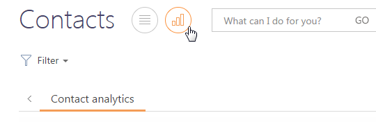
To start working with analytics, open the Analytics view of the needed section (Fig. 78), or go to the Dashboards section.
Fig. 78Opening the [Analytics] view in the [Contacts] section
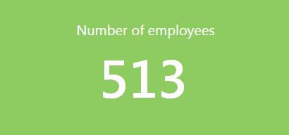
The information in the Analytics view and in the Dashboards section is displayed as a group of elements that are called dashboards components. A dashboard component displays data in a particular way, for example, as a chart or a number (Fig. 79).
Fig. 79The “Indicator” dashboard component example
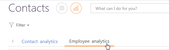
Dashboard components are combined in a dashboard. Each dashboard corresponds to the relevant section tab with the same title. To open a dashboard, click the corresponding tab (Fig. 80).
Fig. 80Selecting dashboard component
Note
Setting up dashboards and dashboard components is described in a separate chapter.
Next in this chapter
•The “Chart” dashboard component
•The “Indicator” dashboard component
•The “Speedometer” dashboard component
•The “List” dashboard component
•The “Widget” dashboard component