How to set up a “Chart” dashboard component
To set up a “Chart” dashboard component, use the chart setup page. To create a chart, enter its title and specify the records from which data should be displayed. Save your changes.
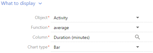
What to display
[Object] - The system object that you want to use for building a chart. For example, to calculate the number of contacts by their job title, select the “Contact” object.
[Function] – How data in a chart is calculated and displayed.
“Count” – The total number of records in a system object.
“maximum”, “minimum”, and “average”.
“sum” – The sum of values for a specified object column, for example, an employee's total duration of activities within a week.
[Column] – The column to be used in the calculation. The list of values includes numeric columns and date columns. For example, specify the “Duration (minutes)” value to calculate the average duration of calls by managers (Fig. 317). This field is not displayed if the “count” value is selected in the [Function] field.
[Chart type] – “Bar chart” or “Pie chart”.
Fig. 317 Setting up the [What to display] detail for a chart
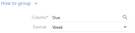
How to group
[Column] – The column that will be used to group records in a new chart. For example, to calculate the number of activities by owner, select the “Owner” field. Use this field to select any column of the selected object.
[Format] – date format, for example, “Week” or “Month & Year”. This field is displayed if a date value is selected in the [Column] field. For example, to calculate the number of completed activities by week, specify “Week” in the [Format] field and “Due” in the [Column] field (Fig. 318).
Fig. 318 Setting up the [How to group] detail for a chart
How to sort
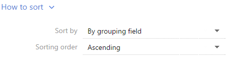
[Sort by] – How data is sorted, for example, to sort employees in alphabetical order on the “Activities by owner” chart, select “By grouping field”. To sort employees by number of activities, select “By resulting data”.
[Sort order] – Alphabetical order or reverse alphabetical order (Fig. 319).
Fig. 319 Setting up the [How to sort] detail for a chart
How to filter
Use this detail to specify conditions for how a chart is to be built. For example, to create a chart that displays how many contacts were added within a specified time period, specify the needed period in the filter conditions, for example, “Created on = Current month” (Fig. 320).
Fig. 320 Setting up the [How to filter] detail for a chart

The filter is available if the [Object] field is filled in.
Note
Detailed information about advanced filters can be found in a separate chapter.
How to connect section data
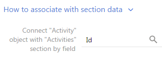
[Connect ... object with ... section by field] – Fill in this field if you want to display data with respect to the filters set up for the section. If you leave this field empty, the filters applied in the section will not be considered when building the chart. The field is displayed if the [Object] field is filled in, but it is not displayed in the [Dashboards] section.
This field can be used in a number of ways.
1.The chart is built based on the records of the section it is added to (chart object corresponds to section object). For example, there is an “Activities by owner“ chart added to the [Activities] section to display the number of activities by owner. In this case, only the [Id] column will normally be available for the object connection field.
a.If you select the [Id] column in the field (Fig. 321), the chart will only be built based on the records that correspond to the filter conditions specified in the section. For example, if you set up a “Completed activities“ folder, then when you select this folder the chart will display information related to the completed activities only. Or, if you select a certain time period, it will display the information related to the activities within that time period only.
Fig. 321 Connecting a chart to a section by the “Id“ field
b.If you leave the connection field blank, then the chart will display the information for all section records, regardless of the filter conditions set.
2.The chart is built based on the data from other section (chart object does not correspond to section object). For example, there is an “Activities by owner“ chart added to the [Contacts] section to display the number of activities by owner. Then, in the the object connection field, you can select a column from the available list of columns used to connect a chart object with a section object.
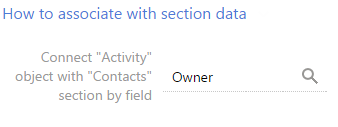
a.If you select a column, the chart will only be built based on the records that correspond to the filter conditions specified in the section. For example, you can select the “Owner“ column for the “Activities by owner“ chart (Fig. 322). Then, if you set a filter in the [Contacts] section, the chart will only display the information related to the activities whose owners are displayed in the section. Or you can select the “Author“ column – in this case, the chart will only display the information related to the activities added by the specified employees.
Fig. 322 Connecting a chart to a section by the “Owner“ field
b.If you leave the connection field blank, then the chart will display the information for all object records used to build the chart, regardless of the filter conditions set.
c.The field will also be left blank if the chart data is not connected to the data of the section it is added to. For example, when the “Activities by owner“ chart is added to the [Knowledge base] section.
What to display
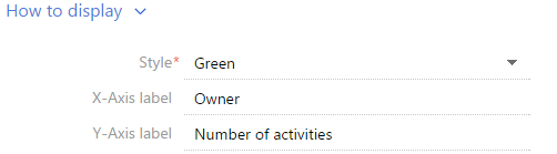
[Style] – The color of the dashboard component title and diagram elements.
[X-axis label], [Y-axis label] – X and Y axes labels that will be displayed on the chart. These fields are only displayed for the charts that contain axes (“spline”, “line”, “area chart”, “scatter chart”) (Fig. 323).
Fig. 323 Setting up the [How to display] detail for a chart
Displaying several series on a chart
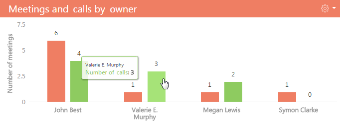
You can show several sets of data called series. For example, you can display meetings and calls in separate series (Fig. 324).
Fig. 324 The example of chart with two series
To add a series to a chart:
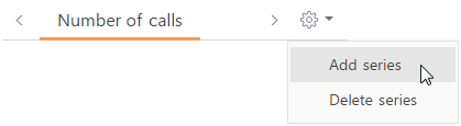
1.In the  button menu of the chart setup page, select the [Add series] command.
Fig. 325 Adding a new series on the chart
2.On the added tab, fill out the needed fields and save the page.
3.Save the chart setup page and the dashboard setup page that contains the chart.
As a result, the chart will display the data series added.
To delete a series:
1.Go to the tab of the series you want to delete.
2.In the  button menu of the chart setup page, select the [Delete series] command (Fig. 326).
Fig. 326 Deleting a data series from chart

3.Save the chart setup page and the dashboard setup page that contains the chart.
As a result, the series will be removed from the page.