Implement a custom Freedom UI component using remote module
To implement the example:
- Create an Angular project. Read more >>>
- Install
npmpackages. Read more >>> - Create a custom Freedom UI component. Read more >>>
- Implement the business logic of the custom Freedom UI component. Read more >>>
- Add the custom Freedom UI component to the Freedom UI Designer. Read more >>>
- Add the custom Freedom UI component to the Freedom UI page. Read more >>>
Add a Custom input component to the custom request page. The component must be an input and include a validator that checks whether the Custom input component added to the custom request page is filled out. The name and value of the input on the page must match the Name field. Add the Custom input component to the library of the Freedom UI Designer. Use the image provided below.
Implement the component using a remote module created in the Angular framework.
Example implementation in Creatio 8.3.4 and later
1. Create an Angular project
To create an Angular project, follow the instructions: Create an Angular project.
For this example:
<%projectName%>macro is set to "sdk_custom_component."<%vendorPrefix%>macro is set to "usr."
As a result, an Angular project to develop a custom UI component using a remote module will be added.
2. Install npm packages
To install npm packages, follow the instructions: Install npm packages.
As a result, required npm packages are installed.
3. Create a custom Freedom UI component
-
Ensure the project includes the "AGENTS.md" file. Instructions: Create a custom Freedom UI component (step 1).
-
Run the
ng g c features/runtime/view-elements/input --view-encapsulation=ShadowDomcommand in the Visual Studio Code terminal to create an Angular component in the project. This adds theInputComponentfiles to the "src/app/features/runtime/view-elements/input" project directory. -
Define the component constants.
-
Go to the "app/features/runtime/view-elements/input" directory.
-
Create the "input.constants.ts" file.
-
Open the "input.constants.ts" file.
-
Export the following constants that define:
- the view element type
- the view element selector
- the component icon
-
Save the file.
"input.constants.ts" file/* The type of the view element.*/export const INPUT_ELEMENT_TYPE = 'usr.Input';/* The selector of the view element. */export const INPUT_ELEMENT_SELECTOR = 'usr-input';/* Define the component icon as an inline SVG. */export const INPUT_ELEMENT_ICON =`<svg xmlns="http://www.w3.org/2000/svg" xmlns:xlink="http://www.w3.org/1999/xlink" width="80px" height="66px" viewBox="0 0 79 66" version="1.1">` +`<g id="surface1">` +`<path style=" stroke:none;fill-rule:nonzero;fill:rgb(0%,0%,0%);fill-opacity:1;" d="M 48.433594 0.0820312 C 47.539062 0.136719 47.394531 0.171875 46.835938 0.429688 C 46.105469 0.789062 45.5 1.367188 45.203125 2.015625 C 45.007812 2.429688 44.984375 2.578125 44.984375 3.332031 C 44.984375 4.113281 45.007812 4.226562 45.21875 4.671875 C 45.566406 5.398438 46.394531 6.203125 46.957031 6.371094 C 47.378906 6.503906 50.277344 6.65625 52.417969 6.664062 L 53.082031 6.664062 L 53.082031 59.335938 L 50.847656 59.335938 C 48.039062 59.34375 47.265625 59.40625 46.726562 59.699219 C 46.136719 60.027344 45.523438 60.675781 45.234375 61.285156 C 45 61.773438 44.984375 61.878906 44.984375 62.667969 C 44.984375 63.449219 45.007812 63.5625 45.21875 64.007812 C 45.644531 64.878906 46.613281 65.617188 47.601562 65.835938 C 48.199219 65.96875 61.867188 66.046875 63.90625 65.925781 L 65.355469 65.84375 L 66.039062 65.503906 C 67.378906 64.835938 67.78125 64.1875 67.78125 62.667969 C 67.78125 61.488281 67.625 61.074219 66.984375 60.433594 C 65.953125 59.417969 65.589844 59.335938 61.964844 59.335938 L 59.683594 59.335938 L 59.683594 6.664062 L 61.925781 6.664062 C 64.757812 6.65625 65.5 6.59375 66.0625 6.28125 C 66.726562 5.925781 67.441406 5.167969 67.625 4.632812 C 67.835938 4.007812 67.835938 2.648438 67.625 2.03125 C 67.351562 1.226562 66.273438 0.398438 65.203125 0.15625 C 64.726562 0.0390625 50.003906 -0.015625 48.433594 0.0820312 Z M 48.433594 0.0820312 "/>` +`<path style=" stroke:none;fill-rule:nonzero;fill:rgb(0%,0%,0%);fill-opacity:1;" d="M 11.355469 14.800781 C 6.71875 14.832031 3.320312 14.890625 2.925781 14.9375 C 1.78125 15.09375 0.855469 15.695312 0.433594 16.558594 C 0.21875 17.003906 0.210938 17.050781 0.136719 19.132812 C 0.046875 21.710938 0.136719 46.394531 0.234375 48.003906 C 0.28125 48.664062 0.363281 49.273438 0.425781 49.433594 C 0.589844 49.816406 1.3125 50.515625 1.820312 50.769531 C 2.191406 50.945312 2.390625 50.980469 3.59375 51.042969 C 4.9375 51.117188 13.582031 51.175781 37.597656 51.246094 L 50.019531 51.28125 L 50.019531 44.625 L 6.605469 44.625 L 6.605469 21.375 L 50.019531 21.375 L 50.019531 14.710938 L 34.578125 14.726562 C 26.082031 14.734375 15.632812 14.769531 11.355469 14.800781 Z M 11.355469 14.800781 "/>` +`<path style=" stroke:none;fill-rule:nonzero;fill:rgb(0%,0%,0%);fill-opacity:1;" d="M 62.746094 18.042969 L 62.746094 21.375 L 72.410156 21.375 L 72.410156 44.625 L 62.746094 44.625 L 62.746094 51.289062 L 68.003906 51.246094 C 74.3125 51.183594 76.390625 51.109375 76.960938 50.914062 C 77.484375 50.726562 78.300781 49.929688 78.574219 49.320312 C 78.984375 48.417969 78.976562 48.621094 78.976562 33 C 78.976562 17.378906 78.984375 17.582031 78.574219 16.679688 C 78.300781 16.070312 77.484375 15.273438 76.960938 15.085938 C 76.390625 14.890625 74.328125 14.808594 68.046875 14.753906 L 62.746094 14.703125 Z M 62.746094 18.042969 "/>` +`<path style=" stroke:none;fill-rule:nonzero;fill:rgb(0%,0%,0%);fill-opacity:1;" d="M 18.589844 24.425781 C 18.148438 24.570312 17.984375 24.765625 17.453125 25.765625 C 16.851562 26.910156 13.683594 33.933594 12.371094 37.0625 C 11.347656 39.476562 11.171875 40.023438 11.210938 40.492188 C 11.261719 40.996094 11.597656 41.484375 12.121094 41.820312 C 12.46875 42.039062 12.582031 42.0625 13.128906 42.0625 C 13.667969 42.0625 13.789062 42.039062 14.085938 41.835938 C 14.546875 41.527344 14.859375 41.0625 15.351562 39.972656 L 15.761719 39.054688 L 19.316406 39.03125 L 22.867188 39.015625 L 23.429688 40.167969 C 24.269531 41.910156 24.484375 42.101562 25.582031 42.101562 C 26.476562 42.101562 26.871094 41.859375 27.289062 41.054688 C 27.691406 40.289062 27.691406 40.21875 27.214844 39 C 26.1875 36.363281 23.292969 29.878906 21.746094 26.78125 C 20.78125 24.832031 20.726562 24.742188 20.386719 24.554688 C 19.941406 24.3125 19.128906 24.253906 18.589844 24.425781 Z M 19.757812 31.1875 C 20.28125 32.359375 21.441406 35.367188 21.386719 35.421875 C 21.320312 35.488281 17.429688 35.496094 17.359375 35.429688 C 17.285156 35.347656 19.300781 30.5625 19.410156 30.5625 C 19.445312 30.5625 19.597656 30.847656 19.757812 31.1875 Z M 19.757812 31.1875 "/>` +`</g>` +`</svg>`; -
-
Define the runtime feature ID.
- Open the "src/app/features/runtime/runtime-feature.ids.ts" file.
- Export the constant that defines the runtime feature ID.
- Save the file.
"runtime-feature.ids.ts" file/* The ID of the runtime feature. */export const RUNTIME_FEATURE_ID = 'sdk_custom_component-runtime'; -
Specify that the
InputComponentis a view element.- Open the "input.component.ts" file.
- Flag the component using the
@CrtViewElementdecorator. - Import the required functionality from the libraries into the file.
- Save the file.
"input.component.ts" file/* Import the required functionality from the libraries. */import { ChangeDetectionStrategy, Component, ViewEncapsulation } from '@angular/core';import { CrtViewElement } from '@creatio-devkit/common';import { INPUT_ELEMENT_SELECTOR, INPUT_ELEMENT_TYPE } from './input.constants';@Component({selector: 'usr-input',templateUrl: './input.component.html',styleUrls: ['./input.component.scss'],encapsulation: ViewEncapsulation.ShadowDom,changeDetection: ChangeDetectionStrategy.OnPush,standalone: false,})/* Register the component as a Freedom UI view element. */@CrtViewElement({selector: INPUT_ELEMENT_SELECTOR,type: INPUT_ELEMENT_TYPE,})export class InputComponent {} -
Register the
InputComponentview element in the runtime feature.The template already contains the runtime feature activation and
bootstrapCrtModule()call. Extend the existing files to register the custom component.-
Open the "runtime-feature.module.ts" file.
-
Add the
InputComponentview element to the@CrtModuledecorator and Angular module declarations."runtime-feature.module.ts" file/* Import the required functionality from the libraries. */import { NgModule } from '@angular/core';import { CommonModule } from '@angular/common';import { CrtModule } from '@creatio-devkit/common';import { InputComponent } from './view-elements/input/input.component';@CrtModule({/* Specify that InputComponent is a view element. */viewElements: [InputComponent]})@NgModule({declarations: [InputComponent],imports: [CommonModule],})export class RuntimeFeatureModule {} -
Open the "runtime.feature-definition.ts" file.
-
Define the
InputComponentin thediscovery.viewElementssection."runtime.feature-definition.ts" file/* Import the required functionality from the libraries. */import type { RemoteFeatureDefinition } from '@creatio-devkit/common';import { RUNTIME_FEATURE_ID } from './runtime-feature.ids';import { INPUT_ELEMENT_TYPE } from './view-elements/input/input.constants';/*** Root definition for the runtime feature.** Describes the view elements this remote package contributes at runtime* and provides the entry points used to load designer metadata and* activate the feature.*/export const runtimeFeatureDefinition = {id: RUNTIME_FEATURE_ID,discovery: {viewElements: [{ type: INPUT_ELEMENT_TYPE },],},loadDesignerDefinitions: (context) =>import('./runtime.designer-definitions').then((m) =>m.loadRuntimeDesignerDefinitions(context)),activate: () =>import('./runtime.feature-activation').then((m) => m.activateRuntimeFeature()),} satisfies RemoteFeatureDefinition; -
Open the "runtime.feature-activation.ts" file.
-
Define the
InputComponentview element as an Angular Element. Learn more: Angular elements overview (official vendor documentation)."runtime.feature-activation.ts" file/* Import the required functionality from the libraries. */import { Injector, ProviderToken, Type } from '@angular/core';import { createCustomElement } from '@angular/elements';import { bootstrapCrtModule } from '@creatio-devkit/common';import {ensureFeatureModuleRef} from '../../remote-app-context';import { RuntimeFeatureModule } from './runtime-feature.module';import { InputComponent } from './view-elements/input/input.component';import { INPUT_ELEMENT_SELECTOR } from './view-elements/input/input.constants';import { REMOTE_ENTRY_NAME } from '../../remote-entry.ids';function defineCustomElement(selector: string,component: Type<unknown>,injector: Injector): void {if (!customElements.get(selector)) {customElements.define(selector, createCustomElement(component, { injector }));}}/* Initialize the runtime feature module and boot the Creatio runtime integration. */export async function activateRuntimeFeature(): Promise<void> {const moduleRef = await ensureFeatureModuleRef(RuntimeFeatureModule);const injector = moduleRef.injector;defineCustomElement(INPUT_ELEMENT_SELECTOR, InputComponent, injector);bootstrapCrtModule(REMOTE_ENTRY_NAME, RuntimeFeatureModule, {resolveDependency: (token) =>injector.get(token as ProviderToken<unknown>),});} -
Save the files.
-
4. Implement the business logic of the custom Freedom UI component
-
Implement an input in the component.
- Open the "input.component.ts" file.
- Add the
valueproperty to theInputComponentcomponent class. The property manages the input value. - Flag the
valueproperty using the@Inputand@CrtInputdecorators. - Add the
labelproperty to theInputComponentcomponent class. The property manages the input name. - Flag the
labelproperty using the@Inputand@CrtInputdecorators. - Import the required functionality from the libraries into the file.
- Save the file.
"input.component.ts" file/* Import the required functionality from the libraries. */import { Component, Input } from '@angular/core';import { CrtInput, CrtViewElement } from '@creatio-devkit/common';export class InputComponent {/* Add decorators to the value property. */@Input()@CrtInput()/* The input value. */public value: string = '';/* Add decorators to the label property. */@Input()@CrtInput()/* The input name. */public label!: string;} -
Track changes of input values.
- Open the "input.component.ts" file.
- Add the
EventEmitter<string>()event to theInputComponentcomponent class. The event tracks input value changes. - Flag the
EventEmitter<string>()using the@Outputand@CrtOutputdecorators. - Import the required functionality from the libraries into the file.
- Save the file.
"input.component.ts" file/* Import the required functionality from the libraries. */import { Output, EventEmitter } from '@angular/core';import { CrtOutput } from '@creatio-devkit/common';export class InputComponent {/* Add decorators to the EventEmitter<string>() event. */@Output()@CrtOutput()/* Track input value changes. */public valueChange = new EventEmitter<string>();} -
Add the validity flag of the bound attribute to the component.
- Open the "input.component.ts" file.
- Add the
valueValidationInfoproperty to theInputComponentcomponent class. The property displays information that the bound attribute is invalid. - Flag the
valueValidationInfoproperty using the@Inputand@CrtValidationInputdecorators. - Import the required functionality from the libraries into the file.
- Save the file.
"input.component.ts" file/* Import the required functionality from the libraries. */import { Component, Input } from '@angular/core';import { CrtValidationInfo, CrtValidationInput } from '@creatio-devkit/common';export class InputComponent {@Input()@CrtValidationInput()/* Display information that the input value is invalid. */public valueValidationInfo!: CrtValidationInfo;} -
Add the markup of the component to the "input.component.html" file.
"input.component.html" file<div class="wrapper"><label class="label">{{label}}</label><input#inputclass="input"[class.invalid]="valueValidationInfo &&!valueValidationInfo.valid && valueValidationInfo.touched"type="text"[value]="value"(keyup)="valueChange.emit(input.value)"/></div> -
Add the styles of the component to the "input.component.scss" file.
"input.component.scss" file.wrapper {display: flex;flex-direction: row;gap: 10px;padding: 10px;align-items: center;.input.invalid {background-color: #FDD8CF;}}
5. Add the custom Freedom UI component to the Freedom UI Designer
-
Set up the component layout.
- Open the "runtime.designer-definitions.ts" file.
- Import the required functionality from the libraries into the file.
- Add the metadata of the custom component to the
viewElementscollection returned by theloadRuntimeDesignerDefinitions()function. - Specify the same public
typethat you registered in the "runtime.feature-definition.ts" file. - Set up the
toolbarConfigproperty that manages the element layout in the library of the Freedom UI Designer. - Specify the
INPUT_ELEMENT_ICONconstant in thetoolbarConfig.iconproperty. - Specify the default property values of the component in the
defaultPropertyValuesproperty. - Save the file.
"runtime.designer-definitions.ts" file/* Import the required functionality from the libraries. */import type {RemoteDesignerDefinitionsLoadContext,RemoteFeatureDesignerDefinitions,} from '@creatio-devkit/common';import { INPUT_ELEMENT_ICON, INPUT_ELEMENT_TYPE } from './view-elements/input/input.constants';export async function loadRuntimeDesignerDefinitions(context: RemoteDesignerDefinitionsLoadContext): Promise<RemoteFeatureDesignerDefinitions> {return {viewElements: [{type: INPUT_ELEMENT_TYPE,toolbarConfig: {caption: 'Custom input',icon: INPUT_ELEMENT_ICON,},defaultPropertyValues: {label: 'Request name',},},],};} -
Run the
npm run buildcommand in the Visual Studio Code terminal to build the project.
As a result, the build will be added to the "dist" directory of the Angular project. The build will have the "sdk_custom_component" name.
6. Add the custom Freedom UI component to the Freedom UI page
-
Create an app based on the "Records & business processes" template. Instructions: Create an app manually (user documentation).
For this example, create a Requests app.
-
Repeat step 2 of the add the custom Freedom UI component to the Freedom UI page instructions to upload packages to Creatio using the Clio utility.
-
Open the Requests app in the Application Designer.
-
Open the Requests form page.
-
Drag the Custom input component to the canvas.
-
Click
 → Source code to open the source code of the Freedom UI page.
 -
Bind an attribute to the page element.
- Go to the
viewConfigDiffschema section →Input_va390j1element. - Bind the
$UsrNameattribute to thevalueproperty.
viewConfigDiff schema sectionviewConfigDiff: /**SCHEMA_VIEW_CONFIG_DIFF*/[{"operation": "insert","name": "Input_va390j1","values": {"type": "usr.Input","label": "Request name",/* The property that defines the input value. Bound to theUsrName attribute. */"value": "$UsrName",}}]/**SCHEMA_VIEW_CONFIG_DIFF*/, - Go to the
-
Click Save.
As a result, the Custom input component will be added to the request page.
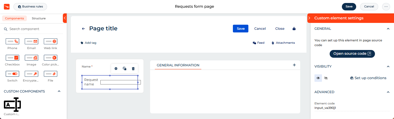
View the result
- Open the Requests section.
- Create a request that has an arbitrary name. For example, "Vacation."
- Clear the custom input.
As a result, Creatio will display the Custom input component in the request profile of the request page. The name and value of the input on the page match the Name field. If the input is empty, Creatio applies validation. The component is implemented using a remote module created in the Angular framework.
Resources
*.zip archive that contains the implemented Freedom UI app (for Creatio version 8.3.4 and later)
Angular project that contains the implemented example (for Creatio version 8.3.4 and later)
Example implementation in Creatio 8.3.3 and earlier
1. Create an Angular project
To create an Angular project, follow the instructions: Create an Angular project.
For this example:
<%projectName%>macro is set to "sdk_custom_component."<%vendorPrefix%>macro is set to "usr."
As a result, an Angular project to develop a custom Freedom UI component using a remote module will be added.
2. Install npm packages
To install npm packages, follow the instructions: Install npm packages.
As a result, required npm packages are installed.
3. Create a custom Freedom UI component
-
Run the
ng g c view-elements/input --view-encapsulation=ShadowDomcommand in the Visual Studio Code terminal to create an Angular component in the project. This adds theInputComponentfiles to the "src/app/view-elements/input" project directory. -
Specify that the
InputComponentis a view element.- Open the "input.component.ts" file.
- Flag the component using the
@CrtViewElementdecorator. - Import the required functionality from the libraries into the file.
- Save the file.
"input.component.ts" file/* Import the required functionality from the libraries. */import { Component, ViewEncapsulation } from '@angular/core';import { CrtViewElement } from '@creatio-devkit/common';@Component({selector: 'usr-input',templateUrl: './input.component.html',styleUrls: ['./input.component.scss'],encapsulation: ViewEncapsulation.ShadowDom})/* Register the component as a Freedom UI view element. */@CrtViewElement({selector: 'usr-input',type: 'usr.Input'})export class InputComponent {} -
Register the
InputComponentview element as a component.- Open the "app.module.ts" file.
- Add the
InputComponentview element to the@CrtModuledecorator. - Register the
InputComponentview element as an Angular Element in thengDoBootstrap()method of theAppModuleroot module. Learn more: Angular elements overview (official vendor documentation). - Save the file.
"app.module.ts" file/* Import the required functionality from the libraries. */import { DoBootstrap, Injector, NgModule, ProviderToken } from '@angular/core';import { createCustomElement } from '@angular/elements';import { BrowserModule } from '@angular/platform-browser';import { bootstrapCrtModule, CrtModule } from '@creatio-devkit/common';import { InputComponent } from './view-elements/input/input.component';@CrtModule({/* Specify that InputComponent is a view element. */viewElements: [InputComponent]})@NgModule({declarations: [InputComponent],imports: [BrowserModule],providers: [],})export class AppModule implements DoBootstrap {constructor(private _injector: Injector) {}ngDoBootstrap(): void {/* Register InputComponent as an Angular Element. */const element = createCustomElement(InputComponent, {injector: this._injector,});customElements.define('usr-input', element);/* Bootstrap CrtModule definitions. */bootstrapCrtModule('sdk_custom_component', AppModule, {resolveDependency: (token) =>this._injector.get(<ProviderToken<unknown>>token)});}}
4. Implement the business logic of the custom Freedom UI component
-
Implement an input in the component.
- Open the "input.component.ts" file.
- Add the
valueproperty to theInputComponentcomponent class. The property manages the input value. - Flag the
valueproperty using the@Inputand@CrtInputdecorators. - Add the
labelproperty to theInputComponentcomponent class. The property manages the input name. - Flag the
labelproperty using the@Inputand@CrtInputdecorators. - Import the required functionality from the libraries into the file.
- Save the file.
"input.component.ts" file/* Import the required functionality from the libraries. */import { Component, Input } from '@angular/core';import { CrtInput, CrtViewElement } from '@creatio-devkit/common';export class InputComponent {/* Add decorators to the value property. */@Input()@CrtInput()/* The input value. */public value: string = '';/* Add decorators to the label property. */@Input()@CrtInput()/* The input name. */public label!: string;} -
Track changes of input values.
- Open the "input.component.ts" file.
- Add the
EventEmitter<string>()event to theInputComponentcomponent class. The event tracks input value changes. - Flag the
EventEmitter<string>()using the@Outputand@CrtOutputdecorators. - Import the required functionality from the libraries into the file.
- Save the file.
"input.component.ts" file/* Import the required functionality from the libraries. */import { Component, EventEmitter, Input, Output } from '@angular/core';import { CrtInput, CrtOutput, CrtViewElement } from '@creatio-devkit/common';export class InputComponent {/* Add decorators to the EventEmitter<string>() event. */@Output()@CrtOutput()/* Track input value changes. */public valueChange = new EventEmitter<string>();} -
Add the validity flag of the bound attribute to the component.
- Open the "input.component.ts" file.
- Add the
valueValidationInfoproperty to theInputComponentcomponent class. The property displays information that the bound attribute is invalid. - Flag the
valueValidationInfoproperty using the@Inputand@CrtValidationInputdecorators. - Import the required functionality from the libraries into the file.
- Save the file.
"input.component.ts" file/* Import the required functionality from the libraries. */import { Component, Input } from '@angular/core';import { CrtValidationInfo, CrtValidationInput } from '@creatio-devkit/common';export class InputComponent {@Input()@CrtValidationInput()/* Display information that the input value is invalid. */public valueValidationInfo!: CrtValidationInfo;} -
Add the markup of the component to the "input.component.html" file.
"input.component.html" file<div class="wrapper"><label class="label">{{label}}</label><input#inputclass="input"[class.invalid]="valueValidationInfo &&!valueValidationInfo.valid && valueValidationInfo.touched"type="text"[value]="value"(keyup)="valueChange.emit(input.value)"/></div> -
Add the styles of the component to the "input.component.scss" file.
"input.component.scss" file.wrapper {display: flex;flex-direction: row;gap: 10px;padding: 10px;align-items: center;.input.invalid {background-color: #FDD8CF;}}
5. Add the custom Freedom UI component to the Freedom UI Designer
-
Set up the component layout.
-
Open the "input.component.ts" file.
-
Flag the component using the
@CrtInterfaceDesignerItemdecorator that has thetoolbarConfigproperty. The property manages the element layout in the library of the Freedom UI Designer. -
Import the required functionality from the libraries into the file.
-
Upload the following image that is displayed in the library of the Freedom UI Designer to the "input" directory.
-
Run the
npm i raw-loader --save-devcommand in the Visual Studio Code terminal to transfer the icon in thestringformat. -
Set up the
toolbarConfigproperty that manages the element layout in the library of the Freedom UI Designer. -
Specify the path to the image in the
toolbarConfig.iconproperty. -
Specify the default property values of the component in the
toolbarConfig.defaultPropertyValuesproperty. -
Save the file.
"input.component.ts" file/* Import the required functionality from the libraries. */import { CrtInterfaceDesignerItem } from '@creatio-devkit/common';/* Add the CrtInterfaceDesignerItem decorator to the InputComponent component. */@CrtInterfaceDesignerItem({/* Manage the element layout in the library of the Freedom UI Designer. */toolbarConfig: {caption: 'Custom input',name: 'Custom input',/* The path to the component image. */icon: require('!!raw-loader?{esModule:false}!./input.svg'),defaultPropertyValues: {label: 'Request name'}}}) -
-
Run the
npm run buildcommand in the Visual Studio Code terminal to build the project.
As a result, the build will be added to the "dist" directory of the Angular project. The build will have the "sdk_custom_component" name.
6. Add the custom Freedom UI component to the Freedom UI page
-
Create an app based on the "Records & business processes" template. Instructions: Create an app manually (user documentation).
For this example, create a Requests app.
-
Repeat step 2 of the add the custom Freedom UI component to the Freedom UI page instructions to upload packages to Creatio using the Clio utility.
-
Open the Requests app in the Application Designer.
-
Open the Requests form page.
-
Drag the Custom input component to the canvas.
-
Click
→ Source code to open the source code of the Freedom UI page. -
Bind an attribute to the page element.
- Go to the
viewConfigDiffschema section →Input_va390j1element →valuesconfiguration object. - Bind the
$UsrNameattribute to thevalueproperty.
viewConfigDiff schema sectionviewConfigDiff: /**SCHEMA_VIEW_CONFIG_DIFF*/[{"operation": "insert","name": "Input_h2fdvpq","values": {"type": "usr.Input","label": "Request name",/* The property that defines the input value. Bound to theUsrName attribute. */"value": "$UsrName",}}]/**SCHEMA_VIEW_CONFIG_DIFF*/, - Go to the
-
Click Save.
As a result, the Custom input component will be added to the request page.
View the result
- Open the Requests section.
- Create a request that has an arbitrary name. For example, "Vacation."
- Clear the custom input.
As a result, Creatio will display the Custom input component in the request profile of the request page. The name and value of the input on the page match the Name field. If the input is empty, Creatio applies validation. The component is implemented using a remote module created in the Angular framework.
Resources
*.zip archive that contains the implemented Freedom UI app (for Creatio version 8.3.3 and earlier)
Angular project that contains the implemented example (for Creatio version 8.3.3 and earlier)