Content block elements arrange other elements of a template. You need at least one block in your template to be able to add non-block elements. Blocks cannot contain other blocks.
A block has a table-like layout. Blocks can hold two types of rows:
-
Sections are multi-column rows. A section can have up to 6 columns. Use sections to arrange most types of content. They are also preferable in general because of their flexibility.
-
Banners are single-column rows. Use banners to insert images that will fill all available space and fit inside the element regardless of the image size. You can align the background image of a banner vertically and horizontally.
As an alternative to using banners, you can specify a background image of an entire block. However, this background image will not stretch or shrink to fit the borders of the block.
By default, a block has one section and no banners. A block must have at least one section or banner. It is not possible to delete the only section or banner of a block.
You can add multiple sections to a single block or add multiple blocks. There will be no visible differentce for the email recipients. We recommend adding any reusable content as separate blocks and saving them to the Block Library for later.
Create a content block
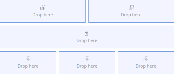
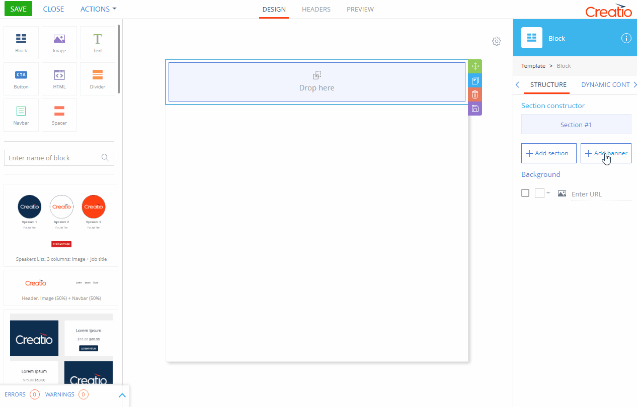
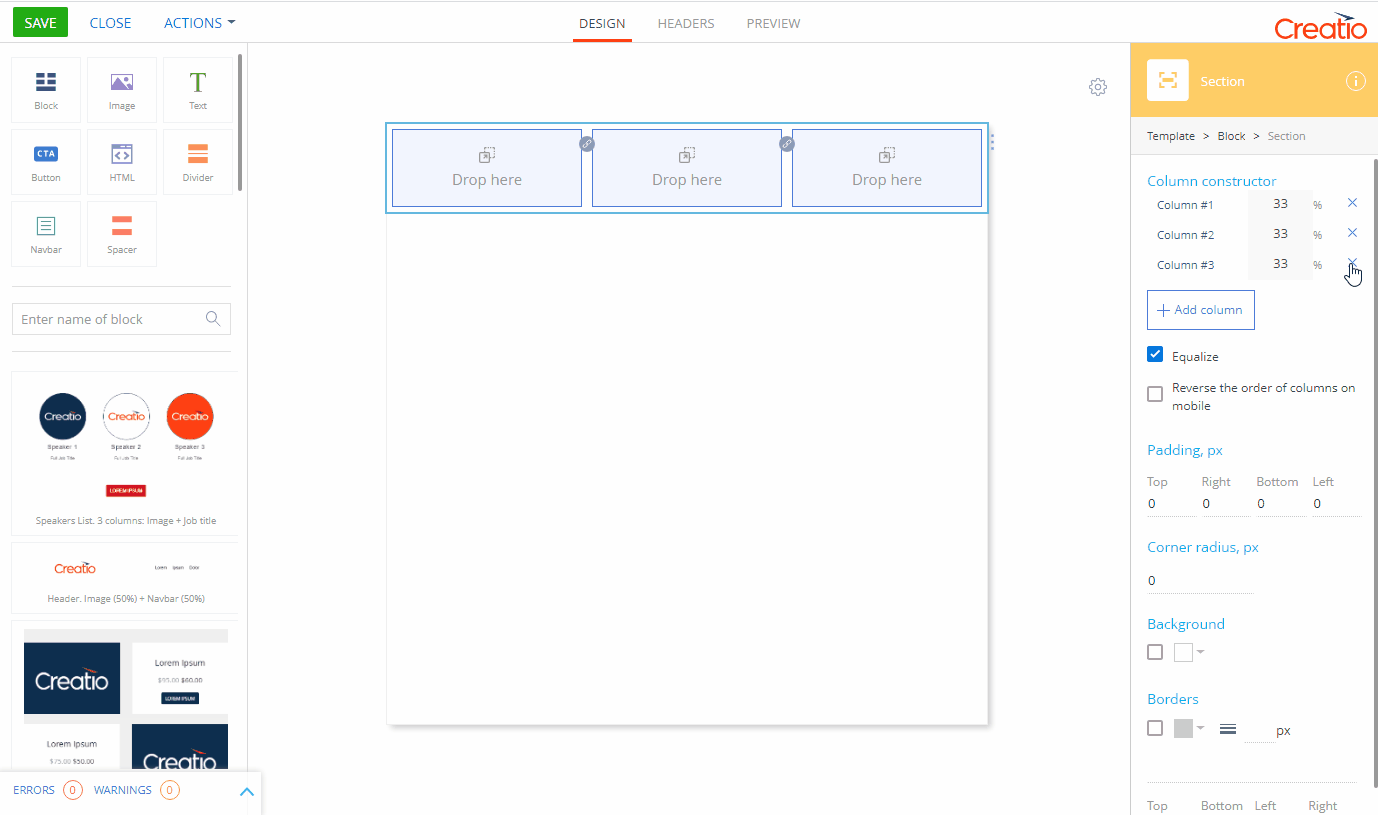
To add a block to a template, drag the Block ( ) element from the element grid to the working area (Fig. 1).
There are several ways you can select a block in the working area:
-
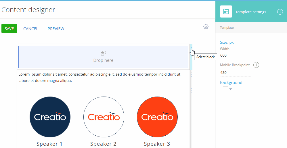
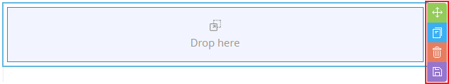
Click on the right border of the block (Fig. 2).
-
Click any element inside the section or banner, then press Esc to go up the navigation tree until the Block element is selected.
-
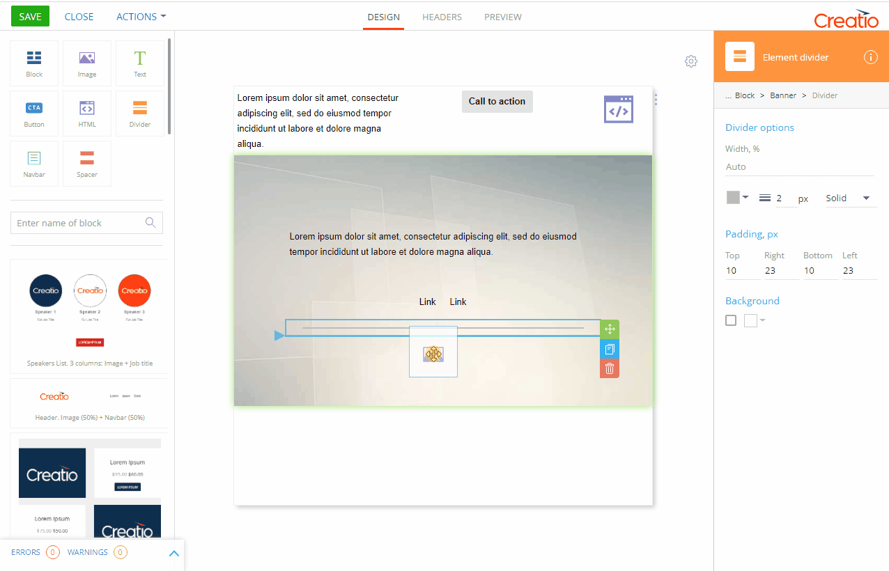
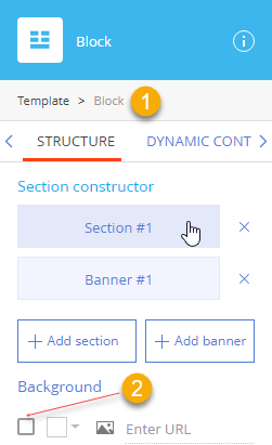
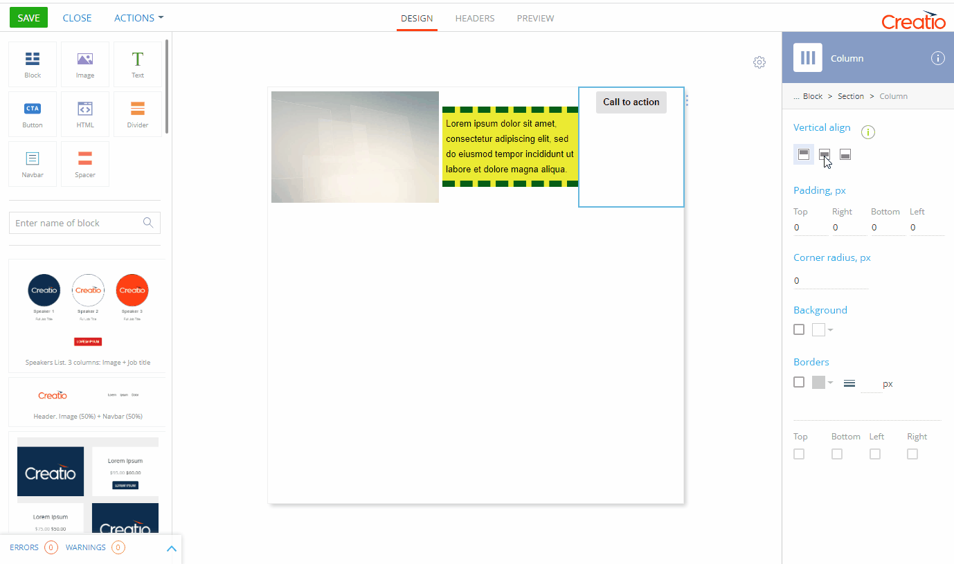
Click any element inside the section or banner, then click “Block” in the breadcrumb navigation in the setup area. Click the leftmost element if “Block” is not yet visible (Fig. 3).
When a block element is selected, its context menu appears on the right (Fig. 4).
-
 : change block position. Drag the block up or down to reorder the blocks in the template.
 -
 : copy the block. A copy block will appear directly under the original block.
 -
 : remove the block from the template. This will permanently remove any blocks that have not been saved in the block library. Deleting a block from the template will not delete it from the block library.
 -
 : save the block in the Block Library. Creatio will prompt you to enter the name under which the block will be saved.
Set up a content block
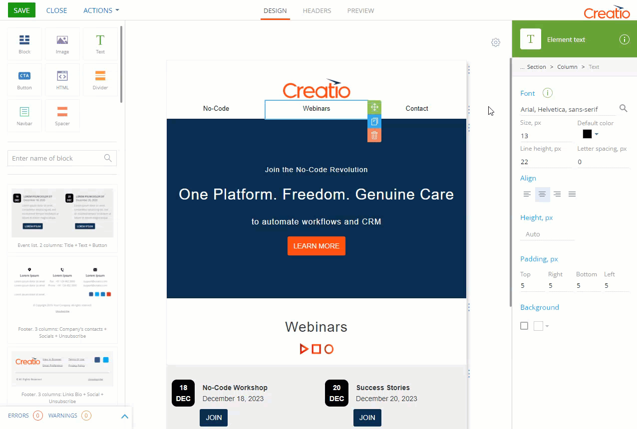
Use the setup area on the right to configure the Block element.
The setup area comprises of three tabs:
-
Structure. The default tab available in the Campaign Designer and Process Designer. It is the only tab available when you open the Content Designer from the Process Designer.
-
Dynamic Content. This tab is only available in the marketing Content Designer for Marketing Creatio. Use it to set up different variations of a block for different conditions, configured on the Rules tab.
-
Rules. This tab is only available in the marketing Content Designer for Marketing Creatio. Use it to set up rules that can be used for defining dynamic content.
The Structure tab (Fig. 5) includes the following properties:
|
Property |
Functionality |
|---|---|
|
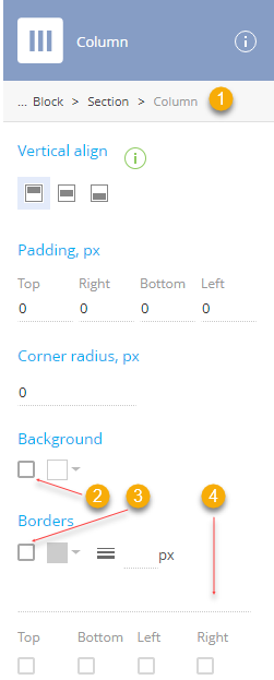
Breadcrumb navigation (1) |
Use breadcrumbs at the top of the setup area to navigate the parent (column, section, banner, block, and template) elements. |
|
Section constructor |
Add, remove, and move the sections and banners of the block. To access the setup area of a section or banner, click the corresponding item in the section list. Click Add section or Add banner to add sections and banners. Click |
|
Background |
Set background image and/or color for the entire block. Note that sections and banners can have their own background settings that may cover the background of the block. Background style settings are disabled by default. Select the checkbox (2) to enable them. Clear this checkbox to disable all background settings of the current block. Click Click |
 to remove a section or banner. Note that you cannot delete the last section (banner) from a content block.
 to open the color picker and select the background color.
 and enter the URL of the image to display on the background.
Banners
A banner is a single-column block “row”. The main purpose of the banner element is to display a background image and some content over it (Fig. 6). Unlike the Block element, you can align the banner background image.
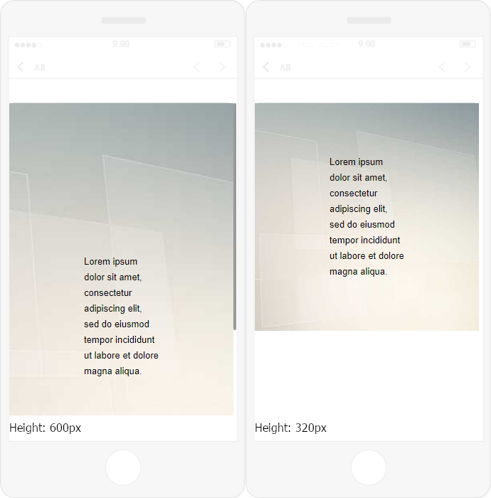
A banner has a fixed height. If it is set to a value that is too large, the banner might not fit the display vertically (Fig. 7).
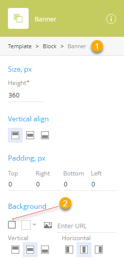
The Banner setup area comprises of the following setup groups: Size, px, Vertical align, Padding, px, and Background (Fig. 8).
|
Property |
Functionality |
|---|---|
|
Breadcrumb navigation (1) |
Use breadcrumbs at the top of the setup area to navigate the parent (column, section, banner, block, and template) elements. |
|
Size, px |
Configure the height of the banner by specifying the Height field value. This value is used to set up the minimum height. If the height of the content of the banner exceeds this value, the banner will stretch vertically. |
|
Vertical align |
Align the contents of the banner vertically (top |
|
Padding, px |
Specify the distance (in pixels) between the content of the banner and each of its borders. Padding is specified separately for each side. |
|
Background |
Set background image and/or color for the entire banner. Note that elements dropped onto the banner can have their own background settings that may cover the background of the banner. Background style settings are disabled by default. Select the checkbox (2) to enable them. Clear this checkbox to disable all background settings of the current banner. Click Click The image will stretch or shrink to fit the banner. We recommend using large or vector images as a background. Align the background image of the banner vertically (top |
 , middle
  , or bottom
  ).
). to open the color picker and select the background color.
 to enter the URL of the image to display on the background.
 , middle
  , or bottom
  ) or horizontally (left
  , center
  , or right
  ).
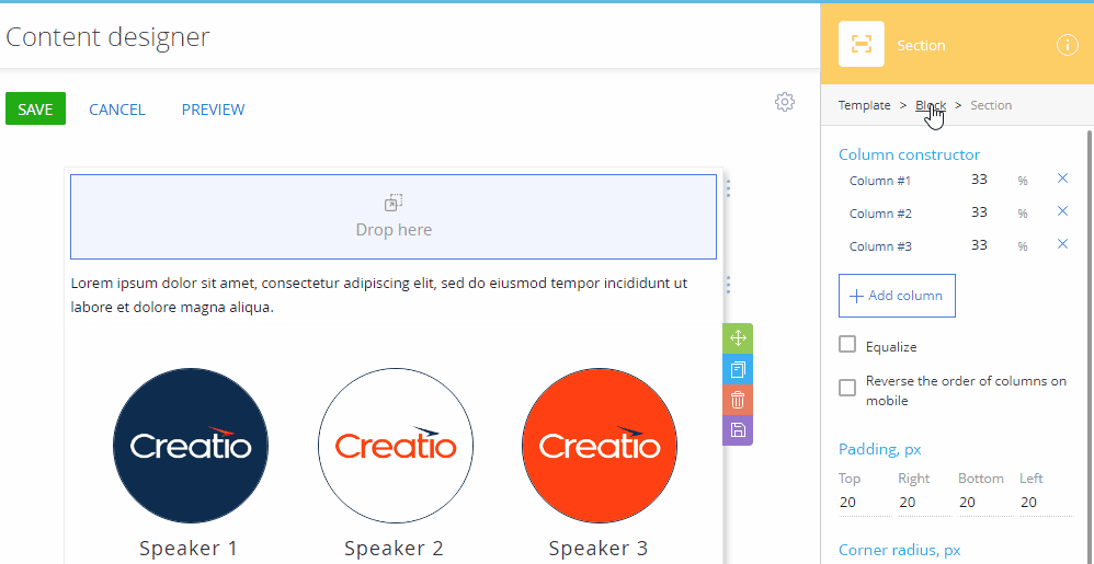
).Section
A section (Fig. 9) is a multi-column block row. This is the default subordinate element of the Block element. A section does not have its own background image.
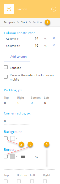
The Section setup area consists of several groups of settings: Column constructor, Padding, px, Corner radius, px, Background and Borders.
|
Property |
Functionality |
|---|---|
|
Breadcrumb navigation (1) |
Use breadcrumbs at the top of the setup area to navigate the parent (column, section, banner, block, and template) elements. |
|
Column constructor |
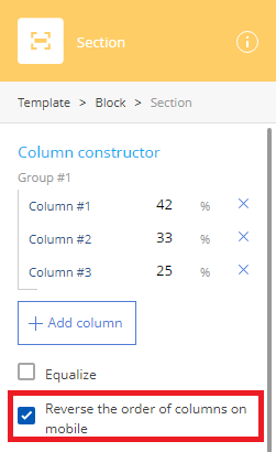
Add and delete columns, specify their widths, or equalize them and reverse the order of the columns on mobile devices. To access the setup area of a column, click the corresponding item in the column list. Click the % field and specify a new value to change the width of a column. The width of the next adjacent column will be adjusted. Click Add column to add a column. Click Select the Equalize checkbox to ensure that all of the columns have equivalent width. If you add or remove a column when this checkbox is selected, the widths of all columns will be adjusted to match each other. Select the Reverse the order of columns on mobile checkbox to reverse the order of ungrouped columns and column groups on mobile devices. As a result, the last column or column group will be at the top of the section, and the first column or column group at the bottom. |
|
Padding, px |
Specify the distance (in pixels) between the content of the section and each of its borders. Padding is specified separately for each side. |
|
Corner radius, px |
Specify the circular radius of the corners of the section. Leave this property empty for sharp corners. This defines the circular radius of all 4 corners of an element. |
|
Background |
Set background color for the entire section. Note that elements dropped onto the section can have their own background settings that may cover the background of the section. Background style settings are disabled by default. Select the checkbox (2) to enable them. Clear this checkbox to disable all background settings of the current section. Click |
|
Borders |
Configure the borders of the section. Border style settings are disabled by default. Select the checkbox (3) to enable them. Click Update the Use the dropdown menu (4) to select the border style. When the border settings are enabled, the “Solid” style is selected by default. The following styles are available:
Select or clear Top, Bottom, Left and Right checkboxes to enable or disable the border style settings for the corresponding border. |
 to remove the column. You cannot delete the only column.
 to open the color picker and select the background color.
 to open the color picker and select the border color.
 field to specify the border width. To hide the border, select the “Hidden” border style.
 : Hidden
 : Dotted
 : Dashed
 : Solid
 : Double
 : Groove
 : Ridge
 : Inset
 : Outset
Columns
A column is a structural element used to arrange other elements in a section. To add a column, click the Add column button the Section element setup area.
The Column setup area comprises of the following setup groups: Vertical align, Padding, px, Corner radius, px, Background, and Borders.
|
Property |
Functionality |
|---|---|
|
Breadcrumb navigation (1) |
Use breadcrumbs at the top of the setup area to navigate the parent (column, section, banner, block, and template) elements. |
|
Align |
Align the contents of the column vertically (top |
|
Padding, px |
Specify the distance in pixels between the content of the column and each of its borders. Padding is specified separately for each side. |
|
Corner radius, px |
Specify the circular radius of the corners of the column. Leave this property empty for sharp corners. This defines the circular radius of all 4 corners of an element. |
|
Background |
Set background color for the entire column. Note that elements dropped onto the column can have their own background settings that may cover the background of the column. Background style settings are disabled by default. Select the checkbox (2) to enable them. Clear this checkbox to disable all background settings of the current column. Click |
|
Borders |
Configure the borders of the column. Border style settings are disabled by default. Select the checkbox (3) to enable them. Click to open the color picker and select the border color. Update the Use the drop-down menu (4) to select the border style. When the border settings are enabled, the “Solid” style is selected by default. Thse following styles are available:
Select or clear Top, Bottom, Left, and Right checkboxes to enable or disable the border style settings for the corresponding border. |
 , middle
  , or bottom
  ).
). to open the color picker and select the background color.
 field to specify the border width. To hide the border, select the “Hidden” border style.
 : Hidden
 : Dotted
 : Dashed
 : Solid
 : Double
 : Groove
 : Ridge
 : Inset
 : Outset
Column layout on desktop and mobile
On the desktop, the columns will be arranged exactly how they are displayed in the Content Designer (Fig. 13).

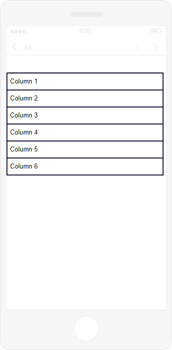
On mobile devices, columns are normally not displayed side by side. Instead, they are re-arranged vertically (Fig. 14).
You can force columns to display side by side on mobile by grouping them. A column group is a sequence of columns displayed side-by-side on mobile.
To group two adjacent columns:
-
Select the Section element using the Section constructor of a Block element or the breadcrumbs navigation of a column or its child elements.
 buttons will appear between columns (Fig. 15).Fig. 15 Link columns
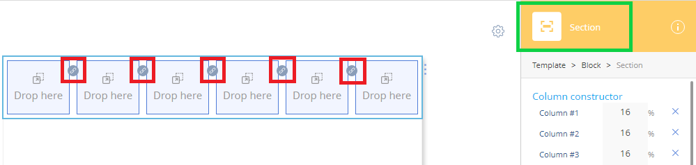
-
Click the
 (Fig. 15) button between the columns that you want to group.
If one of the columns is already a part of a column group, the ungrouped column will become part of the column group. If both columns are parts of their respective column groups, both column groups will become one column group.
On mobile, grouped columns display side by side. Use the Preview tab at the top of the page to view how your email template displays on mobile.
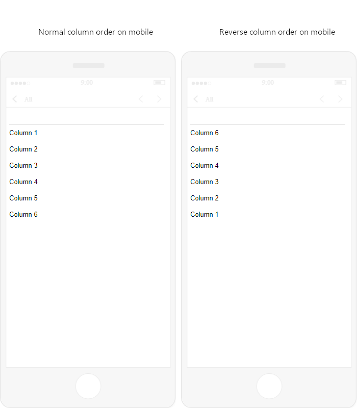
You can also reverse the order of columns on mobile so that the last column is displayed at the top of the section and the first at the bottom. For example, if you have a two-column header with a logo on the right and a title on the left, a mobile device will normally display the title first and the logo second. However, if the order of columns is reversed, the logo will display on top.
To reverse the order of ungrouped columns and column groups on mobile devices, select the Reverse the order of columns on mobile checkbox (Fig. 16).
As a result, the last column or column group will be at the top of the section, and the first column or column group at the bottom.
Anchors
The Content Designer lets you use anchors. This enables the audience to navigate through larger emails easier.
Add an anchor
- Select template text to use as an anchor.
- Click
 on the text toolbar → Web link. This opens a window.
 - Enter the anchor name in the URL field on the Link info tab. For example, “webinars.”
- Open the Advanced tab → specify the anchor ID in the id field. For example, “webinars.”
- Click OK.
- Click
 on the text toolbar. This opens a window.
 - Delete the “href” attribute of the anchor link together with the attribute value. For example, delete “href="http://webinars"” entirely.
- Click Save.
Link an anchor
- Create an anchor. Learn more: Add an anchor.
- Select template text to link to the anchor.
- Click on the text toolbar → Web link. This opens a window.
- Select “Link to anchor in the text” in the Link Type field.
- Click OK.
- Click on the text toolbar. This opens a window.
- Add the anchor ID to the “href” attribute after the #. For example, “href="#webinars".”
- Click Save.
As a result, users will be able to click the link to scroll the email to the anchor.