Set up rows and columns
Row elements arrange content elements of a landing page. Rows are divided into up to 12 columns. You need at least 1 row in your landing page to be able to add content elements. Rows cannot contain other rows.

A row has a table-like layout. Each column of a row can contain multiple elements arranged vertically. A row must have at least one column. It is not possible to delete the only column of a row.
We recommend adding any reusable content as separate rows and saving them to the Library for later.
Create a row
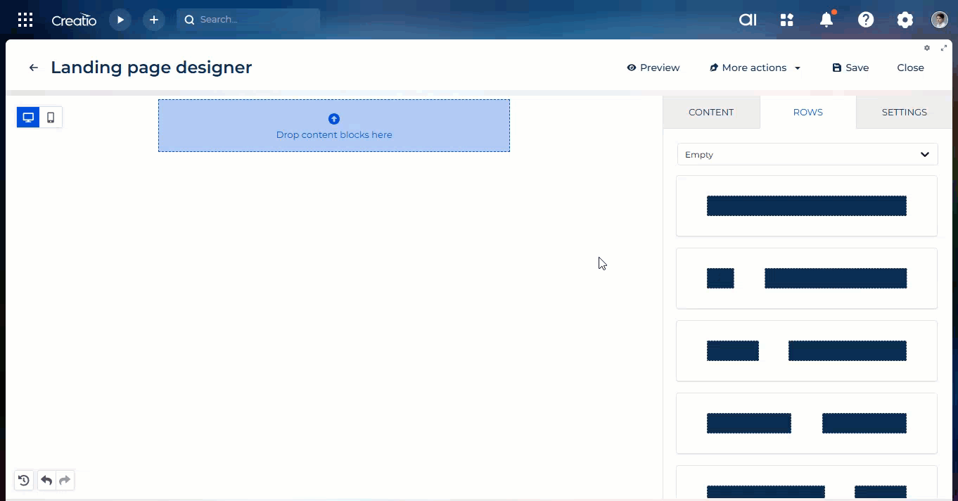
To add a row to a landing page, drag any Row element from the element grid to the working area (Fig. 1).
You can select a row in the working area in multiple ways:
-
Click the row outside of columns.
-
Click any element inside the section or banner, then press Esc to go up the navigation tree.
When a row is selected, its context menu appears on the right (Fig. 4).

-
 : save a row to the Library. Creatio will prompt you to enter the name and category under which to save the row.
 -
 : remove the row from the landing page. This will permanently remove any blocks that have not been saved in the Library. Deleting a row from the landing page will not delete it from the Library.
 -
 : duplicate the row. The duplicate will appear below the original row.
Configure a row and its columns
Use the setup area on the right to configure the Row element.
Property | Functionality |
|---|---|
Row properties | Duplicates the functionality of the context menu. |
Row background color | Background color for the entire row. You can specify a hex code or select from a color palette. Content area and columns can have their own background settings that might cover the background of the row. |
Content area background color | Background color for the content area. You can specify a hex code or select from a color palette. |
Row background image | Enable a background image for the row. |
Choose image | Click the button to open the file manager or specify the image URL in the Url parameter. Available after you click the Row background image toggle. |
Apply image to | Whether to display the background image only in the content area or the entire row. Available after you click the Row background image toggle. |
Fit to background | Whether to fit or fill the background image so that it covers the entire content area or row. Available after you click the Row background image toggle. |
Repeat | Whether to repeat the background image throughout the entire content area or row left to right. Available after you click the Row background image toggle. Cannot be selected together with the Fit to background parameter. |
Center | Whether to align the background image to the center of the row. Available after you click the Row background image toggle. Cannot be selected together with the Fit to background parameter. |
Row background video | Enable a background video for the row. |
Change video | Click the button to open the file manager or specify the video URL in the Url parameter. Available after you click the Row background video toggle. |
Content area border | Whether the content area has an outline. |
Content area rounded corners | Whether the content area has corner radii. |
Vertical align | How to align the elements inside the row vertically. |
Stack on mobile | Whether to display the columns in mobile view above each other instead of horizontally. |
Stack order on mobile | How to order the columns vertically in mobile view. Available if you enable the Stack on mobile parameter. |
Hide on | Whether to hide the row on desktop or mobile view. |
Spacing | Distance between columns. |
Cards rounded corners | Whether the columns have corner radii. |
Columns structure | Click Add new to add a column. Click Delete to delete a column. Point between the columns and drag to resize the columns. Click the column to customize its settings. |
Column background | Background color for the column. You can specify a hex code or select from a color palette. |
Padding | Distance between the elements and the edge of the column. |
Border | Whether the column has an outline. |
Save a row for use in other landing pages
Once you add a row to a landing page and fill out its columns using other Landing Page Designer elements, you can save this block in the Library for future use. For example, you can save headers, footers, or various landing page blocks that include web forms commonly used across multiple landing pages. This also adds value by supporting brand alignment, which is crucial. Designers on the customer end can create saved rows that marketers can then easily reuse.
Saved landing page rows cannot be shared with email saved rows as their structures differ.
View the list of rows from the Library in the setup area on the right. Drag ready-made blocks from the library to the working area to add them to your landing page or edit them.

Every row in the Library is a saved Row element that contains other elements.
Save a custom row in the Library
-
Open the template that contains the needed row in the Landing Page Designer.
-
Modify an existing row if needed or create a new row.
-
Select the needed Row element.
-
Click
 in the context menu on the right. This opens a window.
 -
Fill out the Name field. Users will be able to use the name to search for the row in the Library.
We recommend naming the rows in a way that would describe their contents and purpose. Such an approach helps find the row when you work with the Landing Page Designer. -
Fill out the Category field → Add new → Save.
-
Click Save.
As a result, the new row will appear in the Library of the Landing Page Designer. You will be able to view it if you select the corresponding category.
Edit an existing row in the Content Library
To edit a row, drag it into the working area. Edit and save the row. Delete the old version of the row from the Library if it is no longer needed.
Delete an existing row from the Library
To delete a row from the Library, click  in the bottom right corner → Delete (Fig. 2).

See also
Create a landing page using Creatio.ai