Customize buttons
Button containers
Creatio implements the following button container types:
- Action button container. Holds section page action buttons. Holds standard button containers and the dropdown menu button container.
- Standard button container. Holds the Save, Cancel, and Tags buttons, as well as the dropdown menu of the Actions button.
- Dropdown menu button container. Holds the dropdown menu of the Print and View buttons.
Buttons containers are different for section pages, record pages, and the page that adds new records.
Creatio uses HTML container meta names. It generates actual IDs that match the HTML elements of the record page based on the meta names.
View the meta names of button containers in the table below.
UI element name | Containers | ||
|---|---|---|---|
Action button container | Standard button container | Dropdown menu button container | |
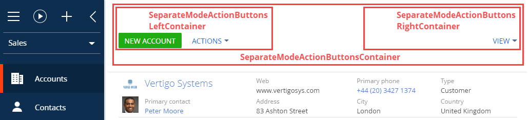
Section page | SeparateModeActionButtonsContainer | SeparateModeActionButtonsLeftContainer | SeparateModeActionButtonsRightContainer |
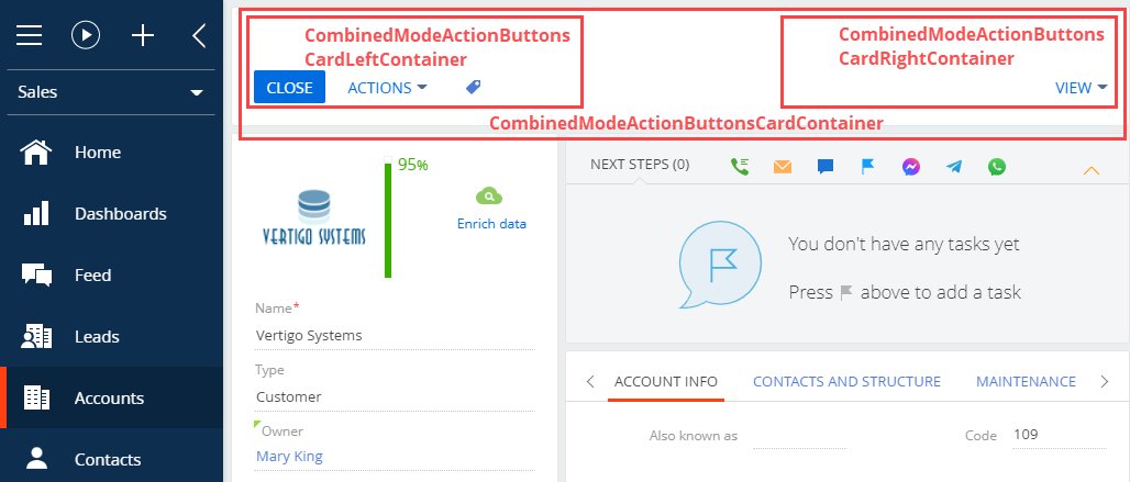
Record page | CombinedModeActionButtonsCardContainer | CombinedModeActionButtonsCardLeftContainer | CombinedModeActionButtonsCardRightContainer |
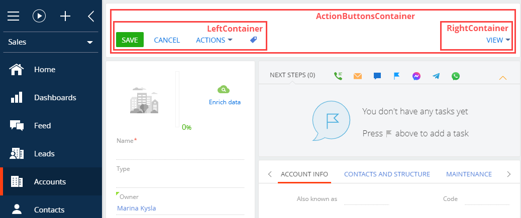
Page that adds new records | ActionButtonsContainer | LeftContainer | RightContainer |
View Section page button containers in the figure below.
View Record page button containers in the figure below.
View the button containers of the page that adds new records in the figure below.
New button
The procedure for adding a button varies depending on the button type.
Creatio implements the following button types:
- simple button
- color picker button
Add a simple button to the record or section page
-
Create a replacement view model of the section or record page to place the button. To do this, follow the procedure covered in a separate article: Implement a replacing module.
-
Add a localizable string with the name of the button to the replacement model schema.
-
Implement the button logic in the replacement model.
-
Implement the following in the
methodsproperty:- The handler method triggered by a button click.
- Auxiliary methods required for the control’s operation. These can be methods that regulate the visibility or availability of the control.
-
Add a configuration object with the settings that determine the button position on the section or record page to the
diffarray of modifications. In the array, specify the container to place the button.
-
Combined mode is a display mode of the record page that has an open vertical list. To place a button on a record page in the combined mode, edit the section page’s replacement view model schema and the record page’s replacement view model schema.
Add a color picker button
-
Create a replacement object schema. To do this, follow the procedure covered in a separate article: Implement a replacing object.
-
Add a column of the Text (50 characters) type to the replacement object schema. The column will store the data about the picked color. To do this, follow the procedure covered in a separate article: Specify the object ID for custom parent object.
-
Create a replacement view model of the section or record page to place the button. To do this, follow the procedure covered in a separate article: Implement a replacing module.
-
Implement the button logic in the replacement model.
-
Implement the following in the
methodsproperty:- The handler method triggered by a button click.
- Auxiliary methods required for the control’s operation. These can be methods that regulate the visibility or availability of the control.
-
Add a configuration object with the settings that determine the button position on the section or record page to the
diffarray of modifications.- Specify the
COLOR_BUTTONtype in theitemTypeproperty. - Bind the added replacement object’s schema column in the
valueproperty.
- Specify the
-
Add a tooltip to a button
Tooltips are text messages that provide the user with additional information about the button functionality. Hover over a button to bring up its tooltip.
To add a tooltip to a button:
- Create a replacement view model of the section or record page to place the button. To do this, follow the procedure covered in a separate article: Implement a replacing module.
- Add a localizable string with the name of the button to the replacement model schema.
- Implement the tooltip in the
diffarray of changes to the replacement view model schema.
You can add tooltips to a button configuration object in several ways:
- Use the
hintproperty. - Use the
tipsproperty.
To add a tooltip to a button using the hint property, add a hint property with the tooltip text to the values property of the control.
To add a tooltip to a button using the tips property:
- Add a
tipsproperty to thevaluesproperty of the control. - Add a tooltip configuration object to the
tipsarray using theinsertoperation. - Add a
contentproperty with the tooltip text to thevaluesproperty of the tooltip configuration object.
Using the tips property to add a tooltip to a button lets you:
- change the display style
- bind the tooltip visibility to a view model event
- add controls, etc.
The types of elements that let you use the tips property:
Terrasoft.ViewItemType.BUTTONTerrasoft.ViewItemType.LABELTerrasoft.ViewItemType.COLOR_BUTTONTerrasoft.ViewItemType.HYPERLINKTerrasoft.ViewItemType.INFORMATION_BUTTON- Elements that have the
generatorproperty specified
See also
E-learning courses
Tech Hour - HOW TO USE BUTTONS AND ACTIONS TO EMPOWER CREATIO PAGES