Implement a Freedom UI Designer setup area for a collection-based custom Freedom UI component
To implement the example:
- Create an Angular project. Read more >>>
- Install
npmpackages. Read more >>> - Create a custom Freedom UI component. Read more >>>
- Create a custom setup area. Read more >>>
- Implement the business logic of the setup area component. Read more >>>
- Add the setup area component to the Freedom UI Designer. Read more >>>
- Add the custom Freedom UI component to the Freedom UI page. Read more >>>
Add a custom Collection table component to the custom product request page. The component must include the "Name," "Code," "Price" columns received from the Products section as a reference table, so users can look up available products without leaving the page.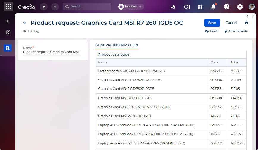
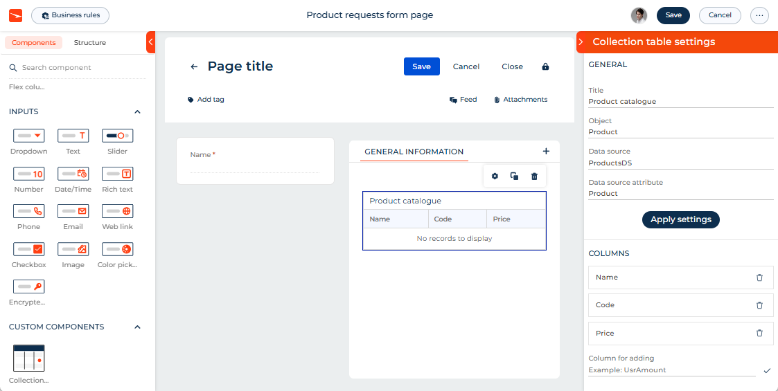
The component must have its own setup area to configure the following parameters directly in the Freedom UI Designer:
- Title — the component title that is displayed on the page.
- Object — the object that provides the collection data.
- Data source — the data source of the object that provides the collection data.
- Data source attribute — the object column that stores the list of product columns.
- Apply settings button — applies the selected data source and attribute to the component and updates the collection binding in the page schema.
- Columns — the list of columns currently displayed in the component.
 button — removes a column from the list of component columns.
- Column for adding — the code of the column to add to the list of component columns.
 button — adds a column to the list of component columns.
Implement the component and its setup area using a remote module created in the Angular framework.
1. Create an Angular project
To create an Angular project, follow the instructions: Create an Angular project.
For this example:
<%projectName%>macro is set to "sdk_custom_collection_based_component."<%vendorPrefix%>macro is set to "usr."
As a result, an Angular project to develop a custom Freedom UI component using a remote module will be added.
2. Install npm packages
To install npm packages, follow the instructions: Install npm packages.
As a result, required npm packages are installed.
3. Create a custom Freedom UI component
-
Run the
npm i @creatio/interface-designercommand in the Visual Studio Code terminal to install the@creatio/interface-designerlibrary. -
Ensure the project includes the "AGENTS.md" file. Instructions: Create a custom Freedom UI component (step 1).
-
Run the
ng g c features/runtime/view-elements/collection-table --view-encapsulation=ShadowDomcommand in the Visual Studio Code terminal to create an Angular component in the project. This adds theCollectionTableComponentfiles to the "src/app/features/runtime/view-elements/collection-table" project directory. -
Define the component constants.
-
Go to the "src/app/features/runtime/view-elements/collection-table" directory.
-
Create the "collection-table.constants.ts" file.
-
Open the "collection-table.constants.ts" file.
-
Export the following constants that define:
- the view element type
- the default column names
- the component icon
"collection-table.constants.ts" file/* Define the component type identifier. */export const COMPONENT_TYPE = 'usr.CollectionTable';/* Define the default columns to display. */export const DEFAULT_COLUMNS = ['Id', 'Name'];/* Define the component icon as an inline SVG. */export const COMPONENT_ICON = `<svg width="72" height="64" viewBox="0 0 72 64" fill="none" xmlns="http://www.w3.org/2000/svg"><g transform="translate(8, 8)"><rect x="0.5" y="0.5" width="55" height="47" rx="1" fill="#FFFFFF" stroke="#181818" /><rect x="1" y="1" width="54" height="10" rx="1" fill="#0D2E4E" /><rect x="4" y="14" width="48" height="8" rx="1" fill="#F5F5F5" /><rect x="4" y="24" width="48" height="8" rx="1" fill="#FFFFFF" /><rect x="4" y="34" width="48" height="8" rx="1" fill="#F5F5F5" /><line x1="20" y1="12" x2="20" y2="44" stroke="#181818" /><line x1="37" y1="12" x2="37" y2="44" stroke="#181818" /><circle cx="47" cy="28" r="3" fill="#FF4013" /></g></svg>`; -
Open the "src/app/features/runtime/runtime-feature.ids.ts" file.
-
Export the following constants that define:
- the remote module package name
- the runtime feature ID
- the view element selector
"runtime-feature.ids.ts" file/* The name of the remote module package. */export const REMOTE_NAME = 'sdk_custom_collection_based_component';/* The ID of the runtime feature. */export const RUNTIME_FEATURE_ID = 'sdk_custom_collection_based_component-runtime';/* The selector of the view element. */export const COLLECTION_TABLE_SELECTOR = 'usr-collection-table'; -
Save the files.
-
-
Specify that the
CollectionTableComponentis a view element.- Open the "collection-table.component.ts" file.
- Flag the component using the
@CrtViewElementdecorator. - Import the required functionality from the libraries to the component.
- Save the file.
"collection-table.component.ts" file/* Import the required functionality from the libraries. */import { ChangeDetectionStrategy, Component, ViewEncapsulation } from '@angular/core';import { CrtViewElement } from '@creatio-devkit/common';import { COMPONENT_TYPE } from './collection-table.constants';import { COLLECTION_TABLE_SELECTOR } from '../../runtime-feature.ids';@Component({selector: 'usr-collection-table-internal',templateUrl: './collection-table.component.html',styleUrls: ['./collection-table.component.scss'],encapsulation: ViewEncapsulation.ShadowDom,changeDetection: ChangeDetectionStrategy.OnPush,standalone: false,})/* Register the component as a Freedom UI view element. */@CrtViewElement({selector: COLLECTION_TABLE_SELECTOR,type: COMPONENT_TYPE,})export class CollectionTableComponent {} -
Register the
CollectionTableComponentview element as a component.-
Open the "runtime-feature.module.ts" file.
-
Add the
CollectionTableComponentview element to the@CrtModuledecorator and Angular module declarations."runtime-feature.module.ts" file/* Import the required functionality from the libraries. */import { NgModule } from '@angular/core';import { CommonModule } from '@angular/common';import { CrtModule } from '@creatio-devkit/common';import { CollectionTableComponent } from './view-elements/collection-table/collection-table.component';@CrtModule({/* Specify that CollectionTableComponent is a view element. */viewElements: [CollectionTableComponent],})@NgModule({declarations: [CollectionTableComponent],imports: [CommonModule],})export class RuntimeFeatureModule {} -
Open the "runtime.feature-definition.ts" file.
-
Add the public type of the
CollectionTableComponentview element to thediscovery.viewElementssection."runtime.feature-definition.ts" file/* Import the required functionality from the libraries. */import type { RemoteFeatureDefinition } from '@creatio-devkit/common';import { RUNTIME_FEATURE_ID } from './runtime-feature.ids';import { COMPONENT_TYPE } from './view-elements/collection-table/collection-table.constants';export const runtimeFeatureDefinition = {id: RUNTIME_FEATURE_ID,discovery: {viewElements: [{ type: COMPONENT_TYPE },],mobileViewElements: [],},loadDesignerDefinitions: (context) =>import('./runtime.designer-definitions').then((m) =>m.loadRuntimeDesignerDefinitions(context)),activate: () =>import('./runtime.feature-activation').then((m) => m.activateRuntimeFeature()),} satisfies RemoteFeatureDefinition; -
Open the "runtime.feature-activation.ts" file.
-
Define the
CollectionTableComponentview element as an Angular Element. Learn more: Angular elements overview (official vendor documentation)."runtime.feature-activation.ts" file/* Import the required functionality from the libraries. */import { ProviderToken } from '@angular/core';import { createCustomElement } from '@angular/elements';import { bootstrapCrtModule } from '@creatio-devkit/common';import { ensureFeatureModuleRef } from '../../remote-app-context';import { RuntimeFeatureModule } from './runtime-feature.module';import {CollectionTableComponent} from './view-elements/collection-table/collection-table.component';import { REMOTE_NAME, COLLECTION_TABLE_SELECTOR } from './runtime-feature.ids';/* Initialize the runtime feature module and bootstraps the Creatio runtime integration. */export async function activateRuntimeFeature(): Promise<void> {const moduleRef = await ensureFeatureModuleRef(RuntimeFeatureModule);const injector = moduleRef.injector;if (!customElements.get(COLLECTION_TABLE_SELECTOR)) {const collectionTableElement = createCustomElement(CollectionTableComponent, {injector,});customElements.define(COLLECTION_TABLE_SELECTOR, collectionTableElement);}bootstrapCrtModule(REMOTE_NAME, RuntimeFeatureModule, {resolveDependency: (token) => injector.get(token as ProviderToken<unknown>),});} -
Save the files.
-
-
Implement the component business logic.
- Open the "collection-table.component.ts" file.
- Add the
rows(the collection of records to display in the table) andcolumns(the list of columns to display in the table) properties to theCollectionTableComponentclass. - Flag the properties using the
@Inputand@CrtInputdecorators. - Import the required functionality from the libraries into the component.
- Save the file.
"collection-table.component.ts" file/* Import the required functionality from the libraries. */import {ChangeDetectionStrategy,Component,Input,ViewEncapsulation,signal} from '@angular/core';import {CrtInput,CrtViewElement,ViewModelCollection,ViewModelContext} from '@creatio-devkit/common';import { COMPONENT_TYPE, DEFAULT_COLUMNS } from './collection-table.constants';import { COLLECTION_TABLE_SELECTOR } from '../../runtime-feature.ids';/* The type of a single cell value in the table. */type TableCellValue = string;/* The type of a single row in the table. */type TableRow = Record<string, TableCellValue>;/* Register the component as a Freedom UI view element. */@CrtViewElement({selector: COLLECTION_TABLE_SELECTOR,type: COMPONENT_TYPE,})@Component({selector: 'usr-collection-table-internal',templateUrl: './collection-table.component.html',styleUrls: ['./collection-table.component.scss'],encapsulation: ViewEncapsulation.ShadowDom,changeDetection: ChangeDetectionStrategy.OnPush,standalone: false,})export class CollectionTableComponent {private _rowsCollection: ViewModelCollection<ViewModelContext> | null = null;protected readonly tableTitle = signal('');protected readonly columnsToDisplay = signal<string[]>(DEFAULT_COLUMNS);protected readonly rowsToDisplay = signal<TableRow[]>([]);/* The table title to display above the columns. */@Input()@CrtInput()public set title(value: string | null) {this.tableTitle.set(value ?? '');}/* The collection of records to display. */@Input()@CrtInput()public set rows(value: ViewModelCollection<ViewModelContext> | null) {this._rowsCollection = value;if (!value) {this.rowsToDisplay.set([]);return;}void this._updateRowsToDisplay(value).catch((error: unknown) => {console.error('Failed to update rows for CollectionTableComponent:', error);this.rowsToDisplay.set([]);});}/* The list of columns to show. */@Input()@CrtInput()public set columns(value: string[] | null) {const columnsToDisplay = Array.isArray(value) && value.length ? value : DEFAULT_COLUMNS;this.columnsToDisplay.set(columnsToDisplay);if (!this._rowsCollection) {this.rowsToDisplay.set([]);return;}void this._updateRowsToDisplay(this._rowsCollection).catch((error: unknown) => {console.error('Failed to update rows for CollectionTableComponent:', error);this.rowsToDisplay.set([]);});}private async _updateRowsToDisplay(collection: ViewModelCollection<ViewModelContext>): Promise<void> {const columns = this.columnsToDisplay();if (!columns.length) {this.rowsToDisplay.set([]);return;}const contexts = collection as unknown as ViewModelContext[];const nextRows = await Promise.all(contexts.map(async (item) => {const entries = await Promise.all(columns.map(async (columnName) => {const rawValue = await Promise.resolve(item[columnName]);return [columnName, this._asCellValue(rawValue)] as const;}),);return Object.fromEntries(entries);}),);this.rowsToDisplay.set(nextRows);}private _asCellValue(value: unknown): string {if (value === null || value === undefined) {return '';}return String(value);}} -
Add the markup of the component to the "collection-table.component.html" file.
"collection-table.component.html" file<section class="collection-table" aria-label="Collection table" data-testid="collection-table"><table>@if (tableTitle()) {<caption class="collection-table__title">{{ tableTitle() }}</caption>}<thead><tr>@for (columnName of columnsToDisplay(); track columnName) {<th scope="col">{{ columnName }}</th>}</tr></thead><tbody>@if (rowsToDisplay().length === 0) {<tr><td [attr.colspan]="columnsToDisplay().length" class="collection-table__empty">No records to display</td></tr>} @else {@for (row of rowsToDisplay(); track $index) {<tr>@for (columnName of columnsToDisplay(); track columnName) {<td>{{ row[columnName] }}</td>}</tr>}}</tbody></table></section> -
Add the styles of the component to the "collection-table.component.scss" file.
"collection-table.component.scss" file:host {display: block;box-sizing: border-box;}.collection-table {font-family: 'Segoe UI', Arial, sans-serif;color: #181818;}table {width: 100%;border-collapse: collapse;border: 1px solid #d9d9d9;background: #ffffff;}caption {font-family: Montserrat, sans-serif;font-size: 14px;color: #0D2E4E;height: 32px;line-height: 32px;text-align: left;padding: 0 10px;border: 1px solid #d9d9d9;border-bottom: none;background: #ffffff;box-sizing: border-box;}th,td {padding: 8px 10px;border: 1px solid #d9d9d9;text-align: left;line-height: 1.4;}th {font-weight: 600;background: #f5f8ff;color: #757575;font-family: Montserrat, sans-serif;font-size: 12px;}td {font-size: 13px;color: #181818;font-family: Montserrat, sans-serif;height: 38px;box-sizing: border-box;}.collection-table__empty {text-align: center;color: #505050;}
4. Create a custom setup area
-
Run the
ng g c features/design/property-panels/collection-table-setup-areacommand in the Visual Studio Code terminal. This adds theCollectionTableSetupAreaComponentfiles to the "src/app/features/design/property-panels/collection-table-setup-area" project directory. -
Define the setup area constants.
-
Open the "src/app/features/runtime/view-elements/collection-table/collection-table.constants.ts" file.
-
Export the constant that defines the setup area type.
"collection-table.constants.ts" file/* Define the setup area type identifier. */export const SETUP_AREA_TYPE = 'usr.CollectionTableSetupArea'; -
Open the "src/app/features/design/design-feature.ids.ts" file.
-
Export the constant that defines the design feature ID.
"design-feature.ids.ts" file/* The ID of the design feature. */export const DESIGN_FEATURE_ID = 'sdk_custom_collection_based_component-design'; -
Save the files.
-
-
Specify that the
CollectionTableSetupAreaComponentis a view element.- Open the "collection-table-setup-area.component.ts" file.
- Flag the component using the
@CrtViewElementdecorator. - Import the required functionality from the libraries to the component.
- Save the file.
"collection-table-setup-area.component.ts" file/* Import the required functionality from the libraries. */import { Component, ViewEncapsulation } from '@angular/core';import { CrtViewElement } from '@creatio-devkit/common';import { SETUP_AREA_TYPE } from '../../../runtime/view-elements/collection-table/collection-table.constants';@Component({selector: 'usr-collection-table-setup-area-internal',templateUrl: './collection-table-setup-area.component.html',styleUrls: ['./collection-table-setup-area.component.scss'],encapsulation: ViewEncapsulation.Emulated,standalone: false,})/* Register the component as a Freedom UI view element. */@CrtViewElement({selector: 'usr-collection-table-setup-area',type: SETUP_AREA_TYPE,})export class CollectionTableSetupAreaComponent {}
5. Implement the business logic of the setup area component
-
Open the "collection-table-setup-area.component.ts" file.
-
Add the
viewNodeEditorsetter to implement thePropertyPanelinterface. -
Initialize
InterfaceDesignerSchemaServiceto access view model attributes and data sources. -
Implement the
_loadTableTitle()method to read thetitleconstant from the view node. -
Implement the
_loadColumns()method to read thecolumnsconstant from the view node. Thecolumnsproperty is stored as a constant array so that UI-specific configuration — such as visible columns — remains independent from the collection data binding. -
Implement the
_loadCollectionBinding()method to resolve the bound collection attribute and its data source. -
Implement the
_applyCollectionBinding()method to write the updated property values back to the schema when the user changes a field. -
Import the required functionality from the libraries into the component.
-
Save the file.
"collection-table-setup-area.component.ts" file/* Import the required functionality from the libraries. */import { ChangeDetectionStrategy, Component, Input, signal, ViewEncapsulation } from '@angular/core';import { CrtInput, CrtViewElement } from '@creatio-devkit/common';import {CollectionViewModelAttributeEditor,DataSourceAttributeAlreadyExistsError,DataSourceType,InterfaceDesignerSchemaService,PropertyPanel,ViewModelAttributeType,ViewNodeEditor,ViewNodePropertyValueType,} from '@creatio/interface-designer';import {SETUP_AREA_TYPE,DEFAULT_COLUMNS} from '../../../runtime/view-elements/collection-table/collection-table.constants';@Component({selector: 'usr-collection-table-setup-area-internal',templateUrl: './collection-table-setup-area.component.html',styleUrls: ['./collection-table-setup-area.component.scss'],encapsulation: ViewEncapsulation.Emulated,changeDetection: ChangeDetectionStrategy.OnPush,standalone: false,})/* Register the setup area as a Freedom UI view element. */@CrtViewElement({selector: 'usr-collection-table-setup-area',type: SETUP_AREA_TYPE,})export class CollectionTableSetupAreaComponent implements PropertyPanel {/* Provide access to the schema editors for reading and modifying the page schema. */private readonly _schemaEditor = new InterfaceDesignerSchemaService().getSchemaEditor();/* Provide access to the selected component's view node in the schema. */private _viewNodeEditorInstance: ViewNodeEditor | null = null;/* Indicate whether the setup area has finished loading the component's properties. */protected readonly isPanelReady = signal(false);protected readonly validationMessage = signal('');protected readonly tableTitle = signal('');protected readonly entitySchemaName = signal('');protected readonly dataSourceName = signal('');protected readonly collectionAttributeName = signal('');protected readonly columns = signal<string[]>(DEFAULT_COLUMNS);protected readonly newColumnName = signal('');private get _viewNodeEditor(): ViewNodeEditor {if (!this._viewNodeEditorInstance) {throw new Error('View node editor is not initialized');}return this._viewNodeEditorInstance;}/* Called by the Freedom UI Designer when a user selects the component on the canvas. */@Input()@CrtInput()public set viewNodeEditor(nodeEditor: ViewNodeEditor) {this.isPanelReady.set(false);this._viewNodeEditorInstance = nodeEditor;this._initialize().catch((error: unknown) => {console.error('CollectionTableSetupArea initialization failed', error);this.validationMessage.set(`Failed to load setup area settings: ${this._asMessage(error)}`);});}/* Store the view node editor and load the current property values from the schema. */private async _initialize(): Promise<void> {await this._loadTableTitle();await this._loadColumns();await this._loadCollectionBinding();this.isPanelReady.set(true);}/* Read the table title constant from the view node. */private async _loadTableTitle(): Promise<void> {const propertyValue = await this._viewNodeEditor.getPropertyValue('title');if (propertyValue?.type !== ViewNodePropertyValueType.Constant || typeof propertyValue.value !== 'string') {return;}this.tableTitle.set(propertyValue.value);}/* Read the columns constant from the view node. */private async _loadColumns(): Promise<void> {const propertyValue = await this._viewNodeEditor.getPropertyValue('columns');if (propertyValue?.type !== ViewNodePropertyValueType.Constant || !Array.isArray(propertyValue.value)) {this.columns.set(DEFAULT_COLUMNS);return;}this.columns.set(this._normalizeColumns(propertyValue.value));}/* Resolve the bound collection attribute and its data source. */private async _loadCollectionBinding(): Promise<void> {const propertyValue = await this._viewNodeEditor.getPropertyValue('rows');if (propertyValue?.type !== ViewNodePropertyValueType.AttributeBinding) {return;}const collectionName = propertyValue.attributePath;this.collectionAttributeName.set(collectionName);const attributeEditor = await this._schemaEditor.viewModelEditor.getAttributeEditor(collectionName);if (!attributeEditor || attributeEditor.attributeType !== ViewModelAttributeType.ModelBindingCollection) {return;}const collectionEditor = attributeEditor as CollectionViewModelAttributeEditor;const modelBinding = await collectionEditor.getModelBinding();this.dataSourceName.set(modelBinding.dataSourceName);const dataSourceEditor = await this._schemaEditor.modelEditor.getDataSourceEditor(modelBinding.dataSourceName);if (dataSourceEditor?.dataSourceType === DataSourceType.EntityDataSource) {this.entitySchemaName.set(dataSourceEditor.entitySchemaName);}}/* Write the updated property values to the schema. */private async _applyCollectionBinding(): Promise<void> {this.validationMessage.set('');const tableTitle = this.tableTitle().trim();const entitySchemaName = this.entitySchemaName().trim();const dataSourceName = this.dataSourceName().trim();const collectionAttributeName = this.collectionAttributeName().trim();const columns = this._normalizeColumns(this.columns());const validationError = this._validateCollectionBindingInput(entitySchemaName, dataSourceName, collectionAttributeName, columns);if (validationError) {this.validationMessage.set(validationError);return;}try {const dataSourceValidationError = await this._ensureDataSource(dataSourceName, entitySchemaName, columns);if (dataSourceValidationError) {this.validationMessage.set(dataSourceValidationError);return;}let collectionAttributeEditor: CollectionViewModelAttributeEditor;try {collectionAttributeEditor = await this._getCollectionAttributeEditor(collectionAttributeName, dataSourceName);} catch (error: unknown) {const errorMessage = error instanceof Error && error.message? error.message: 'Collection attribute cannot be created';this.validationMessage.set(errorMessage);return;}await this._ensureCollectionColumns(collectionAttributeEditor, dataSourceName, columns);/* Store the table title as a constant. */await this._viewNodeEditor.setPropertyValue('title', {constant: tableTitle});/* Bind the rows property to the collection attribute. */await this._viewNodeEditor.setPropertyValue('rows', {bindToAttribute: collectionAttributeName});/* Store the visible columns as a constant. */await this._viewNodeEditor.setPropertyValue('columns', {constant: columns});this.columns.set(columns);} catch (error: unknown) {this.validationMessage.set(`Changes are not applied: ${this._asMessage(error)}`);}}private _validateCollectionBindingInput(entitySchemaName: string,dataSourceName: string,collectionAttributeName: string,columns: string[],): string | null {if (!entitySchemaName) { return 'Entity schema is required'; }if (!dataSourceName) { return 'Data source name is required'; }if (!collectionAttributeName) { return 'Collection attribute name is required'; }if (!columns.length) { return 'At least one column is required'; }return null;}/* Create or get the entity data source and ensure all required columns exist. */private async _ensureDataSource(dataSourceName: string, entitySchemaName: string, columns: string[]): Promise<string | null> {let dataSourceEditor = await this._schemaEditor.modelEditor.getDataSourceEditor(dataSourceName);if (!dataSourceEditor) {dataSourceEditor = await this._schemaEditor.modelEditor.createDataSource(dataSourceName, {type: DataSourceType.EntityDataSource,entitySchemaName,});}if (dataSourceEditor.dataSourceType !== DataSourceType.EntityDataSource) {return `Data source "${dataSourceName}" has unsupported type`;}if (dataSourceEditor.entitySchemaName !== entitySchemaName) {return `Data source "${dataSourceName}" is bound to "${dataSourceEditor.entitySchemaName}" and cannot be used with "${entitySchemaName}"`;}for (const columnName of columns) {try {await dataSourceEditor.createAttribute({name: columnName, path: columnName});} catch (error: unknown) {if (!(error instanceof DataSourceAttributeAlreadyExistsError)) { throw error; }}}return null;}/* Get or create the collection attribute in the view model. */private async _getCollectionAttributeEditor(collectionAttributeName: string,dataSourceName: string,): Promise<CollectionViewModelAttributeEditor> {const viewModelEditor = this._schemaEditor.viewModelEditor;const currentAttributeEditor = await viewModelEditor.getAttributeEditor(collectionAttributeName);if (currentAttributeEditor?.attributeType === ViewModelAttributeType.ModelBindingCollection) {const collectionEditor = currentAttributeEditor as CollectionViewModelAttributeEditor;const modelBinding = await collectionEditor.getModelBinding();if (modelBinding.dataSourceName !== dataSourceName) {await collectionEditor.bindToModel({dataSourceName});}return collectionEditor;}if (currentAttributeEditor) {const canRemove = await viewModelEditor.canRemoveAttribute(collectionAttributeName);if (!canRemove) {throw new Error(`View model attribute "${collectionAttributeName}" cannot be reused`);}await viewModelEditor.removeAttribute(collectionAttributeName);}return viewModelEditor.createAttribute(collectionAttributeName, {isCollection: true,bindToModel: {dataSourceName},});}/* Add any missing column attributes to the collection attribute. */private async _ensureCollectionColumns(collectionEditor: CollectionViewModelAttributeEditor,dataSourceName: string,columns: string[],): Promise<void> {const nestedAttributes = await collectionEditor.getAllAttributeEditors();for (const columnName of columns) {if (nestedAttributes.has(columnName)) { continue; }await collectionEditor.createAttribute(columnName, {bindToModel: {dataSourceName,dataSourceAttributePath: columnName,},});}}protected onTableTitleChange(event: Event): void {this.tableTitle.set(this._extractInput(event));}protected onEntitySchemaNameChange(event: Event): void {this.entitySchemaName.set(this._extractInput(event));}protected onDataSourceNameChange(event: Event): void {this.dataSourceName.set(this._extractInput(event));}protected onCollectionAttributeNameChange(event: Event): void {this.collectionAttributeName.set(this._extractInput(event));}protected onNewColumnNameChange(event: Event): void {this.newColumnName.set(this._extractInput(event));}protected async onAddColumn(): Promise<void> {const nextColumn = this.newColumnName().trim();if (!nextColumn) {this.validationMessage.set('Column name is required');return;}this.columns.set([...this.columns(), nextColumn]);this.newColumnName.set('');await this._applyCollectionBinding();}protected async onRemoveColumn(columnName: string): Promise<void> {const nextColumns = this.columns().filter((column) => column !== columnName);if (!nextColumns.length) {this.validationMessage.set('At least one column is required');return;}this.columns.set(nextColumns);await this._applyCollectionBinding();}protected async onApplySettings(): Promise<void> {await this._applyCollectionBinding();}private _extractInput(event: Event): string {const input = event.target as HTMLInputElement | null;return input?.value ?? '';}private _normalizeColumns(value: unknown[]): string[] {const normalized = value.map((column) => String(column ?? '').trim()).filter((column) => Boolean(column));if (!normalized.length) { return [...DEFAULT_COLUMNS]; }return normalized;}private _asMessage(error: unknown): string {if (error instanceof Error) { return error.message; }return String(error);}} -
Add the markup of the setup area to the "collection-table-setup-area.component.html" file.
"collection-table-setup-area.component.html" file<crt-interface-designer-properties-panel-wrapper[showHeader]="true"[headerTitle]="'Collection table settings'"[canShowTooltip]="true">@if (isPanelReady()) {<div class="section"><h4 class="section-title">General</h4><div class="form-field"><label for="collection-table-title" class="field-label">Title</label><inputid="collection-table-title"type="text"class="field-input"[value]="tableTitle()"(input)="onTableTitleChange($event)"/></div><div class="form-field"><label for="collection-table-object" class="field-label">Object</label><inputid="collection-table-object"type="text"class="field-input"[value]="entitySchemaName()"(input)="onEntitySchemaNameChange($event)"/></div><div class="form-field"><label for="collection-table-data-source" class="field-label">Data source</label><inputid="collection-table-data-source"type="text"class="field-input"[value]="dataSourceName()"(input)="onDataSourceNameChange($event)"/></div><div class="form-field"><label for="collection-table-attribute" class="field-label">Data source attribute</label><inputid="collection-table-attribute"type="text"class="field-input"[value]="collectionAttributeName()"(input)="onCollectionAttributeNameChange($event)"/></div></div><div class="input-wrapper"><button type="button" class="action-button" (click)="onApplySettings()">Apply settings</button></div><hr class="section-divider" /><div class="section"><h4 class="section-title">Columns</h4><div class="column-list" role="list" aria-label="Configured columns">@for (columnName of columns(); track columnName) {<div class="column-item" role="listitem"><span class="column-name">{{ columnName }}</span><buttontype="button"class="column-remove-button"(click)="onRemoveColumn(columnName)"[attr.aria-label]="'Remove column ' + columnName"><svg xmlns="http://www.w3.org/2000/svg" width="16" height="16" viewBox="0 0 16 16" fill="none"><path d="M6.5 2h3a.5.5 0 0 1 .5.5V3H6v-.5a.5.5 0 0 1 .5-.5Z" stroke="currentColor" stroke-width="0.8" fill="none"/><rect x="2.5" y="3.5" width="11" height="0.8" rx="0.4" fill="currentColor"/><path d="M3.8 4.5l.7 8a1 1 0 0 0 1 .9h5a1 1 0 0 0 1-.9l.7-8" stroke="currentColor" stroke-width="0.9" fill="none" stroke-linecap="round"/></svg></button></div>}</div><div class="form-field"><label for="collection-table-new-column" class="field-label">Column for adding</label><div class="input-control-container"><inputid="collection-table-new-column"type="text"class="field-input"placeholder="Example: UsrAmount"[value]="newColumnName()"(input)="onNewColumnNameChange($event)"/><button type="button" class="column-add-button" (click)="onAddColumn()" aria-label="Add column"><svg xmlns="http://www.w3.org/2000/svg" width="16" height="16" viewBox="0 0 16 16" fill="none"><path d="M2.5 8.5l3.5 3.5 7.5-7.5" stroke="currentColor" stroke-width="1.2" stroke-linecap="round" stroke-linejoin="round"/></svg></button></div></div></div>}@if (validationMessage()) {<div class="input-wrapper" role="alert" aria-live="assertive" aria-atomic="true"><div class="validation-message">{{ validationMessage() }}</div></div>}</crt-interface-designer-properties-panel-wrapper> -
Add the styles of the setup area to the "collection-table-setup-area.component.scss" file.
"collection-table-setup-area.component.scss" file@use '@creatio/interface-designer/styles/properties-panel-styles';@import url('https://fonts.googleapis.com/css2?family=Montserrat:wght@400;500;600&display=swap');:host {--font-family: "Montserrat", sans-serif;--font-family-add: "Montserrat", sans-serif;--font-weight: 400;--font-weight-medium: 500;--font-weight-semibold: 600;--foreground-text: 68, 68, 68;--foreground-secondary-text: 117, 117, 117;--foreground-secondary-text-alpha: 1;--headline-3-font-family: "Montserrat", sans-serif;--headline-3-font-size: 18px;--headline-3-font-weight: 500;--headline-3-line-height: 24px;--headline-3-letter-spacing: 0;--crt-palette-foreground-contrast-500: #ffffff;--crt-expansion-btn-background-color: #f4480b;--headline-4-font-family: "Montserrat", sans-serif;--headline-4-font-size: 16px;--headline-4-font-weight: 500;--headline-4-line-height: 20px;--headline-4-letter-spacing: 0;--crt-palette-primary-500: #f4480b;font-family: "Montserrat", sans-serif;font-size: 14px;font-weight: 400;color: rgba(68, 68, 68, 1);display: block;}.section-title {font-family: "Montserrat", sans-serif;font-size: 14px;font-weight: 500;color: #0D2E4E;text-transform: uppercase;letter-spacing: normal;line-height: 18px;margin: 0;padding: 0 8px 14px 8px;display: block;overflow: hidden;text-overflow: ellipsis;white-space: nowrap;-webkit-font-smoothing: antialiased;}.section {padding: 0 0 8px 0;}.section-divider {border: none;border-top: 1px solid rgba(0, 0, 0, 0.1);margin: 15px 0 15px 0;}.form-field {padding: 0 8px 0 8px;display: flex;flex-direction: column;gap: 2px;}.field-label {font-family: "Montserrat", sans-serif;font-size: 12px;font-weight: 500;color: rgb(117, 117, 117);display: flex;align-items: center;justify-content: space-between;line-height: 17px;letter-spacing: 0.24px;margin-top: 15px;-webkit-font-smoothing: antialiased;}.field-input {font-family: "Montserrat", sans-serif;font-size: 13px;font-weight: 500;color: rgb(68, 68, 68);border: none;border-bottom: 1px solid #c8c8c8;outline: none;box-shadow: none;padding: 0;width: 100%;background: transparent;line-height: 20px;text-overflow: ellipsis;-webkit-font-smoothing: antialiased;caret-color: rgb(68, 68, 68);}.field-input:focus,.field-input:focus-visible {outline: none !important;box-shadow: none !important;border-bottom: 1px solid #c8c8c8 !important;background-color: transparent !important;}.field-input::placeholder {font-family: "Montserrat", sans-serif;color: rgba(117, 117, 117, 1);font-style: normal;}.field-input:disabled {color: rgba(117, 117, 117, 1);cursor: not-allowed;border-bottom-color: rgba(0, 0, 0, 0.1);}.column-list {display: flex;flex-direction: column;gap: var(--crt-size-2xs);padding: 0 8px;}.column-item {display: flex;align-items: center;justify-content: space-between;gap: var(--crt-size-2xs);padding: var(--crt-size-2xs) var(--crt-size-xs);border: 1px solid rgba(0, 0, 0, 0.1);border-radius: var(--crt-border-radius-s);}.column-name {font-family: "Montserrat", sans-serif;font-size: 13px;font-weight: 500;color: rgb(68, 68, 68);overflow-wrap: anywhere;line-height: 20px;-webkit-font-smoothing: antialiased;}.column-remove-button,.column-add-button {flex-shrink: 0;display: inline-flex;align-items: center;justify-content: center;width: 24px;height: 24px;padding: 0;background: none !important;border: none !important;border-radius: var(--crt-border-radius-s);color: #0D2E4E !important;cursor: pointer;&:hover {background-color: rgba(13, 46, 78, 0.1) !important;color: #0D2E4E !important;}}.input-wrapper {display: flex;justify-content: center;}.input-control-container {display: flex;align-items: center;gap: var(--crt-size-2xs);}.action-button {display: block;margin: 0 auto;}.validation-message {color: #f4480b;font-family: "Montserrat", sans-serif;font-size: 12px;line-height: 17px;} -
Link the setup area to the Collection table component.
- Open the "runtime.designer-definitions.ts" file.
- Set the
propertiesPanelproperty to "SETUP_AREA_TYPE." - Import the required functionality from the libraries into the file.
- Save the file.
"runtime.designer-definitions.ts" file/* Import the required functionality from the libraries. */import type {RemoteDesignerDefinitionsLoadContext,RemoteFeatureDesignerDefinitions,} from '@creatio-devkit/common';import {COMPONENT_TYPE,COMPONENT_ICON,DEFAULT_COLUMNS,SETUP_AREA_TYPE,} from './view-elements/collection-table/collection-table.constants';export async function loadRuntimeDesignerDefinitions(_context: RemoteDesignerDefinitionsLoadContext,): Promise<RemoteFeatureDesignerDefinitions> {return {viewElements: [{type: COMPONENT_TYPE,toolbarConfig: {caption: 'Collection table',icon: COMPONENT_ICON,},defaultPropertyValues: {title: '',columns: DEFAULT_COLUMNS,},propertiesPanel: SETUP_AREA_TYPE,},],mobileViewElements: [],};}
6. Add the setup area component to the Freedom UI Designer
-
Register the
CollectionTableSetupAreaComponentview element in the design feature so that Freedom UI Designer can display it.-
Open the "design-feature.module.ts" file.
-
Add the
CollectionTableSetupAreaComponentto the@CrtModuledecorator and Angular module declarations."design-feature.module.ts" file/* Import the required functionality from the libraries. */import { CUSTOM_ELEMENTS_SCHEMA, NgModule } from '@angular/core';import { CommonModule } from '@angular/common';import { CrtModule } from '@creatio-devkit/common';import {CollectionTableSetupAreaComponent} from './property-panels/collection-table-setup-area/collection-table-setup-area.component';/* Register CollectionTableSetupAreaComponent as a view element so thatFreedom UI Designer can display it as a setup area when a user selectsthe Collection table component on the canvas. */@CrtModule({viewElements: [CollectionTableSetupAreaComponent],})/* Declare CollectionTableSetupAreaComponent in the Angular module andallow custom element schemas. */@NgModule({declarations: [CollectionTableSetupAreaComponent],imports: [CommonModule],schemas: [CUSTOM_ELEMENTS_SCHEMA],})export class DesignFeatureModule {} -
Open the "design.feature-activation.ts" file.
-
Define the
CollectionTableSetupAreaComponentas an Angular Element. Learn more: Angular elements overview (official vendor documentation)."design.feature-activation.ts" file/* Import the required functionality from the libraries. */import { ProviderToken } from '@angular/core';import { bootstrapCrtModule } from '@creatio-devkit/common';import { DesignFeatureModule } from './design-feature.module';import { ensureFeatureModuleRef } from '../../remote-app-context';import { createCustomElement } from '@angular/elements';import { CollectionTableSetupAreaComponent } from './property-panels/collection-table-setup-area/collection-table-setup-area.component';import { REMOTE_NAME } from '../runtime/runtime-feature.ids';/* Initialize the design feature module and boots the Creatio runtime integration. */export async function activateDesignFeature(): Promise<void> {const moduleRef = await ensureFeatureModuleRef(DesignFeatureModule);if (!customElements.get('usr-collection-table-setup-area')) {const panelElement = createCustomElement(CollectionTableSetupAreaComponent, {injector: moduleRef.injector,});customElements.define('usr-collection-table-setup-area', panelElement);}bootstrapCrtModule(REMOTE_NAME, DesignFeatureModule, {resolveDependency: (token: unknown) => moduleRef.injector.get(token as ProviderToken<unknown>),});} -
Open the "design.feature-definition.ts" file.
-
Add the public type of the
CollectionTableSetupAreaComponentto thediscovery.viewElementssection."design.feature-definition.ts" file/* Import the required functionality from the libraries. */import type { RemoteFeatureDefinition } from '@creatio-devkit/common';import { DESIGN_FEATURE_ID } from './design-feature.ids';import {SETUP_AREA_TYPE} from '../runtime/view-elements/collection-table/collection-table.constants';export const designFeatureDefinition = {id: DESIGN_FEATURE_ID,discovery: {viewElements: [{ type: SETUP_AREA_TYPE }],},activate: () =>import('./design.feature-activation').then(({ activateDesignFeature }) => activateDesignFeature()),} satisfies RemoteFeatureDefinition; -
Save the files.
-
-
Run the
npm run buildcommand in the Visual Studio Code terminal to build the project.
As a result, the build will be added to the "dist" directory of the Angular project. The build will have the "sdk_custom_collection_based_component" name.
7. Add the custom Freedom UI component to the Freedom UI page
-
Create an app based on the Records & business processes template. Instructions: Create an app manually (user documentation).
For this example, create a Product requests app.
-
Repeat step 2 of the add the custom Freedom UI component to the Freedom UI page instructions to upload packages to Creatio using the Clio utility.
-
Open the Product requests app in the Application Designer.
-
Open the Product requests form page.
-
Add a data source for product catalogue.
-
Go to the element library.
-
Click Add data source → Existing data source.
-
Fill out the data source properties.
Property
Value
Object
Product
-
Click Select.
-
Go to the setup area → Relations setup.
-
Go to the Add relation criteria → click
 .
. -
Fill out the relation properties.
Parameter
Value
Product requests
Select "Id"
Product
Select "Id"
-
Click Save.
-
-
Add a Collection table component.
-
Drag the Collection table component to the canvas.
-
Fill out the component parameters.
Parameter
Value
Title
Product catalogue
Object
Product
Data source
ProductsDS
Data source attribute
Product
-
Click Apply settings.
-
Go to the Columns → click
for the "Id" column. -
Go to the Column for adding → enter "Code" → click
. -
Add the "Price" column in the same way. The columns are added to the Columns and reflected on the canvas immediately.
-
-
Click Save.
As a result, the custom Collection table component will be configured directly in the Freedom UI Designer via a setup area. The setup area includes the parameters described in the example conditions.
View the result
- Open the Product requests section.
- Create a product request that has an arbitrary name. For example, "Product request: Graphics Card MSI R7 260 1GD5 OC." Choose the product name for the request name from the Collection table component added to the product request page.
As a result, Creatio will display the custom Collection table component on the product request page. The component includes the "Name," "Code," "Price" columns received from the Products section as a reference table. The component has its own setup area that is displayed in the Freedom UI Designer. Both the component and the setup area are implemented using a remote module created in the Angular framework. View the result >>>