Button component
Button is a component to execute a page action. Learn more: Button, Set up Button components (user documentation).
To customize the Button component in Creatio Mobile, follow the instructions: Button component in Creatio Mobile.
View an example of a configuration object that sets up the button functionality below.
{
    "operation": "insert",
    "name": "Button_ezt1u1f",
    "values": {
        "type": "crt.Button",
        "caption": "#ResourceString(Button_ezt1u1f_caption)#",
        "color": "default",
        "disabled": false,
        "size": "large",
        "iconPosition": "only-text",
        "visible": true,
        "clicked": {
            "request": "crt.SaveRecordRequest",
            "params": {
                "showSuccessMessage": true
            }
        },
        "clickMode": "default",
        "hotkeys": ["save"]
    },
    "parentName": "MainHeaderBottom",
    "propertyName": "items",
    "index": 2
}
Properties
string type
Component type. "crt.Button" for the Button component.
string title
Button name. Required to bind the button to a handler, access the model attributes, etc.
boolean visible
Whether to display the button.
ButtonColor color
Button color. By default, "default."


ButtonDisplayType displayType
Button display type. By default, "contained."

string ariaLabel
Button property mapped to the aria-label button attribute. Uses the caption property value by default.
string caption
Localizable schema caption displayed when holding the pointer over the button.
boolean disabled
Whether to lock the button. By default, "false."
Available values
Value | Description |
|---|---|
false | The button is unlocked. |
true | The button is locked. |
boolean pressed
Whether to display the button clicked status. By default, "false."

boolean disableRipple
Whether to disable the button animation on click. By default, "false" (animation enabled).
TextTransform textTransform
Display the style of the button caption.
Available values


ButtonClickMode clickMode
Set the button mode. By default, "default."
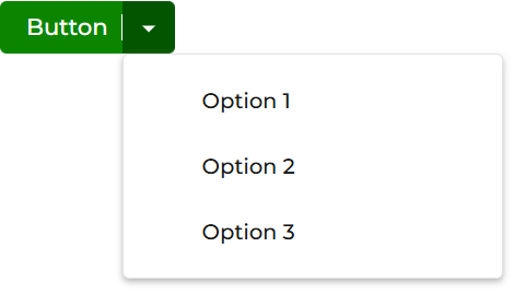
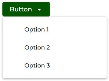
SizeEnum size
Set the button size. By default, "large."


BaseComponentShape shape
Set the button shape. By default, "default."

boolean showNotification
Whether to broadcast an accessibility notification when a process starts. Applicable when "request": "crt.RunBusinessProcessRequest" and processRunType property are specified. Out of the box, the property value is set to "true."
Available values
Value | Description |
|---|---|
true | Broadcasts a LiveAnnouncer message when the process starts. The message text is specified as a localizable string in the |
false | Does not broadcast a notification when the process starts. |
string notificationText
Specifies the text of the accessibility notification broadcast when the process starts. Applicable when "request": "crt.RunBusinessProcessRequest" and "showNotification": true. If "showNotification": false, the notificationText property is ignored. The message text must be defined as a localizable string. Out of the box, the value is "Process started."
object clicked
Action executed when a user clicks the button.
Parameters
Name | Type | Required | Description | ||||||||||||||||||||||||||||||||||||||||||||||||||||||||||||||||||
|---|---|---|---|---|---|---|---|---|---|---|---|---|---|---|---|---|---|---|---|---|---|---|---|---|---|---|---|---|---|---|---|---|---|---|---|---|---|---|---|---|---|---|---|---|---|---|---|---|---|---|---|---|---|---|---|---|---|---|---|---|---|---|---|---|---|---|---|---|---|
request | string | Yes | The action to execute when a user clicks the button. Without a Value Description crt.CreateRecordRequest Open new record crt.UpdateRecordRequest Open existing record crt.OpenPageRequest Open specific page crt.OpenDuplicatesPageRequest Open duplicates page crt.OpenChangeLogRequest Open change log crt.SaveRecordRequest Save data crt.CancelRecordChangesRequest Cancel changes crt.LoadDataRequest Refresh data crt.ClosePageRequest Close page crt.RunBusinessProcessRequest Run process crt.DeleteRecordsRequest Delete data crt.MergeRecordsRequest Merge data crt.UploadFileRequest Upload file crt.AddTagsInRecordsRequest Add tags crt.RemoveTagsInRecordsRequest Remove tags crt.RemoveRecordsInStaticFoldersRequest Remove records from static folder crt.AddRecordsInStaticFoldersRequest Add records to static folder crt.AddCommunicationOptionsRequest Add communication option crt.ImportDataRequest Data import crt.ExportDataGridToExcelRequest Export to Excel crt.SetRecordRightsRequest Set up access rights crt.SetCalendarTimeScaleRequest Set calendar time scale crt.ShowRelationshipsRequest Show record's relationships crt.ToggleFollowFeedRequest Follow/Unfollow Feed crt.AddCalendarSyncAccountRequest Add calendar synchronization account crt.SetupCalendarSyncAccountRequest Set up calendar synchronization account crt.SendInvitesForActivityRequest Send invite crt.ContinueInOtherPageRequest Continue in other page crt.MoveSelectedItemsRequest Move selected records crt.PrintablesRequest Print report crt.CopilotActionRequest Creatio.ai action crt.CreateEmailRequest Create an email | ||||||||||||||||||||||||||||||||||||||||||||||||||||||||||||||||||
params | object | No | Additional parameters for the action specified in |
array hotkeys
Assigns one or more keyboard shortcuts to the button. Creatio triggers the button click handler when the user presses the specified key combination. Custom and overridden click handlers keep working as usual.
Set the value using one of the following formats:
- A modifier and key combination, such as
ctrl+sorshift+esc. Usectrl,shift,alt, ormetaas the modifier. On macOS, you can also usecommand(equalsmeta) andoption(equalsalt). A combination matches the pressed key byevent.keyand might not work on all keyboard layouts. - An alias for a common action, such as
save,copy,create, ordelete. An alias matches the physical key byevent.coderegardless of the keyboard layout. Use aliases instead of key combinations whenever possible. - An individual key name without a modifier, such as
taborescape.
By default, the Save button that the base form page template provides has the "hotkeys": ["save"] property specified in the "Base page template" (BasePageTemplate code) schema of the "Client module" type. Creatio does not assign shortcuts to other buttons automatically, including custom buttons whose clicked.request property in the source code of the Freedom UI page is set to "crt.SaveRecordRequest." Ctrl+S is used on Windows and Linux. Cmd+S is used on macOS.
Creatio processes shortcut pressing as follows:
- If a modal window is open over the record page, the shortcut saves only the modal window data.
- If the record page has multiple data sources, the shortcut saves all of them.
- If the record page has multiple buttons whose
clicked.requestproperty is set to "crt.SaveRecordRequest," the shortcut takes no action. - After saving, Creatio preserves the page scroll position.
To stop using this functionality, register and enable the DisableHotkeys additional feature.
The CrtHotkeyService service listens for keyboard shortcuts across the Freedom UI page and triggers the matching button click. This service manages hotkeys consistently for all crt.Button component types on the page.
disabled-button-background
Color of an inactive button.
button-border-radius
Button border radius.
SizeEnum iconSize
Set the icon button size. By default, "large."


IconPositionEnum iconPosition
Position of the icon relative to the button caption. By default, "only-text."




string icon
Icon to display next to the button caption.
Available values


Menu-item component (crt.MenuItem)
Menu-item is a component that lets you add additional actions to a button menu item. Use the Menu-item component for any interaction that performs an action on the current page.
string type
Component type. "crt.MenuItem" for the Menu-item component.
string caption
Localizable caption of the button menu item.
boolean visible
Whether to display the menu item.
boolean disabled
Whether to lock the menu item. By default, "false."
CrtMenuItemViewElementConfig[] items
Index of button menu items. Displayed when you hold the pointer over the menu item that contains a submenu. The operation mechanism and properties of the button submenu and the button itself are identical.
string icon
Icon to display next to the menu item caption.
Available values
string iconColor
Hex code of an icon color.
See also
Overview of Freedom UI Designer and its elements (user documentation)
Set up Button components (user documentation)