Flex container layout element
Flex container is a layout element to group elements in a certain direction without binding the elements to a fixed layout. Learn more: Flex container, Set up a Flex container layout element (user documentation).
The Flex container layout element lets you run the following actions on layout elements:
- Specify the element direction.
- Align elements.
- Distribute the space between elements.
Learn more about Flexible Box: Basic concepts of flexbox (Mozilla).
The following example uses the Flex container layout element in the Freedom UI page schema below.
"name": "FlexContainer",
"values": {
    "layoutConfig": {
        "minWidth": 368,
        "maxWidth": 368
    },
    "type": "crt.FlexContainer",
    "direction": "column",
    "justifyContent": "start",
    "alignItems": "stretch",
    "wrap": "nowrap",
    "gap": "small",
    "items": []
}
...
{
    "operation": "insert",
    "name": "Button",
    "values": {
        "type": "crt.Button",
        "caption": "#ResourceString(Button_caption)#",
        "color": "primary",
    },
    "parentName": "FlexContainer",
    "propertyName": "Items",
    "index": 0
}
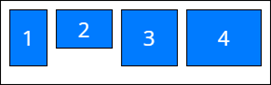
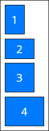
string direction
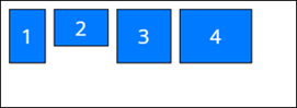
Specify the orientation and direction of the flex container's main axis to which flex elements align.
Available values
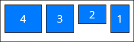
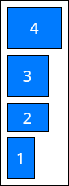
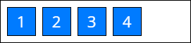
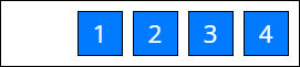
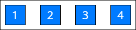
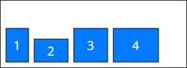
string justifyContent
Space distribution along the main axis. Defines how the browser distributes space between and around elements along the main axis of the flex container.
Available values
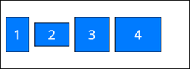
string alignItems
Space distribution along the cross axis. Defines how the browser distributes space between and around elements along the cross axis of the flex container.
Available values
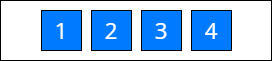
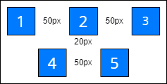
string gap
Define the column and row spacing between the elements in the flex container. This is a shorthand for the row-gap (vertical gap) and column-gap (horizontal gap) properties.
View the resulting settings for row-gap and column-gap below.
.container {
    display: flex;
    flex-wrap: wrap;
    column-gap: 50px;
    row-gap: 20px;
    justify-content: center;
}
View the resulting layout in the figure below.
string padding
Define the container padding settings. This setting can apply a single value to all sides or provide a specific value for each side. The property can accept numbers, strings, and the available values listed below.
Available values
none | Zero padding. |
small | Small padding. |
medium | Medium padding. |
large | Large padding. |
View the example settings for the padding property below.
"padding": {
    "top": "6px",
    "right": 6,
    "bottom": "small",
    "left": "large"
}
string border-radius
Define the corner rounding in the container. This setting can apply a single value to all corners or provide a specific value for each corner. The property can accept numbers, strings, and the available values listed below.
Available values
none | No rounding. |
small | Small corner radius. |
medium | Medium corner radius. |
large | Large corner radius. |
View the example settings for the border-radius property below.
"borderRadius": "medium"
string color
Define the container color. This setting accepts a color code.
View the example settings for the color property below.
"color": "#FDAB06"
LayoutConfig layoutConfig
Configure width and height of flex container, in pixels.
Parameters
number minWidth | Minimum width. |
number maxWidth | Maximum width. |
number width | Strictly defined width. |
number height | Strictly defined height. |
View the example settings for the layoutConfig property below.
"layoutConfig": {
    "minWidth": 368,
    "maxWidth": 368
}
See also
Overview of Freedom UI Designer and its elements (user documentation)
Set up a Flex container layout element (user documentation)