Set up List components
Use List components to display list of any object's records and filter the records if needed.
Set up a list that displays request records
Set up the List component that displays request records on the page. Enable users to add new records using a mini page and view existing records using a full page. Create dedicated pages for external users. Add "Print report" bulk action for list records. Connect the list to the Search component.
-
Add and set up the Search component.
-
Drag a List component to the canvas and open the component setup area.
-
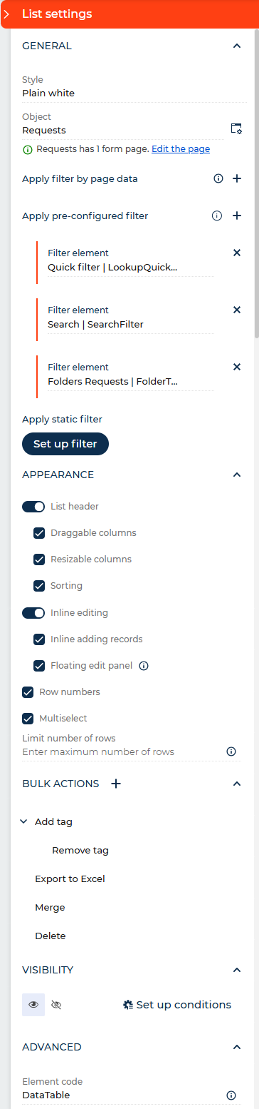
Set up the parameters in the General block.
-
Select the visual style of the list in the Style parameter. For this example, leave the default style.
-
Select the list data source in the Object parameter or click
 next to the parameter to add a new data source. For this example, select "Requests."
 -
Click the
 button next to the Object parameter and set up the form pages to use together with the data source.
- Select the page that displays existing records in the Default page parameter or click next to the parameter to add and set up a page. For this example, select the "Requests form page" page.
- Select the page that displays new records in the Add page parameter or click next to the parameter to add and set up a page. For this example, add and set up the "Requests mini page" mini page based on the "Mini page" template.
- Click Pages setup for external users. This opens page parameters for external users.
- Click next to the Default page parameter for external users to add and set up the "Requests form page for external users" page.
- Click next to the Add page parameter for external users to add and set up the "Requests mini page for external users" page.
- Click Save.
- Select the page that displays existing records in the Default page parameter or click
-
Click
next to the Apply filter by page data parameter to filter list data by page data source, Approvals list, Attachment list, or another List component. For this example, do not set up these filters. Learn more about setting up filters by page data in a different section: Set up a List component that displays data of record approver contacts. -
Click
next to the Apply pre-configured filter parameter → the Search component. -
Click Set up filter to set up a static filter that is always applied to the list. The filter setup process is similar to Classic UI. Learn more in a separate article: Advanced filter. For this example, do not set up the static filter.
-
-
Set up the parameters in the Appearance block.
- Toggle on List header to show the column header row. When enabled, additional checkboxes become available. For this example, leave the toggle enabled and all checkboxes selected: Draggable columns, Resizable columns, Sorting. Available starting from Creatio 8.3.1.
- Toggle Inline editing to let users edit record data directly in the list. For this example, leave the toggle enabled.
- Clear the Inline adding records checkbox to make users unable to add new records directly in the list without opening a separate page. For this example, leave the checkbox selected.
- Clear the Floating edit panel checkbox to disable the floating panel that appears when a user selects a record in the list. For this example, leave the checkbox selected.
- Clear the Row numbers checkbox to make the list rows unnumbered. For this example, leave the checkbox selected.
- Clear the Multiselect checkbox to make users unable to bulk select list records. For this example, leave the checkbox selected.
- Enter the maximum number of records to display in the Limit number of rows parameter. This is useful for focused list views, for example, top five records. For this example, leave the parameter empty to display all records. Available starting from Creatio 8.3.1.
-
Click
in the Bulk actions block. This opens the setup area of the bulk action.- Enter Print report in the Title parameter.
- Select Print report in the Action parameter.
- Specify the List component in the Which data to print? parameter.
- Click Requests at the top to go back to the list setup area.
-
Click the
 or
or  button in the Visibility block to make the component visible or invisible by default on the page, respectively. For this example, leave the component visible.
 -
Click Set up conditions in the Visibility block to set up element business rules. For this example, do not add business rules. Learn more about setting up business rules in a separate article: Set up business rules.
-
View the unique component code in the page schema in the Element code parameter in the Advanced block. Creatio uses this code in page schemas. You can change it if needed. This helps software developers to customize the app easier, especially if you have multiple similar components on the page. For this example, leave the code as is.
As a result, Creatio will add the List component that displays request records. Users will be able to add new records using a mini page and view existing records using a full page. External users will use dedicated pages. Users will be able to generate printable reports for list records. The Search component will be connected to the list.
Set up a list that displays data of record approver contacts
Set up the List component that increases the transparency of request approval workflow by displaying data of record approver contacts.
-
Add and set up Approvals and Approvals list components.
-
Configure a business process that approves requests. Learn more about configuring approval processes in a separate article: Configure a document approval process.
-
Drag a List component to the canvas and open the component setup area.
-
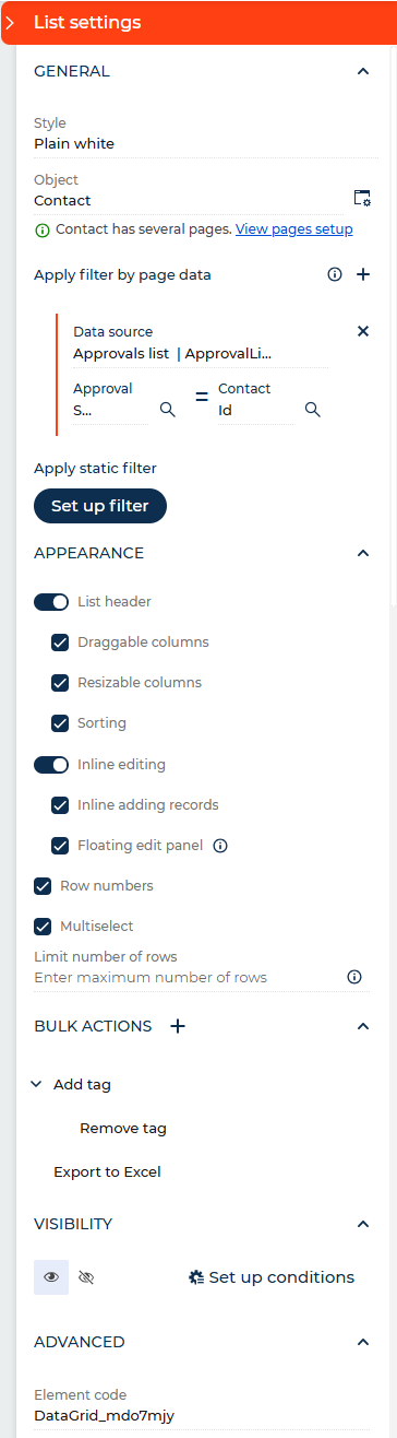
Select "Contact" in the Object parameter in the General block.
-
Filter the list data by the Approvals list component:
- Click next to the Apply filter by page data parameter. This brings up new parameters.
- Select the Approvals list component in the Data source parameter.
- Click the
 icon next to the Approval parameter → Related objects → Approver → Related objects → Contact → Id checkbox → Select.
 - Select Id in the Contact parameter.
- Click
-
Click
next to the Apply pre-configured filter parameter to connect the list to filter components, for example, Search. For this example, do not connect the list to filter components. -
Click Set up filter to set up a static filter that is always applied to the list. The filter setup process is similar to classic UI. Learn more in a separate article: Advanced filter. For this example, do not set up the static filter.
-
Set up the parameters in the Appearance block. For this example, leave all parameters at their default values.
-
Click the
or button in the Visibility block to make the component visible or invisible by default on the page, respectively. For this example, leave the component visible. -
Click Set up conditions in the Visibility block to set up element business rules. For this example, do not add business rules. Learn more about setting up business rules in a separate article: Set up business rules.
-
View the unique component code in the page schema in the Element code parameter in the Advanced block. Creatio uses this code in page schemas. You can change it if needed. This helps software developers to customize the app easier, especially if you have multiple similar components on the page. For this example, leave the code as is.
As a result, Creatio will add the List component that increases the transparency of request approval workflow by displaying data of record approver contacts.
See also
Overview of Freedom UI Designer and its elements