Set up Filters components
Use the Filters component to let users build complex record filters directly on a Freedom UI page without using folders.
To set up the Filters component, add two components to the page: the Filters panel, which stores and applies the conditions, and the Filters menu, which is the button users click to open and close the panel. You also need to connect the list on the page to the Filters panel so that the list refreshes when the user applies a filter.
Set up the Filters component
Add the Filters component to the Accounts list page so that users can filter accounts directly on the page.
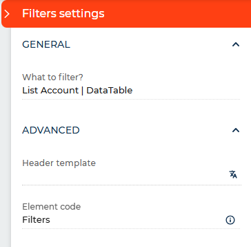
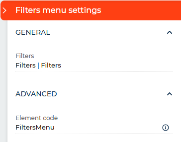
-
Open the needed Freedom UI page in Freedom UI Designer.
-
Open the Element library tab.
-
Add a Filters component to the canvas.
-
Open the Filters component settings and specify the data source in the What to filter? parameter. Select the object whose records the filter must apply to, for example, Account.
-
Add a Filters menu component to the canvas.
-
Open the Filters menu settings and select the Filters panel in the Advanced filters parameter.
noteThe Filters menu must be linked to a Filters panel. If the link is empty, the menu button is inactive in runtime.
-
Save the page.
As a result, users will be able to build and apply complex record filters directly on the page. The filter panel opens and closes using the menu button. The panel state is saved per user and restored the next time the page is opened.
Customize the filter panel header
By default, the filter panel displays a standard header above the root condition group. You can replace it with any text that better fits the page context. The header supports the {menuOperator} macro, which renders as the logical operator toggle — all or any — that users can click to switch between operators. If you omit the macro, Creatio appends it at the end of the header text automatically.
For example, entering "All contacts that match {menuOperator} of these conditions" displays the header with a clickable operator between "match" and "of these conditions."
- Open the Filters component settings.
- Expand the Advanced section.
- Enter the needed text in the Header template parameter. Include
{menuOperator}where you want the operator toggle to appear. - Save the page.
As a result, the filter panel will display the custom text above the root condition group.