Flex container element
Use the Flex container element to lay out its nested components vertically or horizontally.
View the example of a configuration object that adds Freedom UI Mobile components to the Flex container element below.
{
    "type": "crt.FlexContainer",
    "items": [
        {
            "type": "crt.Link",
            "caption": "Some link caption"
        },
        {
            "type": "crt.Button",
            "caption": "Some button caption"
        }
    ],
    "gap": 16,
    "padding": {
        "left": "medium",
        "right": "medium"
    },
    "direction": "row",
    "justifyContent": "center",
    "wrap": "nowrap"
}
string type
Element type. crt.FlexContainer for the Flex container element.
array of objects items
The array of nested Freedom UI Mobile components. The items property of an Flex container component can include Freedom UI Mobile layout elements and Freedom UI Mobile components.
Parameters
type | Type of nested component. |
caption | Caption of nested component. |
number gap
The column and row spacing between the nested components in the flex container. The property applies a single value to both vertical and horizontal gaps and is able to accept numbers only.
object padding
The flex container padding settings. The property can apply a single value to all sides or provide a specific value for each side of nested components. The property can accept numbers, strings, and the available values listed below.
Available values
none | Zero padding. |
small | Small padding. |
medium | Medium padding. |
large | Large padding. |
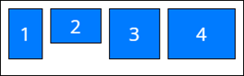
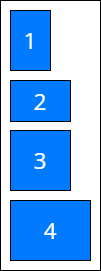
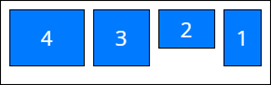
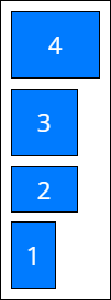
string direction
The orientation and direction of the flex container’s main axis to which flex components align. By default, row.
Available values
string justifyContent
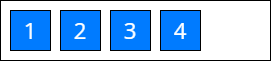
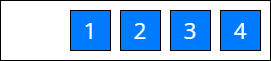
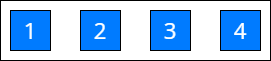
Space distribution along the main axis. Defines how the Creatio Mobile distributes space between and around nested components along the main axis of the flex container. By default, start.
Available values

string wrap
Sets whether the nested components are forced onto one line or can wrap onto multiple lines in the flex container. By default, nowrap.


