Grid container layout element
Grid container is a layout element to lay out its children elements within a grid. The elements may have variable size depending on their content. Built on top of CSS Grid Layout.
Learn more about Grid Layout: Basic Concepts of grid layout (Mozilla), Set up a Grid container layout element (user documentation).
The following example uses the Grid container layout element in the Freedom UI page schema below.
"name": "GridContainer",
"values": {
    "layoutConfig": {
        "minWidth": 368,
        "maxWidth": 368
    },
    "type": "crt.GridContainer",
    "columns": [
        "minmax(32px, 1fr)",
        "minmax(32px, 1fr)",
        "minmax(32px, 1fr)",
        "minmax(32px, 1fr)"
    ],
    "rows": "minmax(max-content, 32px)",
    "gap": {
        "columnGap": "large"
    },
    "items": []
}
...
{
    "operation": "insert",
    "name": "Button",
    "values": {
        "layoutConfig": {
            "column": 1,
            "row": 1,
            "colSpan": 3,
            "rowSpan": 1
        },
        "type": "crt.Button",
        "caption": "#ResourceString(Button_caption)#",
        "color": "default",
    },
    "parentName": "GridContainer",
    "propertyName": "Items",
    "index": 0
}
string rows, columns
Define the track size of the layout grid.
Available values
Constant | The track size must be integer. |
View the example for the columns and rows properties below.
{
    ...
    "columns": [
        "298px",
        "minmax(64px, 1fr)"
    ],
    "rows": "minmax(max-content, 32px)",
    ...
}
Grid container layout element does not support the following CSS Grid Layout features:
- The
grid-line-nameproperty. Required for named grid lines. - The
fit-content()function. Limits the size of a track. The function is the amin(max-content, max(auto, argument))formula calculated as theautoproperty (i.e.,minmax(auto, max-content)). The track size is capped at theargumentvalue as long as that value is larger than the minimum value ofauto. In Creatio, the browser renders a single 32px-wide column regardless of the argument in thefit-content()function. - The
repeat()function. Introduces a repeated fragment of a track list for compact representation of a recurring pattern.
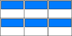
string justifyItems
Space distribution along the main axis. Defines how the browser distributes space between and around elements relative to the horizontal axis of the grid container.
Available values
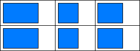
View the example settings for the justify-items property below.
.container {
    justify-items: start | end | center | stretch;
}
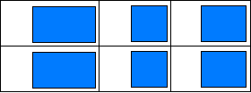
string alignItems
Space distribution along the cross axis. Pack the elements inside the block vertically.
Available values
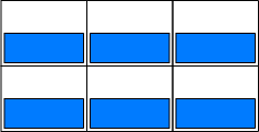
View the example settings for the align-items property below.
.container {
    align-items: start | end | center | stretch;
}
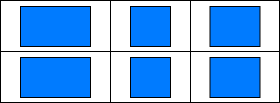
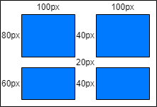
object gap
Define the track spacing between the elements in the grid container. This is a shorthand for the row-gap (vertical gap) and column-gap (horizontal gap) properties.
View the resulting settings for row-gap and column-gap below.
.container {
    grid-template-columns: 100px auto;
    grid-template-rows: 80px 60px;
    column-gap: 40px;
    row-gap: 20px;
}
View the resulting layout in the figure below.
object padding
Define the container padding settings. This setting can apply a single value to all sides or provide a specific value for each side. The property can accept numbers, strings, and the available values listed below.
Available values
none | Zero padding. |
small | Small padding. |
medium | Medium padding. |
large | Large padding. |
View the example settings for the padding property below.
"padding": {
    "top": "6px",
    "right": 6,
    "bottom": "small",
    "left": "large"
}
string border-radius
Define the corner rounding in the container. This setting can apply a single value to all sides or provide a specific value for each side. The property can accept numbers, strings, and the available values listed below.
Available values
none | No rounding. |
small | Small corner radius. |
medium | Medium corner radius. |
large | Large corner radius. |
View the example settings for the border-radius property below.
"borderRadius": "medium"
string color
Define the container color. This setting accepts a color code.
View the example settings for the color property below.
"color": "#FDAB06"
LayoutConfig layoutConfig
Configure width and height of grid container, in pixels.
Parameters
number minWidth | Minimum width. |
number maxWidth | Maximum width. |
number width | Strictly defined width. |
number height | Strictly defined height. |
View the example settings for the layoutConfig property below.
"layoutConfig": {
    "minWidth": 368,
    "maxWidth": 368
}
See also
Set up a Grid container layout element (user documentation)