Implement a Freedom UI Designer setup area for a custom UI component
To implement the example:
- Create an Angular project. Read more >>>
- Create a custom UI component. Read more >>>
- Create a custom setup area. Read more >>>
- Add the custom UI component to the Freedom UI page. Read more >>>
Implement a custom Rating component to rate contacts directly on the contact page.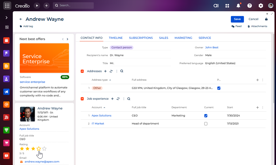
The component must have its own setup area to configure the following parameters directly in the Freedom UI Designer:
- Star count — the maximum number of stars to display.
- Star color (active) — the color of filled stars.
- Data source — the object that implements rating functionality.
- Data source attribute — the column of the object that implements the data source. The column stores rating value.
Implement the custom component and its setup area using a remote module created in the Angular framework.
1. Create an Angular project
To create an Angular project, follow the instructions: Create an Angular project to develop a custom UI component using remote module via the Clio utility.
For this example:
- Create an Angular project whose name is
sdkCustomRatingComponent. - Use
usras the vendor prefix. - Update the
@creatio-devkit/commonlibrary to the latest version. - Install the
class-transformerand the@creatio/interface-designerlibraries.
As a result, an Angular project to develop a custom UI component using a remote module will be added.
2. Create a custom UI component
-
Run the
ng g c view-elements/rating --view-encapsulation=ShadowDomcommand at the Visual Studio Code terminal to create an Angular component in the project.As a result, the
RatingComponentfiles will be added to the "src/app/view-elements/rating" project directory.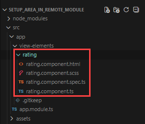
-
Define the component constants.
- Go to the "src/app/" directory.
- Create the "constants" directory → "rating.constants.ts" file.
- Open the "rating.constants.ts" file.
- Export constants that define the component type and the component icon.
- Save the file.
"rating.constants.ts" file/* Define the component type identifier. */export const COMPONENT_TYPE = 'usr.CustomRating';/* Define the component icon as an inline SVG. */export const COMPONENT_ICON =`<svg xmlns="http://www.w3.org/2000/svg" width="24" height="24" ` +`viewBox="0 0 24 24" fill="none" stroke="currentColor" stroke-width="2">` +`<polygon points="12 2 15.09 8.26 22 9.27 17 14.14 18.18 21.02 ` +`12 17.77 5.82 21.02 7 14.14 2 9.27 8.91 8.26 12 2"/></svg>`; -
Specify that the
RatingComponentis a view element.- Open the "rating.component.ts" file.
- Flag the component using the
@CrtViewElementdecorator. - Import the required functionality from the libraries into the component.
- Save the file.
"rating.component.ts" file/* Import the required functionality from the libraries. */import {Component,OnInit,ViewEncapsulation} from '@angular/core';import {CrtViewElement} from '@creatio-devkit/common';@Component({selector: 'usr-rating-internal',templateUrl: './rating.component.html',styleUrls: ['./rating.component.scss'],encapsulation: ViewEncapsulation.ShadowDom})/* Register the component as a Freedom UI view element. */@CrtViewElement({selector: 'usr-rating',type: COMPONENT_TYPE})export class RatingComponent implements OnInit {constructor() { }ngOnInit(): void {}} -
Register the
RatingComponentview element as a component.- Open the "app.module.ts" file.
- Add the
RatingComponentview element to the@CrtModuledecorator. - Register the
RatingComponentview element as a component, i.e., Angular Element, in the module constructor. - Save the file.
"app.module.ts" file/* Import the required functionality from the libraries. */import {DoBootstrap,Injector,NgModule,ProviderToken} from '@angular/core';import {createCustomElement} from '@angular/elements';import {BrowserModule} from '@angular/platform-browser';import {bootstrapCrtModule,CrtModule} from '@creatio-devkit/common';import {RatingComponent} from './view-elements/rating/rating.component';@CrtModule({/* Specify that RatingComponent is a view element. */viewElements: [RatingComponent]})@NgModule({declarations: [RatingComponent],imports: [BrowserModule],providers: [],})export class AppModule implements DoBootstrap {constructor(private _injector: Injector) {}ngDoBootstrap(): void {/* Register RatingComponent as an Angular Element. */const ratingElement = createCustomElement(RatingComponent, {injector: this._injector,});customElements.define('usr-rating', ratingElement);/* Bootstrap CrtModule definitions. */bootstrapCrtModule('sdkCustomRatingComponent', AppModule, {resolveDependency: (token) => this._injector.get(<ProviderToken<unknown>>token)});}} -
Implement the business logic of the component.
- Open the "rating.component.ts" file.
- Add the
rating(the current rating value),maxStars(the maximum number of stars), andfilledColor(the color of filled stars) properties to theRatingComponentclass. - Flag the properties using the
@Inputand@CrtInputdecorators. - Add the
ratingChangeevent to theRatingComponentclass. The event emits the new rating value when a star is clicked. - Flag the
ratingChangeevent using the@Outputand@CrtOutputdecorators. - Register the component in the Freedom UI Designer element library using the
@CrtInterfaceDesignerItemdecorator. - Import the required functionality from the libraries into the component.
- Save the file.
"rating.component.ts" file/* Import the required functionality from the libraries. */import {ChangeDetectionStrategy,Component,EventEmitter,Input,OnInit,Output,ViewEncapsulation} from '@angular/core';import {CrtInput,CrtInterfaceDesignerItem,CrtOutput,CrtViewElement} from '@creatio-devkit/common';import {COMPONENT_ICON,COMPONENT_TYPE} from '../../constants/rating.constants';/* Register the component in the Freedom UI Designer element library. */@CrtInterfaceDesignerItem({toolbarConfig: {caption: 'Rating',icon: COMPONENT_ICON,},})/* Register the component as a Freedom UI view element. */@CrtViewElement({selector: 'usr-rating',type: COMPONENT_TYPE,})@Component({selector: 'usr-rating-internal',templateUrl: './rating.component.html',styleUrls: ['./rating.component.scss'],changeDetection: ChangeDetectionStrategy.OnPush,encapsulation: ViewEncapsulation.ShadowDom,})export class RatingComponent implements OnInit {/* The current rating value. */@Input()@CrtInput()public rating: number = 0;/* The maximum number of stars. */@Input()@CrtInput()public maxStars: number = 5;/* The color of filled stars. */@Input()@CrtInput()public filledColor: string = '#ffc107';/* Emits the new rating value when a star is clicked. */@Output()@CrtOutput()public readonly ratingChange = new EventEmitter<number>();constructor() { }ngOnInit(): void { }protected get stars(): number[] {return Array(this.maxStars).fill(0).map((_, i) => i + 1);}protected isStarFilled(starIndex: number): boolean {return starIndex <= this.rating;}protected onStarClick(starIndex: number): void {this.ratingChange.emit(starIndex);}} -
Add the markup of the custom component.
- Open the "rating.component.html" file.
- Add the markup.
- Save the file.
"rating.component.html" file<div class="custom-rating" data-testid="custom-rating"><div class="stars-container">@for (star of stars; track star) {<buttontype="button"class="star"[class.star--filled]="isStarFilled(star)"[style.color]="isStarFilled(star) ? filledColor : null"[attr.aria-label]="'Rate ' + star + ' stars'"(click)="onStarClick(star)">@if (isStarFilled(star)) {<svgxmlns="http://www.w3.org/2000/svg"width="24"height="24"viewBox="0 0 24 24"fill="currentColor"><polygonpoints="12 2 15.09 8.26 22 9.27 17 14.14 18.18 21.0212 17.77 5.82 21.02 7 14.14 2 9.27 8.91 8.26 12 2"/></svg>} @else {<svgxmlns="http://www.w3.org/2000/svg"width="24"height="24"viewBox="0 0 24 24"fill="none"stroke="currentColor"stroke-width="2"><polygonpoints="12 2 15.09 8.26 22 9.27 17 14.14 18.18 21.0212 17.77 5.82 21.02 7 14.14 2 9.27 8.91 8.26 12 2"/></svg>}</button>}</div><div class="rating-value">{{ rating }} / {{ maxStars }}</div></div> -
Add the styles of the custom component.
- Open the "rating.component.scss" file.
- Add the styles.
- Save the file.
"rating.component.scss" file:host {display: block;}.custom-rating {display: flex;flex-direction: column;gap: 4px;}.stars-container {display: flex;gap: 4px;}.star {background: none;border: none;padding: 0;margin: 0;cursor: pointer;color: #ccc;line-height: 0;&:hover {color: #ffc107;}}.star--filled {color: #ffc107;}.rating-value {font-size: 12px;color: #666;}
3. Create a custom Freedom UI Designer setup area
-
Run the
ng g c view-elements/rating-setup-areacommand at the Visual Studio Code terminal to create an Angular component in the project.As a result, the
RatingSetupAreaComponentfiles will be added to the "src/app/view-elements/rating-setup-area" project directory.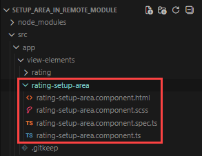
-
Define the setup area constants.
- Go to the "src/app/constants" directory.
- Open the "rating.constants.ts" file.
- Export constants that define the setup area type, property codes, and default property values.
- Save the file.
"rating.constants.ts" file/* Define the identifier of the setup area type. */export const SETUP_AREA_TYPE = 'usr.RatingSetupArea';/* Define the property codes used in the Freedom UI page schema. */export const PROPERTY_RATING = 'rating';export const PROPERTY_MAX_STARS = 'maxStars';export const PROPERTY_FILLED_COLOR = 'filledColor';/* Define the default property values. */export const DEFAULT_MAX_STARS = 5;export const DEFAULT_FILLED_COLOR = '#ffc107'; -
Specify that the
RatingSetupAreaComponentis a view element.- Open the "rating-setup-area.component.ts" file.
- Flag the component using the
@CrtViewElementdecorator. - Import the required functionality from the libraries into the component.
- Save the file.
"rating-setup-area.component.ts" file/* Import the required functionality from the libraries. */import {Component,ViewEncapsulation} from '@angular/core';import {CrtViewElement} from '@creatio-devkit/common';import {SETUP_AREA_TYPE} from 'src/app/constants/rating.constants';@Component({selector: 'usr-rating-setup-area-internal',templateUrl: './rating-setup-area.component.html',styleUrls: ['./rating-setup-area.component.scss'],encapsulation: ViewEncapsulation.None})/* Register the component as a Freedom UI view element. */@CrtViewElement({selector: 'usr-rating-setup-area',type: SETUP_AREA_TYPE})export class RatingSetupAreaComponent {} -
Implement the business logic of the setup area.
- Open the "rating-setup-area.component.ts" file.
- Add the
viewNodeEditorsetter to implement thePropertyPanelinterface. ThePropertyPanelinterface defines the contract for the setup area implemented using a remote module. Freedom UI Designer calls theviewNodeEditorsetter when a user selects the component on the canvas. - Initialize
InterfaceDesignerSchemaServiceto access view model attributes and data sources. - Implement
_loadElementData()to read the current property values from the schema asynchronously on setup area initialization. - Implement
_applyChanges()to write the updated property values back to the schema when the user changes a field. - Import the required functionality from the libraries into the component.
- Save the file.
"rating-setup-area.component.ts" file/* Import the required functionality from the libraries. */import {ChangeDetectionStrategy,Component,Input,signal,ViewEncapsulation,WritableSignal} from '@angular/core';import {InterfaceDesignerSchemaService,PropertyPanel,ViewModelAttributeType,ViewNodeEditor,ViewNodePropertyValueType,} from '@creatio/interface-designer';import {CrtInput,CrtViewElement} from '@creatio-devkit/common';import {DEFAULT_MAX_STARS,DEFAULT_FILLED_COLOR,SETUP_AREA_TYPE,PROPERTY_MAX_STARS,PROPERTY_RATING,PROPERTY_FILLED_COLOR,} from 'src/app/constants/rating.constants';/* Describe the schema state read from Freedom UI Designer. */interface RatingSetupAreaSchemaState {maxStars?: number;filledColor?: string;viewModelAttributeName?: string;dataSourceName?: string;dataSourceAttributeName?: string;}/* Register the setup area as a Freedom UI view element. */@CrtViewElement({selector: 'usr-rating-setup-area',type: SETUP_AREA_TYPE,})@Component({selector: 'usr-rating-setup-area-internal',templateUrl: './rating-setup-area.component.html',styleUrls: ['./rating-setup-area.component.scss'],changeDetection: ChangeDetectionStrategy.OnPush,encapsulation: ViewEncapsulation.None,})export class RatingSetupAreaComponent implements PropertyPanel {/* Provide access to the schema editors for reading and modifying the page schema. */private readonly _schemaEditor = new InterfaceDesignerSchemaService().getSchemaEditor();/* Provide access to the selected component's view node in the schema. */private _viewNodeEditor!: ViewNodeEditor;/* Return the name of the view model attribute that binds the rating property. */private get _viewModelAttributeName(): string {return `${this._viewNodeEditor.nodeName}_Rating`;}/* Indicate whether the setup area has finished loading the component's properties. */protected readonly isPanelReady = signal<boolean>(false);/* The current value of the maxStars property displayed in the setup area. */protected readonly maxStars = signal(DEFAULT_MAX_STARS);/* The current value of the filledColor property displayed in the setup area. */protected readonly filledColor = signal(DEFAULT_FILLED_COLOR);/* The code of the selected component instance on the canvas. */protected readonly elementCode = signal('');/* The name of the data source selected in the setup area. */protected readonly dataSourceName = signal('');/* The name of the data source attribute selected in the setup area. */protected readonly dataSourceAttributeName = signal('');/* Called by Freedom UI Designer when a user selects the component on the canvas. */@Input()@CrtInput()public set viewNodeEditor(nodeEditor: ViewNodeEditor) {this._init(nodeEditor).catch((error) => console.error('Error initializing rating setup area:', error));}/* Store the view node editor and load the current property values from the schema. */private async _init(nodeEditor: ViewNodeEditor): Promise<void> {this._viewNodeEditor = nodeEditor;await this._loadElementData();this.isPanelReady.set(true);}/* Read the current property values from the schema. */private async _getStateFromSchema(): Promise<RatingSetupAreaSchemaState> {let maxStars: number | undefined;let filledColor: string | undefined;/* Read the maxStars and filledColor constant values from the view node. */const maxStarsPropertyValue = await this._viewNodeEditor.getPropertyValue(PROPERTY_MAX_STARS);const filledColorPropertyValue = await this._viewNodeEditor.getPropertyValue(PROPERTY_FILLED_COLOR);if (maxStarsPropertyValue?.type === ViewNodePropertyValueType.Constant) {maxStars = Number(maxStarsPropertyValue.value);}if (filledColorPropertyValue?.type === ViewNodePropertyValueType.Constant) {filledColor = filledColorPropertyValue.value as string;}/* Read the rating attribute binding from the view node. */const ratingPropertyValue = await this._viewNodeEditor.getPropertyValue(PROPERTY_RATING);if (ratingPropertyValue?.type !== ViewNodePropertyValueType.AttributeBinding) {return { maxStars, filledColor };}/* Resolve the view model attribute and its model binding. */const viewModelAttributePath = ratingPropertyValue.attributePath;const viewModelAttributeEditor = await this._schemaEditor.viewModelEditor.getAttributeEditor(viewModelAttributePath);if (!viewModelAttributeEditor) {return { maxStars, filledColor, viewModelAttributeName: viewModelAttributePath };}if (viewModelAttributeEditor.attributeType !== ViewModelAttributeType.ModelBindingValue) {return { maxStars, filledColor, viewModelAttributeName: viewModelAttributePath };}const modelBinding = await viewModelAttributeEditor.getModelBinding();return {maxStars,filledColor,viewModelAttributeName: viewModelAttributePath,dataSourceName: modelBinding.dataSourceName,dataSourceAttributeName: modelBinding.dataSourceAttributePath,};}/* Populate the setup area signals using the current property values from the schema. */private async _loadElementData(): Promise<void> {this.elementCode.set(this._viewNodeEditor.nodeName);const {maxStars,filledColor,dataSourceName,dataSourceAttributeName} = await this._getStateFromSchema();this.maxStars.set(maxStars ?? DEFAULT_MAX_STARS);this.filledColor.set(filledColor ?? DEFAULT_FILLED_COLOR);this.dataSourceName.set(dataSourceName ?? '');this.dataSourceAttributeName.set(dataSourceAttributeName ?? '');}/* Remove the existing rating attribute binding before creating a new binding. */private async _unbindExisting(): Promise<void> {const attributeName = (await this._getStateFromSchema()).viewModelAttributeName;if (!attributeName) {return;}/* Clear the rating property binding in the view node. */await this._viewNodeEditor.setPropertyValue(PROPERTY_RATING, { constant: null });/* Remove the view model attribute if it is no longer in use. */if (await this._schemaEditor.viewModelEditor.canRemoveAttribute(attributeName)) {await this._schemaEditor.viewModelEditor.removeAttribute(attributeName);}}/* Create or update the view model attribute that binds the rating property to a data source. */private async _bindViewModelAttribute(viewModelAttributeName: string,dataSourceName: string,dataSourceAttributeName: string,): Promise<void> {const viewModelAttributeEditor = await this._schemaEditor.viewModelEditor.getAttributeEditor(viewModelAttributeName);const targetModelBinding = {dataSourceName,dataSourceAttributePath: dataSourceAttributeName};if (!viewModelAttributeEditor) {/* Create a new view model attribute bound to the selected data source attribute. */await this._schemaEditor.viewModelEditor.createAttribute(viewModelAttributeName, { bindToModel: targetModelBinding });} else if (viewModelAttributeEditor.attributeType === ViewModelAttributeType.ModelBindingValue) {/* Update the model binding of the existing attribute. */await viewModelAttributeEditor.bindToModel(targetModelBinding);}}/* Write the updated property values to the schema. */private async _applyChanges(): Promise<void> {/* Save the maxStars and filledColor constant values to the view node. */await this._viewNodeEditor.setPropertyValue(PROPERTY_MAX_STARS, { constant: this.maxStars() });await this._viewNodeEditor.setPropertyValue(PROPERTY_FILLED_COLOR, { constant: this.filledColor() });const dataSourceName = this.dataSourceName();const dataSourceAttributeName = this.dataSourceAttributeName();/* If both data source fields are set, update the rating attribute binding. */if (dataSourceName && dataSourceAttributeName) {await this._unbindExisting();await this._bindViewModelAttribute(this._viewModelAttributeName,dataSourceName,dataSourceAttributeName);/* Bind the rating property to the view model attribute. */await this._viewNodeEditor.setPropertyValue(PROPERTY_RATING, { bindToAttribute: this._viewModelAttributeName });}}/* Handle a property change triggered by user input in the setup area. */protected async handlePropertyChange(event: Event,signal: WritableSignal<string | number>,propertyName: string,): Promise<void> {const inputElement = event.target as HTMLInputElement;/* Convert the input value to a number if the input type is "number". */const value = inputElement.type === 'number'? Number(inputElement.value): inputElement.value;signal.set(value);try {await this._applyChanges();} catch (error) {console.error(`Error applying ${propertyName} change:`, error);}}} -
Add the markup of the setup area.
- Open the "rating-setup-area.component.html" file.
- Add the markup.
- Save the file.
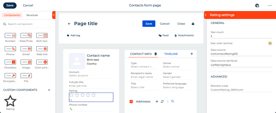
"rating-setup-area.component.html" file@if (isPanelReady()) {<crt-interface-designer-properties-panel-wrapper[headerTitle]="'Rating settings'"[showHeader]="true"[canShowTooltip]="true"><div class="section"><h4 class="section-title">General</h4><div class="form-field"><label class="field-label" for="max-stars-input">Star count</label><inputid="max-stars-input"type="number"class="field-input"placeholder="Max star count"[value]="maxStars()"(change)="handlePropertyChange($event, maxStars, 'maxStars')"/></div><div class="form-field"><label class="field-label" for="filled-color-input">Star color (active)<inputid="filled-color-input"type="color"[value]="filledColor()"(change)="handlePropertyChange($event, filledColor, 'filledColor')"/></label></div><div class="form-field"><label class="field-label" for="data-source-input">Data source</label><inputid="data-source-input"type="text"class="field-input"placeholder="Data source name"[value]="dataSourceName()"(change)="handlePropertyChange($event, dataSourceName, 'dataSourceName')"/></div><div class="form-field"><labelclass="field-label"for="data-source-attribute-input">Data source attribute</label><inputid="data-source-attribute-input"type="text"class="field-input"placeholder="Data source attribute name"[value]="dataSourceAttributeName()"(change)="handlePropertyChange($event,dataSourceAttributeName,'dataSourceAttributeName')"/></div></div><hr class="section-divider" /><div class="section"><h4 class="section-title">Advanced</h4><div class="form-field"><labelclass="field-label"for="element-code-input">Element code</label><inputid="element-code-input"disabledtype="text"class="field-input"[value]="elementCode()"/></div></div></crt-interface-designer-properties-panel-wrapper>} -
Add the styles of the setup area.
- Open the "rating-setup-area.component.scss" file.
- Add the styles.
- Save the file.
"rating-setup-area.component.scss" file@import url('https://fonts.googleapis.com/css2?family=Montserrat:wght@400;500;600&display=swap');:host {--font-family: "Montserrat", sans-serif;--font-family-add: "Montserrat", sans-serif;--font-weight: 400;--font-weight-medium: 500;--font-weight-semibold: 600;--foreground-text: 68, 68, 68;--foreground-secondary-text: 117, 117, 117;--foreground-secondary-text-alpha: 1;--headline-3-font-family: "Montserrat", sans-serif;--headline-3-font-size: 18px;--headline-3-font-weight: 500;--headline-3-line-height: 24px;--headline-3-letter-spacing: 0;--crt-palette-foreground-contrast-500: #ffffff;--crt-expansion-btn-background-color: #f4480b;--headline-4-font-family: "Montserrat", sans-serif;--headline-4-font-size: 16px;--headline-4-font-weight: 500;--headline-4-line-height: 20px;--headline-4-letter-spacing: 0;--crt-palette-primary-500: #f4480b;font-family: "Montserrat", sans-serif;font-size: 14px;font-weight: 400;color: rgba(68, 68, 68, 1);display: block;}.section-title {font-family: "Montserrat", sans-serif;font-size: 14px;font-weight: 500;color: #0D2E4E;text-transform: uppercase;letter-spacing: normal;line-height: 18px;margin: 0;padding: 0 8px 14px 8px;display: block;overflow: hidden;text-overflow: ellipsis;white-space: nowrap;-webkit-font-smoothing: antialiased;}.section {padding: 0 0 8px 0;}.section-divider {border: none;border-top: 1px solid rgba(0, 0, 0, 0.1);margin: 15px 0 15px 0;}.form-field {padding: 0 8px 0 8px;display: flex;flex-direction: column;gap: 2px;}.field-label {font-family: "Montserrat", sans-serif;font-size: 12px;font-weight: 500;color: rgb(117, 117, 117);display: flex;align-items: center;justify-content: space-between;line-height: 17px;letter-spacing: 0.24px;margin-top: 15px;-webkit-font-smoothing: antialiased;}.field-input {font-family: "Montserrat", sans-serif;font-size: 13px;font-weight: 500;color: rgb(68, 68, 68);border: none;border-bottom: 1px solid #c8c8c8;outline: none;box-shadow: none;padding: 0;width: 100%;background: transparent;line-height: 20px;text-overflow: ellipsis;-webkit-font-smoothing: antialiased;caret-color: rgb(68, 68, 68);}.field-input:focus,.field-input:focus-visible {outline: none !important;box-shadow: none !important;border-bottom: 1px solid #c8c8c8 !important;background-color: transparent !important;}.field-input::placeholder {font-family: "Montserrat", sans-serif;color: rgba(117, 117, 117, 1);font-style: normal;}.field-input:disabled {color: rgba(117, 117, 117, 1);cursor: not-allowed;border-bottom-color: rgba(0, 0, 0, 0.1);}input[type="color"] {width: 20px;height: 20px;border: 1px solid #c8c8c8;border-radius: 3px;padding: 0;cursor: pointer;background: none;} -
Register the setup area so that Freedom UI Designer can display it.
- Go to the "src/app" directory.
- Create the "rating.design-time.module.ts" file.
- Add
RatingSetupAreaComponentso that Freedom UI Designer can display it as a setup area when a user selects the Rating component on the canvas. - Register
RatingSetupAreaComponentas a custom element so that the browser can render it inside the Freedom UI Designer. - Save the file.
"rating.design-time.module.ts" file/* Import the required functionality from the libraries. */import {CommonModule} from '@angular/common';import {CUSTOM_ELEMENTS_SCHEMA,inject,Injector,NgModule} from '@angular/core';import {createCustomElement} from '@angular/elements';import {CrtModule,Type} from '@creatio-devkit/common';import {RatingSetupAreaComponent} from './view-elements/rating-setup-area/rating-setup-area.component';/* Register RatingSetupAreaComponent as a view element so that Freedom UI Designercan display it as a setup area when a user selects the Rating component on the canvas. */@CrtModule({viewElements: [RatingSetupAreaComponent],})/* Declare RatingSetupAreaComponent in the Angular module and allow custom element schemas. */@NgModule({declarations: [RatingSetupAreaComponent],imports: [CommonModule],exports: [RatingSetupAreaComponent],schemas: [CUSTOM_ELEMENTS_SCHEMA],})export class RatingDesignTimeModule {/* Injector is used to create Angular Elements from components. */private readonly _injector = inject(Injector);constructor() {/* Register RatingSetupAreaComponent as a custom element on module initialization. */this._registerCustomElement('usr-rating-setup-area', RatingSetupAreaComponent);}/* Register a component as a custom element so that the browser can render itinside Freedom UI Designer if it has not been registered yet. */private _registerCustomElement(selector: string, component: Type): void {if (!customElements.get(selector)) {/* Convert the Angular component to a custom element and define it in the browser registry. */const elementConstructor = createCustomElement(component, { injector: this._injector });customElements.define(selector, elementConstructor);}}} -
Register the
RatingSetupAreaComponentview element as a component.- Open the "app.module.ts" file.
- Add
RatingDesignTimeModuleto theimportsarray. - Register the
RatingSetupAreaComponentview element as a component, i.e., Angular Element, in the module constructor. - Save the file.
"app.module.ts" file/* Import the required functionality from the libraries. */import {DoBootstrap,Injector,NgModule,ProviderToken} from '@angular/core';import {createCustomElement} from '@angular/elements';import {BrowserModule} from '@angular/platform-browser';import {bootstrapCrtModule,CrtModule} from '@creatio-devkit/common';import {RatingComponent} from './view-elements/rating/rating.component';import {RatingSetupAreaComponent} from './view-elements/rating-setup-area/rating-setup-area.component';import {RatingDesignTimeModule} from './rating.design-time.module';@CrtModule({/* Specify that RatingComponent and RatingSetupAreaComponent are view elements. */viewElements: [RatingComponent, RatingSetupAreaComponent]})@NgModule({declarations: [RatingComponent],imports: [BrowserModule, RatingDesignTimeModule],providers: [],})export class AppModule implements DoBootstrap {constructor(private _injector: Injector) {}ngDoBootstrap(): void {/* Register RatingComponent as an Angular Element. */const ratingElement = createCustomElement(RatingComponent, {injector: this._injector,});customElements.define('usr-rating', ratingElement);/* Bootstrap CrtModule definitions. */bootstrapCrtModule('sdkCustomRatingComponent', AppModule, {resolveDependency: (token) => this._injector.get(<ProviderToken<unknown>>token)});}} -
Link the setup area to the Rating component.
- Open the "rating.component.ts" file.
- Set the
propertiesPanelproperty toSETUP_AREA_TYPE. ThepropertiesPanelproperty allows you to use a custom component as a setup area. - Import the required functionality from the libraries into the component.
- Save the file.
"rating.component.ts" fileimport { SETUP_AREA_TYPE } from '../../constants/rating.constants';.../* Register the component in the Freedom UI Designer element library. */@CrtInterfaceDesignerItem({propertiesPanel: SETUP_AREA_TYPE,}) -
Run the
npm run buildcommand at the Visual Studio Code terminal to build the project.
As a result, the build will be added to the "dist" directory of the Angular project. The build will have the "sdkCustomRatingComponent" name.
4. Add the custom UI component to the Freedom UI page
-
Upload packages to Creatio using Clio utility.
- Go to the "../Terrasoft.WebApp/Terrasoft.Configuration/Pkg/sdkCustomRatingComponent/Files" directory.
- Create a "src/js" directory.
- Copy the build artifacts from the "../sdkCustomRatingComponent/dist" project directory to the "../Terrasoft.WebApp/Terrasoft.Configuration/Pkg/sdkCustomRatingComponent/Files/src/js" directory.
- Run the
clio pushw -e sdkCustomRatingComponentcommand at the Visual Studio Code terminal to upload the changes to Creatio.
-
Open the Customer 360 app in the Application Designer.
-
Open the Contacts form page.
-
Add data source for contact rating.
-
Go to the element library.
-
Click Add data source → New data source.
-
Fill out the data source properties.
Property
Property value
Name
Contact rating
-
Click Save.
-
Go to the setup area → Relations setup.
-
Click
 in the Add relation criteria.
 -
Fill out the relation properties.
Property
Property value
Contact
Select "Id"
Contact rating
Select "Id"
-
Click Save.
-
Add a column to the object that determines data source.
-
Open the Customer 360 app in the Application Designer.
-
Go to the Package settings tab →
sdkCustomRatingComponentpackage. -
Open the "Contact rating" (
UsrContactRatingcode) schema of the "Object" type. -
Go to the Columns node.
-
Click
 → Number → Integer.
 -
Fill out the column properties.
Property
Property value
Code
UsrRatingValue
Title
Rating value
-
Click Save and publish.
-
-
-
Refresh the Contacts form page.
-
Add a label of the contact rating.
-
Drag a label to the canvas.
-
Fill out the label properties.
Property
Property value
Text
Rating
Style
Caption
Text color
#757575 Element code
UsrRating
-
-
Add a Rating component.
-
Drag the Rating component to the canvas.
-
Fill out the rating properties.
Property
Property value
Data source
UsrContactRatingDS
Data source attribute
UsrRatingValue
Leave default values for component properties.
-
-
Click Save.
As a result, the custom Rating component will be configured directly in the Freedom UI Designer via a setup area implemented using a remote module. The setup area includes the following parameters:
- Star count — the maximum number of stars to display.
- Star color (active) — the color of filled stars.
- Data source — the object that implements rating functionality.
- Data source attribute — the column of the object that implements the data source. The column stores the rating value.
Changes made in the setup area are reflected on the canvas immediately.
View the result
- Open the Contacts section.
- Open an arbitrary contact. For example, "Andrew Wayne."
As a result, Creatio will display the custom Rating component in the contact profile of the contact page. The component enables users to rate contacts. The component has its own setup area that is displayed in the Freedom UI Designer. Both the component and the setup area are implemented using a remote module created in the Angular framework. View the result >>>
Source code
- rating.constants.ts
- rating.component.ts
- rating.component.html
- rating.component.scss
- rating-setup-area.component.ts
- rating-setup-area.component.html
- rating-setup-area.component.scss
- rating.design-time.module.ts
- app.module.ts
/* Define the component type identifier. */
export const COMPONENT_TYPE = 'usr.CustomRating';

/* Define the component icon as an inline SVG. */
export const COMPONENT_ICON =
  `<svg xmlns="http://www.w3.org/2000/svg" width="24" height="24" ` +
  `viewBox="0 0 24 24" fill="none" stroke="currentColor" stroke-width="2">` +
  `<polygon points="12 2 15.09 8.26 22 9.27 17 14.14 18.18 21.02 ` +
  `12 17.77 5.82 21.02 7 14.14 2 9.27 8.91 8.26 12 2"/></svg>`;
/* Define the identifier of the setup area type. */
export const SETUP_AREA_TYPE = 'usr.RatingSetupArea';
/* Define the property codes used in the Freedom UI page schema. */
export const PROPERTY_RATING = 'rating';
export const PROPERTY_MAX_STARS = 'maxStars';
export const PROPERTY_FILLED_COLOR = 'filledColor';
/* Define the default property values. */
export const DEFAULT_MAX_STARS = 5;
export const DEFAULT_FILLED_COLOR = '#ffc107';
/* Import the required functionality from the libraries. */
import {
ChangeDetectionStrategy,
Component,
EventEmitter,
Input,
OnInit,
Output,
ViewEncapsulation
} from '@angular/core';
import {
CrtInput,
CrtInterfaceDesignerItem,
CrtOutput,
CrtViewElement
} from '@creatio-devkit/common';
import {
COMPONENT_ICON,
COMPONENT_TYPE,
SETUP_AREA_TYPE
} from '../../constants/rating.constants';
/* Register the component in the Freedom UI Designer element library. */
@CrtInterfaceDesignerItem({
toolbarConfig: {
caption: 'Rating',
icon: COMPONENT_ICON,
},
propertiesPanel: SETUP_AREA_TYPE,
})
/* Register the component as a Freedom UI view element. */
@CrtViewElement({
selector: 'usr-rating',
type: COMPONENT_TYPE,
})
@Component({
selector: 'usr-rating-internal',
templateUrl: './rating.component.html',
styleUrls: ['./rating.component.scss'],
changeDetection: ChangeDetectionStrategy.OnPush,
encapsulation: ViewEncapsulation.ShadowDom,
})
export class RatingComponent implements OnInit {
/* The current rating value. */
@Input()
@CrtInput()
public rating: number = 0;
/* The maximum number of stars. */
@Input()
@CrtInput()
public maxStars: number = 5;
/* The color of filled stars. */
@Input()
@CrtInput()
public filledColor: string = '#ffc107';
/* Emits the new rating value when a star is clicked. */
@Output()
@CrtOutput()
public readonly ratingChange = new EventEmitter<number>();
constructor() { }
ngOnInit(): void { }
protected get stars(): number[] {
return Array(this.maxStars).fill(0).map((_, i) => i + 1);
}
protected isStarFilled(starIndex: number): boolean {
return starIndex <= this.rating;
}
protected onStarClick(starIndex: number): void {
this.ratingChange.emit(starIndex);
}
}
<div class="custom-rating" data-testid="custom-rating">
    <div class="stars-container">
        @for (star of stars; track star) {
            <button
                type="button"
                class="star"
                [class.star--filled]="isStarFilled(star)"
                [style.color]="isStarFilled(star) ? filledColor : null"
                [attr.aria-label]="'Rate ' + star + ' stars'"
                (click)="onStarClick(star)"
            >
                @if (isStarFilled(star)) {
                    <svg
                        xmlns="http://www.w3.org/2000/svg"
                        width="24"
                        height="24"
                        viewBox="0 0 24 24"
                        fill="currentColor"
                    >
                        <polygon
                            points="12 2 15.09 8.26 22 9.27 17 14.14 18.18 21.02
                                    12 17.77 5.82 21.02 7 14.14 2 9.27 8.91 8.26 12 2"
                        />
                    </svg>
                } @else {
                    <svg
                        xmlns="http://www.w3.org/2000/svg"
                        width="24"
                        height="24"
                        viewBox="0 0 24 24"
                        fill="none"
                        stroke="currentColor"
                        stroke-width="2"
                    >
                        <polygon
                            points="12 2 15.09 8.26 22 9.27 17 14.14 18.18 21.02
                                    12 17.77 5.82 21.02 7 14.14 2 9.27 8.91 8.26 12 2"
                        />
                    </svg>
                }
            </button>
        }
    </div>
    <div class="rating-value">{{ rating }} / {{ maxStars }}</div>
</div>
:host {
    display: block;
}

.custom-rating {
    display: flex;
    flex-direction: column;
    gap: 4px;
}

.stars-container {
    display: flex;
    gap: 4px;
}

.star {
    background: none;
    border: none;
    padding: 0;
    margin: 0;
    cursor: pointer;
    color: #ccc;
    line-height: 0;

    &:hover {
        color: #ffc107;
    }
}

.star--filled {
    color: #ffc107;
}

.rating-value {
    font-size: 12px;
    color: #666;
}
/* Import the required functionality from the libraries. */
import {
ChangeDetectionStrategy,
Component,
Input,
signal,
ViewEncapsulation,
WritableSignal
} from '@angular/core';
import {
InterfaceDesignerSchemaService,
PropertyPanel,
ViewModelAttributeType,
ViewNodeEditor,
ViewNodePropertyValueType,
} from '@creatio/interface-designer';
import {
CrtInput,
CrtViewElement
} from '@creatio-devkit/common';
import {
DEFAULT_MAX_STARS,
DEFAULT_FILLED_COLOR,
SETUP_AREA_TYPE,
PROPERTY_MAX_STARS,
PROPERTY_RATING,
PROPERTY_FILLED_COLOR,
} from 'src/app/constants/rating.constants';
/* Describe the schema state read from Freedom UI Designer. */
interface RatingSetupAreaSchemaState {
maxStars?: number;
filledColor?: string;
viewModelAttributeName?: string;
dataSourceName?: string;
dataSourceAttributeName?: string;
}
/* Register the setup area as a Freedom UI view element. */
@CrtViewElement({
selector: 'usr-rating-setup-area',
type: SETUP_AREA_TYPE,
})
@Component({
selector: 'usr-rating-setup-area-internal',
templateUrl: './rating-setup-area.component.html',
styleUrls: ['./rating-setup-area.component.scss'],
changeDetection: ChangeDetectionStrategy.OnPush,
encapsulation: ViewEncapsulation.None,
})
export class RatingSetupAreaComponent implements PropertyPanel {
/* Provide access to the schema editors for reading and modifying the page schema. */
private readonly _schemaEditor = new InterfaceDesignerSchemaService().getSchemaEditor();
/* Provide access to the selected component's view node in the schema. */
private _viewNodeEditor!: ViewNodeEditor;
/* Return the name of the view model attribute that binds the rating property. */
private get _viewModelAttributeName(): string {
return `${this._viewNodeEditor.nodeName}_Rating`;
}
/* Indicate whether the setup area has finished loading the component's properties. */
protected readonly isPanelReady = signal<boolean>(false);
/* The current value of the maxStars property displayed in the setup area. */
protected readonly maxStars = signal(DEFAULT_MAX_STARS);
/* The current value of the filledColor property displayed in the setup area. */
protected readonly filledColor = signal(DEFAULT_FILLED_COLOR);
/* The code of the selected component instance on the canvas. */
protected readonly elementCode = signal('');
/* The name of the data source selected in the setup area. */
protected readonly dataSourceName = signal('');
/* The name of the data source attribute selected in the setup area. */
protected readonly dataSourceAttributeName = signal('');
/* Called by Freedom UI Designer when a user selects the component on the canvas. */
@Input()
@CrtInput()
public set viewNodeEditor(nodeEditor: ViewNodeEditor) {
this._init(nodeEditor).catch(
(error) => console.error('Error initializing rating setup area:', error)
);
}
/* Store the view node editor and load the current property values from the schema. */
private async _init(nodeEditor: ViewNodeEditor): Promise<void> {
this._viewNodeEditor = nodeEditor;
await this._loadElementData();
this.isPanelReady.set(true);
}
/* Read the current property values from the schema. */
private async _getStateFromSchema(): Promise<RatingSetupAreaSchemaState> {
let maxStars: number | undefined;
let filledColor: string | undefined;
/* Read the maxStars and filledColor constant values from the view node. */
const maxStarsPropertyValue = await this._viewNodeEditor
.getPropertyValue(PROPERTY_MAX_STARS);
const filledColorPropertyValue = await this._viewNodeEditor
.getPropertyValue(PROPERTY_FILLED_COLOR);
if (maxStarsPropertyValue?.type === ViewNodePropertyValueType.Constant) {
maxStars = Number(maxStarsPropertyValue.value);
}
if (filledColorPropertyValue?.type === ViewNodePropertyValueType.Constant) {
filledColor = filledColorPropertyValue.value as string;
}
/* Read the rating attribute binding from the view node. */
const ratingPropertyValue = await this._viewNodeEditor
.getPropertyValue(PROPERTY_RATING);
if (ratingPropertyValue?.type !== ViewNodePropertyValueType.AttributeBinding) {
return { maxStars, filledColor };
}
/* Resolve the view model attribute and its model binding. */
const viewModelAttributePath = ratingPropertyValue.attributePath;
const viewModelAttributeEditor = await this._schemaEditor.viewModelEditor
.getAttributeEditor(viewModelAttributePath);
if (!viewModelAttributeEditor) {
return { maxStars, filledColor, viewModelAttributeName: viewModelAttributePath };
}
if (viewModelAttributeEditor.attributeType !== ViewModelAttributeType.ModelBindingValue) {
return { maxStars, filledColor, viewModelAttributeName: viewModelAttributePath };
}
const modelBinding = await viewModelAttributeEditor.getModelBinding();
return {
maxStars,
filledColor,
viewModelAttributeName: viewModelAttributePath,
dataSourceName: modelBinding.dataSourceName,
dataSourceAttributeName: modelBinding.dataSourceAttributePath,
};
}
/* Populate the setup area signals using the current property values from the schema. */
private async _loadElementData(): Promise<void> {
this.elementCode.set(this._viewNodeEditor.nodeName);
const {
maxStars,
filledColor,
dataSourceName,
dataSourceAttributeName
} = await this._getStateFromSchema();
this.maxStars.set(maxStars ?? DEFAULT_MAX_STARS);
this.filledColor.set(filledColor ?? DEFAULT_FILLED_COLOR);
this.dataSourceName.set(dataSourceName ?? '');
this.dataSourceAttributeName.set(dataSourceAttributeName ?? '');
}
/* Remove the existing rating attribute binding before creating a new binding. */
private async _unbindExisting(): Promise<void> {
const attributeName = (await this._getStateFromSchema()).viewModelAttributeName;
if (!attributeName) {
return;
}
/* Clear the rating property binding in the view node. */
await this._viewNodeEditor.setPropertyValue(PROPERTY_RATING, { constant: null });
/* Remove the view model attribute if it is no longer in use. */
if (await this._schemaEditor.viewModelEditor.canRemoveAttribute(attributeName)) {
await this._schemaEditor.viewModelEditor.removeAttribute(attributeName);
}
}
/* Create or update the view model attribute that binds the rating property to a data source. */
private async _bindViewModelAttribute(
viewModelAttributeName: string,
dataSourceName: string,
dataSourceAttributeName: string,
): Promise<void> {
const viewModelAttributeEditor = await this._schemaEditor.viewModelEditor
.getAttributeEditor(viewModelAttributeName);
const targetModelBinding = {
dataSourceName,
dataSourceAttributePath: dataSourceAttributeName
};
if (!viewModelAttributeEditor) {
/* Create a new view model attribute bound to the selected data source attribute. */
await this._schemaEditor.viewModelEditor
.createAttribute(viewModelAttributeName, { bindToModel: targetModelBinding });
} else if (viewModelAttributeEditor.attributeType === ViewModelAttributeType.ModelBindingValue) {
/* Update the model binding of the existing attribute. */
await viewModelAttributeEditor.bindToModel(targetModelBinding);
}
}
/* Write the updated property values to the schema. */
private async _applyChanges(): Promise<void> {
/* Save the maxStars and filledColor constant values to the view node. */
await this._viewNodeEditor
.setPropertyValue(PROPERTY_MAX_STARS, { constant: this.maxStars() });
await this._viewNodeEditor
.setPropertyValue(PROPERTY_FILLED_COLOR, { constant: this.filledColor() });
const dataSourceName = this.dataSourceName();
const dataSourceAttributeName = this.dataSourceAttributeName();
/* If both data source fields are set, update the rating attribute binding. */
if (dataSourceName && dataSourceAttributeName) {
await this._unbindExisting();
await this._bindViewModelAttribute(
this._viewModelAttributeName,
dataSourceName,
dataSourceAttributeName
);
/* Bind the rating property to the view model attribute. */
await this._viewNodeEditor
.setPropertyValue(PROPERTY_RATING, { bindToAttribute: this._viewModelAttributeName });
}
}
/* Handle a property change triggered by user input in the setup area. */
protected async handlePropertyChange(
event: Event,
signal: WritableSignal<string | number>,
propertyName: string,
): Promise<void> {
const inputElement = event.target as HTMLInputElement;
/* Convert the input value to a number if the input type is "number". */
const value = inputElement.type === 'number'
? Number(inputElement.value)
: inputElement.value;
signal.set(value);
try {
await this._applyChanges();
} catch (error) {
console.error(`Error applying ${propertyName} change:`, error);
}
}
}
@if (isPanelReady()) {
<crt-interface-designer-properties-panel-wrapper
[headerTitle]="'Rating settings'"
[showHeader]="true"
[canShowTooltip]="true"
>
<div class="section">
<h4 class="section-title">General</h4>
<div class="form-field">
<label class="field-label" for="max-stars-input">Star count</label>
<input
id="max-stars-input"
type="number"
class="field-input"
placeholder="Max star count"
[value]="maxStars()"
(change)="handlePropertyChange($event, maxStars, 'maxStars')"
/>
</div>
<div class="form-field">
<label class="field-label" for="filled-color-input">
Star color (active)
<input
id="filled-color-input"
type="color"
[value]="filledColor()"
(change)="handlePropertyChange($event, filledColor, 'filledColor')"
/>
</label>
</div>
<div class="form-field">
<label class="field-label" for="data-source-input">Data source</label>
<input
id="data-source-input"
type="text"
class="field-input"
placeholder="Data source name"
[value]="dataSourceName()"
(change)="handlePropertyChange($event, dataSourceName, 'dataSourceName')"
/>
</div>
<div class="form-field">
<label class="field-label" for="data-source-attribute-input">Data source attribute</label>
<input
id="data-source-attribute-input"
type="text"
class="field-input"
placeholder="Data source attribute name"
[value]="dataSourceAttributeName()"
(change)="handlePropertyChange($event, dataSourceAttributeName, 'dataSourceAttributeName')"
/>
</div>
</div>
<hr class="section-divider" />
<div class="section">
<h4 class="section-title">Advanced</h4>
<div class="form-field">
<label class="field-label" for="element-code-input">Element code</label>
<input id="element-code-input" disabled type="text" class="field-input" [value]="elementCode()" />
</div>
</div>
</crt-interface-designer-properties-panel-wrapper>
}
@import url('https://fonts.googleapis.com/css2?family=Montserrat:wght@400;500;600&display=swap');

:host {
    --font-family: "Montserrat", sans-serif;
    --font-family-add: "Montserrat", sans-serif;
    --font-weight: 400;
    --font-weight-medium: 500;
    --font-weight-semibold: 600;
    --foreground-text: 68, 68, 68;
    --foreground-secondary-text: 117, 117, 117;
    --foreground-secondary-text-alpha: 1;
    --headline-3-font-family: "Montserrat", sans-serif;
    --headline-3-font-size: 18px;
    --headline-3-font-weight: 500;
    --headline-3-line-height: 24px;
    --headline-3-letter-spacing: 0;
    --crt-palette-foreground-contrast-500: #ffffff;
    --crt-expansion-btn-background-color: #f4480b;
    --headline-4-font-family: "Montserrat", sans-serif;
    --headline-4-font-size: 16px;
    --headline-4-font-weight: 500;
    --headline-4-line-height: 20px;
    --headline-4-letter-spacing: 0;
    --crt-palette-primary-500: #f4480b;

    font-family: "Montserrat", sans-serif;
    font-size: 14px;
    font-weight: 400;
    color: rgba(68, 68, 68, 1);
    display: block;
}

.section-title {
    font-family: "Montserrat", sans-serif;
    font-size: 14px;
    font-weight: 500;
    color: #0D2E4E;
    text-transform: uppercase;
    letter-spacing: normal;
    line-height: 18px;
    margin: 0;
    padding: 0 8px 14px 8px;
    display: block;
    overflow: hidden;
    text-overflow: ellipsis;
    white-space: nowrap;
    -webkit-font-smoothing: antialiased;
}

.section {
    padding: 0 0 8px 0;
}

.section-divider {
    border: none;
    border-top: 1px solid rgba(0, 0, 0, 0.1);
    margin: 15px 0 15px 0;
}

.form-field {
    padding: 0 8px 0 8px;
    display: flex;
    flex-direction: column;
    gap: 2px;
}

.field-label {
    font-family: "Montserrat", sans-serif;
    font-size: 12px;
    font-weight: 500;
    color: rgb(117, 117, 117);
    display: flex;
    align-items: center;
    justify-content: space-between;
    line-height: 17px;
    letter-spacing: 0.24px;
    margin-top: 15px;
    -webkit-font-smoothing: antialiased;
}

.field-input {
    font-family: "Montserrat", sans-serif;
    font-size: 13px;
    font-weight: 500;
    color: rgb(68, 68, 68);
    border: none;
    border-bottom: 1px solid #c8c8c8;
    outline: none;
    box-shadow: none;
    padding: 0;
    width: 100%;
    background: transparent;
    line-height: 20px;
    text-overflow: ellipsis;
    -webkit-font-smoothing: antialiased;
    caret-color: rgb(68, 68, 68);
}

.field-input:focus,
.field-input:focus-visible {
    outline: none !important;
    box-shadow: none !important;
    border-bottom: 1px solid #c8c8c8 !important;
    background-color: transparent !important;
}

.field-input::placeholder {
    font-family: "Montserrat", sans-serif;
    color: rgba(117, 117, 117, 1);
    font-style: normal;
}

.field-input:disabled {
    color: rgba(117, 117, 117, 1);
    cursor: not-allowed;
    border-bottom-color: rgba(0, 0, 0, 0.1);
}

input[type="color"] {
    width: 20px;
    height: 20px;
    border: 1px solid #c8c8c8;
    border-radius: 3px;
    padding: 0;
    cursor: pointer;
    background: none;
}
/* Import the required functionality from the libraries. */
import {
  CommonModule
} from '@angular/common';
import {
  CUSTOM_ELEMENTS_SCHEMA,
  inject,
  Injector,
  NgModule
} from '@angular/core';
import {
  createCustomElement
} from '@angular/elements';
import {
  CrtModule,
  Type
} from '@creatio-devkit/common';
import {
  RatingSetupAreaComponent
} from './view-elements/rating-setup-area/rating-setup-area.component';

/* Register RatingSetupAreaComponent as a view element so that Freedom UI Designer
can display it as a setup area when a user selects the Rating component on the canvas. */
@CrtModule({
  viewElements: [RatingSetupAreaComponent],
})
/* Declare RatingSetupAreaComponent in the Angular module and allow custom element schemas. */
@NgModule({
  declarations: [RatingSetupAreaComponent],
  imports: [CommonModule],
  exports: [RatingSetupAreaComponent],
  schemas: [CUSTOM_ELEMENTS_SCHEMA],
})
export class RatingDesignTimeModule {
  /* Injector is used to create Angular Elements from components. */
  private readonly _injector = inject(Injector);

  constructor() {
    /* Register RatingSetupAreaComponent as a custom element on module initialization. */
    this._registerCustomElement('usr-rating-setup-area', RatingSetupAreaComponent);
  }

  /* Register a component as a custom element so that the browser can render it
  inside Freedom UI Designer if it has not been registered yet. */
  private _registerCustomElement(selector: string, component: Type): void {
    if (!customElements.get(selector)) {
      /* Convert the Angular component to a custom element and define it in the browser registry. */
      const elementConstructor = createCustomElement(component, { injector: this._injector });
      customElements.define(selector, elementConstructor);
    }
  }
}
/* Import the required functionality from the libraries. */
import {
  DoBootstrap,
  Injector,
  NgModule,
  ProviderToken
} from '@angular/core';
import {
  createCustomElement
} from '@angular/elements';
import {
  BrowserModule
} from '@angular/platform-browser';
import {
  bootstrapCrtModule,
  CrtModule
} from '@creatio-devkit/common';
import {
  RatingComponent
} from './view-elements/rating/rating.component';
import {
  RatingSetupAreaComponent
} from './view-elements/rating-setup-area/rating-setup-area.component';
import {
  RatingDesignTimeModule
} from './rating.design-time.module';

@CrtModule({
  /* Specify that RatingComponent and RatingSetupAreaComponent are view elements. */
  viewElements: [RatingComponent, RatingSetupAreaComponent]
})
@NgModule({
  declarations: [RatingComponent],
  imports: [BrowserModule, RatingDesignTimeModule],
  providers: [],
})
export class AppModule implements DoBootstrap {
  constructor(private _injector: Injector) {}

  ngDoBootstrap(): void {
    /* Register RatingComponent as an Angular Element. */
    const ratingElement = createCustomElement(RatingComponent, {
      injector: this._injector,
    });
    customElements.define('usr-rating', ratingElement);

    /* Bootstrap CrtModule definitions. */
    bootstrapCrtModule('sdkCustomRatingComponent', AppModule, {
      resolveDependency: (token) => this._injector.get(<ProviderToken<unknown>>token)
    });
  }
}