Freedom UI layout components for Mobile Creatio
Adaptive layout
Use the Adaptive layout component to place the page components into multiple sections. Freedom UI page has the Adaptive layout component out of the box. Unlike the Area component, the Adaptive layout component places components between columns and rows based on a configured layout. The Adaptive layout component adapts the content based on the device type and screen orientation.
Mobile Creatio displays the Freedom UI page content as follows:
- A smartphone displays content in a single column.
- A tablet in portrait mode displays 2 columns that have the same width.
- A tablet in landscape mode displays 2 columns. The first column has 30% width, and the second column has 70% width.
View the example of a configuration object that places page components into multiple columns below.
{
    "scrollable": true,
    "columns": {
        "phonePortrait": 1,
        "phoneLandscape": 1,
        "tabletPortrait": [1, 1],
        "tabletLandscape": [3, 7]
    },
    "items": [
        {
            "value": "$Title",
            "type": "crt.EditField",
            "layoutConfig": {
                "column": 2,
                "row": 1
            }
        },
        {
            "value": "$LeadType",
            "type": "crt.EditField",
            "layoutConfig": {
                "column": 1,
                "row": 1
            }
        },
        {
            "value": "$Type",
            "type": "crt.EditField",
            "layoutConfig": {
                "column": 1,
                "row": 2
            }
        },
    ]
}
type
Component type. crt.AdaptiveLayout for the Adaptive layout component.
scrollable
A flag that determines whether to scroll component data. By default, false.
Available values
true | Scrolling is enabled. Mobile Creatio applies scrolling when the Adaptive layout component has nested Freedom UI components. |
false | Scrolling is disabled. |
columns
A set of fixed-width columns that include other components. Column number and size based on the device type and screen orientation.
Parameters
phonePortrait | Column settings in mobile device portrait mode. |
phoneLandscape | Column settings in mobile device landscape mode. |
tabletPortrait | Column settings in tablet portrait mode. |
tabletLandscape | Column settings in tablet landscape mode. |
items
The array of nested Freedom UI components. The items property of an Adaptive layout component can include Freedom UI layout components and common Freedom UI components.
Parameters
value | The name of attribute from the | ||||
type | Type of nested component. | ||||
layoutConfig | The number of columns and rows for nested component. column Number of columns for nested component. row Number of rows for nested component. Mobile Creatio handles nested Freedom UI components as follows:
|
padding
The container padding settings. The property can apply a single value to all sides or provide a specific value for each side of nested components. The property can accept numbers, strings, and the available values listed below.
Available values
none | Zero padding. |
small | Small padding. |
medium | Medium padding. |
large | Large padding. |
Area
Use the Area component to place the page components into multiple sections. Unlike the Adaptive layout component, the Area component places components between columns and rows arbitrarily. The Area component adapts the content based on the device type. Mobile Creatio displays single column for mobile phones and two for tablets.
View the example of a configuration object that places page components into multiple sections below.
{
    "type": "crt.Area",
    "title": "Title",
    "items": [
        ...
    ]
}
type
Component type. crt.Area for the Area component.
title
Localizable area title.
items
The array of nested Freedom UI components.
Parameters
value | The name of attribute from the |
type | Type of nested component. |
Expansion panel
Use the Expansion panel component to place the page components into multiple sections. Unlike the Area component, the Expansion panel component can be expanded. The Expansion panel component adapts the content based on the device type. Mobile Creatio displays single column for mobile phones and two for tablets.
View the example of a configuration object that places page components into multiple sections below.
{
    "type": "crt.ExpansionPanel",
    "title": "Job experience",
    "items": [
        {
            "type": "crt.DataGrid",
            "items": "ContactCareerDetailV2EmbeddedDetail",
            "verticalScroll": false,
            "columns": [
                {
                    "code": "Job",
                    "sticky": true,
                },
                {
                    "code": "Account",
                    "caption": "My account",
                    "width": 200,
                }
            ]
        }
    ],
    "tools": [
        {
            "type": "crt.Button",
            "icon": "add-button-icon",
            "iconPosition": "only-icon",
            "color": "default",
            "size": "medium",
            "clicked": {
                "request": "crt.CreateRecordRequest",
                "params": {
                    "entityName": "ContactCareer",
                    "defaultValues": [
                        {
                            "attributeName": "Contact",
                            "value": "\$Id"
                        }
                    ]
                }
            },
            "visible": true,
            "clickMode": "default"
        }
    ],
    "name": "ContactCareerDetailV2EmbeddedDetail"
}
type
Component type. crt.ExpansionPanel for the Expansion panel component.
title
Localizable title of the Expansion panel component.
items
The array of nested Freedom UI components.
Parameters
value | The name of attribute from the |
type | Type of nested component. |
tools
List of nested common Freedom UI components. For example, buttons. Nested components are displayed in the top right of the Expansion panel component.
Parameters
type | Type of nested component. |
text | Name of nested component. |
expanded
The flag that determines whether to expand a component. By default, true.
Available values
true | A component is expanded. |
false | A component is collapsed. |
Positioned expansion panel
Use the Positioned expansion panel component to place the page components into multiple sections. The component includes the following elements:
- Title
- Container that has common Freedom UI components expanded
- Static container that has common Freedom UI components
The component lets you display specified nested components and at the same time hide other nested components.
View the example of a configuration object that places page components into multiple sections below.
{
    "type": "crt.PositionedExpansionPanel",
    "title": "Filters",
    "toggleItems": [
        {
            "type": "crt.Button",
            "text": "Show canceled"
        }
    ],
    "items": [
        {
            "type": "crt.Calendar",
            "templateValuesMapping": {
                "startColumn": "StartDate",
                "endColumn": "DueDate",
                "titleColumn": "Title",
                "notesColumn": "Notes"
            },
            "highlightedStartDate": "Calendar_highlightedStartDate",
            "items": "Items"
        }
    ],
    "tools": [
        {
            "type": "crt.Button",
            "text": "Days"
        }
    ],
    "expanded": true
}
type
Component type. crt.PositionedExpansionPanel for the Positioned expansion panel component.
title
Localizable title of the Positioned expansion panel component.
toggleItems
List of nested common Freedom UI components that are added to the container and can be expanded.
Parameters
type | Type of nested component. |
text | Name of nested component. |
items
The array of nested common Freedom UI components that are added to the static container. The items property of a Positioned expansion panel component can include Freedom UI layout components and common Freedom UI components. We recommend adding common Freedom UI components that require significant space on the page to a static container. For example, Calendar, List. If you need to add several components to a static container, specify fixed component width and height. Otherwise, nested components are hidden.
tools
List of nested common Freedom UI components. For example, buttons. Nested components are displayed in the top right of the Positioned expansion panel component.
Parameters
type | Type of nested component. |
text | Name of nested component. |
position
The container position. By default, top.
Available values
left | Display the container to the left of the component. |
right | Display the container to the right of the component. |
top | Display the container above the component. |
bottom | Display the container below the component. |
expanded
The flag that determines whether to expand component container. By default, true.
Available values
true | A component is expanded. |
false | A component is collapsed. |
Flex container
Use the Flex container component to lay out its nested components vertically or horizontally.
View the example of a configuration object that adds Freedom UI components to the Flex container component below.
{
    "type": "crt.FlexContainer",
    "items": [
        {
            "type": "crt.Link",
            "caption": "Some link caption"
        },
        {
            "type": "crt.Button",
            "caption": "Some button caption"
        }
    ],
    "gap": 16,
    "padding": {
        "left": "medium",
        "right": "medium"
    },
    "direction": "row",
    "justifyContent": "center",
    "wrap": "nowrap"
}
type
Component type. crt.FlexContainer for the Flex container component.
items
The array of nested Freedom UI components. The items property of an Flex container component can include Freedom UI layout components and common Freedom UI components.
Parameters
type | Type of nested component. |
caption | Caption of nested component. |
gap
The column and row spacing between the nested components in the flex container. The property applies a single value to both vertical and horizontal gaps and is able to accept numbers only.
padding
The flex container padding settings. The property can apply a single value to all sides or provide a specific value for each side of nested components. The property can accept numbers, strings, and the available values listed below.
Available values
none | Zero padding. |
small | Small padding. |
medium | Medium padding. |
large | Large padding. |
direction
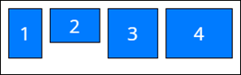
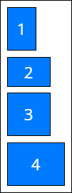
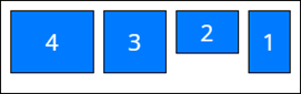
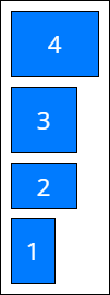
The orientation and direction of the flex container’s main axis to which flex components align. By default, row.
Available values
justifyContent
Space distribution along the main axis. Defines how the Mobile Creatio distributes space between and around nested components along the main axis of the flex container. By default, start.
Available values
wrap
Sets whether the nested components are forced onto one line or can wrap onto multiple lines in the flex container. By default, nowrap.
Available values


Tabs
Use the Tabs component to add a tab area. The tab area lets you display content grouped by multiple criteria. That way, you can publish more required information without overcrowding the page. Mobile Creatio lets you reorder tabs.
View the example of a configuration object that adds tab areas below.
{
    "type": "crt.Tabs",
    "isScrollable": true,
    "items": [
        {
            "position": 1,
            "text": "Tab 1",
            "body": {
                ...
            }
        },
        {
            "position": 2,
            "text": "Tab 2",
            "body": {
                ...
            }
        }
    ]
}
type
Component type. crt.Tabs for the Tabs component.
isScrollable
The flag that determines whether to scroll component data. By default, true.
Available values
true | Scrolling is enabled. |
false | Scrolling is disabled. |
items
The array of tabs.
Parameters
position | Tab order. | ||||
text | Tab name. | ||||
body | The array of nested Freedom UI components. | ||||
isTransparent | The flag that determines whether the tab has a background. By default, true The tab has background. false The tab has no background. |
Column
Use the Column component to arrange page content vertically.
View the example of a configuration object that arranges page content vertically below.
{
    "type": "crt.Column",
    "scrollable": true,
    "items": [
        ...
    ],
    "padding": {
        "left": "medium"
    }
}
type
Component type. crt.Column for the Column component.
scrollable
A flag that determines whether to scroll component data. By default, false.
Available values
true | Scrolling is enabled. Mobile Creatio lets applies scrolling when the Column component has nested Freedom UI components. |
false | Scrolling is disabled. |
items
The array of nested Freedom UI components.
Parameters
value | The name of attribute from the |
type | Type of nested component. |
padding
The container padding settings. The property can apply a single value to all sides or provide a specific value for each side of nested components.
Available values
none | Zero padding. |
small | Small padding. |
medium | Medium padding. |
large | Large padding. |